Tim Holtz Distress Ink Color Pop!
Hi readers! Happy Tuesday to you! We’re excited to be collaborating with Wanda Guess on a fun monthly feature to show some fun projects using the Distress Ink colors of the month! We hope this features inspires you to get inky with these new colors! Enjoy!
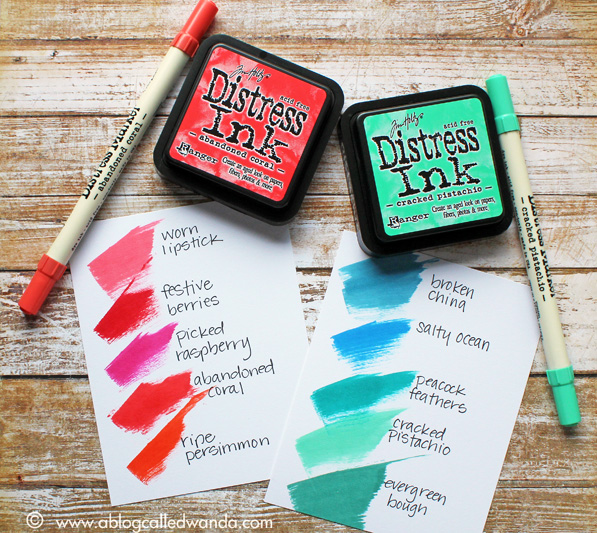
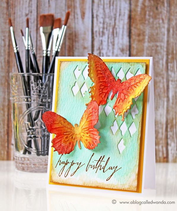
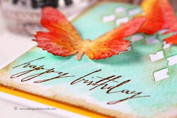
Hi everyone! Wanda here, kicking off a brand new monthly feature here at Simon Says Stamp! I’m going to be spotlighting the new Distress Ink colors as they are released. Are you as excited as I am every month to see what the new Distress Ink color is? They are so gorgeous…and don’t you love the color names?! A new color is announced each month, on the first Friday of the month. It’s like Christmas every time! I will be making a project each month – showcasing that new color. I’ll be creating a color swatch card too, so you can see where the new color fits in with your favorite existing Distress Ink colors. Today I’m using the first TWO colors together – Cracked Pistachio and Abandoned Coral.
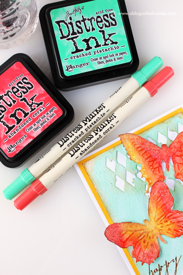
Cracked Pistachio and Abandoned Coral are very bright, clear, and almost Tropical colors! They remind me of bright birds, flowers and butterflies. I was drawn to use Squeezed Lemonade Distress Ink with these two new colors, and this color trio creates a very pretty palette.
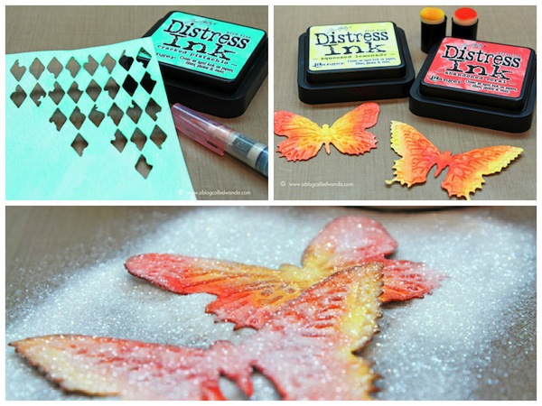
I first die cut the Mixed Media Alterations die from a watercolor sheet. Then I used Cracked Pistachio ink mixed with water to create a wash over the panel. After it was dry, I went back over with some Vintage Photo Distress ink around the edges of the panel, and around the cut out diamonds. Next I die cut and embossed the Tim Holtz Butterfly Duo – also out of watercolor paper. I used sponge daubers to place ink onto the butterflies. Then, I took my water brush and slightly blended the two colors together. As with the main panel, I edged the butterflies with Vintage Photo Distress Ink. Next I added beautiful Rock Candy Distress Glitter to the two butterflies. Finally, a beautiful stamped sentiment to finish off the card. I assembled the card, and used glossy accents to hold the two butterflies in place, gently bending the wings upward.
I hope you are inspired you to use these beautiful new colors.The next new color is called Mermaid Lagoon! I’ll be back soon with a project and a color swatch card. Until then, happy crafting!
SUPPLIES:
 |
 |
 |
 |
 |
 |
 |
 |
 |
 |
 |
 |
 |
 |
 |
 |
 |
 |
 |
 |
 |
Thanks for reading today and thanks so much to the awesome Wanda Guess for this inspiration today!
Blog Candy Alert!! Follow our blog via email and comment on this post for a chance to win a special blog candy!
Congrats! Blog Candy Winners!
From: Happy Spring and New Beginnings!: Heather Ferguson!
From: Tim Holtz Fragments: Jean Marmo!
From: 10 Ways to Watercolor!: Victoria Harris!
From: Your Favorite Challenge!: Suzi Metcalfe!
From: Sending You Love & Hugs: Brenda Lee!
Please email Samantha ([email protected]) with your mailing address and the name of the blog you won from to claim your prize!


GORGEOUS card – LOVE IT ALL!!!
I feel the NEED to get DISTRESSED :)
THANK YOU for sharing your CREATIVE INSPIRATION Wanda!!!
CONGRATULATIONS to all the lucky winners too – it is always EXTRA AWESOME to see some friends names listed :)
AMAZING CARD! I’m so in awe of your flawless blending! Love the new shades – Abandoned Coral looks like it might just be my next absolute fav!
Wonderful distressed project…thanks for the ink comparison pic too.
What a color combination! Love it!
Love the vivid and bright color palette on this fabulous card!!!
Such a perfect way to Ink those butterflies !! Absolutely love it
Wonderful distressed project. I just love use distress ink for my mix media projects and also for the card. Congratulations for the winers!!
Beautiful card using these new colors.
Love distress inks and your card today. I can’t wait to see the next awesome project inspired by mermaid lagoon.
The butterflies are just gorgeous – love the rock candy glitter and the beautiful new distress ink colors. The abandoned coral is to die for!!!
the colors are so bright and vivid. Beautiful.
Love the new colors and the card, gorgeous!!
Beautiful card! I am loving the vibrancy of these new distress colors. I love the properties of the distress ink but sometimes they are just too toned down for my taste. The new colors will make this entire line of colors more versatile.
Awesome bright n beautiful card !
GORGEOUS Wanda!
Stunning butterflies!! Thanks so much for the ink comparison, so helpful:)
This is FABULOUS! Absolutely Gorgeous!!! Love those colors ♥
Beautiful card Wanda! Looking forward to your next monthly feature!
Gorgeous card and yummy colours! x
I am so excited for this feature! I love, love, love Wanda and her amazing talent! This card is absolutely stunning!
I love the new monthly Distressed inks!
These new colours are beautiful, love them together too
Beautiful colours; stunning cards! In awe…
~c (carol)
Thank you for this new monthly feature and this project is stunning!
Such a beautiful card–the butterflies are stunning, like a tropical sunset :)
These two colors look fabulous together. Thank you for showcasing these inks.
Gorgeous card! I love Wanda’s work and look forward to this awesome new monthly feature!
What a beautiful card, I love these colors together, and can’t wait to see what will come next!
Wanda, great post! I love the color swatches you did – very helpful. Your card is gorgeous. Lucky girl to be able to play with all this fun stuff. I’m finding it very difficult to find the inks and mixed media die, but I know SSS will have it as soon as they can. Can’t wait.
wow…. fab
This is stunning! Love the vivid colors with the Tim Holtz products. Congrats to all of the winners!
stunning card… those new tim holtz dies are absolutely amazing!!!
You weren’t kidding when you said color POP… POP they do… and they’re gorgeous!!
Love the fabulous color combination.
Great projects. Can’t wait for the next colo=r
Wow love the color contrast! The harlequin die cut looks great.
Gorgeous card from Wanda! I love the new colors and have to add them to my wish list! Beautiful details on the card with the die cut and the lovely butterflies!
Great colors! LOVE distress!
All of the new release colors are just so yummy!
Fabulous colors!! great job.
Beautiful colours and such a beautiful project! Thanks for the inspiration!
Oh my goodness, I love this card. I must get the butterfly dies, they’re gorgeous.
Wanda’s card is gorgeous. Anyone would be thrilled to recieve this card. It could be used as a room decoration!
Beautiful card. Just recently received these new colors. Love them.
The pistachio is definitely a yes…..the coral I am still not sure.
I love how you are show casing the new colors here. One request I would make, it is very difficult to tell the difference between some of the colors in the photos, is that you give a verbal description of the closest ones (i.e., Abandoned Coral and Ripe Persimmon). The colors are lovely, but I can’t afford to buy basically the same color as I already have.
love the soft pistachio along with the vibrant coral! Simply stunning Wanda! Congrats on the feature!
Amazing card! Love the colors :)
Beautiful! I can’t wait to get the new distress colors, thanks for sharing your gorgeous card!
I love everything about this card… the motifs, the dies, the colors, the composition… sigh… so beautiful!!!! Keep up the good work! Can hardly wait to see more. Thank you.