Shipping NOW! Tim Holtz idea-ology Paper Collection: Shop the Full Palette!
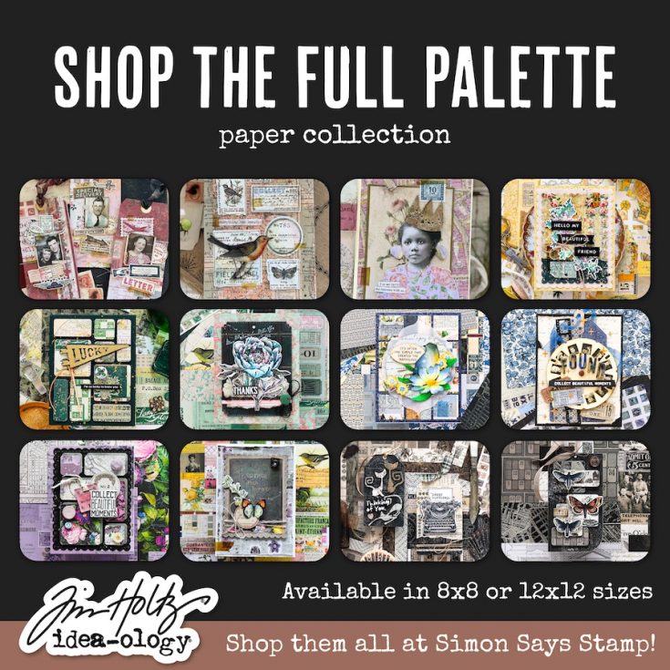
Meet Multi: Bursting with character, color, and creative energy, the Palette Collection: Multi is a vibrant mosaic of vintage hues—perfect for makers who love lively storytelling. From rainbow-tinted ephemera and iconic labels to collage art and florals, this palette brings joyful versatility.
Meet Charcoal: Deep, distressed, and beautifully dramatic—the Palette Collection: Charcoal brings a rich palette of shadowy tones and textured vintage elements to your creative work. Featuring 12 double-sided 8×8 papers, this collection blends worn blacks, aged grays, antique neutrals, typography, grids, and collage snippets to create a striking yet timeless foundation for your makes.
Meet Purple: Soft lilacs meet deep plum tones in this romantic, artfully distressed palette. The Palette Collection: Purple blends florals, marbled textures, grid patterns, and classic ephemera for a sophisticated and whimsical feel.
Meet Blue: Inspired by sea-worn textures, aged maps, soft skies, and washed blues, the Palette Collection: Blue brings a serene, nostalgic atmosphere to your creative projects. Perfectly distressed and beautifully balanced, it’s a dreamy blend of texture and tone that adds depth and timeless charm to every make.
Meet Teal: Inspired by nature, patina, and timeworn textures, the Palette Collection: Teal blends serene greens, soft coppery tones, botanical illustrations, and layered collage art to create a fresh yet timeless aesthetic—rich with depth, character, and artistic charm.
Meet Indigo: Rich, moody, and beautifully layered, the Palette Collection: Indigo takes blue to its deepest, most dramatic tones. Featuring botanical prints, maps, labels, and vintage ephemera, this palette radiates sophistication, depth, and irresistible old-world charm.
Meet Yellow: Warm, mellow, and beautifully timeworn. This curated palette blends golden yellows, soft ochres, and muted mustard tones with vintage-inspired botanicals, maps, ledgers, ticket blocks, and aged textures. Designed for layering and storytelling, these 12 double-sided papers add a timeless glow to cards, journals, scrapbooks, and mixed-media makes.
Meet Green: Earthy and organic with a vintage soul. Mossy greens, soft sages, deep forest tones, and weathered olives pair with botanicals, maps, typography, and aged textures across 12 double-sided papers. Perfect for layered storytelling in cards, journals, scrapbooks, and mixed-media projects.
Meet Neutral: Timeless and versatile with a vintage soul. Soft creams, warm tans, weathered grays, and deep charcoals create the perfect foundation for layered storytelling. These 12 double-sided papers feature ledgers, typography, botanicals, woodgrain, textures, and ephemera-style patterns—ideal for journaling, cardmaking, scrapbooking, and mixed-media projects.
Meet Pink: A romantic blend of muted blush tones and timeless vintage charm, Palette Collection: Pink invites makers into a world of delicate storytelling. This curated assortment of 12 double-sided papers features soft florals, classic checks, nostalgic textures, and iconic ephemera—perfect for journaling, cardmaking, layering, and mixed-media creativity.
Meet Red: Rich, aged, and bursting with character, Palette Collection: Red celebrates the striking depth of the red spectrum—from brick and crimson to rust, ledger red, and muted holiday hues. This 12-sheet double-sided collection pairs structured patterns with nostalgic collage imagery for bold, expressive storytelling with a vintage soul.
Meet Orange: Warm, earthy, and beautifully nostalgic, Palette Collection: Orange captures the essence of fall, nature, and sun-washed vintage stories. From pumpkin spice tones and deep rust to soft creams, this 12-sheet double-sided set blends botanical prints, travel snippets, ledgers, cozy checks, and nostalgic textures for a grounded, seasonal aesthetic.
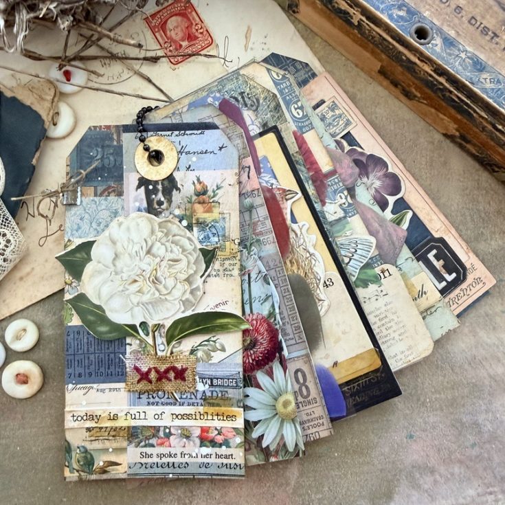
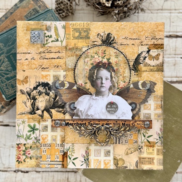
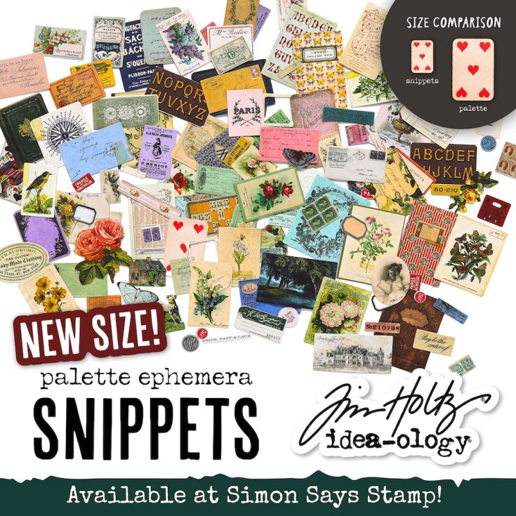
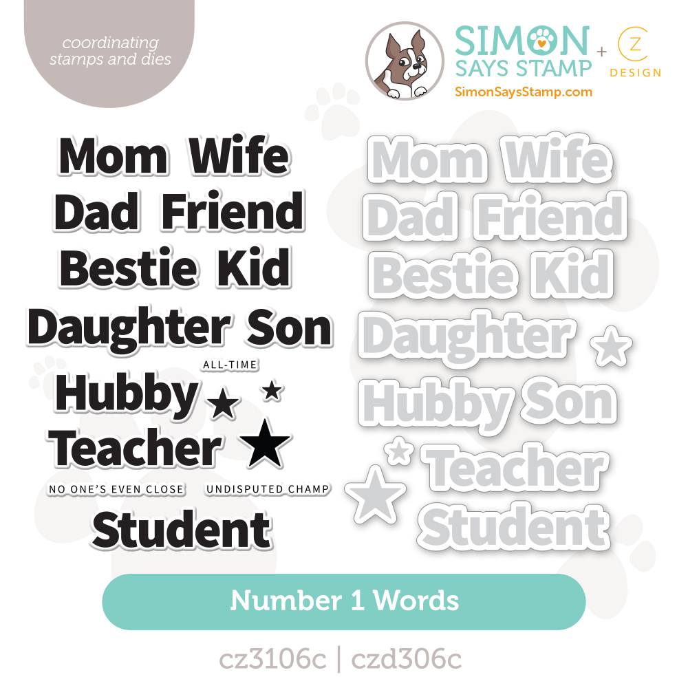
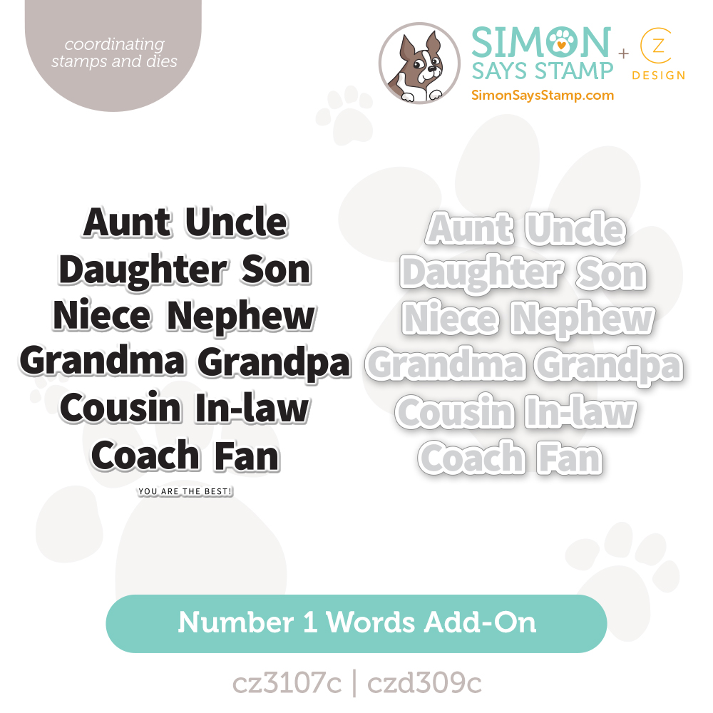
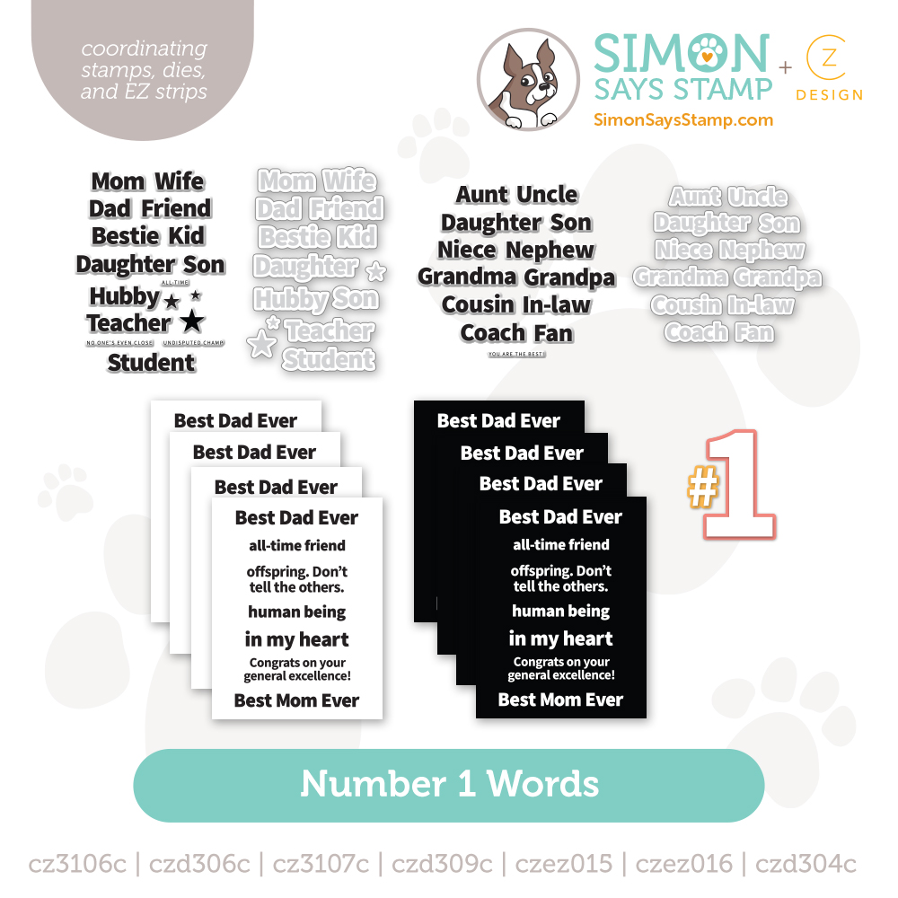
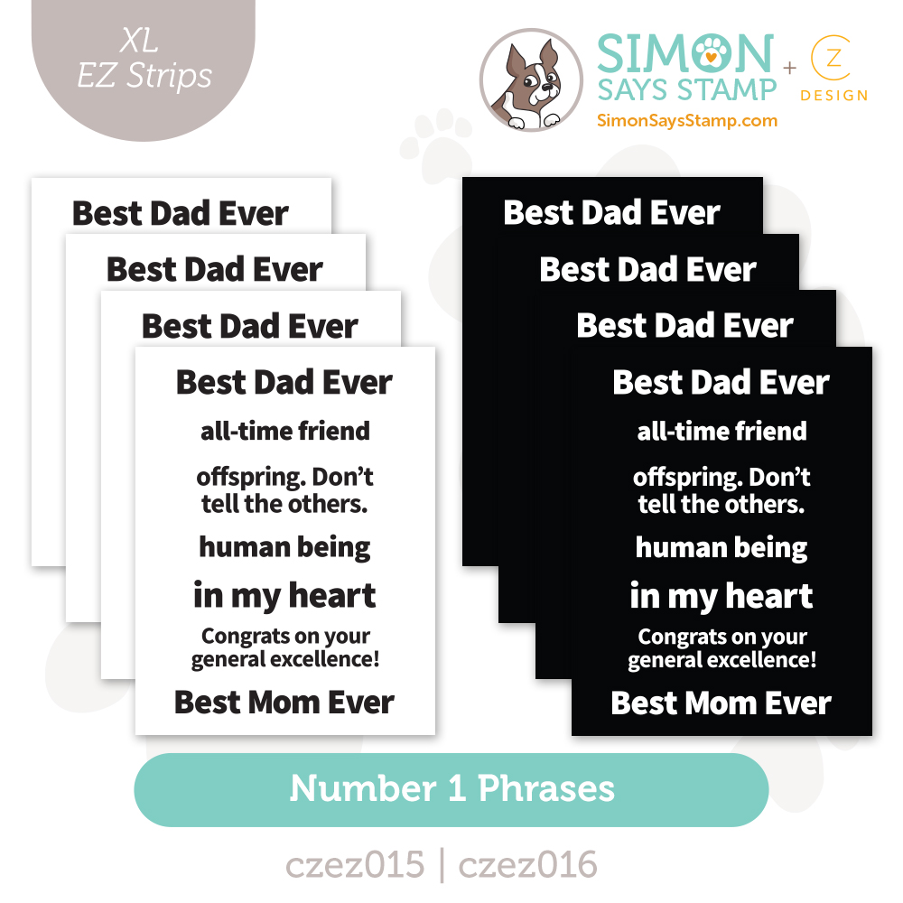
Bring it all together with SNIPPETS!
Last Call for An Exclusive Gift + Double Paws Event!
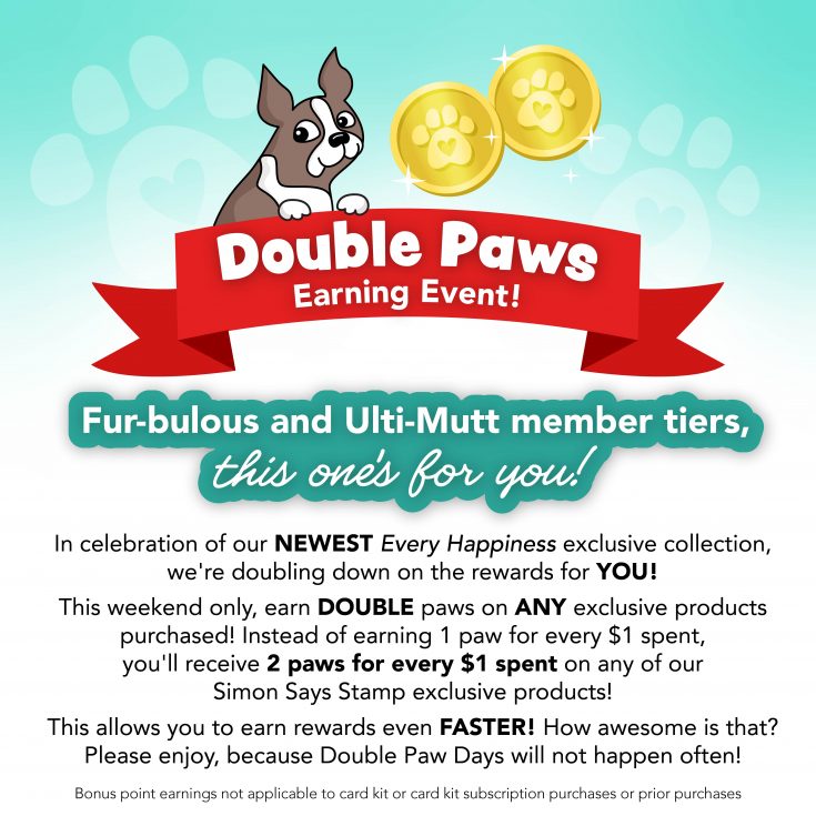
Hey there, Ulti-mutt and Fur-bulous friends!!
Today’s your LAST CHANCE to earn DOUBLE Paws on any Simon Says Stamp branded purchase! It’s one of the fastest ways to grow your Rewards balance and get even closer to your next reward.
Don’t miss this rare opportunity to earn rewards twice as fast—this special event ends TONIGHT! Shop now before it’s gone!

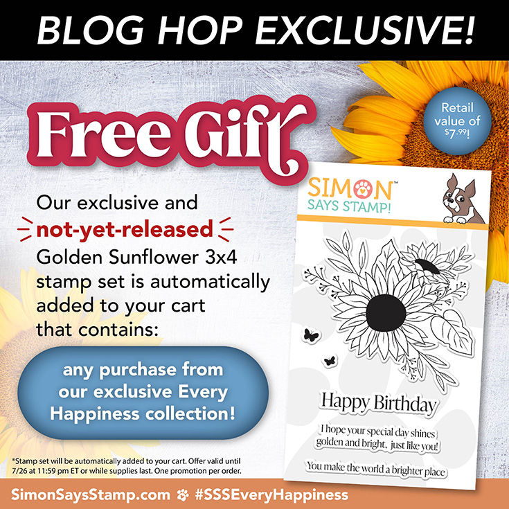
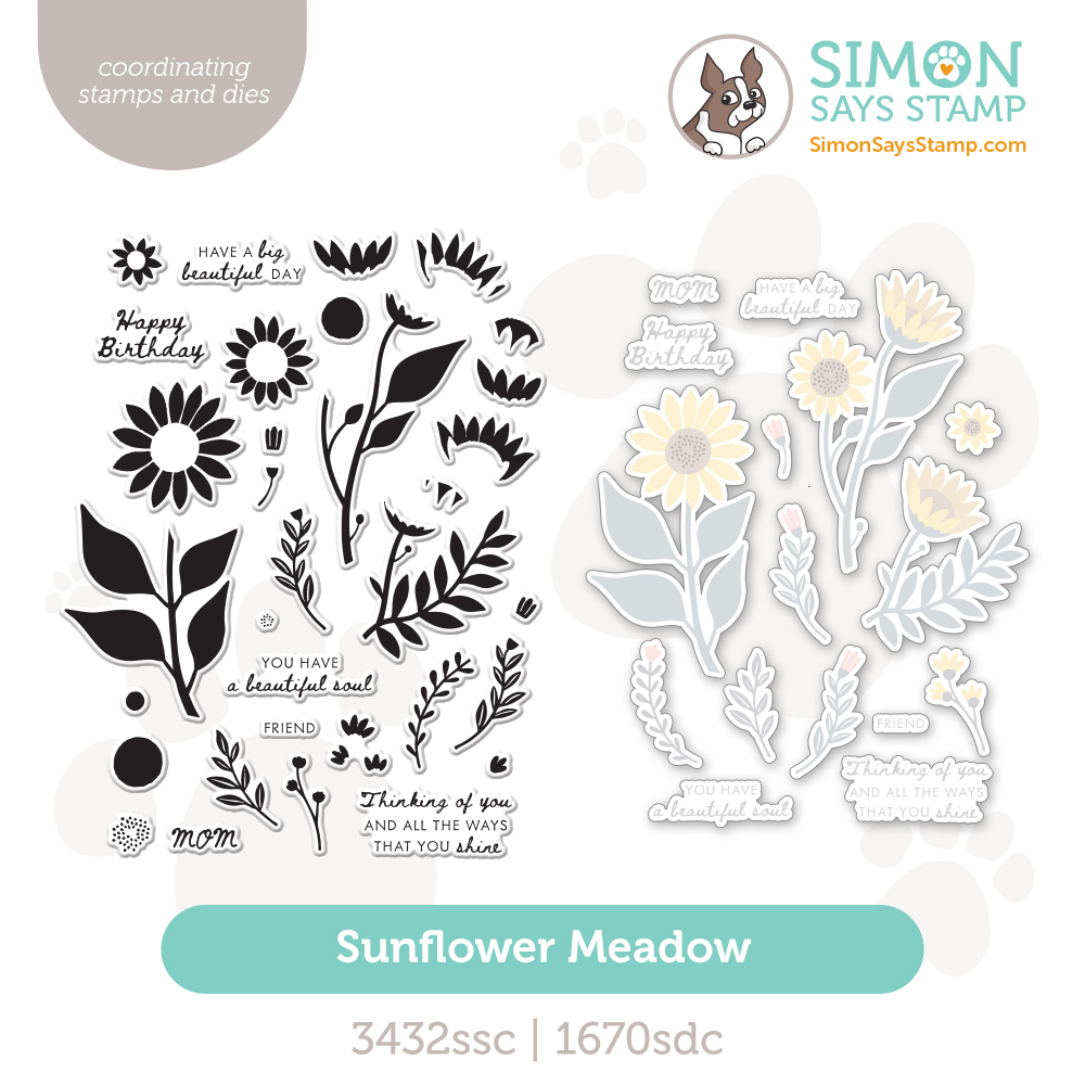
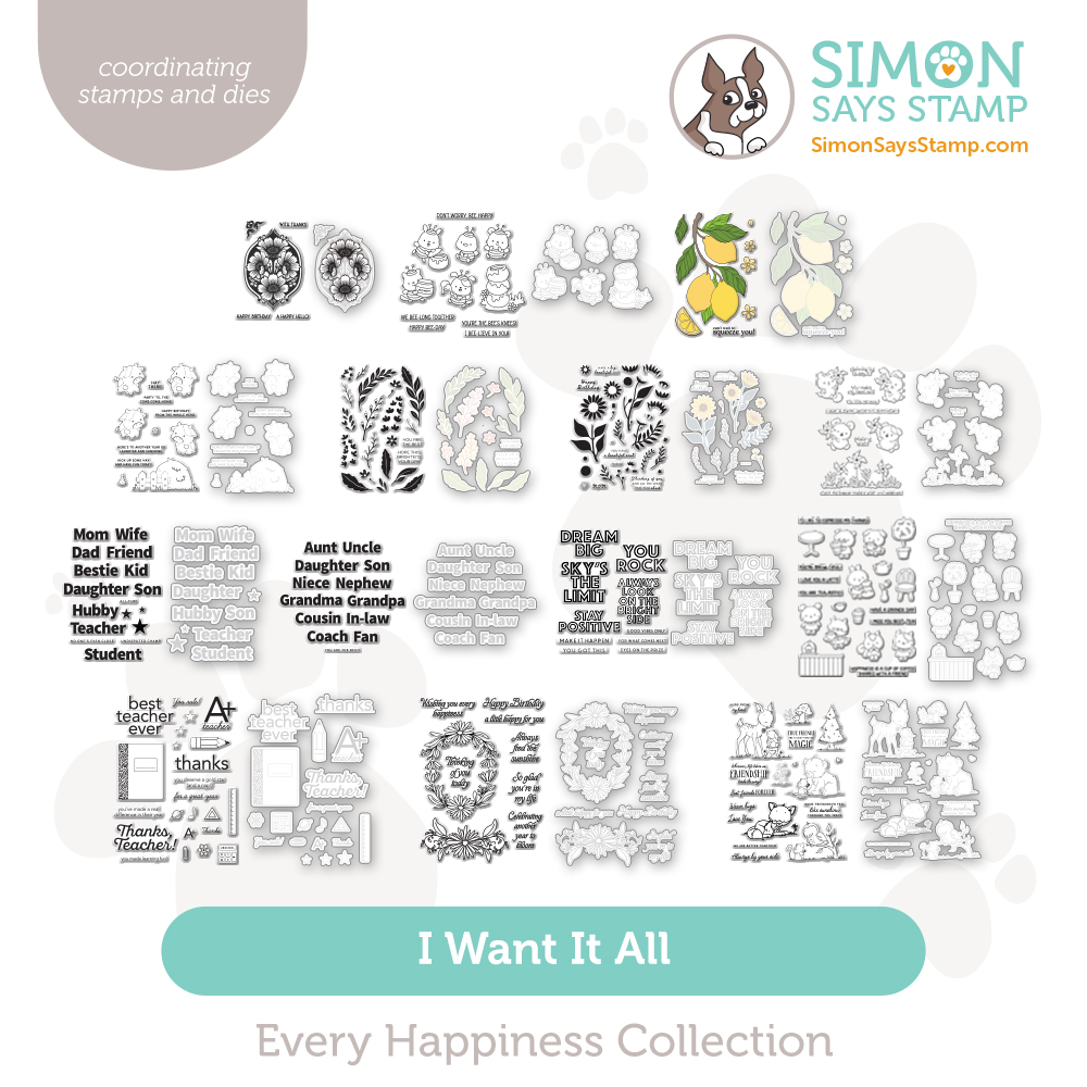
And ALSO if that wasn’t already cool enough we have just a few gift with purchases left of our brand new and exclusive Golden Sunflower stamp set – yours free with ANY purchase from our new Every Happiness collection while supplies last! No code required!
Every Happiness Blog Hop 2!
Hello, friends, and welcome to day two of our Every Happiness release blog hops! If you missed yesterday’s hop, be sure to circle back and check it out HERE.
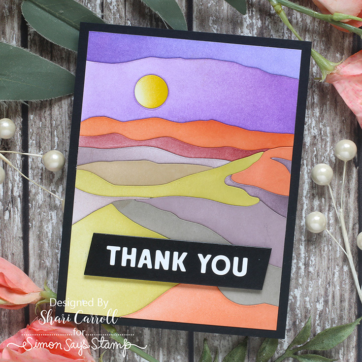
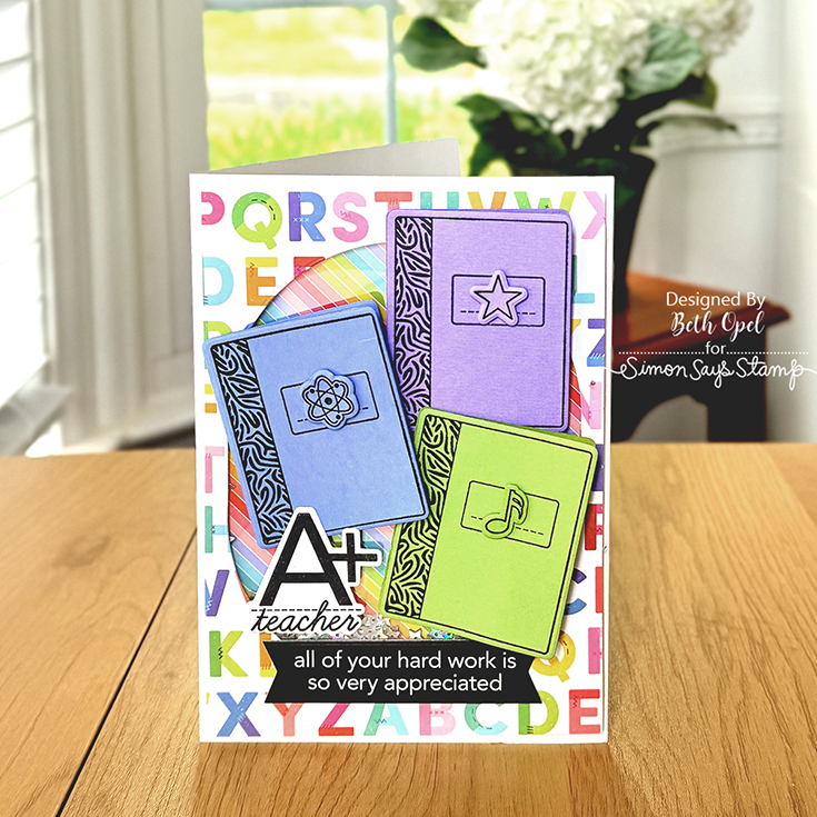
Before we hop, let’s take a look at some fabulous inspiration from Shari Carroll and Beth Opel:
We love our customers! And we love your enthusiasm for our exclusive releases and blog hops. To celebrate, Simon has set aside a free gift just for you! Our not-yet-released Simon Says Stamp Golden Sunflower 3×4 stamp is automatically added to your cart that contains any purchase from our exclusive Every Happiness collection! Check out the details on the banner at the top of this post for information about claiming your gift.
Ready for even more Every Happiness inspiration? Hop along with these talented designers! You’ll be inspired AND for every comment you leave on each blog, you’ll earn a chance to win a $25 Simon Says Stamp store shopping spree. YAY!
- Simon Says Stamp Blog <<YOU ARE HERE!
- Nina-Marie Trapani
- Emily Midgett
- Cathy Zielske
- Keisha Charles
- Sandi MacIver
- Suzy Plantamura
- Mindy Eggen
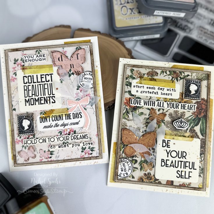
- Nichol Spohr
- Alberto Gava
- Caryn Davies
- Rachel Alvarado
- Rosemary Dennis
- Susan Valle
- Pam Sparks
Please share some feedback with these creative artists who work hard to inspire and excite us! Your comments mean so much to them.
Thanks again for joining us today!
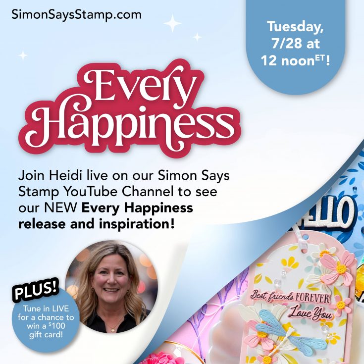
We hope you will join us on Instagram on Tuesday, July 28, for an Instagram Hop featuring our Every Happiness release! We are excited to share awesome ideas from several creative minds using these fantastic products.
You’ll love browsing our Every Happiness gallery on our blog for loads of additional inspiration, and you can add your projects to these galleries as well!
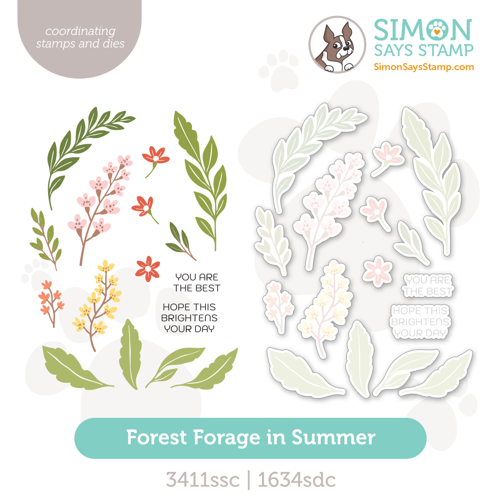
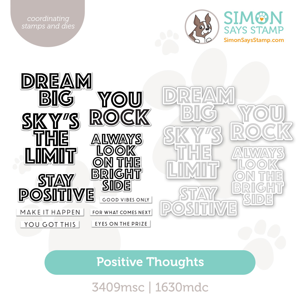
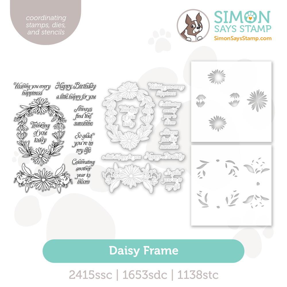
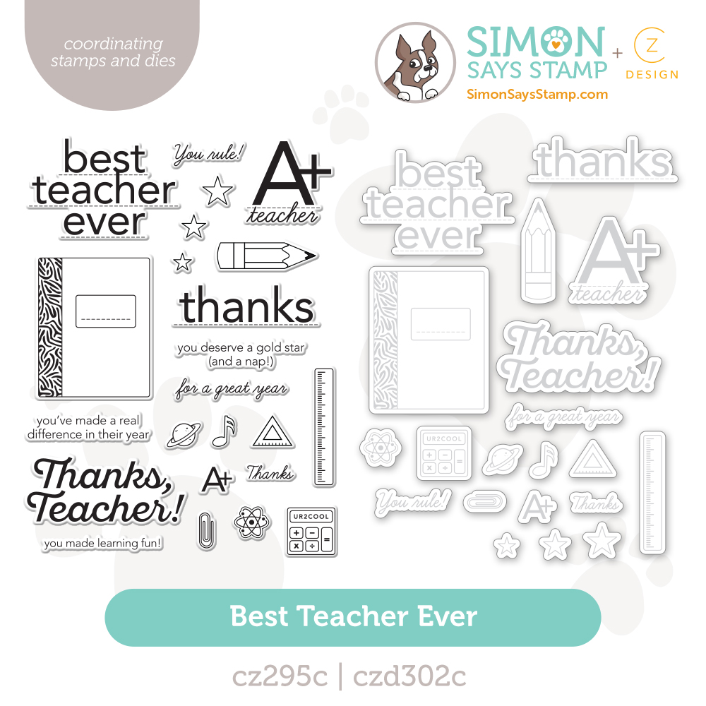
Shop the entire collection:
Can’t pick a favorite? Shop our NEW Bundles:
Join us LIVE!
We’re going live NEXT WEEK! (Tuesday June 28th at 12 PM ET) to showcase our brand new + exclusive collection, Every Happiness! Come get inspired, plus comment live for a chance to win a $100 gift card!