Tim Holtz Distress Ink Color POP: Twisted Citron
Hi readers! Happy Tuesday and happy last day of June! We’re officially past the half way mark of 2015! Can you believe it? The very fun and talented Wanda Guess joins us again this month with the Color Pop feature for May: Twisted Citron! Did you miss a past feature? Check out our archives for the combined Cracked Pistachio and Abandoned Coral feature, Mermaid Lagoon, and Fossilized Amber! Coming up next month: Hickory Smoke! Excited for July’s color? Be sure to tune into our blog on FRIDAY to find out what it is!
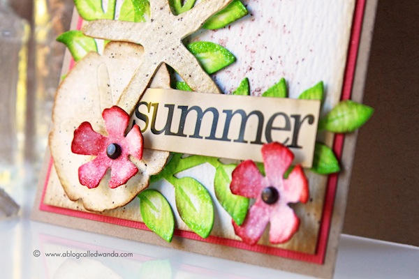
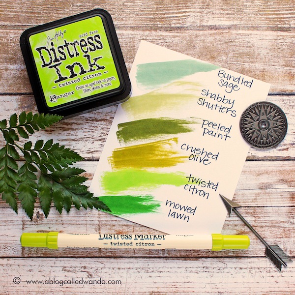
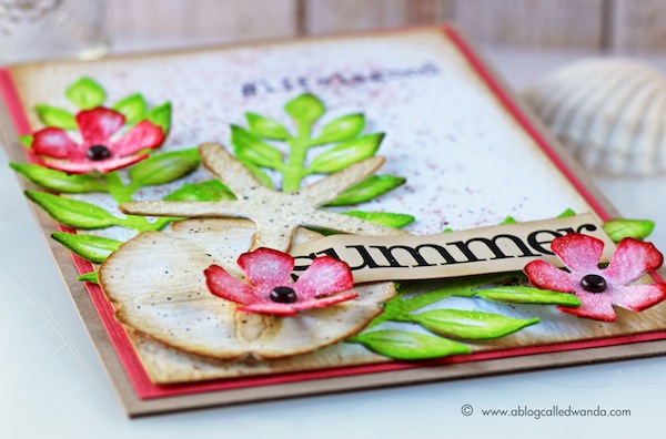
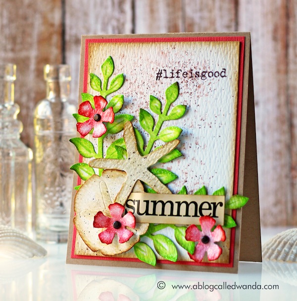
It’s Wanda here! Happy Summer! I’m here today with the fourth installment in our Color Pop series – featuring the newest Distress Ink Color! I’m excited to share a project using the color for May – Twisted Citron. This is a bright, clear, happy green. Think margarita green, lime-y and fresh! It’s very strong and vibrant, but it’s easy to tone down with other colors, too. Basically, it’s perfect! With this color, a little goes a long way! I love it. Since it’s Summer time I decided to make a beach-themed card and used the Twisted Citron for some gorgeous tropical leaves.
Green is always a good neutral, and this new green was an easy one to match with other colors. I used pretty Abandoned Coral Ink along with some neutral tones of brown and cream to complete my beach look. I love this color combination! Reminds me of Hawaii. My leaves were colored with the ink pad using a sponge dauber. I left some white space in the center of the leaves. If you look closely, you’ll see that I went back and used the Twisted Citron Marker to make a center vein in each leaf for some dimension. I also put just a touch of Vintage Photo ink on some of the edges.
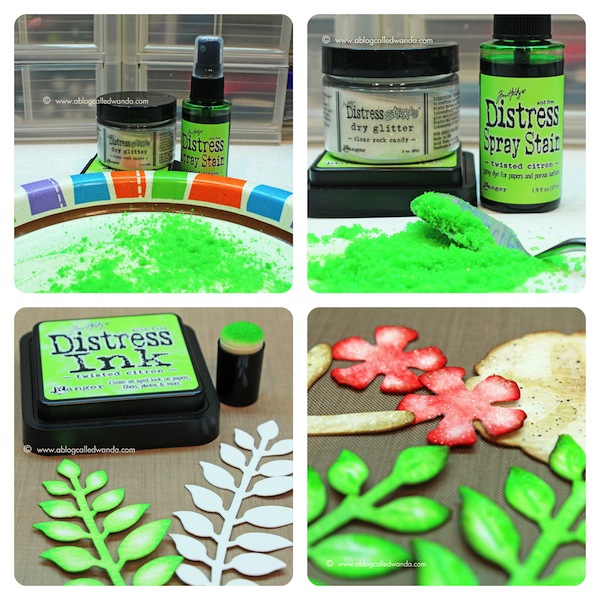
Something really fun that I thought of was to make my own glitter. I was thinking to myself…wouldn’t it be nice to have Twisted Citron glitter?? So I made some! I took a paper plate and sprinkled some clear Rock Candy Distress Glitter on it. I took the Twisted Citron Spray Stain and made a fine mist over the clear glitter. Then I let it dry and stirred it up with a palette knife. Voila! Perfectly matching glitter! Next up I’m going to make some Abandoned Coral glitter…. After it was dry, I used my new green glitter on the tropical leaves.
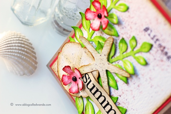
My leaves, flowers and shells are cut from Ranger Watercolor Paper. I added Clear Rock Candy glitter to all the pieces except the leaves. I also edged everything with Vintage Photo ink and a sponge dauber. For the background I tried another new technique. I wanted to mimic the feeling of sand. I used the Vintage Photo Marker in the Tim Holtz Distress Sprayer took and made spatters on my paper. Then I took the water mister and let some fine mist of clean water fall onto the spatters. Some of the dots softened and some stayed pretty strong. I love this and will definitely use this technique again.
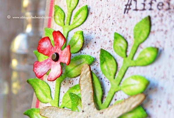
I used a Flashcard and cut out the word Summer. Then I stamped the hashtag #lifeisgood…and assembled all my pieces onto a kraft card base with a small layer of coral paper.
I’ve made another color swatch reference chart for you to see where the new color fits in with your existing Distress Ink colors. This green is in the Yellow Green family more so than the Blue Green family.
Next up is the rich and mysterious Hickory Smoke… Can’t wait to get my hands on this new neutral. See you next month! Have a great day and happy crafting!
SUPPLIES:
 |
 |
 |
 |
 |
 |
 |
 |
 |
 |
 |
 |
 |
 |
 |
 |
 |
 |
 |
 |
 |
 |
 |
 |
 |
 |
 |
Thanks for reading today, and thanks again to the super talented Wanda for continuing this fun feature for our blog!
Last chance! —>

Blog Candy Alert!! Follow our blog via email and comment on this post for a chance to win a special blog candy!
Congrats! Blog Candy Winners!
From: Canvas Crafting with The Color of FUN!: Elizabeth Marie!
From: Mixed Media Artist: Tracy Scott: Michele Clay!
From: Many Thanks!: Marcia Scantlin!
From: Add some PUNCH to your next project!: Rose Noelle!
Please email Samantha ([email protected]) with your mailing address and the name of the blog you won from to claim your prize!


what a great idea to make custom color glitters!
stamping sue
http://stampingsueinconnecticut.blogspot.com/
These colors are so vibrant and lively … love ’em … and what a sweet card creation to showcase them!
Wonderful color addition. Green is a fav color of my daughter.
Melissa
“Sunshine HoneyBee”
Beautiful color if distress ink! Wonderful card!
This is a WOW! card. So many details, such beautiful blended colors in tasteful combinations and the textured sand look makes one think of the beach.
Love the idea of making matching glitter! I’ll have to try that sometime.
Just love this new color and need to try this idea..
Customized glitter is a brilliant idea! Thanks for a fabulous tip. Love your summer card.
Awesome summer color!
Gorgeous card. Wonderful ideas, so inspirational.
Great new color! So vibrant!
Love your beautiful summery card, that Citron is vibrantly fabulous! Love your tutorial especially on making colored glitter and your sandy background technique. Thanks for sharing.
Just gorgeous xx
Beautiful card. I love the bright colors. Thank you for the inspiration.
Gorgeous green!
Beautiful card Wanda! TFS!
Wanda, what a great card! You made your own glitter that is so neat. I love sea and flower mixture too.
Congrats all winners.
I must say I do like bundled sage so I think I may have to mark down on my wanted list.
Love the idea of making colored glitter!
Wow, that color is full of energy!
Love how the colors are shading. Makes it easier when stamping.
thanks for sharing a beautiful card.
Always impressed with Wanda and the amazing things I learn from her!!! Wonderful post!!
Great color and card! ;-)
A very impressive artistic card!
SO BRIGHT and CHEERY :)
LOVE how you coloured your glitter – WOW – that is SO COOL – I look forward to try it!!!
I love Wanda’s cards and her use of color. Great idea to make matching glitter.
Gorgeous card! LOVE the new distress color!!! ♥
Fantatsic idea with the glitter. This is a orgeous colour. Hugz
Stunning card and just love this new colour.
Beautiful card and Twisted has just made my “gotta have it” list.
I’m slowly adding all the new distress colors to my stash. Twisted citrus will probably be next…I love the idea of matching the glitter to the color on the card. Great idea! Lovely card!
I love this feature with Wanda! What a gorgeous card!
Very beautiful card! Really like the vibrant colors.
I always love everything that Wanda does. She never misses. Gorgeous!
Great idea to color glitter!
Ooh beautiful card and gorgeous shade of green :)
This color looks so NEON, great addition to the TH spektrum.
Great techniques. Very cool. Beautiful card, too. Michelle t
Love Wandas project and the new green color distress ink!
beautiful card!! love the colors you have used… gorgeous!!
So vibrant colors!
And a great idea with glitter and inks!
I love this colour, so vibrant and fresh!
LOVE this color!!! I am so glad they are releasing a color a month! It makes it easier to be able to get them all! Beautiful card! TFS!
Gorgeous piece! Love the bright colors and die cuts.
Beautiful card, loving
that green color!
Carla from Utah
Love this pretty bright green–I just got mine! I haven’t used it yet, getting excited to give it a try. Thanks for your sharing your beautiful card and “twisted” gillter–how cool!
Love the glitter idea and the card is awesome.
That green is very pretty, i dont own any tim holtz products!
THANK YOU!!! These comparisons with the other ink colors are SO HELPFUL when shopping online!
Stephanie, would it be possible for Simon to do this with all of their very own inks too? It is very difficult to compare (for example) all the shades of greens or blues that are in the Simon line when shopping for them. If we had a chart of actual ink swatches it would be SO helpful. Perhaps make it a permanent link on the blog?
Love that summery green and love Wanda’s card! TFS