Tim Holtz Distress Ink Color Pop: Fossilized Amber!
Hi readers! I sure hope you’re loving this fun feature as much as I am! We’re back with the awesome Wanda Guess for our monthly color POP series, and this month she’s spotlighting Fossilized Amber! Next: Twisted Citron! If you missed our features on Cracked Pistachio/Abandoned Coral or Mermaid Lagoon, be sure to check them out!
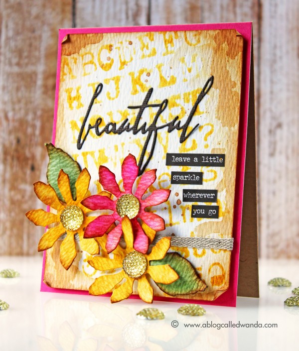
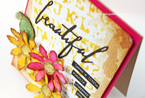
It’s Wanda, and I’m here today with the third installment in our Color Pop series – featuring the newest Distress Ink Color! I’m excited to share a project using the color for April – Fossilized Amber. This is a rich, deep, warm, golden yellow. Perhaps the color of sunflowers? That is what inspired me! So I made a card with some bright and cheerful flowers.
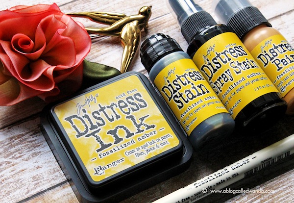
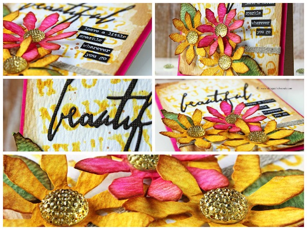
This ink color was an easy one to match with other colors – since yellow goes with almost any other color. But, I wanted something special, and something maybe not obvious. Well, it came to me – Picked Raspberry! And, yes, I love these colors together now! I used the Fossilized Amber Ink pad to stencil my background paper with the Typo Stencil. I also used the ink pad to color my Tattered Floral Dies. I used the Fossilized Amber Spray Stain to color in some Tim Holtz Gumdrops for the centers of my flowers. I like to show you different ways to use each medium. The spray stain is dark and pigmented and it drenches on the color.
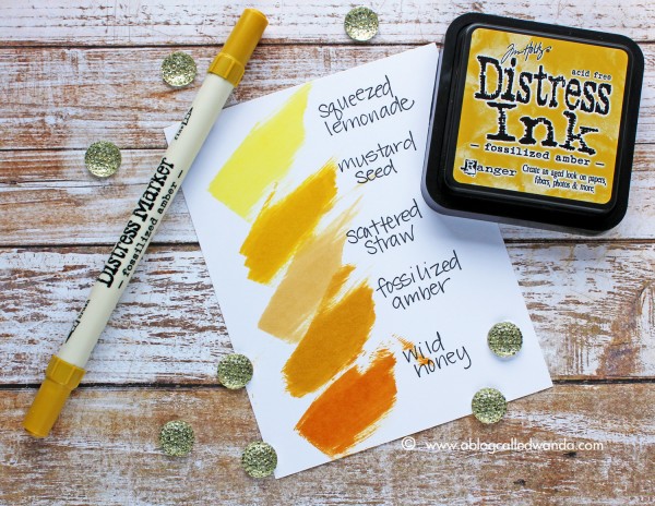
I’ve made another color swatch reference chart for you to see where the new color fits in with your existing Distress Ink colors. Here is the entire Distress Ink Yellow color story.
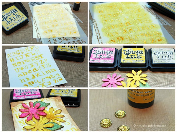
To make my background paper, I taped my stencil down to some watercolor paper and used a sponge dauber to ink it. Then, while the stencil was still on the paper, I misted the entire thing with water – to soften the edges of my stenciled images. Then I spattered some Vintage Photo ink and also edged my paper with the Vintage Photo ink. This gives me a nice base to work with. You can see I put my stencil on at an angle for some visual interest.
I die cut my Tattered Floral die pieces out of Ranger Watercolor paper and then applied ink from the ink pads. Here you can see my color choices. I die cut the word ‘beautiful’ from a TH word die and then added my stained gumdrops and my small word stickers. I decided to pop the card by using a layer of pretty raspberry cardstock behind my images.
Next up is the gorgeous Twisted Citron! (Editor’s note: Available to reserve now!!) Since the moment Tim announced he was doing a new color each month, I have been hoping for a bright citrus green! Yahoo – can’t wait to get my hands on the new color. See you next month! Have a great day and happy crafting!
SUPPLIES:
Thanks for reading today and thanks so much to the awesome Wanda for this inspiration today!
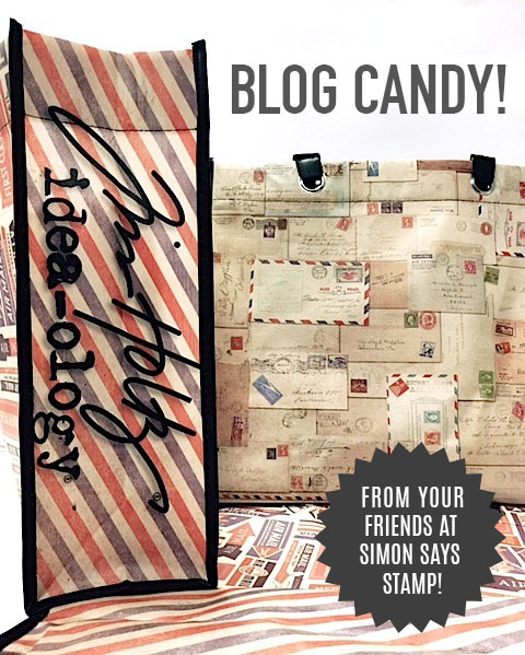
Blog Candy Alert! Is this color a must have for you? Comment your thoughts on this post for a chance to WIN a reusable Tim Holtz Idea-olgy tote bag! Good luck!











This color is another beautiful addition to the distress line.
Love this card showcasing the new fossilized amber color with deep pink–gorgeous! Wild Honey has long been one of my favorites in the distress line, so yes, this new deep yellow color is a must-have f
I. Really love this color! It is deep and rich but goes beautifully with al those brights!!!
I love this color and I also think it’s perfect for sunflowers! Beautiful card!!
Love the rich hues on this card! Another fabulous color added to the list!
Great way to make that color pop!
Great Card!
LOVE Fossilized Amber!!!!!
Yellows are not my go-to colors, but this one looks like it will be great for summer and autumn projects, especially!
<3 J
jwoolbright at gmail dot com
HerPeacefulGarden.blogspot.com
Your card is trully beautiful! I love all the colors! Thank you
All the new colors so far a must have. They are gorgeous and vibrant. I love them.
Really nice! Love your stenciled background and the fun flowers. Thanks!
What a fun technique, I should give it a try. the colors are so beautiful.
OMGosh…All of Tim’s colors are a MUST HAVE!!!!
I didn’t think I would like this color when the it was revealed, but seeing it on a card I have completely changed my mind! It’s lovely. Beautiful card.
Wanda did such a great job using the newest addition to the TH color-line. I love the picked raspberry color that she chose to accent the fossilized amber. It’s the perfect complimentary color. Great job!
LOVE Fossilized Amber! It is my favorite of the new colors so far! This is an absolutely gorgeous card!! LOVE the bright colors and the tattered florals ROCK!! TFS!
Whatever Wanda creates is so delightful and amazing and such a work of art!! She is amazingly talented and she really knows how to make her projects burst with color and awesome details!!!
Love the colors… it makes me think of different ways to use my Tattered Florals die… :D I just adore anything TH… Thanks for sharing!
Absolutely STUNNING !
Awesome!