Art Journaling at Presque Isle!
Hi bloggers! Happy Monday to you! I’m jazzed to have the amazing Lisa Spangler as a guest on our blog! She has truly crafted up an Art Journaling masterpiece for us and without further ado I’m going to let her take the “blog floor” ;) Enjoy!
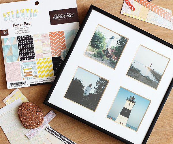
Hello! I am so glad that Stephanie asked me to be a guest on the blog again — it gave me a chance to play with my Dylusions Creative journal. (Editors note: NEW! Small version available!!) I must confess to being a little intimidated by it’s size, since I mostly make cards — which are much smaller! But the blank pages kept begging for me to come and play. Liiiiiisa….liiiiiiisa….ha!I also wanted to play with my new stencils from Hero Arts as they haven’t seen much action — yet! (I know I’ll be playing with them again soon.) And then I spotted some scraps of paper I had on my desk from a Studio Calico Atlantic 6×6 pad. Love this pad so much, just makes me happy.
I am planning a trip to Ohio to visit my Dad in a few weeks — cannot wait to see him, my sister who lives in Florida, and the rest of the family. I had just called him suggest that we all spend a day relaxing at Presque Isle, a park on Lake Erie. Love that place so much! I can remember going there with girlfriends in high school, talking about boys. One time we all fell asleep and I got the absolute worst sunburn ever! And then years later, I remember going there with my husband Jason. We spent the day swimming and picnicking and then watched the sunset. It’s such a happy place! Best of all, it’s only about 2 hours from home. :)
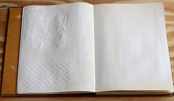
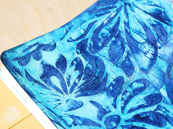
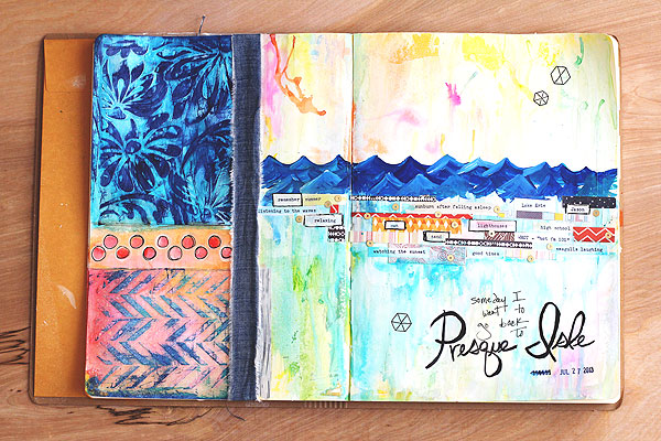
So I decided to do some journaling all about it! I started off by gessoing my whole page — is that a word? lol! I used an old hotel key card to scrape it on. I let it dry, then I scraped more gesso through the stencils. That’s the Large Lotus Pattern on top and the Tweed Pattern on bottom. I thought the Large Lotus pattern looked like a pair of swim trunks!
While I was waiting for the stenciled areas to dry I went to town making a background on the rest. This was really really fun, and really really easy. I just dropped Dylusions mist here and there on the page, misted it with water, and used my fingers to blend it together.
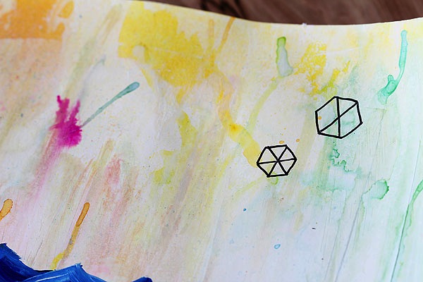
Sometimes I gave it a mist with white to lighten it up, too. Then I let that dry.
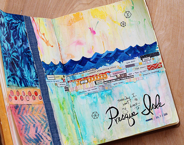
Then: disaster struck! I knocked over the squeezed orange mist bottle — and the lid hadn’t been secured on! — so I wound up with a line of squeezed orange all across the journal! Oh no! I quickly grabbed a baby wipe and blotted it off, whew. Buuuuut, it removed some of my background in the process. I tried to repair it, but no go. Note to self: always secure your lids!What to do, what to do? I decided to hide it by painting waves with Claudine Hellmuth’s acrylic paint over top. Ha! I mixed different shades of blue plus a little white here and there to make the waves.
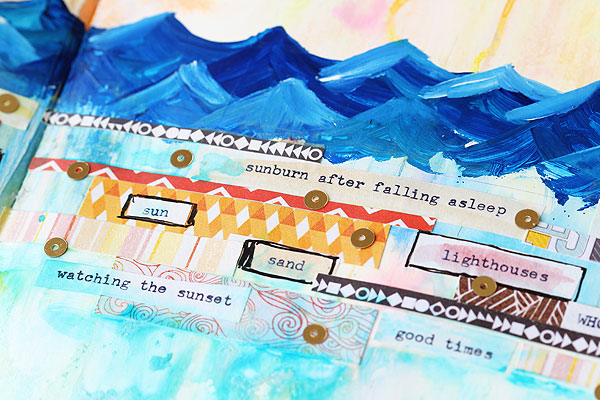
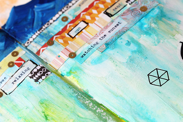
Next I used my trusty typewriter to type up some words. I brushed mists over some of the words and left others blank, then I adhered them to my pages with gel medium. I mixed in some scraps of papers, too! This is a great way to use up scraps! One word of caution though: once the gel medium seeps into the paper it will reactivate the mists again and they’ll start moving around. So you gotta work fast!
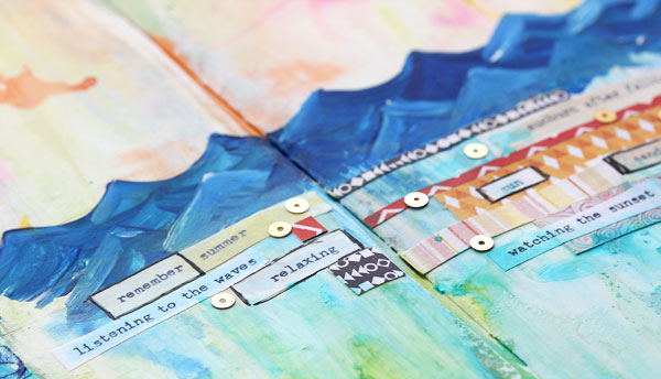
Then I added in a few Kelly Purkey gold sequins — love using these on journal pages since they are flat, and won’t mess you up when you work on the other side of the page. I like to use Tombow liquid adhesive to adhere sequins to journal pages since it stays flexible when dry. (I’ve found that sequins adhered with glossy accents just pop off the page!)The stenciled areas were dry, so I used my fingers again to apply mist to the top, then let it dry. To finish off the Lotus Flower stencil in the top left, I rubbed it directly with Hero Arts navy ink. The texture is really incredible!
To finish off the Tweed Pattern, i first painted it with bubblegum pink and fresh lime mists, then let it dry. I thought it needed a little more definition so I rubbed it with ocean ink and then a little navy.
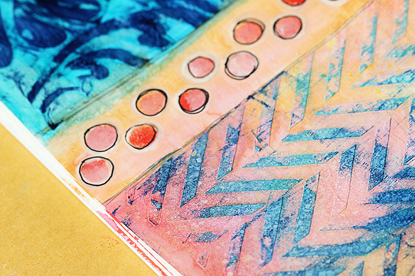
For the area in between the two, first I painted it with squeezed orange mist. Then I grabbed the Hero Arts border stencil and stippled on some polka dots, using painterly pink and modern red acrylic paints. When it was dry I outlined it with a white pen followed by a black pen. So fun!
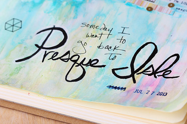
To finish it off, I used a pencil to lightly write “Presque Isle”, then I went over it with a black Copic sketch marker, using the brush tip. Then I wrote “I want to go back to” with a black pen. Then I stamped the date with navy ink and the Studio Calico roller date stamp. (Love it!)It needed a little something, so I grabbed the border stencil again and traced some hexagons with a thinner black pen.
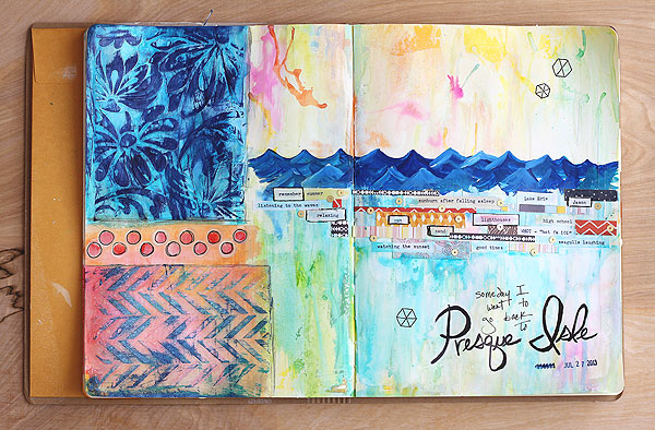
I was almost ready to call it done, but not quite…that uneven edge by the stenciled areas was bothering me. So I grabbed an old jean shirt and tore off a strip, then adhered it in place.
And that was that! Hope that you enjoyed hearing about my process as much as I enjoyed remembering all the good times at Presque Isle! Please let me know if you have any questions, and have a great summer! xx
SUPPLIES:
 |
 |
 |
 |
 |
 |
 |
 |
|
 |
 |
 |
 |
 |
 |
 |
 |
|
|
|
|
|
|
|
|
|
|
|
 |
 |
 |
 |
Thanks so much for reading and BIG hugs and gratitude to Lisa for providing this gorgeous exclusive inspiration on our blog today!!
Blog Candy Alert!! Follow our blog via email and comment on this post for a chance to win a special blog candy!

Congrats to last week’s winners!!
From: Cut & Paste WOWS at CHA: Renee!
From: CHA: New Releases from Lawn Fawn + More!: Shawn Wenrich!
From: Tim Holtz Stamps CHA 2013: Kateri Cochran!
From: With Sympathy Card: Amber Sheaves!
From: Always Lots to Love from Kelly Purkey: Peggy Wood!
Please email me ([email protected]) with your address if applicable and the name of the blog you won from to claim your prize!


fabulous!
ps- for some reason I am only able to comment on this and not past posts- not sure why, I will let me read all but not comment. Thanks!
AWESOME Inspiration!! Thanks for sharing and have a Fabulous Week!! =)
It’s great to be free from constraints. Love mixed media.
Gotta love Lisa and her “free” creative process. Awesome.
Love this whole artsy process, fabulous!!
Oh wow. This turned out fabulous!
Great art journal page! I have this journal and just love it. Your stencils and gesso turned out amazing!
narly journal page. I totally agree with you on that uneven part. that was a perfect addition to cover that spot with. I like it. thanks for sharing
Oooh, the little anchors on that DP stack just drew me in!
Wonderful – thanks for sharing the process.
very fun!
Sandra ltb
This is an amazing work of art. Your colors and textures are so pretty. What wonderful memories. TFS.
D~
designsbydragonfly.blogspot.com
Wow – great job!!
Thanks for sharing your creative process, including your little mishap, with us! Great pages! :-) xx
Creating art and having fun! That’s a great combination! Love it! Thanks for sharing!
Thank you Simon for all the inspiration :)
Great project – thanks for howing all the details
Wow, made my day to see that I won something! Thanks! Lisa’s work is so pretty, I’m drooling over the navy blue ink on gesso, and those pretty waves! The overall look is so amazing!
I’m excited about this process and the new stencils from HA! I have most of the materials Lisa used and am going to do a little bit of magic, too! Thanks for the showing some of the new stuff and your inspiration!
WOUW this sure looks like a lot of fun. Thanks so much for lots of great inspiration again today.
What a fantastic project! I’m following this blog vis email now :)
Love the art journal! Great inspiration!
Lisa I love this. It is a piece of art.
Fabulous page! Love your choices.
Just love this page, it feels so summery!!! Thanks for sharing!!!
This is awesome–I like the colors, texture and patterns.
WOW is all I’ve got. I’m not that creative :)
Wow, this turned out so pretty! Thanks for sharing and the inspiration.
Wow, beautiful art page. Thanks for sharing you’re inspiration.
I’d have never known you made a mistake unless you’d pointed it out, and even then it looked like part of the process. Nice recovery. Love the textures and bright colors.
This is beautiful.
I do not know where to begin to describe how beautiful this is!
I find those large pages a little intimidating too. I already follow by email and have for a while.
Oh wow, just so beautiful! I have to say that I’ve been shying away from multi media for quite some time but it is most definitely a gorgeous effect!
Love all the colors and texture on these artbook pages! Thanks for showing how this all comes together and how to use the stencil. This is so beautiful.
i just love this!!
This is a beautiful creation! Great way to capture memories.
Wow! Lisa is incredibly talented!
That’s quite a cool journal Lisa created! I love the line about sunburn after falling asleep :)
What a cool journal!
I always love seeing the art journals of everybody.
love it! looks like fun :) thanks for sharing!
Love Lisa’s journal spread! Good to hear that the pros actually make big mistakes too! What a great way to save the spill by painting the waves over it.
WOW!! Fabulous page, Lisa! It is so fun to see you doing some art journaling! LOVE every detail of your fantastic page! It turned out so cool! (a jeans shirt?!! – awesome!) Thanks for the inspiration! :)
One of my friends lives in Erie and of course, goes to Presque Island. It’s a beautiful place filled with much inspiration. I love just being by the water. Thanks for the blog and the pages!
I really like that paper pad, how cute!
Beautiful project! LOVE the effect of the gesso and stencils…. gotta try that!
Great [age! Thanks for all the ideas, tips & tricks. ;-)
Never tried mixed media before but it looks like fun. The stencilling looks great and the page turned out fantastic.