Tim Holtz Distress Ink Color POP: Ground Espresso!
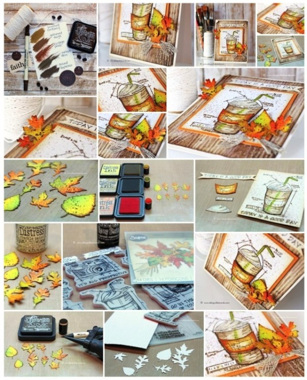
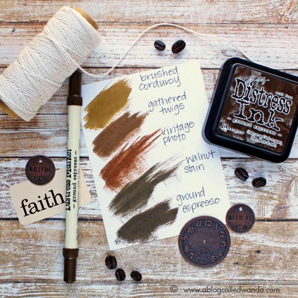
It’s Wanda, and I’m here today with the latest installment in our Color Pop series – featuring the newest Distress Ink Color! I’m excited to share my project using the color for August – Ground Espresso. And, that’s just what it is – the exact color of a cup of rich, dark coffee. It’s bold and deep and yummy! I think it’s the perfect shade of brown to go with anything Fall. So, in that regard, I combined it with Mustard Seed, Spiced Marmalade, Twisted Citron and Crushed Olive for a pretty Fall palette. For my project I used the brand new Tim Holtz Limited Edition Stamptember Stamp Set! (Editor’s note: Sold out! If you missed it, giveaway at the bottom of this post :)) You have to have it!
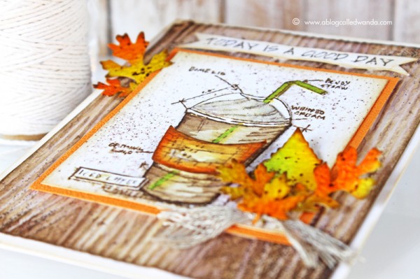
I love coffee, and I love Pumpkin Spice Lattes…and my favorite season is Autumn! And it’s September…so that’s what inspired this card! How many of you out there are waiting for your first PSL of the season? Or did you already have one? I did! MMMM.
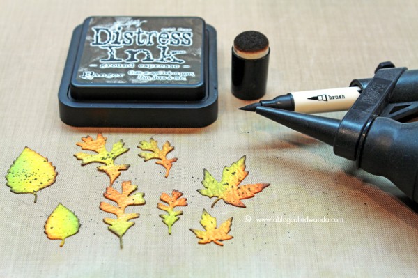
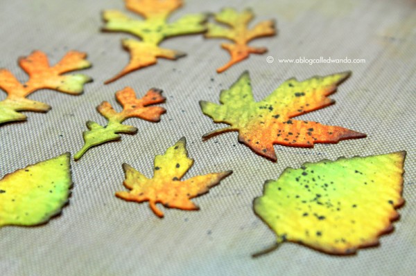
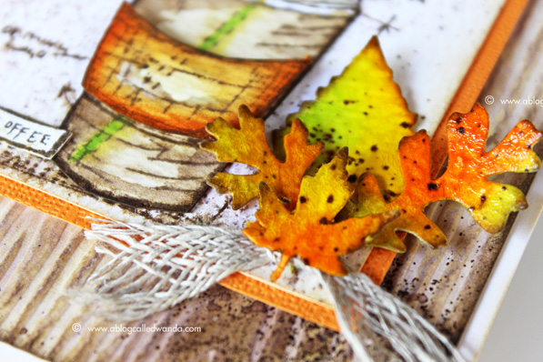
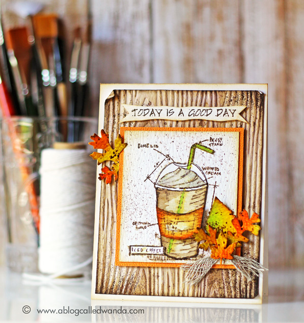
I started by die cutting out the Fall Foliage Thinlits leaves from Ranger watercolor paper. Then I dry embossed the Woodgrain embossing folder – also from watercolor paper. These were my base pieces. I colored the leaves with distress inks and a sponge dauber. I just had fun combining the pretty fall colors. I used the Ground Espresso Ink to edge the leaves. I used the Ground Espresso Distress Marker and the Spritzer tool to make some dots on the leaves. As the final step for my leaves I coated them with Crackle Paint and let them dry. This makes them pretty and shiny like real leaves.
Next, I put some Ground Espresso re-inker onto my craft mat and mixed it with some water to make a softer brown color. I covered my entire woodgrain piece with this ink mixture. After it was dry, I went back and splattered some more droplets to look like coffee spills! The messier the better on this one! Then I took the embossing ink pad and smudged it around the edges of my woodgrain piece. I sprinkled on some Ranger Walnut embossing powder (the perfect match for Ground Espresso) and heat set it. I think it looks like coffee grounds, in keeping with our theme.
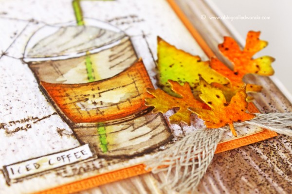
I stamped my Blueprint Stamp three times onto watercolor paper with Ground Espresso Ink. I cut out the pieces and colored them with Distress Markers and water. I used orange as my accent to indicate the Pumpkin Spice Latte! I mounted the pieces onto my main card base and then spritzed the entire thing with water to make it messy and soft. Lastly, the super fun part! Putting together those pretty leaves…and finishing up the card. I like the sentiment better at the top of the card, so I cut it out and mounted it there.
Any day that you have coffee is a good day indeed! This is a great card for any occasion or friend. I made another color swatch reference chart for you this month, so you can see where this rich new color fits into the Distress Ink brown color family. Thank you for following along with me each month as I feature a new color. Next month is Wilted Violet. Oh boy! Have a great day and happy crafting!
SUPPLIES:
 |
 |
 |
 |
 |
 |
 |
 |
 |
 |
 |
 |
 |
 |
 |
 |
 |
 |
 |
 |
 |
 |
 |
 |
 |
 |
 |
 |
 |
 |
 |
 |
Blog candy alert!!!
Unfortunately this STAMPtember® 2015 exclusive is sold out, but we have one left to giveaway!! Comment on this blog post with your favorite color of the month so far for a chance to win. Winner will be announced next week! Good luck!


Ground expresso is so rich. I love it!
Great work and I so appreciate the color comparisons. My favorite so far is Mermaid Lagoon.
This project shows why a brown can be used to make beautiful projects.
Love this Fall project. The colors you have used are so perfect for this time of the year.
I think my favorite color so far is theTwisted Citron because it is so vibrant and I don’t have any other color even close to it – the Autumn leaves really pop with a hint of Twisted Citron. The Ground Expresso is a close second for me because of its rich dark coloring:) Thanks for giving us the opportunity to win this great stamp set:)
What a great addition to this line of distress inks!
Wonderful new brown color. My fav new color is Mermaid since I’m fond of blue. I ordered the 2 sets of mini pads of the new and will order the last set when Nov & Dec are named. Thanks for giveaway chance.
Melissa
“Sunshine HoneyBee”
Beautiful use of colors…just gorgeous! Twisted citron is my favorite color so far.
So far, Wilted Violet is the most exciting color choice that I pick.
If i can only choose one favorite, so far it would be Twisted Citron. Would love to win the stamp set!!
Oh, I have to take the chance, I love Tim Holtz stamps. My favorite has to be Mermaid lagoon <3
Total gorgeousness!!!!!!!!
gotta go with mermaid lagoon, love your card, makes me want to go out and have a coffee with a friend
I love the blueprint sketch color.
And I love this card.
Oh boy is this ever amazing!!! I can’t wait to play with these techniques!!! This kind of project really floats my boat, so glad SSS has such a great variety of styles and products! :)
My favorite is the disgustingly gorgeous twisted citron. Green just makes may heart sing.
I just love ALL of the unique names that Tim comes up with for these colors … makes me smile out loud … my favorite would be mermaid lagoon (I’m a Pisces and naturally drawn to hues of blue).
I feel lucky because I did buy this already….now if I win it I will give it to my friend…
I think my favorite color so far is the Twisted Citron.
hard to pick a favorite, but think it would have to be mermaid lagoon – can’t ever resist blue
love that stamp set! It is hard to pick just one color as I have liked them all but I think my favorite might have to be Mermaid Lagoon!
Beautiful card, lovely colors. My favorite of this year is the fosilized amber.
SQUEAL!! =) I LOVE LOVE LOVE the New Ground Espresso Ink and your AMAZING Card!! The Colors and the Leaves make me HAPPY!! =) THANKS SO MUCH for sharing and have a Fabulous Weekend!! =)
Wow, this is gorgeous! The attention to detail is amazing!
I love the cracked pistachio but then wilted Violet came out so it’s a toss up between the two. I havnt got my hands on the Violet color yet but I use the cracked pistachio a lot.
Love all the fall color on the project., the new monthly distress colors are perfect for the card.
cracked pistachio is my favorite right now but who knows in months to come which I will like.
those leaves look great.
stamping sue
http://stampingsueinconnecticut.blogspot.com/
Blueprint Sketch is my favorite so far. Closely followed by Fossilized Amber. These are such versatile colors.
Loving the wonderful texture and colors in this card and of course I would LOVE to win this set!
Wanda, I love all the special touches you gave this card. Just to name a few, the tinted wood embossed background, the spritzed brown dots and crackle paint on the leaves and the coffee grounds made with smudged embossing powder and ink (ingenious!). This is a terrific card.
What a great project… Love the fall theme. My favorite so far is the Wilted Violet.. so rich and creamy looking, but then again every new color is my favorite LOL
Love the card, the colors are beautiful. Vintage Photo is my all time favorite brown. It can make things look old or new!
Love your card!! I also love lattes-will have to try the pumpkin spice. My favorite color is Mermaid Lagoon, love everything blue, but ground espresso is a close second!!
My favorite color so far is Sketch Book Blue!!
Awesome card as always Wanda! Thanks for sharing!
GORGEOUS fall card, love those autimn leaves and the new Espresso color really makes the fall leaf colors pop!
What a beautiful card. My favorite new distress color has got to be cracked pistachio. Fortunately, though, in my craft room I don’t have to choose.
Beautiful!! If I had to pick a favorite distress ink so far this year, I would pick wilted violet.
I LOVE these color POPS!! Thanks Wanda, for the photos of the color swatches together. Wilted Violet is my favorite so far:)
Awesome fall-colored card! Love the coffee cup stamp!!! Today IS a good day!
Not a fan of pumpkin, but I am addicted to chai! Love the fall colors too.
I look forward to Wanda’s Color Pop posts–so creative. Crackle paint on the leaves–brilliant!
I’ve so enjoyed Stamptember! Fall really is my favorite season! Beautiful project!
Twisted Citron
Your card is just gorgeous and the spray technique was a great idea.
Thanks for the opportunity to win this HOT stamp set!
Wow love the fall colors you used this is amazing thanks for sharing some of your steps on how you made this
Wilted violet
I love this card. I am definitely going to purchase those leaves while drinking a cup of coffee :) I have been searching for a coffee cup stamp /die, now to decide which one.
Luv the blueprint sketch! Card is beautiful!
My favorite is still Cracked Pistachio, though I love Mermaid Lagoon and Abandoned Coral too. Thanks very much for a chance to win. Michelle t
This is an AWESOME card! I absolutely love this set. I went back and forth on it and never ended up picking it up. I obviously waited a bit too long! My favorite color of the month so far is the Hickory Smoke. It is SUCH a fantastic grey tone!