Tim Holtz Distress Ink Color POP: Ground Espresso!
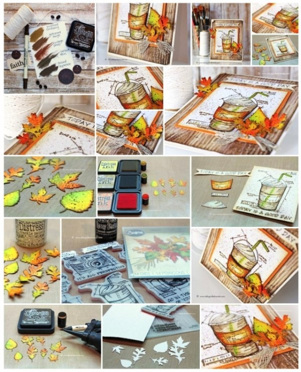
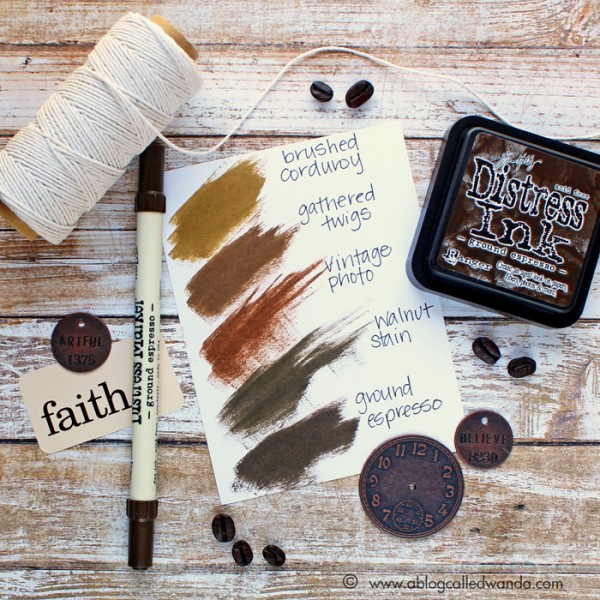
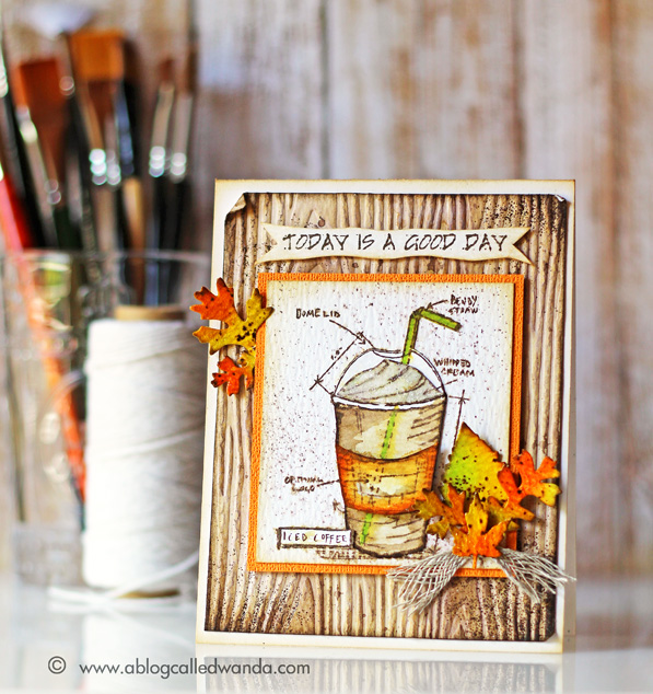
It’s Wanda, and I’m here today with the latest installment in our Color Pop series – featuring the newest Distress Ink Color! I’m excited to share my project using the color for August – Ground Espresso. And, that’s just what it is – the exact color of a cup of rich, dark coffee. It’s bold and deep and yummy! I think it’s the perfect shade of brown to go with anything Fall. So, in that regard, I combined it with Mustard Seed, Spiced Marmalade, Twisted Citron and Crushed Olive for a pretty Fall palette. For my project I used the brand new Tim Holtz Limited Edition Stamptember Stamp Set! (Editor’s note: Sold out! If you missed it, giveaway at the bottom of this post :)) You have to have it!
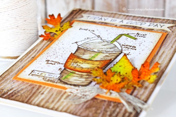
I love coffee, and I love Pumpkin Spice Lattes…and my favorite season is Autumn! And it’s September…so that’s what inspired this card! How many of you out there are waiting for your first PSL of the season? Or did you already have one? I did! MMMM.
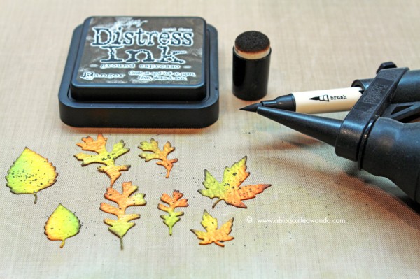
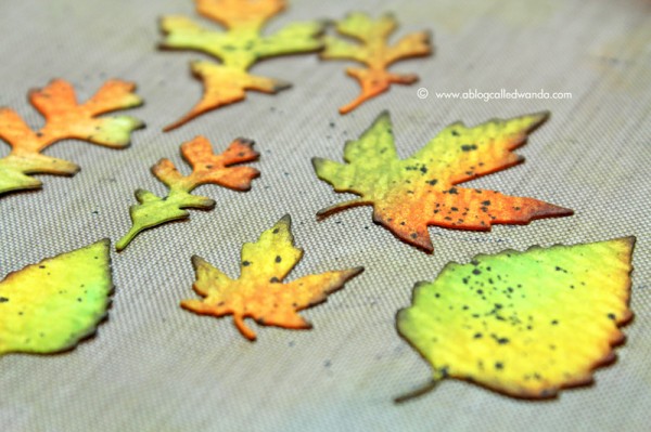
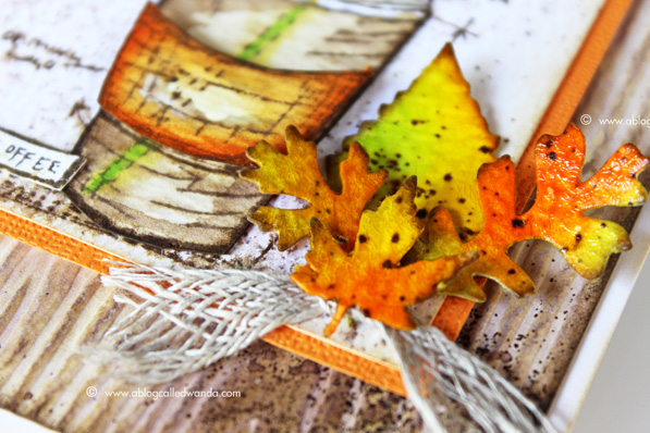
I started by die cutting out the Fall Foliage Thinlits leaves from Ranger watercolor paper. Then I dry embossed the Woodgrain embossing folder – also from watercolor paper. These were my base pieces. I colored the leaves with distress inks and a sponge dauber. I just had fun combining the pretty fall colors. I used the Ground Espresso Ink to edge the leaves. I used the Ground Espresso Distress Marker and the Spritzer tool to make some dots on the leaves. As the final step for my leaves I coated them with Crackle Paint and let them dry. This makes them pretty and shiny like real leaves.
Next, I put some Ground Espresso re-inker onto my craft mat and mixed it with some water to make a softer brown color. I covered my entire woodgrain piece with this ink mixture. After it was dry, I went back and splattered some more droplets to look like coffee spills! The messier the better on this one! Then I took the embossing ink pad and smudged it around the edges of my woodgrain piece. I sprinkled on some Ranger Walnut embossing powder (the perfect match for Ground Espresso) and heat set it. I think it looks like coffee grounds, in keeping with our theme.
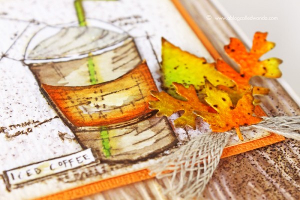
I stamped my Blueprint Stamp three times onto watercolor paper with Ground Espresso Ink. I cut out the pieces and colored them with Distress Markers and water. I used orange as my accent to indicate the Pumpkin Spice Latte! I mounted the pieces onto my main card base and then spritzed the entire thing with water to make it messy and soft. Lastly, the super fun part! Putting together those pretty leaves…and finishing up the card. I like the sentiment better at the top of the card, so I cut it out and mounted it there.
Any day that you have coffee is a good day indeed! This is a great card for any occasion or friend. I made another color swatch reference chart for you this month, so you can see where this rich new color fits into the Distress Ink brown color family. Thank you for following along with me each month as I feature a new color. Next month is Wilted Violet. Oh boy! Have a great day and happy crafting!
SUPPLIES:
 |
 |
 |
 |
 |
 |
 |
 |
 |
 |
 |
 |
 |
 |
 |
 |
 |
 |
 |
 |
 |
 |
 |
 |
 |
 |
 |
 |
 |
 |
 |
 |
Blog candy alert!!!
Unfortunately this STAMPtember® 2015 exclusive is sold out, but we have one left to giveaway!! Comment on this blog post with your favorite color of the month so far for a chance to win. Winner will be announced next week! Good luck!


Pure gorgeousness! And I HOPE I snag that set as I missed it!!!
My favorite new DI colors are Hickory Smoke and Wilted Violet. Who can pick just one????
Beautiful fall color! My favorite so far is hickory smoke.
Beautiful card Wanda! I am so lucky to have these stamps and the thinlits dies that you used. Thanks for the inspiration!
Great inspiration!!! My favorite color is Wilted Violet as I LOVE the color purple:)
Gorgeous card! Fall is my absolute favorite season too!
I think my favorite color must be blueprint sketch, because I’ve used that one the most so far. love this card!
Absolutely GORGEOUS!!!
Love your card-the colors you used are perfect for fall! My favorite color so far is the Twisted Citron-so bright & pretty!
Blueprint Sketch!
I would have to say that my favorite color so far is wilted violet. I love that is a deep, true purple and one of the colors that I have few variations of. ;-).
Oh the mermaid lagoon is delicious! LOVE IT!
Beautiful card, great new ink color! LOVE Tim Holtz products!
I love this set. I will grab it when its back in stock! I cant pick a fav ink colour sorry… they are all so beautiful!
love the stamp set and techniques you shared here; wonderful project. i’m loving the vintage photos; thanks for a chance to win! I’d be ecstatic!
Love the stamp set!! So want to win!!! :)
On of my favorite coffee themed cards ever! I do love Fall colors & you’ve inspired me!
Amazing card – the colors work so well together.
My favorite color is ground espresso. Being non coffiee drinker I have to just enjoy the color.
Fabulous card!
My favorite color so far is Cracked Pistachio.
I am still eyeing Abandoned Coral. I don’t have this ink yet, but I am working on it.
Oddly enough, the color I go to most often out of the new line is Twisted Citron. I just am drawn to it. I do think I am going to be using Wilted Violet a lot too.
I am head over heels for the Distress Inks used for watercolor. A lovely new shade to pine for!
Love how you colored the leaves! TFS. My favorite color so fair is abandoned coral.
Beautiful project! My fave is Hickory smoke :)
Love the fall colors. I like Hickory Smoke so far.
I’m partial to purple so Wilted Violet is my favorite color so far.
I have loved pretty much every color released. I think my fave is Twisted Citron, it’s a burst of fresh color in the line!
wilted violet! wilted violet! I have been looking for a true purple and that totally fit the bill.
I am in love with Peacook Feathers from begining!!But I love all!
My favorite color is Blueprint Sketch…..:)
Absolutely gorgeous card!!!! I don’t think I can pick just one favorite of the new colors, so I’ll pick two: cracked pistachio and twisted citron! ;D
LOOOOOOOOOOOOOOOOOOOVE this card so much and also love the stamp set…would LOVE to win it!!!
such a stunning color combo..love the leaves well love everything about this card…
Gorgeous a masterpiece Wanda!
What a gorgeous card! My favorite new color is cracked pistachio and my wish list keeps getting longer!
This card is so beautiful. My favorite color so far has to be Abandoned Coral.
Eek! I would love to win this set. I have to say my favorite color so far is Twisted Citron! So bright and beautiful. Goes so well with Squeezed Lemonade.
Wow love the ground espresso colour and the cling stamp
Kicking myself for missing it
Oh no!
Twisted citron is the FAV!!
WOW this card is gorgeous, I love all of the fall colors! I think my favorite ink is Vintage Photo, it’s the ink I use the most to darken my edges.
Twisted citron……….super.
What a beautiful card. My fav color so far is Twisted Citron but the Carved pumpkin might beat that one. I wouls LOVE to win Tims beautiful set. Thank you so much for the chance.
I like this ground espresso. It makes a rich looking wood grain.
thanks.
Beautiftl, I love all of the fall colors and the Vintage photo too.
totally loving the new carved pumpkin color!! gorgeous card!
I like the wilted violet, and blueprint the best. I hope I win, because I can’t order from Simon, they only ship USPS. Thanks!
Espresso is my favorite color, anything related to coffee, especially as the autumn gold, orange, and brown colors begin to fill the eyes and the heart. Cheers!
I love them all, but I think Mermaid Lagoon is my favorite of the new colors. So pretty!
I have to say that Twisted Citron has been my favorite so far. It’s bright and fun, and different from everything else I have!
Mermaid Lagoon and Wilted Violet are my favorites so far.