Serenity: Color Coordinates with Shari Carroll

Ocean breeze… walks on the beach.. day in the spa… this is Serenity! I’d like my house painted in all of these colors, they are so peaceful!! I’ve picked out colors that are all muted in nature, some slightly darker, some lighter. I’ve included three NEW colors Seafoam, Dusty Sage and Winter Sky. Aren’t they amazing?
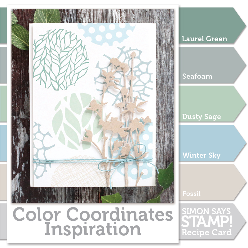
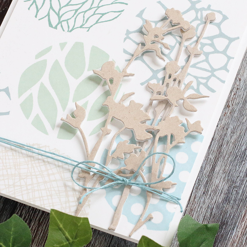
Even though there are blue and greens, this combination is gender neutral. I’ve created my card using the Dina Wakeley Circle Patterns stamps because they went so well with my beachy theme and show off the ink colors. The die cut Wildflowers are what make this a feminine card. I would make a card like this in batches and add messages later for events or occasions.
I’ve filmed a video with the process to create this card. You can view it below or on our YouTube channel HERE.
 Blog Candy Alert!! Follow our blog via email and comment on this post for a chance to win a special blog candy!
Thanks for reading today… I hope I’ve calmed your spirit, enjoy!
 |
 |
 |
 |
 |
 |
 |
 |
 |
 |
 |
 |
 |
 |
 |


Love the soft color and the use of the images for a background. Great inspiration here!! Thank you.
Beautiful card, it really is serene.
Thanks! This is so inspiring. I needed some ideas for some quick cards and this is perfect. Love the colors and the wildflower dies. They are maybe my favorite dies from Tim and I use them lots.
Gorgeous! I love these colors together. So pretty and soft.
Love the colors! Great card.
Love the colours, and such a beautiful card! Very peaceful indeed. Thanks for the inspiration!
So peaceful as i sit here in my beach chair enjoying my vacation by the sea.
Another great combination to add to my recipe file. Very calming Shari. Love the warm shade of blue.
Those colors ARE amazing!
I think we all could use some serenity occasionally and I hope you will offer these colors as a bundle. Thanks!
Love the card and the colors from this one. Thanks for doing the color coordinates, one of my favorite segments!! Thanks for sharing .
I really liked those colors
Lovely color scheme! Thanks for the inspiration!
The new colors are beautiful and are generally in my go-to palette. Thank you for sharing!
Beautiful card and I love the color combo. I think Simon needs to put these together in Inchie cubes!!! It could be called Sheri’s choice. Set 1. And on and on……bundled in a set of course ? Jus sayin.
What a Lovely card!!! In love with these colors thanks!!
Awesome circle
designs and a
great looking
card.
Carla from Utah
Your card is so pretty!
Love the card and the pretty soft colors.
I love these colors! What a beautiful card :)
Love the video! Thank you for taking the time to include it.
oh what beautiful colors and your choice of Dina’s stamps to showcase them is just perfect!
Ohhhh what a gorgeous card, love those soft colours together :)
I love the new colors. Beautiful card design!
So soft and beautiful. Thanks for sharing.
Linda D.
They really are calming colours, so beautiful!
Loving this color scheme!
Great card and colors! :)
Love these comfortable colors–very soothing, great card!
Didn’t think that I would like the stamps too well, but I was wrong – they look cool. Great idea to use the desert storm paper.
Serene is the best way to describe that fab color combo!
This card color combination exudes calm! Love it!
I usually do not make pastel cards but I really like your color combination. I appreciate a card that is gender neutral for my card stash. Thanks for the inspiration.
Serene neutral colors…beautiful.
Really beautiful. Love the gender-neutral color combo!
Loving this subtle color combo! Such a peaceful, calming creation, too.
such pretty and serene colors :)
These colours remind of the beach…very calming.
Wonderful palette of color used.\
Melissa
“Sunshine HoneyBee”
Your card is really different and catches my eye. The new colours are really beautiful and so are the stamps!
Candy
OH WOW!! These colors are absolutely stunning together and your card is just breathtakingly beautiful!!!
I love the colors!
This soft color palette is so pretty.
Beautiful ink colors, definitely serene! They are a perfect match for the stamps.
What a great stamp set! I love how you’ve used it for a lovely background for your beautiful card!
I love this color combocombo. In fact I want an entire wardrobe of just these colors.
Loved the soft shades of colors you used on this card. These are some of my favorite colors to use in my stamping.
A cool and moody colour combo!
great presenation of the stamps and love how you left the spray natural
Love these colours combination and this card is elegent and pretty