Doodling with Debby: Quick & Easy Distress Oxide Background
Hi friends! Happy Sunday! Thanks for stopping by! I’m so happy to share the latest Doodling with Debby Feature! Please read on and enjoy!
 Hi It’s Debby here and I’m delighted to be joining you with this month’s Doodle With Debby feature. Today I have a video playing with a couple of new products to me – the Distress Oxide inks from Tim Holtz and the Nuvo Jewel Drops. I’m pairing them with one of my favorite stamps, the Leaves Background, and the Big U dies and matching Big U words stamp set.
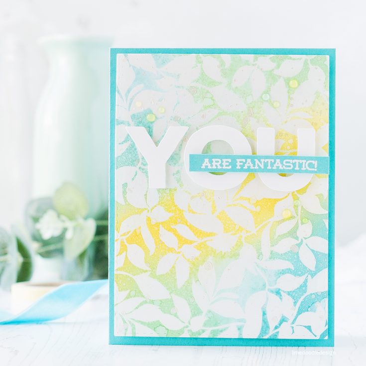 I started this card with a piece of Neenah Solar White card and stamped the Leaves Background in clear embossing ink before sprinkling with clear embossing powder and heat setting. I then blended Cracked Pistachio, Broken China, and Fossilzed Amber Distress Oxide inks over the card, letting the heat embossed leaves resist the ink. I must say how gorgeously these Distress Oxide inks blend! So smooth and create lovely new colors where the areas of each ink overlapped.
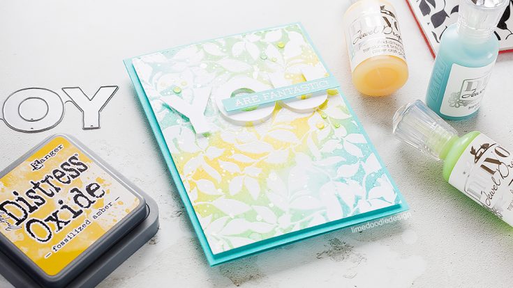 I spritz and splattered the background with water and lifted some of the wet ink with a paper towel to give variation and interest. In addition, I can’t leave an inky background as done until I splattered with a shimmery solution of Perfect Pearls. With the background now complete I cut the panel with a Stitched Rectangle and put it to one side while I worked on the sentiment.
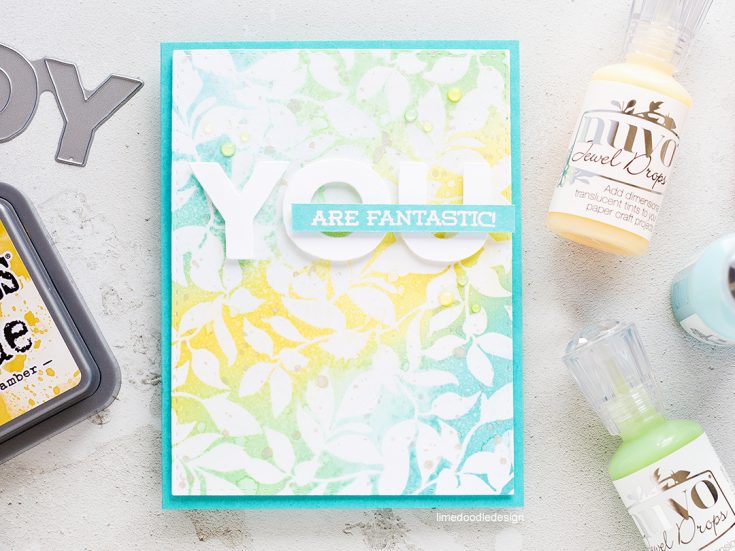
I wanted to keep the rest of the card clean and simple so as not to cover up or compete with the pretty background. I cut one of the YOU dies from the Big U die set from white card and paired it with a sentiment from the Big U Words stamp set. I stamped the sentiment in clear embossing ink and then embossed with white embossing powder before trimming to a skinny strip. I mounted all the elements on the panel foam adhesive and then accented around the sentiment area with toning colors of Nuvo Jewel Drops; Limoncello, Sea Breeze and Key Lime. Finally I mounted the panel on a side folding Audrey Blue card base.
Thanks for joining me today and I’ll see you for next month’s Doodle With Debby feature.
Watch the VIDEO:
Watch below or in HD at YouTube.
SUPPLIES:
Thanks for reading today, and thanks to Debby for being our guest!

Blog Candy Alert!! Follow our blog via email and comment on this post for a chance to win a special blog candy!



I love the resist effect with these new stamp inks. They always look like they blend real well. Can’t wait to get some of the new inks. Great card!! Thank you for sharing!
Your card is so pretty. I’m dying to get my hands on some distress oxide inks but I’m on a No Spend since I was made redundant last year
Lovely card – thanks so much for your video!!
I love the color combo and soft bacground colors of today’s card.
This is beautiful!
Such a pretty background! Love these colors!
What a beautiful card! I love the background and the simplicity of the greeting!
What a beautiful example , I’d love to give this design a try myself , very motivating ? !
Your card is so beautiful. Love those Nuvo drops. Thanks for all the great inspiration.
Thanks for sharing this card and video. The colors, embossing and embellishments come together to create a truly lovely card.
What a pretty card. Love the colors.
Love these colors and that effect over the embossing! Thanks.
LOVE Debby’s soft style! Gorgeous card ♥
such a pretty card
Beautiful card! Will have to give these inks a try!
These new Oxide inks are so fun and versatile. Your background is gorgeous!!
I love this card. The colors are so pretty and those distress oxide inks are so awesome.
Great card! The pastels are beautiful and perfect for spring. I like how you used the the die and stamp too.
Gorgeous, as always Debbie! I’m dreaming about distress oxide inks!!
Love this card!!!
Cristina
thehouseoftheblackbirds.blogspot.it
these are gorgeous, sp spoft and pretty colors
Thanks for inspiration!
Rather like this delicate and dainty card x
Wow! Beautiful background!!! Great colors!!!
The colors are lovely and the background done beautifully – TFS
Beautiful! I appreciate all of the tips you included in the video, especially about tapping the back of the jewel drops.
The Distress Oxide inks do blend like a dream. So easy to use. Love the color combo here.
I will have to get some of these Oxide inks – your card is so very pretty. Thanks for the inspiration !
Love the softness of the oxide inks!
All your cards are so lovely. I like the new oxides inks. Great color choices too.
love the background!!
Lovely card, love the colours!
I love the new Distress Oxides! Can’t wait to try them!
pretty card, I love this technique.
I love how soft and delicate this card loooks!
Just the style I love–wonderful card!
The colors were much brighter in the video than on the picture of the finished card. So! I loved, loved, all of the colors you used. Beautiful card! Thanks for all you do!
What a lovely card, I love the soft tone!
wow! so pretty ! love the soft colors
Brilliant!
Debby–what a lovely card! It’s so soft and spring-like with those wonderful colors. I have the new inks but haven’t had a chance to work with them yet. I really like your project–it looks like a great one to try. Thanks so much for sharing!
I must get my hands on these inks. Love them a lot.
Beautiful! I’m not having nearly this much success with my oxide inks yet. :P
I just love Debbie’s cards. Really beautiful. Fave.
I’m in love with these oxide inks!
That is so very pretty!!! Beautiful colors. Can’t wait to try these new inks!!
<3 J
jwoolbright at gmail dot com
HerPeacefulGarden.blogspot.com
Beautiful card! Thanks for showing the Distress Oxide inks – I just ordered some and am excited to start experimenting!
BEAUTIFUL! I would love to know how Debbie always gets such a soft look on her cards. Maybe I’m too heavy handed but try as I might, I’ve never been able to get a soft and light look to my cards like she does. This is stunning!
SO very lovely and beautiful!
Very pretty! Love the soft color look!! Thanks for sharing.