Color Coordinates: Soft Colors for Year Round Cardmaking

Welcome to the blog my friends! It’s Shari here with a new color coordinate combination. I have been waiting to do a color blocking background using an ink blending tool, so I chose some colors that sit well on top of each other.
They are all pastels and are pleasant for many occasions.
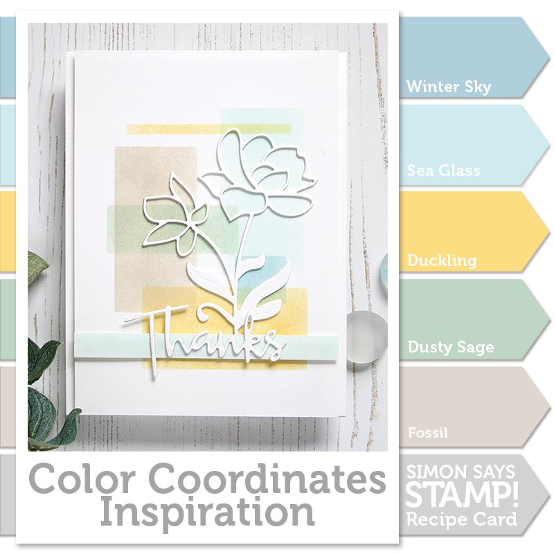
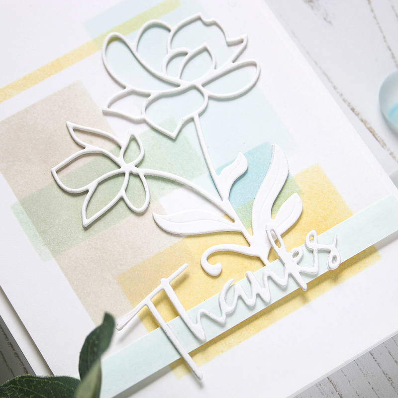
The technique used is quite simple and is a great jumping point for those of you wanting to ink up a quick background. I started out by using my Rectangle dies cut from cardstock to create a quick stencil. I also used some Post-It tape to adjust the size of the openings to get a variation of the rectangles.
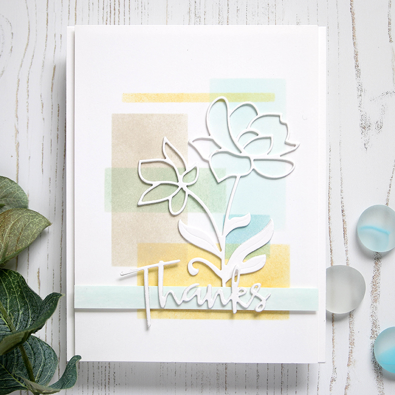
Once I had the background colors blocked out, I trimmed up the panel and put it on a top folding notecard. Next, I die cut the Bright Blossoms die from Neenah card stock three times and glued them together. This gives the flowers nice dimension. I did the same with the Script Thanks die and mounted it to a strip of cardstock colored with Sea Glass ink.
I filmed a video that you can view below or on our YouTube channel HERE.
Blog Candy Alert!! Follow our blog via email and comment on this post for a chance to win a special blog candy!

Thanks for stopping by. Have a great day!!
 |
 |
 |
 |
 |
 |
 |
 |
 |
 |
 |
 |
 |
 |
 |
 |
 |
 |


Very delicate and beautiful! Thank you so much for the inspiration!
Simply stunning. Love this color palette Shari. You are the master of coordination. Nicely done.
What a beautiful card created with this color combination! The video tutorial is so helpful–shows how doable something like this is. Thanks for sharing!
Beatiful card. So delicate. Thanks for sharing
Love this color blocking technique and the colors you used. The resulting card is delicate but stunning. Thanks for the video and the inspiration!
The soft colors are very pretty!
This is so pretty!
Beautiful colors
and love the flower.
Carla from Utah
I love everything about this card, the colors and the techniques and the texture!
Love the soft pretty colors in the background.
I am a big fan of soft tone, lovely!
Beautiful card. I love the soft colors for the background and the color blocking. Thanks for sharing….
Great color palette. So soft and pretty
Love the idea of the color blocking. Great look and love the soft colors. The flowers die and thanks in white is perfect. Love this.
Very soft and beautiful card. Love the pastel colors and the layering of the die cuts.
This is one of the most elegant cards I’ve seen. It takes skill to choose colors so well and I wish we could have gotten some insight into that process as well.
Pretty card with a lovely soft colour combo. Like the idea for the ink-blended geometric background!
Nice easy technique for a card!
Very soft and pretty.
I love this!!! Soooo Pretty and delicate!! I’m going to try this out!!
Such a lovely card. Looks so delicate.
what a soft and beautiful design. thanks for sharing it with us. Looks like something i would like to try.
Love the card and the colors used!
Really pretty and a fun color combo. Love the blocked background! Happy weekend.
I like the color combo and the pastels are perfect for summer. Very pretty.
Love all of the color coordinates combos
These soft colors are so pretty and so is your card. Thanks for sharing.
Linda D.
I love this card! The colors are gorgeous and the diecuts go perfectly with your design. Can’t wait to try!
So awesome. Love the white flowers on top.
very cool, love the seaglass effect
Cute color combinations!
This is such a pretty card! I really like the soft colors :)
Lovely card and appreciate all the video tips. Thanks
One of my favorite segments is the color coordinates! Always gives me inspiration for my card making and my scrapbooking! Thanks for sharing and inspiring!
This soft colour palette is lovely! Beautiful card.
This is such a cool card, Shari! I really love the color blocking and the die-cut flowers. Nice colors too! Hoping to CASE this one!
Great card! :)
Pretty colors combination. I already follow by email.
Oh! This is so pretty! Such a soft and delicate card!!
Love the softness of those colors.
stunning! the color combo is so soft…
So very pretty and soft – love these colors and your card is beautiful! Thanks for sharing.
I love this color combo…it makes a very beautiful card!
The soft pastel colors go so well with the white silouet flower.
Shari I love the colors you put together. This is so beautiful and delicate. If u do not write in the card do u have stamps for the inside messages? I am going to order this but why wait til July for the flower u are showing now? Well SS is out of one of the things I need but I could have got it here in our area. Luv Luv this card. Have SS ever thought about making a stamp to put on back of card > Hand Made by Dolores Holloman or Crafted with love by their name? I would like one of them I Love this card. TYFS
Shari I love the colors you put together. This is so beautiful and delicate. If u do not write in the card do u have stamps for the inside messages? I am going to order this but why wait til July for the flower u are showing now? Well SS is out of one of the things I need but I could have got it here in our area. Luv Luv this card. Have SS ever thought about making a stamp to put on back of card > Hand Made by Dolores Holloman or Crafted with love by their name? I would like one of them TYFS
Love the colors & simplicity of this one!
What a fun card, Shari, and beautiful pastel background!
Great colors! What a wonderful idea for background! Thanks for sharing!
Beautiful design & colors!