Color Coordinates: Soft Colors for Year Round Cardmaking
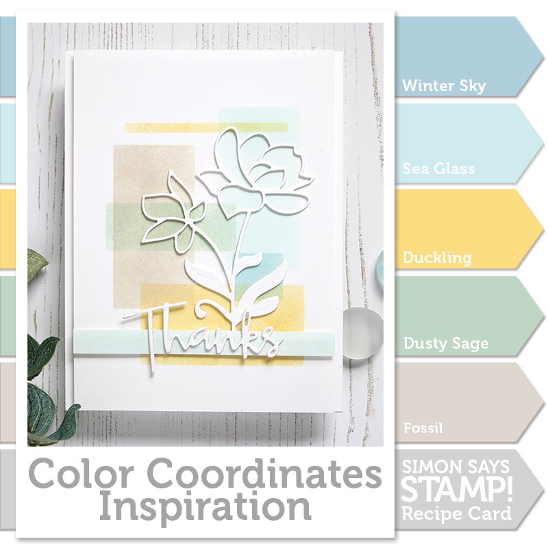
Welcome to the blog my friends! It’s Shari here with a new color coordinate combination. I have been waiting to do a color blocking background using an ink blending tool, so I chose some colors that sit well on top of each other.
They are all pastels and are pleasant for many occasions.
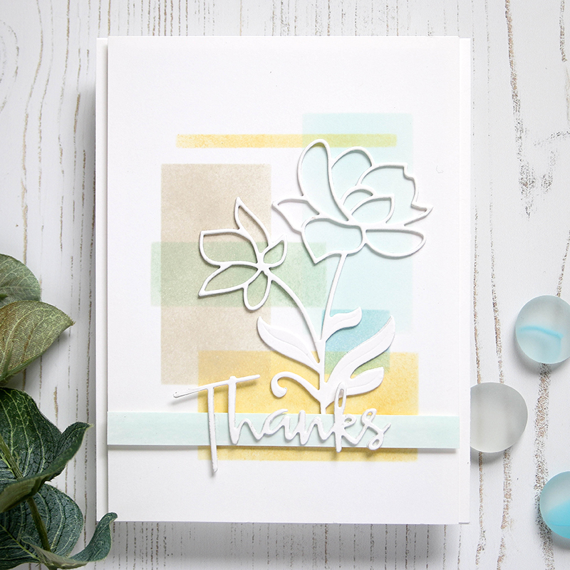
The technique used is quite simple and is a great jumping point for those of you wanting to ink up a quick background. I started out by using my Rectangle dies cut from cardstock to create a quick stencil. I also used some Post-It tape to adjust the size of the openings to get a variation of the rectangles.
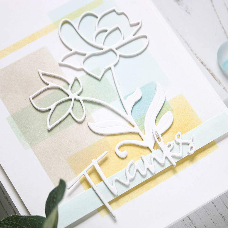
Once I had the background colors blocked out, I trimmed up the panel and put it on a top folding notecard. Next, I die cut the Bright Blossoms die from Neenah card stock three times and glued them together. This gives the flowers nice dimension. I did the same with the Script Thanks die and mounted it to a strip of cardstock colored with Sea Glass ink.
I filmed a video that you can view below or on our YouTube channel HERE.
Blog Candy Alert!! Follow our blog via email and comment on this post for a chance to win a special blog candy!
Thanks for stopping by. Have a great day!!












gorgeous!
How pretty! I love the lovely soft colors!
What a pretty card with the white die cut and soft pastels!
Love the pastels and the technique.
What a lovely way to do a background! The colours you’ve used are very pretty.
I love the background!Great job!Thank you for sharing.
Whoo hoo! More color combo cards to add to my Shari collection!
Brilliant design, love it! Looks fantastic with these colours
Lovely colors! Love the simplicity & beauty of this card!
Beautiful card, wonderful colors.
Such a simple but pretty card. Gorgeous colours too.
This is so beautiful. I love when there’s a video!
LOPVE your Color Coordinates series, the color combinations are always stunning. Love your card, so soft and elegant :-)
A beautiful palette! I love these Color Coordinates posts.
Love your color co-ordinates! The colors look so beautiful together and the card is so very elegant. Thank you so much for sharing!
Great idea with using the 3 layers!
So pretty! I love the white on pastel pallette.
Love how you created that back ground. These are great colors too.
Even if it´s summer right now I already started working on my Christmas Cards, and this is a Color Combo I will use on winter themed Cards this year.
This is such a pretty color combo! Your card is so sweet!
Oooh such a pretty colour theme, they go beautifully together :)
Love the soft colors and the bright white dimensional die cuts!
So soft and pretty, Shari! ♥
I really like this technique and your color choices.
Awesome, I love the soft color blocks!
I want roese
https://www.wordleplay.co/
Wordle Play can be attributed to its simplicity, accessibility, and the sense of achievement it provides. The game’s intuitive interface and addictive nature have made it a hit on social media platforms, where players often share their progress, strategies, and achievements