Color Coordinates: A Walk on the Beach

Welcome everyone! It’s Shari here with another color coordinate recipe for you. This combo reminds me of when I was a kid walking on the beach finding sea glass, balsa wood and kelp! Ahhhh the treasured memories!
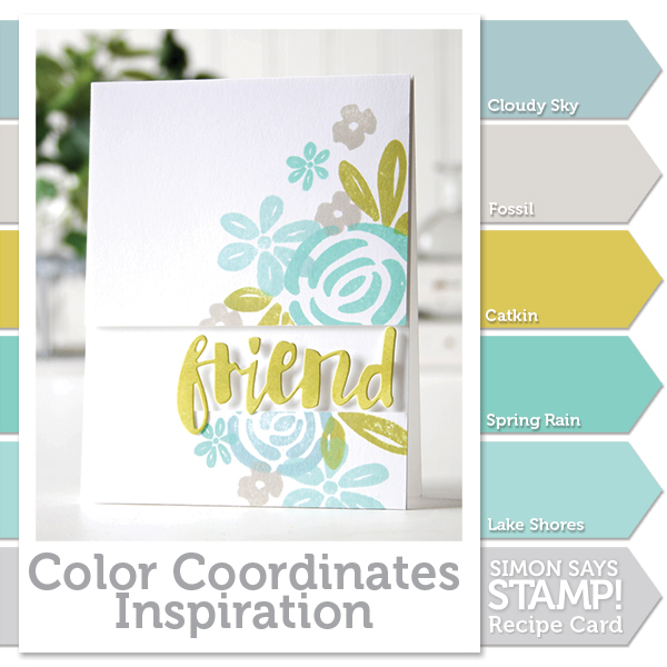
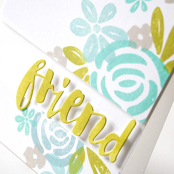
These colors coordinate so well together and can be overlapped in your stamping without becoming muddy. I’ve chosen the Blooming Day because it has a nice tropical feel and the images are solid to show off my ink colors.
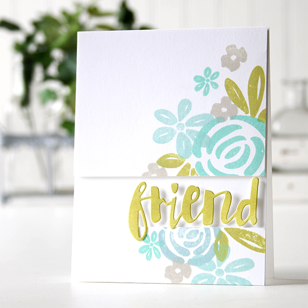
I masked off my panel before I started stamping (so I would have an idea of how it would look when finished), then trimmed it up and foam mounted it to a top folding note card. I used an ink blending tool to color some cardstock with Catkin ink, then die cut the word Friend and added it to my card.
I’ve created a video for you showing the process. You can watch it below or on our YouTube channel.

Blog Candy Alert!! Follow our blog via email and comment on this post for a chance to win a special blog candy!
Thanks for stopping by today, I hope you have a great week-end!
 |
 |
 |
 |
 |
 |
 |
 |
 |
 |
 |
 |
 |


Love this layout with the popped up sentiment. Gorgeous color combo too!
Great card! :)
gorgeous color combo – and love the design
What a lovely floral card!
lovin those colors!
Hope you all have a great weekend as well!
Great color combination!
Beautiful color combo
Lovely card and I can definitely feel the beach vibe from these colors.
Loving the color combination!
Beautiful colour combo and beautiful card too
I love how the word Friend has the pop to it – lovely layout – TFS
Beautiful, chilly summer colors.
Great color combo. Love the card!
I always come away with an awesome tip or technique when watching your videos. You all are so talented and giving of your time…thanks a bunch!
So love those colors, too
Very pretty color combination Shari. Love the tips that you give in the video. You are always so inspiring! Happy weekend!
Beautiful color combination and card. The video is very informative! TFS
Beautiful card w/beautiful colors!! Love it!
Swooning over the combination of colours and design on Shari’s card! Thank you for the video!
~carol
Shari, this is such a beautiful color combo – and so is your card!
I just love this color combination. Beautiful card.
Gorgeous colors! Love this card!
Such a beautiful soft card, I absolutely love that delicate colour combo! The images are so beautiful, too! And the floating diecut word is so cool… oh, all in all it’s really great!
these colors are absolutely gorgeous together and create such a soothing palette! a beautiful card created with them. :)
Beautiful card!
Love those colors! Gorgeous card!!
Lovely card. I’m lovin’ the Catkin color. Really made the color combo pop!! Enjoyed your video too! Thanks for sharing with us!
Gorgeous colour combinations! I love the design of this card.
Soft summer colors…. great video. Thanks Shari. This gets me thinking about that stamp set. I need an upcoming anniversary card.
This color combination is fabulous and Shari”s card is simply stunning!!!
Love these segments that Shari does.
I love these soft colors of blues, yellows and whites.
Thanks for the idea of using ink on paper before die cutting! I always forget about that!
Beautiful soft colors.
Wonderful color choices and extremely stunning card! Nicely done!
Loved the Color Coordinates Inspiration tutorial! The colors used were great and the construction of the card was wonderful! I am new to Simon Says Stamp but, don’t know what I did without it as a source of inspiration and supply necessities :)
I love the softness of this card! And I love learning new ways of figuring out how to use my friend die!
i love this colour combination!! it does remind me of the beach and wonderful memories!
What a fabulous colour combination Shari! That’s the perfect shade for kelp! We used to pop the bladders on it as kids. Lovely card!
Pretty colors!
Great color combination and layout!
WOW! Love the colors!!!
This a fabulous color combo that I never would have thought of on my own. The card is beautiful!
Simple elegant design- love it! And the tip for the masking/alignment! Thanks for the inspiration !
Such a great color combo. Wonderful card!
Very Creative!
Great color combo on this card!! Thanks for the awesome tutorial, Shari:)
Love the design of this card and the beautiful colors. I have wonderful memories of beach time as a child and my go-to colors tend to include some blue/aqua/green tones. There must be a connection! LOL! :)
Such a lovely and beautiful colour combination! Love the card and the stamp set!
What a pretty card!! Love the color combination and I love when you do the color coordinates because it makes me look at me my inks in a different way! Thanks for sharing these!