Color Coordinates: A Walk on the Beach

Welcome everyone! It’s Shari here with another color coordinate recipe for you. This combo reminds me of when I was a kid walking on the beach finding sea glass, balsa wood and kelp! Ahhhh the treasured memories!
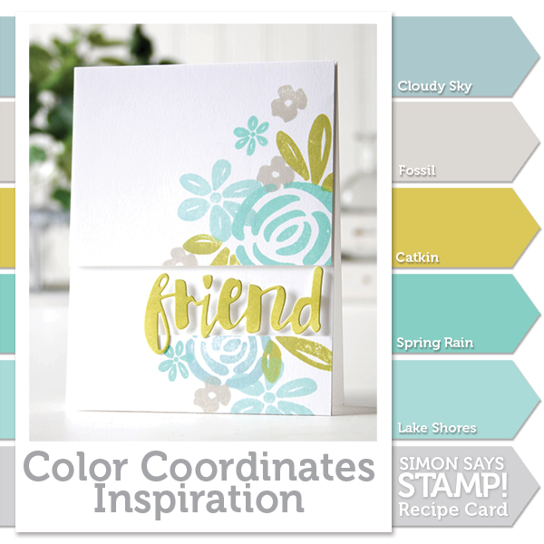
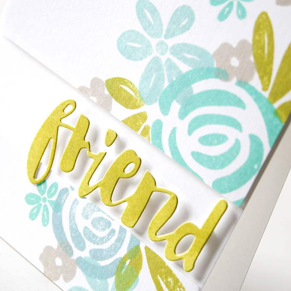
These colors coordinate so well together and can be overlapped in your stamping without becoming muddy. I’ve chosen the Blooming Day because it has a nice tropical feel and the images are solid to show off my ink colors.
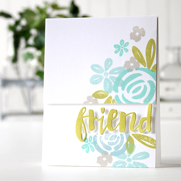
I masked off my panel before I started stamping (so I would have an idea of how it would look when finished), then trimmed it up and foam mounted it to a top folding note card. I used an ink blending tool to color some cardstock with Catkin ink, then die cut the word Friend and added it to my card.
I’ve created a video for you showing the process. You can watch it below or on our YouTube channel.

Blog Candy Alert!! Follow our blog via email and comment on this post for a chance to win a special blog candy!
Thanks for stopping by today, I hope you have a great week-end!
 |
 |
 |
 |
 |
 |
 |
 |
 |
 |
 |
 |
 |


A beautiful color combo on a lovely card. Thanks so much for the video.
LOVE the soft colors of this beautiful card!! TFS!
So lovely, great
color choices.
Carla from Utah
The colors on your card are so soft and pretty! Nice!
Beautiful color combo and gorgeous card (as always) :-D
Beautiful card! These colors work so well together!
Your card is so beautiful!!!! Really LOVE the colors:)
Lovely colors! Such a pretty card.
What beautiful calming colors. That is one of my main problems- color coordinating colors!! This card is so serene. Thank you for sharing.
Gayle
Very pretty card Shari. Those colors look wonderful on your card. I like how you cut your front into 2 pieces and then used the space to highlight your word. Thanks for sharing.
Gorgeous color combo! Thanks for sharing another great card!
Very pretty with all the soft colors.
I love the color combination on your Walk on the Beach card. Thank you for sharing.
Your card is just beautiful! Love the design and your colors. PRETTY!!!
Beautiful card! I love the colors and the flower designs! Love the cut away section for the word die!
Great color combo–love it!
SQUEAL!! LOVING LOVING LOVING the AMAZING Card you’ve created and the AWESOME Video!! THANKS for sharing and have a FABULOUS WEEK!! =)
Wow! Such a lovely card!!! I love so much the soft colours that you used!
Wonderful colors and I like how you placed the word.
Lovely color combo, Shari. So restful!
Your colors always make me swoon. I love,love, love this color palette so much!
Shari, your card and video are fabulous! Love the color combo and how your split your top layer.
I love this color combination!! I’m having to add more inks to my wish list! Love the card too–it’s really pretty!
Love your card. This color combo is perfect! Thanks for the video.
Beautiful color combo.
Fabulous colour combination – great mix of subtles!
Beautiful colours on this card! Love the friend die cut too! So pretty! Great technique to add colour then die cut! Thanks for the helpful video. Love it :)
Beautiful card, love the soft and summery colors!
The colors are wonderful on this creation. Have a Bee-utiful day!
Melissa
“Sunshine HoneyBee”
I love these colors and this CAS design. Very pretty!
Lovely color combo, I feel refreshed just looking at it!! Thanks for the video!
Beautiful color combo, Shari.
A pretty and restful colour combo, and you’ve mixed some colours I wouldn’t have thought to do….so thanks for more inspiration.
Beautiful soft colors! Thanks for the tutorial~
Oh, my….those are lovely colors. What a pretty card, too…..so peaceful and relaxing.
<3 J
jwoolbright at gmail dot com
HerPeacefulGarden.blogspot.com
Such a gorgeous card! Love the colours.
A lovely card Shari and the colors are great.
I just love the gorgeous color palette!! Absolutely Beautiful!
Great color combo and a beautiful card.
I am in love with this color combo! Especially bc you can spamp them on top of each other and it still looks fantastic!
Beautiful! The color combo really gives a breezy island feel! I love how Shari popped up the friend sentiment with minimal dimension tape. It looks as if it’s floating!
Love these beautiful colors. Reminds me of the lovely weekend vacation my family went to Martha’s Vineyard.
Beautiful card and lovely colors!!!
Love these colors together!
Beautiful colours, so soft and pretty!!
Very pretty
Such a pretty card and this color combo is great. Love the cloudy sky and spring rain colors.
Fun colors and such a beautiful card!
I like these colours together! Very nice! Gorgeous card!
Would never think to go to these colors on my own, but they are beautiful!