Color Coordinates: A Walk on the Beach

Welcome everyone! It’s Shari here with another color coordinate recipe for you. This combo reminds me of when I was a kid walking on the beach finding sea glass, balsa wood and kelp! Ahhhh the treasured memories!
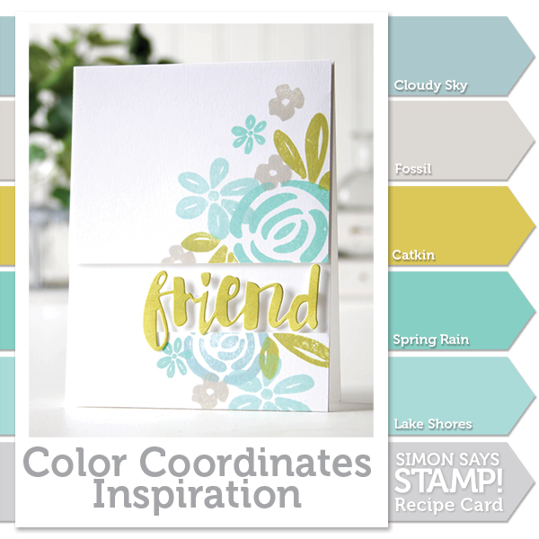
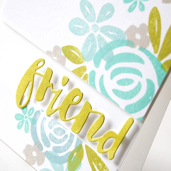
These colors coordinate so well together and can be overlapped in your stamping without becoming muddy. I’ve chosen the Blooming Day because it has a nice tropical feel and the images are solid to show off my ink colors.
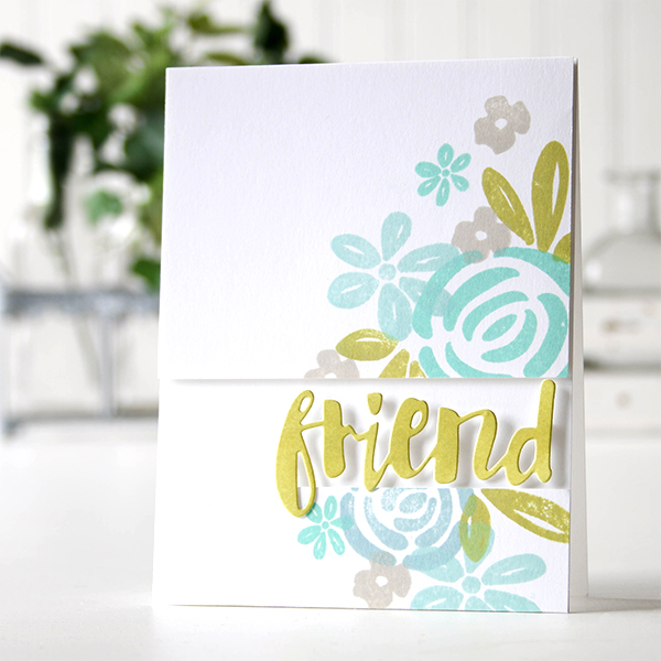
I masked off my panel before I started stamping (so I would have an idea of how it would look when finished), then trimmed it up and foam mounted it to a top folding note card. I used an ink blending tool to color some cardstock with Catkin ink, then die cut the word Friend and added it to my card.
I’ve created a video for you showing the process. You can watch it below or on our YouTube channel.

Blog Candy Alert!! Follow our blog via email and comment on this post for a chance to win a special blog candy!
Thanks for stopping by today, I hope you have a great week-end!
 |
 |
 |
 |
 |
 |
 |
 |
 |
 |
 |
 |
 |


Gorgeous!! Love the color combination and the separation of the panels with the dimensional sentiment in between.
LOVE this soft color combo.
I love the color combo you suggested, your card is beautiful! Thanks so much for your very inspiring video!
Gorgeous card, and I adore those soft beachy colors!
So very pretty! Love how you did this!
I said before, your color combinations are my favorite. Thank you!
Oh what a nice color combo! TFS!
Cristina
thehouseoftheblackbirds.blogspot.it
Love the design and soft colors.
Love it !!!
LOVE IT.
Very pretty!
Love these colors, Shari! So glad you share these posts for those of us who struggle with putting different ink colors together! Beautiful card! ♥