Art Journaling: Distress Oxide Reinker Technique with Shari Carroll
Hello everyone and welcome back to the blog!!
As part of my Art Journal feature, I come up with card ideas and techniques that you can also use in your journals. I recently played around with some Distress Oxide reinkers and figured out a cool technique. SUPER COOL INDEED! It almost has a wood grain effect. Now I just need to figure out a name for it. Ha! This is a fantastic technique that you can use as a background or starting point for any size project.
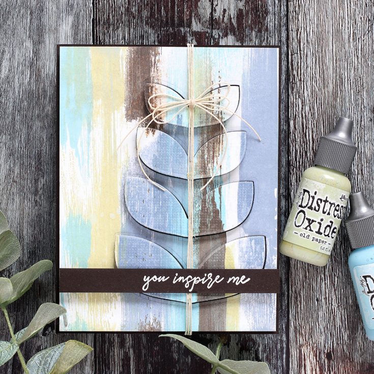
This is really simple and quite effective. I’ve used the Tim Holtz Tonic Glass Media Mat, a drop or two of ink and an acrylic block to move the ink. I dragged the paper through the ink and VIOLA! For journals and larger projects, you can apply the ink using the acrylic block. One of the effects that I really like is the streaks it created. I think the key to this technique is to keep a bit of white space on your surface.
I’ve used colors that created a masculine feel, but any colors can be used for your desired effect. You can also change the direction of your streaks for an abstract look as well. Fun isn’t it?
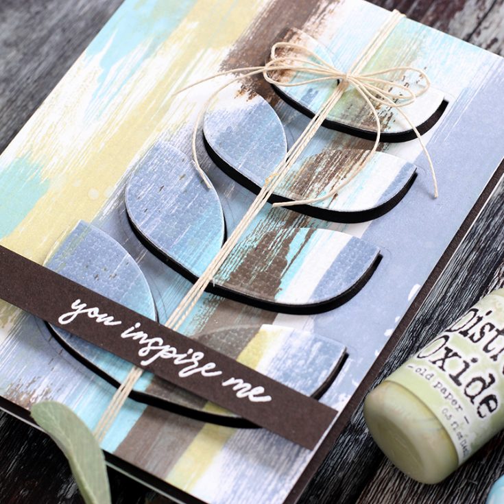
I used the Reverse Confetti Mod Floral stamps and coordinating dies for my main image. By die cutting them from my colored paper and lifting them up, I didn’t lose my background.
I’ve captured this technique in a video which you can view below or on our YouTube channel HERE.

Blog Candy Alert!! Follow our blog via email and comment on this post for a chance to win special blog candy!
I hope I’ve given you inspiration to try something new for your cards and projects. Enjoy!!
|


I love this techniques and this card came out great!!
How charming is this! I was thrilled when I opened this mail to find you using this set from Reverse Confetti. I just got mine in the mail a couple of days ago… it’s meant to be. I love your technique and will definitely give it a go…
The Distress Oxides look cool. I have seen Tim demo them, and they look great.
Pretty card and great video!
What a gorgeous card and technique, great video, I can’t wait to try this!
Love this card so much. Great designs! Thanks for sharing your talent!
Love this new technique–thanks for sharing your lovely project.
This is beyond gorgeous and a great technique. I generally don’t see colors as masculine or feminine (except maybe baby pinks?) and in this case the colors read “modern” to me – like abstract modern art. Speaking of which I’d frame your piece as art in a heartbeat!
As usual, such beautiful work, thank you.
this is a fabulous technique – I do not have Oxide inks but I tried it with my Distress inks which looks good to me – will be posting soon as I was playing along with the Video TFS
What a fabulous background
Gorgeous card! Very similar to the technique spreading acrylic paint with a credit card which I need to remember to do again!
Beautiful card! What a fun and neat technique.
Such a pretty card and great video!
Love this technique!
You Inspire Me! What a awesome technique Shari, it looks like vintage painted wood, but used in a modern way. Your card is stunning, love the colours and what you did with the leaves. Thank you for this masterpiece!
Very cool technique!
So beautiful!!!
Lovely card! Great technique!
Awesome technique!
WOW! Beautiful card. I love the technique. Thank you for sharing this technique with us.
Wonderful artsy look to this technique in this creation.
Melissa
“Sunshine HoneyBee”
Wow!!! Great technique!!! I love all the colors you used!!!
Beautiful card. I love the technique and the final results. It really does look like it was painted on wood!
AWESOME technique! Thanks for sharing.
Love this technique and what you did with them. Lovely! You are so very creative.
Great card, technique and choice oc colors!
This is way cool. I already follow by email.
So cool Shari! I love watching your videos and reading this blog! It makes me feel inspired!
Amazing. Love the colors and the
design. Oxides are wonderful.
thanks for sharing
txmlhl(at)yahoo(dot)com
This is really pretty! I love the colors! :)
You definitely gave me inspiration. Love that look.
Great technique and awesome card! Thanks for the inspiration.
awesome technique!!!
Shari, thank you so much for sharing your newly discovered technique with oxide inks. Yes, it does look like distressed wood.
What a great use of Oxide inks! I love this.
Very cool technique and I love the card.
Just gorgeous
What a lovely idea! Sometimes your projects feel out of my depth, but this one feels quite doable. And, as always, your color choices are fascinating and gorgeous. Thanks for sharing this idea and technique with us!
Love the background you created and then you did the cool die cut technique to it – very cool.
smart technique. I wonder if I could recreate this effect using distress inks as well. should aim to get the stripes right. thank you for the inspiration! the
Fabulous card, I love everything about it.
What a beautiful card! I love the woodgrain look you’ve achieved with the dragging technique.
Love this technique!!!! Definitely want to try……ASAP!!!
Thanks for the inspiration…..
WOW! Another fabulous technique from the fabulous Shari! This is wonderful and I can’t wait to give it a try! I have four sons, 3 brothers, brothers-in-law, etc. Love new ideas for guy cards!! Different colors would also work for my sisters, granddaughters, friends, etc. etc.
Thank you so much Shari! XOXO
Very cool technique indeed Shari. Thanks for sharing with us.
Very cool technique, Shari! Love the masculine feel along with the distressed look! Thanks for your clear video instructions!
I love the card. FYI – the term you used upon completion read “VIOLA”. You meant VOILA. My name is Viola pronounced (vy-o-la) and people missspell that word all the time, over 50% of the time in fact.
I love your technique. Thanks for the inspiration.
Love the colors.
what a fantastic look this is and so easy. I don’t have the refills but I have all the pads so will try experimenting with them cause this is just brilliant.
Thank you for this technique, Shari. I AM inspired! I will try it soon – it’s so cool!