Simon A to Z
Hi friends! Happy Sunday! One of our dear teamies made this lovely video that we would be remiss to not share with you all on our blog! Which letter resonates with YOU the most?
Have an awesome day!
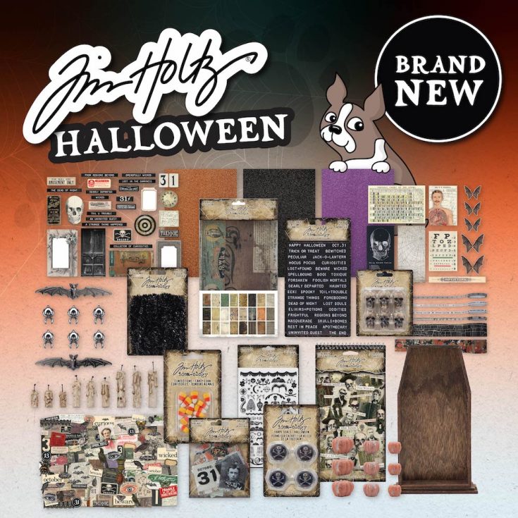
BRAND NEW Tim Holtz Idea-ology for Halloween 2022!
Hi friends! Happy Saturday! Are YOU ready for another fun Saturday Livestream with the one-and-only Tim Holtz?! Be sure to click or tap HERE to check it out for great inspiration and MORE at NOON et!
For now, check out the AWESOME products that will be included in the line up of inspiration for Halloween 2022!
|


Mixed Media Halloween Clipboard with NEW Tim Holtz Dies!
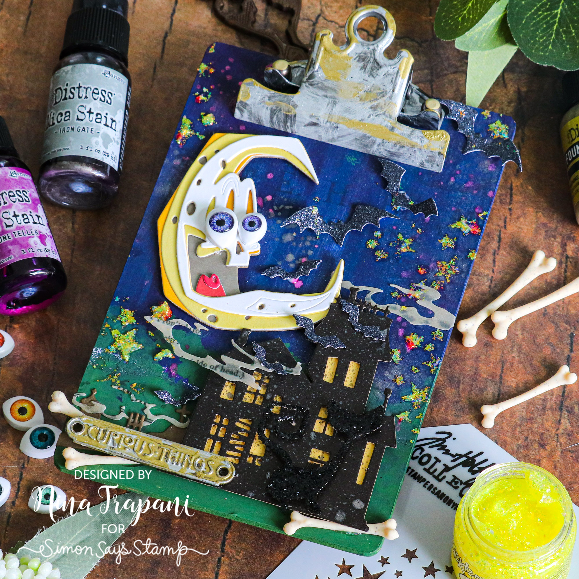
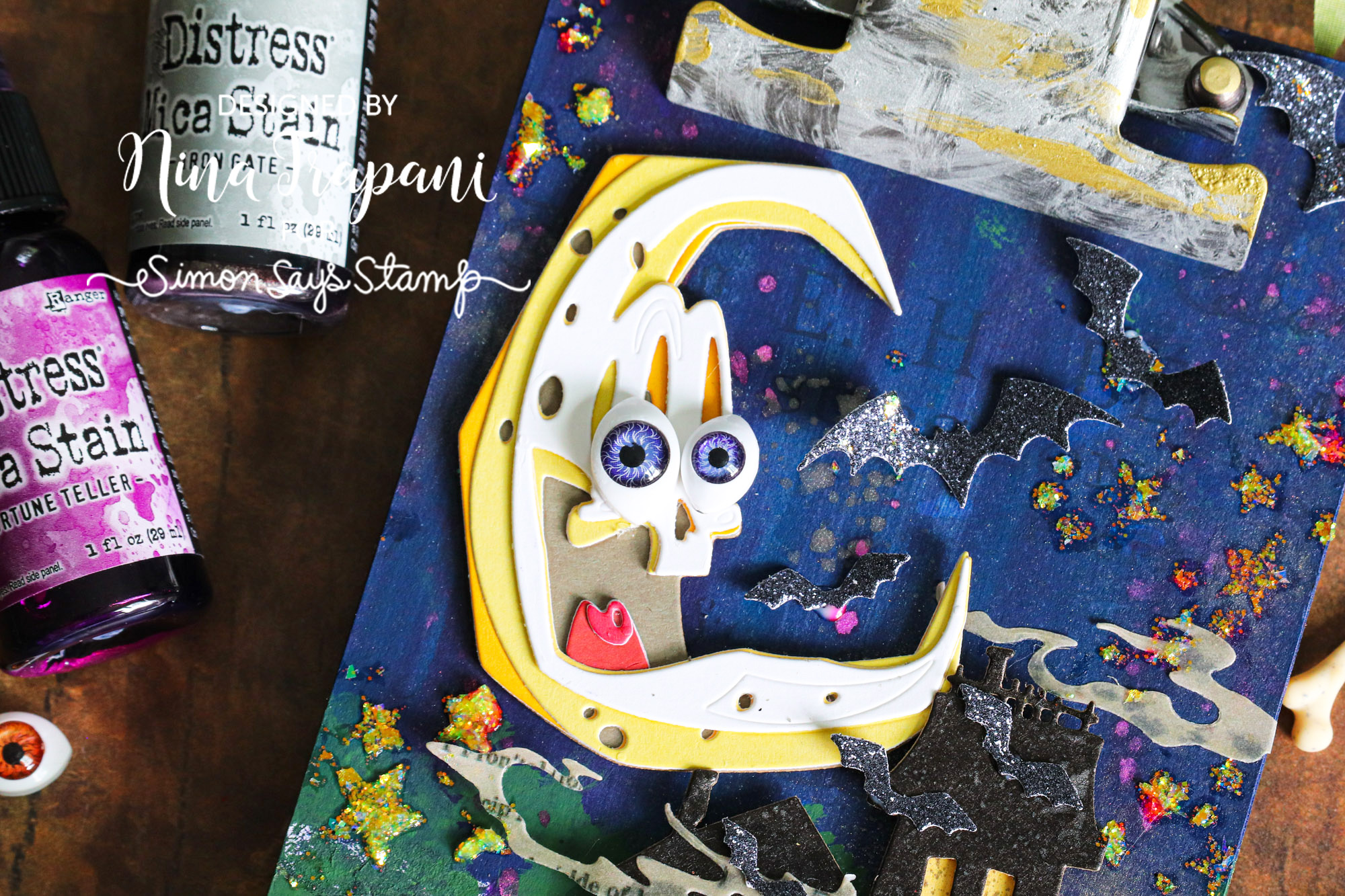
Hello everyone, it’s Nina-Marie here with you sharing a mixed media clipboard that I created with some of Tim Holtz’s new Halloween dies!
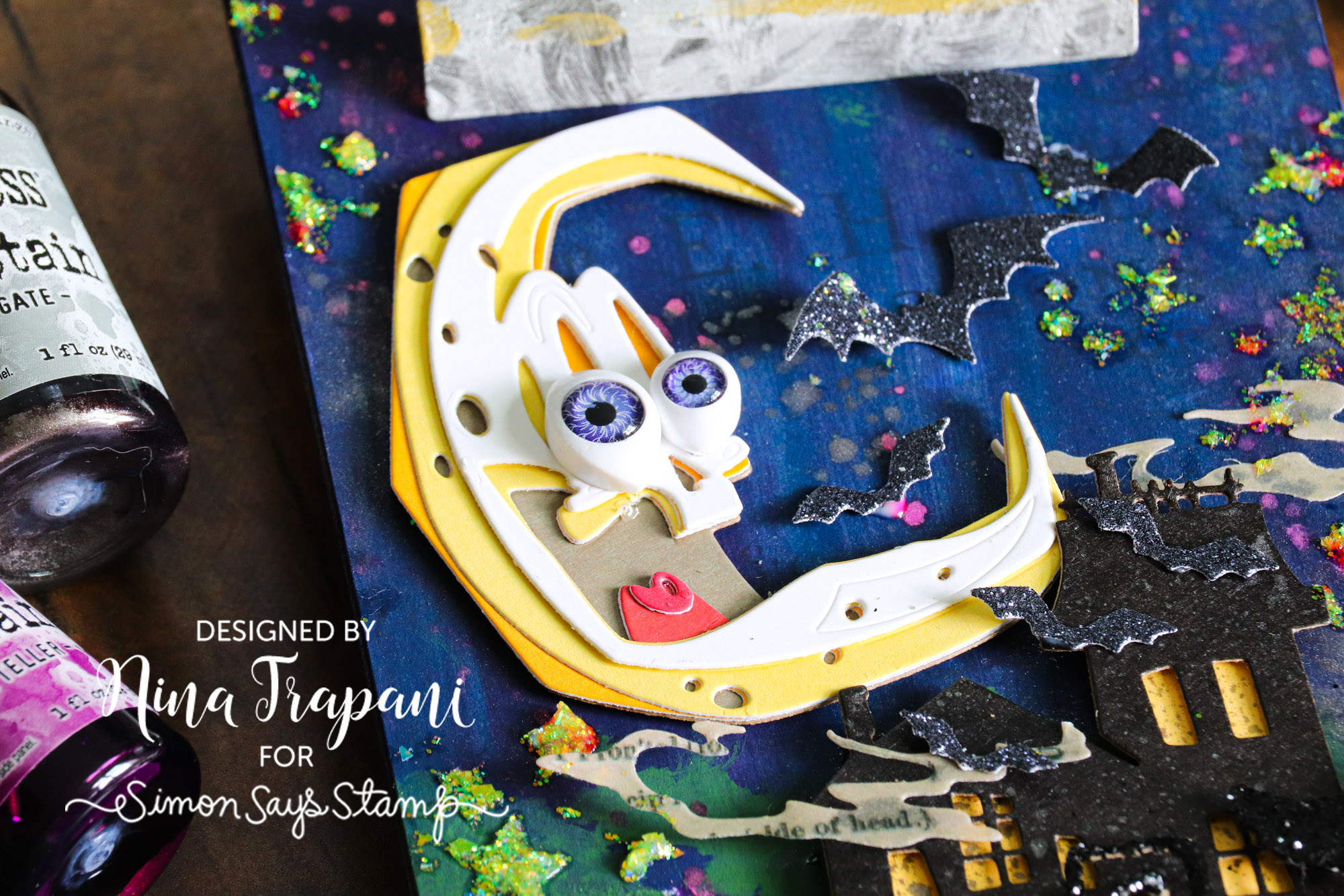
I created this spooky project with Otis the moon as the main focal point. He is such a fun character and I couldn’t wait to pair him with Tim’s Ghost Town dies. To make both the moon and haunted house, I die cut colored cardstocks (including Tim Holtz Idea-ology Kraft Stock). The moon features some Creepy Eyes for added embellishment and I added some Distress Mica Spray to the house for a bit of shimmer.
Speaking of shimmer, the background of this clipboard was a combination of layers; I covered the clipboard with Idea-ology Halloween Backdrops, then painted over them with Uncharted Mariner, Villainous Potion, and Rustic Wilderness Distress Paint. Finally, I sprayed the background with Mica Spray and applied some stars with Stickles and Tim’s Hocus Pocus stencil.
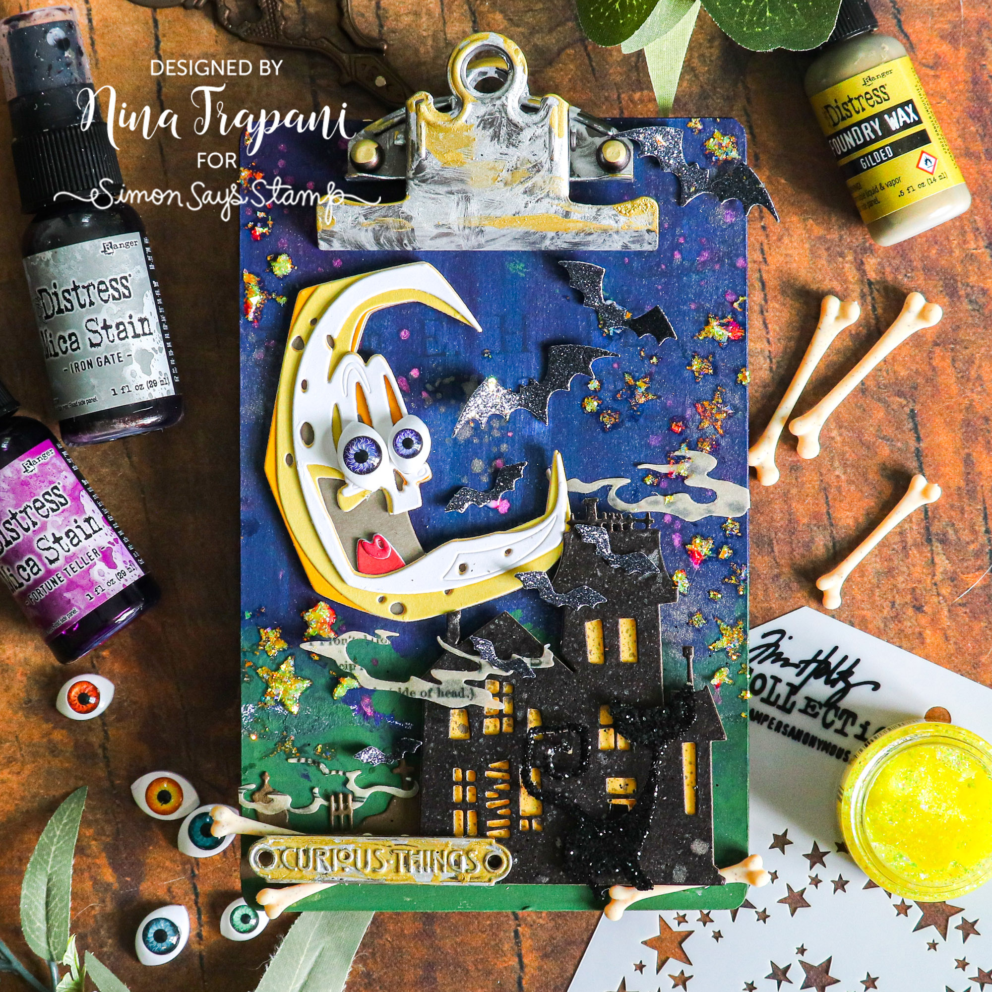
You’ll notice some extra details throughout this project, including the glitter paper bats (die cut from the Ghost Town and Otis die sets), bones, a Halloween Word Plaque, and even a black glitter cat! The cat is created from Tim’s new Mischievous dies and I covered it with black Distress Glitter.
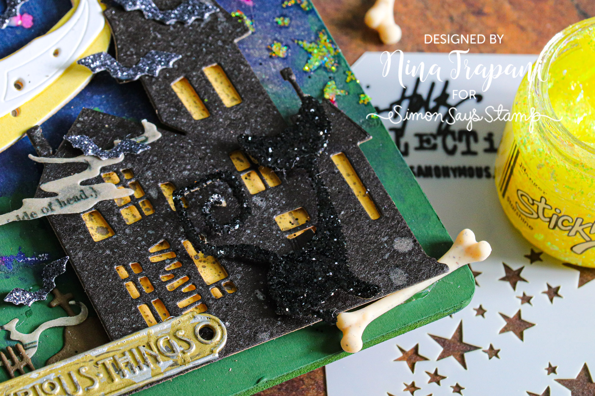
This piece is a bright and spooky decor piece for Halloween and was SO much fun to make! I hope it inspired you with ideas on how you can use Tim’s new Halloween dies to create some awesome projects this coming season! Thanks for coming by!
SUPPLIES
|


