Yippee for Yana: Tips and Tricks for Mass Producing Christmas Cards

Hi friends! Happy Tuesday, and please join me in welcoming special guest Yana Smakula back to our blog. (Please note; our dear friend Yana is Ukrainian, to show support to our brothers and sisters in Ukraine, please see Yana’s post HERE.)

Hello, crafters, this is Yana Smakula for Simon Says Stamp! Welcome back for another Yippee For Yana video!
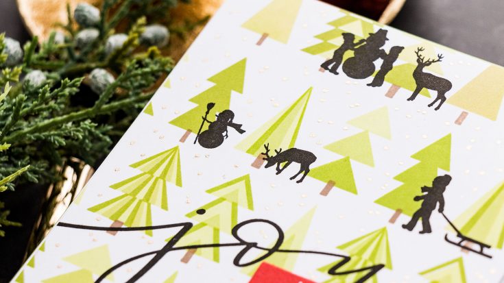
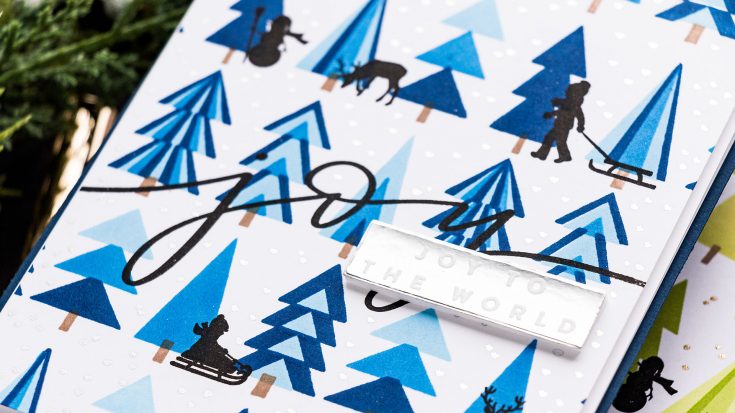
I love to combine various stamp sets to give the images a new, different look. Today I’m working with 4 sets – Printmaking Pines, I am a big fan of the Printmaking stamp series, you might remember my previous videos featuring other Printmaking sets, next I have the Holiday Horizon set, it is a new to me set and I cannot wait to use it, I love the little silhouettes here, next I have the Holiday Sparkle Greetings – this one is one of my favorites for Christmas, I love the big scripty words included in this set, that Joy is absolutely fantastic, and last but not least is the Simple Holiday Greetings set. It is one that is classy and timeless, with many Christmas and Holiday greetings that can be used as main sentiments or sub sentiments on your Holiday cards.
The star of the show for today’s cards is of course the Printmaking Pines set. if you want to replicate these cards, you’ll need to use the Printmaking Pines set and if you don’t have the other sets you can try and substitute them using other sets you might have in your stash.
The Printmaking Pines is a 4-step set. There are 4 steps to stamping the beautiful pine trees and you’ll need 4 colors of ink, respectively. You don’t have to mass produce this card design if you don’t want to, of course, but we will be doing quite a lot of stamping, so it makes sense to mass produce this design as the stamping itself doesn’t take a lot of time, it is the change of the layers and the positioning of the layers that takes longer.

I have my MISTI stamping tool; I’m using the large MISTI and not the small one as the small one will not accommodate the additional stamping that we’ll need to do to fill in the entire background. And I also have white cardstock panels cut to 4 1/2 x 5 1/2”. I’m going to start by stamping the layer with the top part of this middle tree. The reason for that, is I want the top part to be stamped using the lightest ink color, the middle part using the medium ink color and the bottom part using the darkest ink color. It was easiest for me to start with the top layer, so that’s what I did. I placed the stamp in the center of my panel. The idea for these cards is to stamp a background that covers the entire panel. So, we’ll stamp this design in the center, next, we’ll repeat it to left and to the right and in the top and bottom section of the panel. So, lots and lots of stamping.
I’m going to use the Simon’s Pawsitively Saturated inks, they come in nice groupings of 3, so I have my light, medium and dark color and this is perfect for my plan. For this panel I am stamping the trees in green using the Celery, Limelicious and Perfection inks. Starting with the Celery.
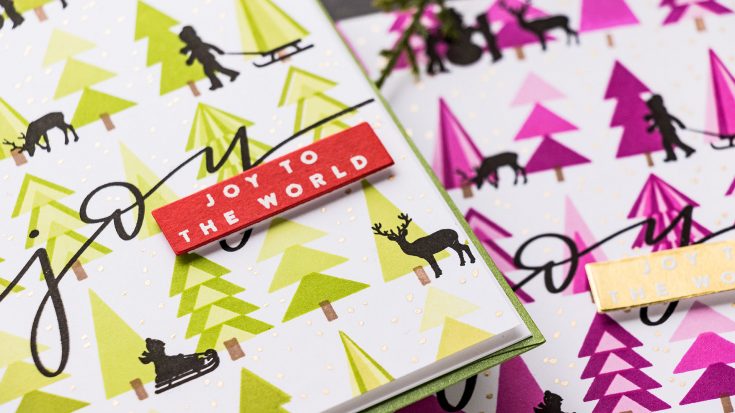
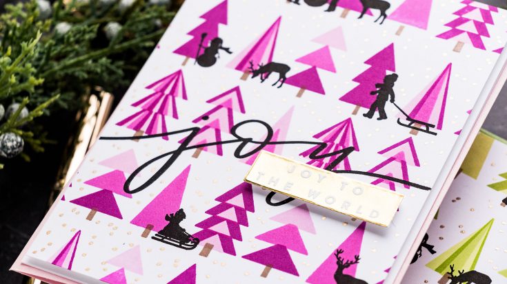
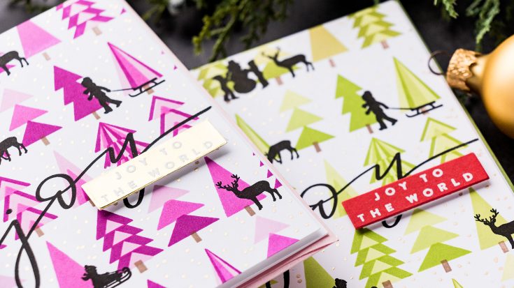
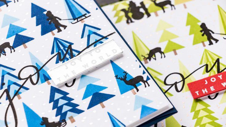
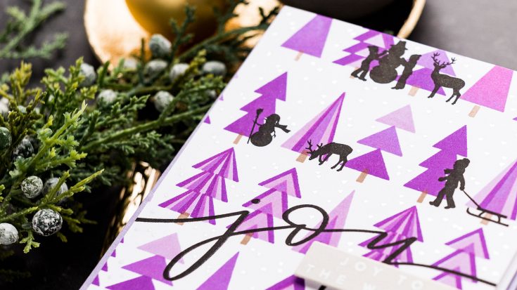
Because I have this stamp already positioned on the door of my MISTI I might as well stamp additional panels. This is where the mass production comes into play. You can mass produce using the same ink color. Or you can follow my lead and play a bit with all the other ink colors you have. I decided I needed to stamp trees in blue, purple and pink.
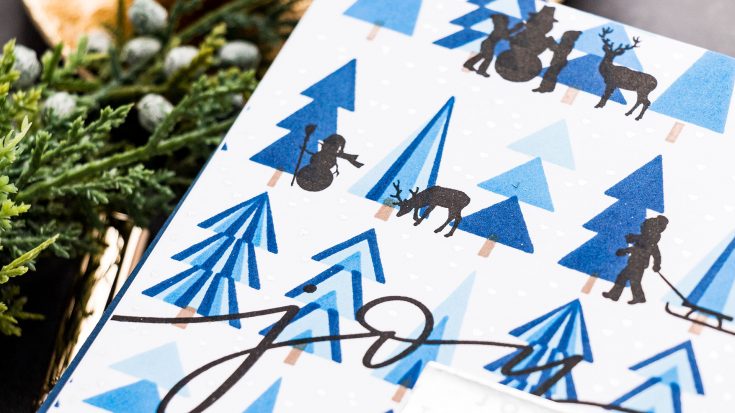
With the 1st layer stamped onto all my panels, I’m going to stamp the 2nd one. I am aligning it over my previous layer, these printmaking stamps are very easy to align, they aren’t hard to use at all! And I’m ready stamp the 2nd layer onto this panel and onto the other panels I have started. For the blue panel, for example, I am using Marine, Cadette, and Royal ink colors. When I started stamping the panels in other ink colors, I wasn’t sure if they would work. After all, blue Christmas trees are not that common. But I wanted to experiment and play, and I glad I did, because I had a lot of fun during the process and the cards ended up looking fabulous too.
Next, I aligned my 3rd layer, again this is very easy to do and stamped it using my darkest green. And the corresponding darkest ink color on the other panels.

The 4th and final layer is one with the tree trunks. You stamp all of them at once using brown ink. I have the Cappuccino ink for this.
Now that I have my main cluster stamped, I have the space around it that I need to fill in. And I do that by repeat stamping the same layers. This is what’s going to take the longest, but to me – this is the fun of it. I get to use a smaller stamp to build a new background for my cards. I repeat the process – starting with the lightest ink and first layer and I stamp it again, onto all my panels. I then add the 2nd layer onto all the panels, the 3rd one onto all the panels as well and the 4th one too. Using MISTI is a must for this technique as you just align the image once and replicate the position as many times as you need. There is no guess work, you just stamp, stamp, stamp.
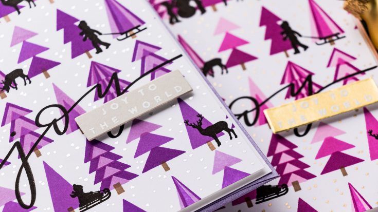
Once I stamped my forest, and that’s what these trees look like to me – once the background was filled, they looked like a big forest, or maybe a park, because of how linear the trees are they probably look more like a park. Once I had stamped my park, I thought about ways I could add additional details. The trees look fantastic on their own, but this doesn’t mean we can’t add other images on top. You can look through your stash to see if you have anything that would work, size wise next to these trees. You can stamp tree silhouettes, you can do people silhouettes, you can add in tiny embellishments to the trees, stamp tiny birds etc. See what you have and try to envision if that would work in conjunction with the trees.
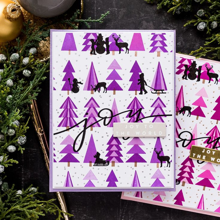
My next step for these cards was to stamp the sentiment. I picked the large joy as I wanted something big to span across the entire background and in way connect all the trees. I stamped it using VersaFine Onyx Black ink – this is my favorite black ink for stamping sentiments and solid images. It is very dark deep black. I think it is the best black ink out there.
Next, I used the tiny silhouette images from the Holiday Horizon set. The silhouettes are fun and playful, and they add interest and character to the stamped tree background. I positioned several, at least one in each row of trees and stamped them in the same Versafine Onyx Black ink.
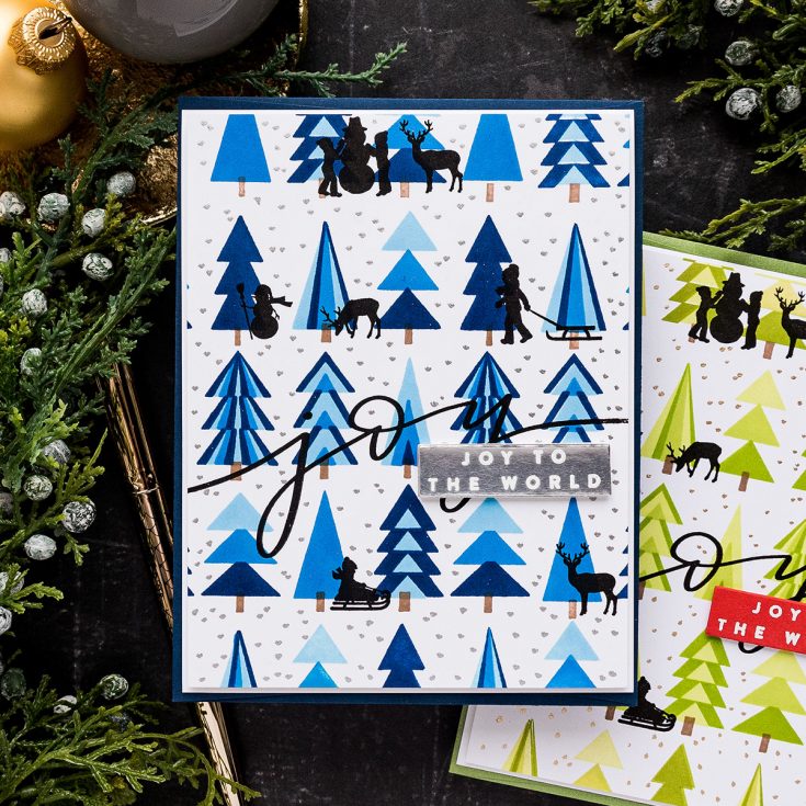
The sentiment I had stamped previously, the large scripty Joy was fun, but it wasn’t enough for what I had in mind. So, I heat embossed a sub sentiment in white embossing powder onto various colors of cardstock depending on the colors I used for my trees. I used red cardstock for the green tree background, grey cardstock for the purple background, silver cardstock for the blue trees and gold cardstock for the pink trees.
Next, I trimmed each background panel down slightly, I cut about 1/8” off from each side. This gave me a panel slightly smaller than my A2 card base, giving a nice border around the finished card.
I wanted to add something else to my card design and I decided to add snow. I used gold and silver pens for this and simply dotted gold or silver dots onto my white background, anywhere in between the trees. I didn’t add any dots over the trees, just into the white spaces between them. You can add the dots over the trees, if you want to, but I feel it might look a bit too busy.
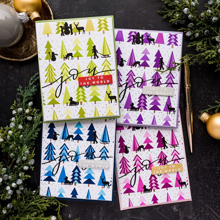
Next, I cut a panel of white fun foam to 4 x 5 1/4” and used it to foam mount the background onto the card. I also used fun foam scraps to foam mount the sentiment overlapping the “y”.
I repeated that for all my cards and that finished my projects. Have fun stamping!
WATCH THE VIDEO:
SUPPLIES:
|


Ways to support Ukraine:
If you are looking for ways to support Ukraine, we encourage you to visit this page on Yana’s blog:

Thanks so much for stopping by, and thanks to Yana for being our guest!
Spellbinders 3-Day Sale

Hi friends! To continue to celebrate our love of dies, please enjoy 15% off all in-stock Spellbinders products NOW through December 15th with code SPBD552 at checkout! Please enjoy!

Still looking for the perfect gift or a stocking stuffer?!

Crafty with Caly: Special Delivery Foiled Mailbox Card for the Holidays!

Hi friends! Happy Monday! Please join me in welcoming special guest Caly Person for a fun holiday card idea! Let’s dive in!
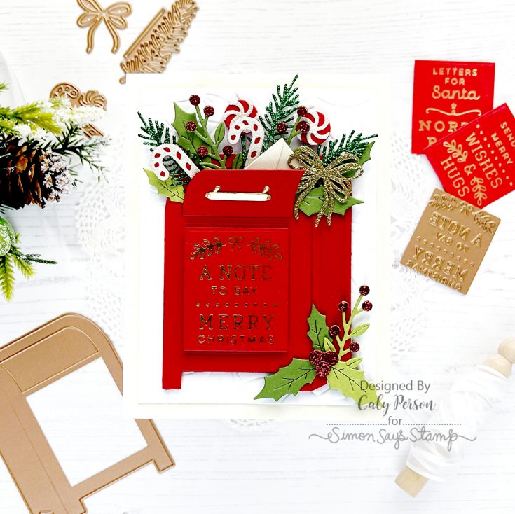
Hello! My project today requires no stamping and coloring – I find this a relief from my usual cards. Foiling is not my strong suit, but this one is simple and the results were great, so I was happy about it! The Spellbinders Parcel & Post Mailbox is easy to put together and I love the different ways you can embellish it and make it more festive.
I started by foiling the Christmas Mailbox Greetings to get that step out of the way. If you want your mailbox to be an all occasion mailbox, there are All Occasions Mailbox Greetings, too! I used Lipstick Red cardstock and Polished Brass Hot Foil, to coordinate with the red mailbox I planned to make.
WATCH THE VIDEO:
I used the Parcel & Post Christmas Decorations die to die-cut all the holiday foliage for my mailbox. For an all-occasion card, you don’t need this die-set at all as there are some pretty floral blooms that accompany the Parcel & Post Mailbox set. I used a combination of colored cardstock, glitter cardstock, and Matte Gold cardstock to create lots of sparkle and interest.
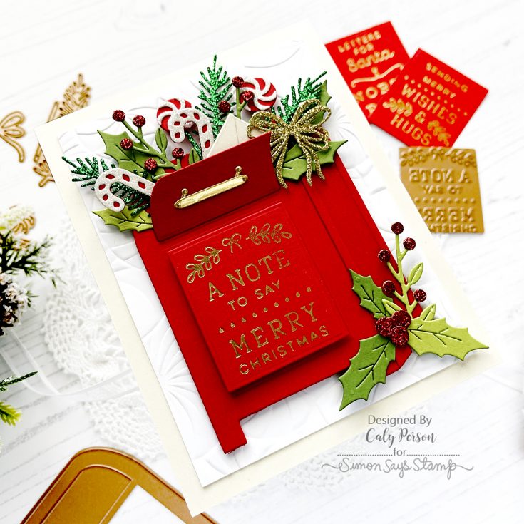
For my background, I embossed a fun background using the Twirling Embossing Folder using white cardstock. I adhered my mailbox to this embossed panel using foam adhesive for dimension, then worked to tuck in all my Parcel & Post Christmas Decorations foliage.
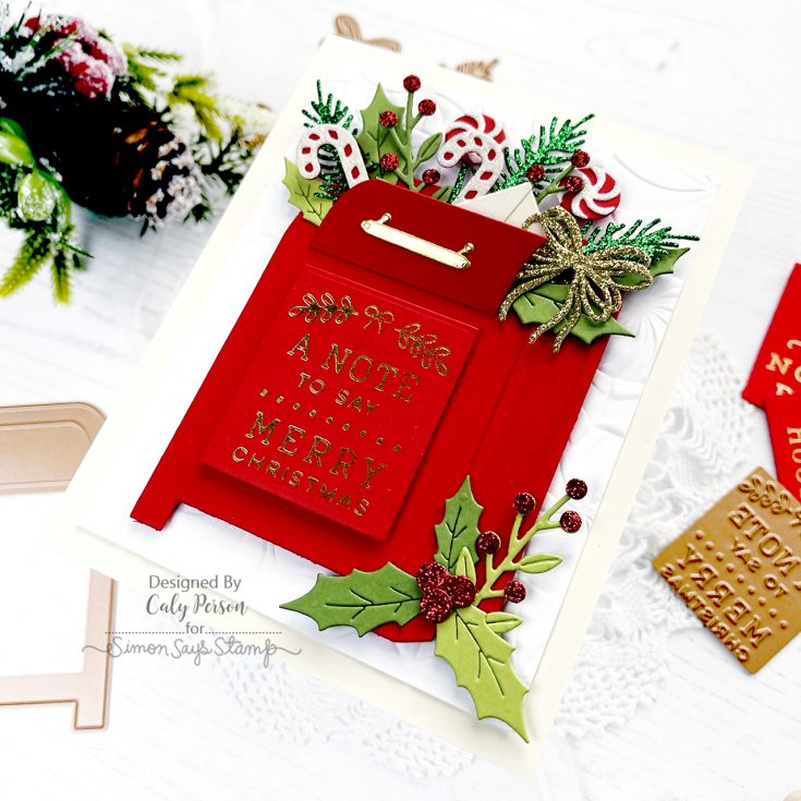
I finished by adhering a Christmas Mailbox Greeting to my mailbox and matted my card front over a piece of Cream cardstock. I hope you enjoyed this project! Thank you so much for stopping by today! ~Caly
SUPPLIES:
|


Thanks so much for stopping by, and to Caly for being our guest!


