You’re One of A Kind
Hi there! Happy Sunday readers! I’m not sure about you, but the view from where I sit is quite gray at the moment. I mean this literally as it is winter in the mid-west. During this time of year I especially gravitate to bright colors, and it’s almost as if our guest designer Pamela Ho read my mind, because she delivered this punch of color in such a sweet designed card!
Enjoy!
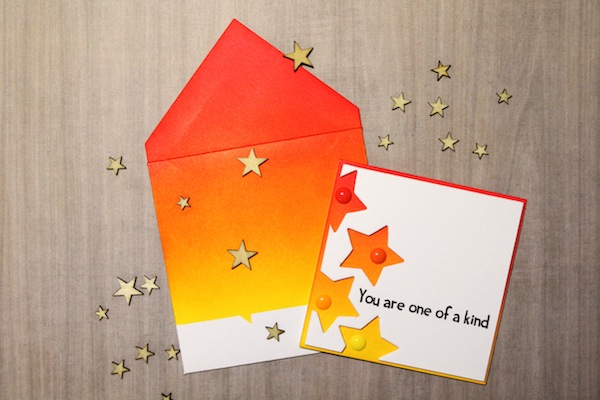
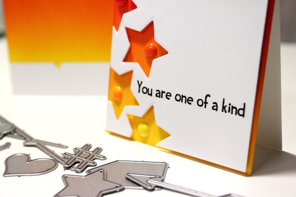
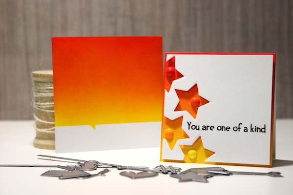
I was going for a “super star” type of card and thought it would be fun to use the star from the cardbooking dies to create some negative space. Using the blender, I blended the red, orange and yellow together so that the colors would show up from the negative spaces. I added some enamel dots to finish off the card.
The envelope was created with the Simon Says small envelope. I masked the front using the speech bubble die and blended the ink to match the colors from the card.
SUPPLIES:
 |
 |
 |
 |
|
 |
 |
 |
 |
 |
 |
 |
Blog Candy Alert!! Follow our blog via email and comment on this post for a chance to win a special blog candy!


Fun cards! Love the happy colors.
It’s summer here in New Zealand but it is cold and rainy today! Thanks for brightening my day :) I follow the blog by email.
Thank you for featuring my card ^_^
LOVE Pamela’s work! Awesome card and matching envie!
Pam’s work is so wonderful! thanks for sharing!
Such a beautiful card! I love the colors and the die cuts.
Love those colors! Perfect blending. TFS
That card and amazing envelope is so simple, yet utterly fabulous. Well done!
I’m a sucker for anything with a star on it and this is just gorgeous! Love those warm colours and the fun pattern of die cuts!
Love the cut out stars.
Such a great card- so vibrant. Wasn’t sure about the cardbooking die set, but seeing it in use, I’m really liking it.
Beautiful blending of colors. I love the warm, happy colors. CA has way too much sun compared to what it should this time of year. We are having a drought! I am torn between loving the sunny, fair weather and being worried about the drought.
A beautiful card with amazing colors. I love it. Thank you for sharing with us.
I really want to try this technique on some cards…LOVE the look!
The colors you used are just great, I’d love to see a tutorial on how to blend the colors like that. Thanks for sharing your talent with us…
Great card – love the use of the negative and the color coordinated envelope really sets it off !!! Thanks for sharing !!!
Love the matching envelope.
Wow, awesome card and what a great idea for the envelope!!
Such a cheerful card!
Great card! I love the color palette you used. Thank you for the inspiration.
Beautiful!
Sandra ltb
Awesome card and envelope too! I love the dramatic colors and the space left from the die cut. Great job! Thanks for sharing.
Katie B.
Love the bright and happy colors used here…it’s a nice reminder that Spring is right around the corner!
Love the star cuts and the ombre effect!
In Australia we have been having a heat wave, so these colours remind me of the summer sun. Love the negative space.
I ADORE the colours in this one, soooooooooo beautiful!!! Would love to see a video to see how this was done.
Simply beautiful!
Oh my this is so gorgeous, I just love it.
Definitely brings some sunshine to you! Great card!
Oh how gorgeous!! I love the bright colors. It really puts a smile on my face!!
Such beautiful and cheerful colours! Thanks for sharing!
Gorgeous! Love the bold colours and your blending is perfect.
Love the colors and the use of negative space!
Beautiful card!
Love this card and envelope! The blending is awesome, bright and cheery. It is another gray day in Maine as well – the card made me smile!
Love how clean and graphic this is!
Brilliant use of color! Such a simple idea, yet packs a lot of “WOW!” Thanks for sharing! :)
That’s a VERY cool card…being in the Midwest myself, I can sure appreciate and welcome the bright colors!
Loved the bright ,vibrant colors ! Awesome card !
So bright and cheerful…mission accomplished!
Love this bright and fun CAS card!
Oh, I love the bright cheerful colors with those candy dots. I was just looking at that die set yesterday and put in on my wish list. :)
Pam your card and envelope are so bright and cheery. orange and yellow make for great sunsets or sunrises. thanks for sharing.
stamping sue
http://stampingsueinconnecticut.blogspot.com/
I love this card. Love the colors. Love the dies. And love the envelope. Super.
this is absolutely fab!!! bright and cheery, looove it ♥
This is such a happy card! The inks are blended so perfectly, and I love the matching card and envelope.
Great card! I love the bright, cheery colors blended together.
what a cool card!
Lovely card with striking colors!
Very cool card. I was unaware of cardbooking dies. Going to check them out now. Thanks.