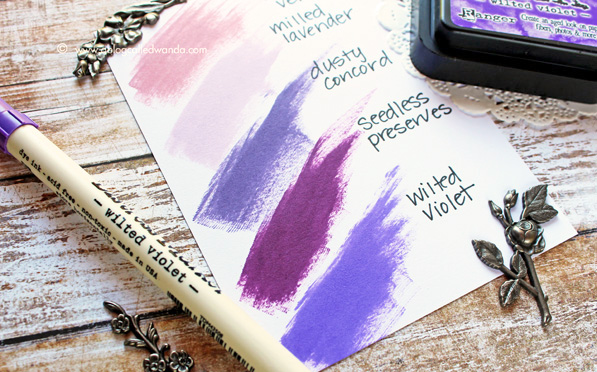
Tim Holtz Distress Ink Color POP: Wilted Violet!
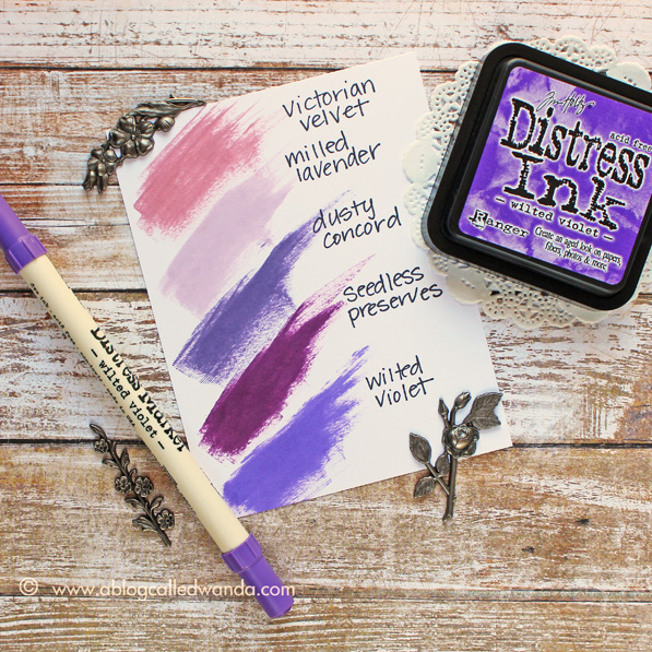
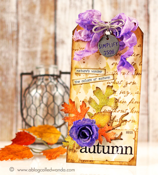
It’s one of my favorite days of the month! It’s Color POP day! (Happy Halloween too!) I’m here today with the latest installment in our Color Pop series – featuring the newest Distress Ink Color! I’m excited to share a project with the color for September — Wilted Violet. This is the prettiest shade of purple you have ever seen! Clear, clean, vivid, pure color. It is the color of beautiful grapes. I’m hooked for sure! Since it is Autumn, I paired Wilted Violet with warm tones of Mustard Seed, Spiced Marmalade and Crushed Olive. This month I thought it would be fun to make a tag instead of a card. I used lots of pretty leaves dies and lots of glitter too.
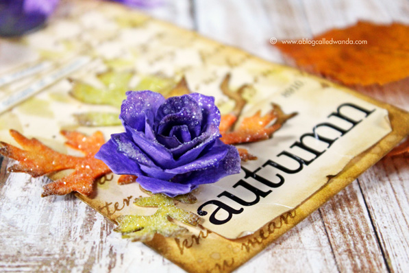
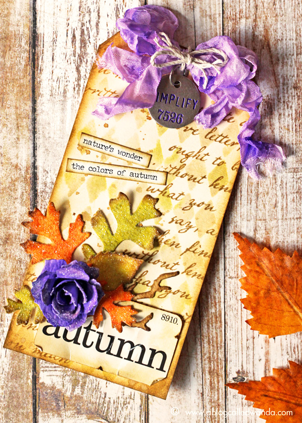
Have you ever made a rose out of a pinecone die before? If not, I highly recommend it. This is the Tattered Pinecone die, and if you roll it just so, you get a beautiful rose. Here is my pretty violet rose. CLICK HERE for Tim Holtz’s tutorial on how to do this. The part about the roses is at the end of the video! This bright purple flower is the focal point of my tag.
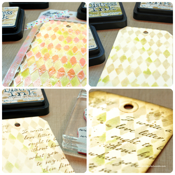
To make my background layer for my tag I first used the Harlequin stencil and inked it with shades of Antique Linen, Crushed Olive and Brushed Corduroy inks. Then I sprayed the tag with water to let those colors run together. After that part was dry I randomly stamped words on the tag with Brushed Corduroy Ink. I then splattered wet ink over the entire tag for some more character. Lastly I inked the edges with both Antique Linen and Brushed Corduroy Distress Inks. To get your tag to lay flat again after all that water and ink, you can put it under some heavy books – or even iron it!
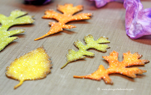
I die cut my Tattered Pinecone Die pieces and my Leaves pieces out of watercolor paper. Then I inked them in pretty Fall colors. For the flower, I saturated the paper with beautiful Wilted Violet ink! I edged the pieces with Brushed Corduroy. After I rolled and assembled my rose, I covered all the pieces with beautiful Rock Candy Distress Glitter. There is nothing in this world that is not made better by Rock Candy Glitter – you can quote me on that! I used some Ranger Glue-n-Seal to secure the glitter. I applied it evenly with a paint brush.
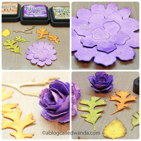
Here is a close up shot of my leaves – all ready for my tag. You can also see in this photo that I hand dyed my own ribbon using the Wilted Violet re-inker ink and some water. So very very pretty. Are you addicted to this color yet?
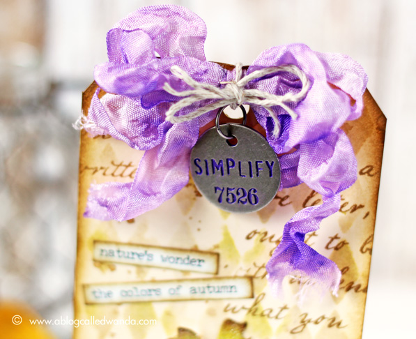
To finish off my tag, I chose some words from the new Occasions word stickers and also a flash card that says “Autumn.” I inked the edges of all the pieces so they would blend in. The last step was to assemble everything together and glue it all down with some Glossy Accents.

Thank you so much for joining us all year long for this fun feature. The color for October is Carved Pumpkin and my inks are sitting on my desk as we speak. I’ll be back soon with another Color POP! In the meantime, happy creating!


Blog Candy Alert!! Follow our blog via email and comment on this post for a chance to win a special blog candy!


Wow this is gorgeous Wanda! I love that you showed steps of what you did and that violet purple is amazing!! ❤️
Beautiful tag! This is what I love about Autumn, the colors and the leaves♥
WOW! Fabulous tag!! And a lovely shade of purple–yes, I’m smitten too! The tattered pine cone die is on my wish list! Thanks to Wanda for the clear tutorial. Happy Autumn and Happy Halloween!!
Beauuuutiful tag! And yes – I AM addicted to this colour! :D
Inspiring work, Wanda! Love how you used these bright colors–purple color is not easy for me!
Beautiful tag with amazing details and fabulous colors.. Thanks for sharing and inspiration.
Love all the beautiful details in this gorgeous card. Thanks for sharing.
SO GORGEOUS!
I want this color for sure!!! Gorgeous Fall tag.
Wow – so very prettY!
beautiful colors, beautiful tag. . . .the purple rose is perfect!
Goodness, that purple flower really grabs attention. Thanks for the color comparison chart. It always surprises me to see the distress colors side by side.
Beautiful tag, violet and yellow go great together.
Beautiful tag and colors….thanks for sharing the pictures and the steps!!
I love the vibrancy of this color!
KILLER tag!!! Love the purple pop with the fall colors . … . absolutely stunning! Thanks for the inspiration, my friend!
Gorgeous tag! I really like this new color too. I just used it to make to cards.
I LOVE this segment!! I’ve made the color POP tags for myself and it’s a great reference!! Thanks so much Wanda. Your tag is gorgeous, love the new color on the pinecone turned rose!! FABULOUS!
absolutely gorgeous!
Wanda the colors are beautiful!!! Love it:)
Oh my goodness – love these colors and how it pops! TFS this lovely art work with us – that purples is super on this tag with the colored leaves! Beautiful!
This is such a beautiful colour.
Wow, that really does pop!
Gorgeous tag, Wanda, with lots of pop! Love that you shared how to make the rose and also the color comparisons against Wilted Violet.
Absolutely gorgeous!
WOW! Absolutely adore this project! The flower is gorgeous! I strongly suspect that ‘Wilted Violet’ will be flying off the shelves now :))
Great tag. Wilted Violet is a lovely color.
Absolutely beautiful.
What a stunning tag, Wanda! Love the mix of colors you used! Soooo creative!
BEAUTIFUL!! <3 <3 <3 the AMAZING New Color and you Tag!! Just AMAZING!! THANKS for sharing and have a FABULOUS HALLOWEEN WEEKEND!! =)
Gorgeous tag – those colours just rock together!
What a beautiful color and well done card. The unusual combination of purple with traditional autumn colors is eye candy. I’ll have to get this new T.H. color. You’re making Tim rich , Wanda!
Wanda, you did it again! Your projects and colors are AWESOME!! Thanks to you and Tim!
Love that rolled rose!
I love Wanda’s creations–her color sense is amazing! I also appreciate the color swatches each month. I’d love to see more of Wanda’s cards–her blog is so much fun!
Truly a work of art! Yes–now I need that new purple!
Forgot to add that I find Wanda’s photo essays very easy to follow. Her photography and instructions and really helpful.
Absolutely gorgeous!! Love that flower!
Absolutely gorgeous tag! I’m not much of a glitter girl, but I love the sugary sweetness of these leaves! Just beautiful!
wow. What a punch of color “wilted Violet” gives to this tag. Awesome job. Thanks for sharing.
Love purple and
this is gorgeous!
Happy Halloween.
Carla from Utah
You details are beautifully executed and make a tremendous impact!
What a pretty colour for fall.
Gorgeous colors! And beautiful tag!
This is a really eye catching new color. And by the way … the tags are very nice, too.
Great color, love the rose!
There is nothing wilted about this vibrant violet color. Love it! Happy haunting!
Wow, what a beautiful tag! Love the new colour :)
Love the color chart. Really helps me see where the new one fits. Beautiful tag. Your purple flower really pops.
Great project