Tim Holtz Distress Ink Color POP: Ground Espresso!
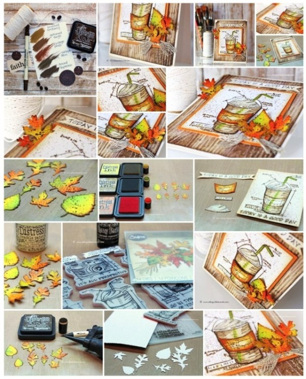
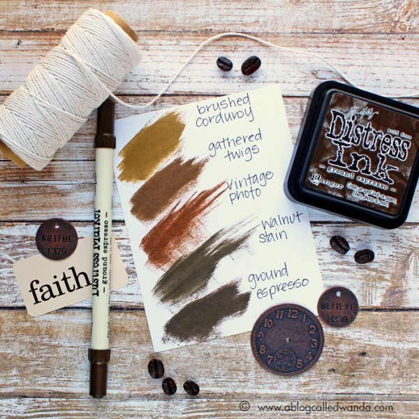
It’s Wanda, and I’m here today with the latest installment in our Color Pop series – featuring the newest Distress Ink Color! I’m excited to share my project using the color for August – Ground Espresso. And, that’s just what it is – the exact color of a cup of rich, dark coffee. It’s bold and deep and yummy! I think it’s the perfect shade of brown to go with anything Fall. So, in that regard, I combined it with Mustard Seed, Spiced Marmalade, Twisted Citron and Crushed Olive for a pretty Fall palette. For my project I used the brand new Tim Holtz Limited Edition Stamptember Stamp Set! (Editor’s note: Sold out! If you missed it, giveaway at the bottom of this post :)) You have to have it!
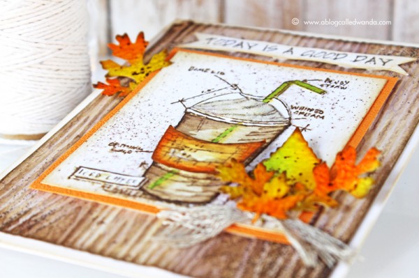
I love coffee, and I love Pumpkin Spice Lattes…and my favorite season is Autumn! And it’s September…so that’s what inspired this card! How many of you out there are waiting for your first PSL of the season? Or did you already have one? I did! MMMM.
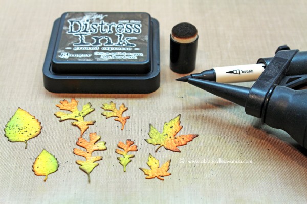
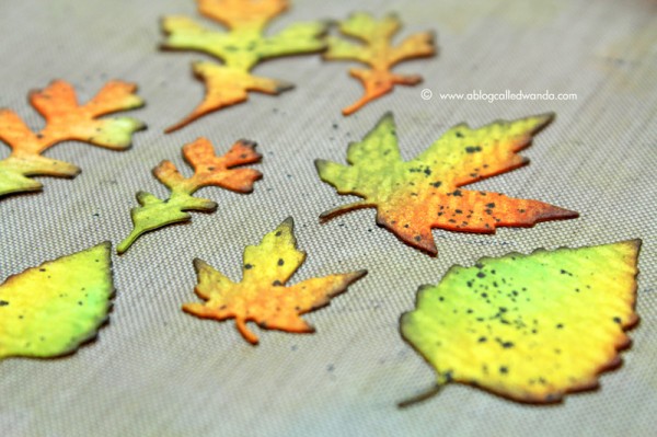
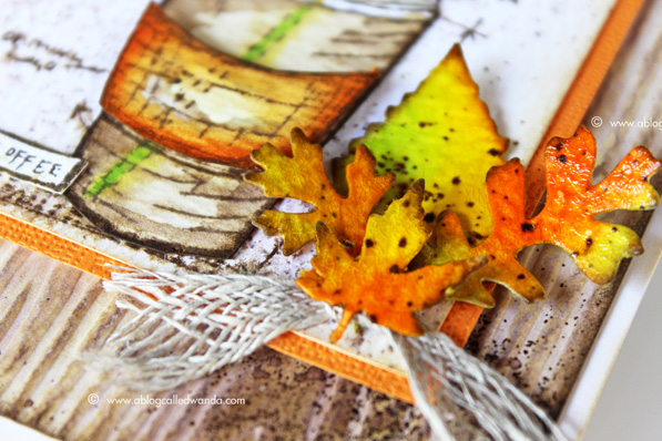
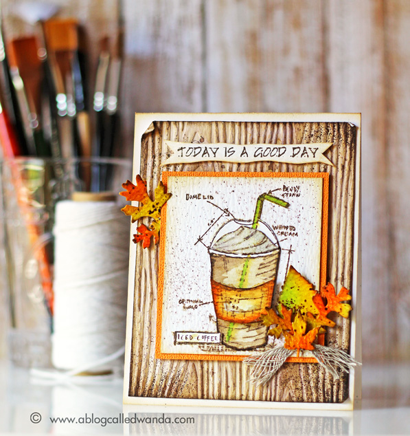
I started by die cutting out the Fall Foliage Thinlits leaves from Ranger watercolor paper. Then I dry embossed the Woodgrain embossing folder – also from watercolor paper. These were my base pieces. I colored the leaves with distress inks and a sponge dauber. I just had fun combining the pretty fall colors. I used the Ground Espresso Ink to edge the leaves. I used the Ground Espresso Distress Marker and the Spritzer tool to make some dots on the leaves. As the final step for my leaves I coated them with Crackle Paint and let them dry. This makes them pretty and shiny like real leaves.
Next, I put some Ground Espresso re-inker onto my craft mat and mixed it with some water to make a softer brown color. I covered my entire woodgrain piece with this ink mixture. After it was dry, I went back and splattered some more droplets to look like coffee spills! The messier the better on this one! Then I took the embossing ink pad and smudged it around the edges of my woodgrain piece. I sprinkled on some Ranger Walnut embossing powder (the perfect match for Ground Espresso) and heat set it. I think it looks like coffee grounds, in keeping with our theme.
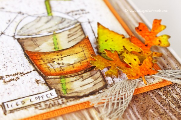
I stamped my Blueprint Stamp three times onto watercolor paper with Ground Espresso Ink. I cut out the pieces and colored them with Distress Markers and water. I used orange as my accent to indicate the Pumpkin Spice Latte! I mounted the pieces onto my main card base and then spritzed the entire thing with water to make it messy and soft. Lastly, the super fun part! Putting together those pretty leaves…and finishing up the card. I like the sentiment better at the top of the card, so I cut it out and mounted it there.
Any day that you have coffee is a good day indeed! This is a great card for any occasion or friend. I made another color swatch reference chart for you this month, so you can see where this rich new color fits into the Distress Ink brown color family. Thank you for following along with me each month as I feature a new color. Next month is Wilted Violet. Oh boy! Have a great day and happy crafting!
SUPPLIES:
 |
 |
 |
 |
 |
 |
 |
 |
 |
 |
 |
 |
 |
 |
 |
 |
 |
 |
 |
 |
 |
 |
 |
 |
 |
 |
 |
 |
 |
 |
 |
 |
Blog candy alert!!!
Unfortunately this STAMPtember® 2015 exclusive is sold out, but we have one left to giveaway!! Comment on this blog post with your favorite color of the month so far for a chance to win. Winner will be announced next week! Good luck!


All colors are amazing, but I’d pick hickory smoke – no greys in my stash so far.
Gorgeous card!!! :-D My favorite color of the month so far is Blueprint Sketch. Thank you for sharing and opportunity to win. :-D
Please give me crackled pistachio…I think it works great even with groung espresso…
Cristina
thehouseoftheblackbirds.blogspot.it
Would be so great to ink up one of these beautiful stamps of this set! Love the cards; the style and colours are super!
I love, love the Wilted Violet!!!!
Every month I have a new favorite. This month it’s carved pumpkin. Who doesn’t love pumpkin!
Well that’s a silly question!! The answer is “all of them, of course” Unfortunately I don’t have any of them…………..Yet!! It will take me a while to get them all! Would absolutely LOVE to win this set, come to think of it, I don’t have any of Tim’s stamps yet either!!
I’m working on Halloween so I’m crushing on orange pumpkin, wilted violet, twisted citron and hickory smoke… But I am also needing my ground espresso! Thanks for the opportunity!
Beautiful card…love all the colors and the technique you used to make this card.
Well, this may certainly make me rethink oranges! But my favourites (because you can’t pick just one) so far of the colours this year are Mermaid Lagoon, Soked Hickory, Cracked Pistachio, and Ground Expresso, and Blueprint Sketch – those are the ones I can envision myself using the most… though I would lust after them all :)
I love love love Ground Esspresso & Wilted Violet. This card is gorgeous!!!
I could use this stamp set in many differnt kind projects. I love this card!
What a fabulous card!!!! The leaves are just absolutely beautiful!!!! Oh it is so hard to pick just one as my favorite because I truly do love them all!!! I am always showing them off to friends and family showing them what the distress inks can do and how beautiful they blend and how gorgeous all the colors are!! Well since it is October I guess I will have to go with Carved Pumpkin, Twisted Citron and Wilted Violet!! All three are absolutely amazing colors for Halloween!!!
Absolutely gorgeous card! Love these fall colors! My favorite(s): mermaids lagoon, wilted boiled, and blueprint sketch. I can’t choose just one! :)
I love this color, it is a perfect in between orange-yellow color. I will for sure get this one.
I especially LOVE blueprint sketch. I also think cracked pistachio is great!
Love the violet – so beautiful.
all colors are beautiful but I’d pick hickory smoke!!!
What beautiful colored leaves!! Another fabulous, “must have” color!
My favorite color has been abandoned coral!
Pretty card. Love the rich colors and the sentiment.
What a FAB set…so sorry I didn’t buy one :-(
Favorite color ‘blueprint sketch’
Love them all, but Cracked Pistachio has to be my favorite!
My favorite is the Ground Espresso! LOVE that color!
Cracked Pistachio! I love minty colors!!
The newest color is always my favorite! Love them all because distress mixes so well! Colors I reach for time and time again include Persimmon, Mustard Seed, Marmalade and Twig, will coordinate with Pumpkin fabulously!
The Color of the Month release has been so exciting! My favorite so far is the Cracked Pistachio.
I love this stamp set and I LOVE coffee! Beautiful card!!
definitely love the new pumpkin color! great card!
Such a rich and beautiful color!
would it be okay if i change my favorite monthly?! so far I think the twisted citron – there’s something about the bright greens that I’m lovin’ lately – is my fav … but I really love the ground espresso too!
My favorite color of the month, so far, is Blueprint Sketch!
My favorite is ground pistachio. Beautiful card.
I have been waiting for a for color like carved pumpkin. I like twisted citron too.
My love on first sight so far is crackled pistacchio.
Wonderful card and photo tutorial – I really LOVE this autumn color mix. Nevertheless my color of the month is definitely pumice stone, because I just realized this month on a local fair how wonderful it changes from a fresh grey to dry light earth brown tone – simply fantastic!
kind regards, Irmgard
Gorgeous card…love the inks esp mermaid lagoon.
blueprint sketch is my favorite – if i have to choose only 1!
Love this card & this color! :)
Love all the great colors but Cracked Pistachio is my fave.
Gorgeous card,love the coloring and the spritzed ground espresso speckles! I bought this set already, but would love to receive last year’s exclusive Tim Holtz set if you have one left!!!!!
I like them all but cracked pistachio is my favorite♥
it is SO HARD to pick just one color… but I think the new Carved Pumpkin is on my “must have” list! I missed out on the stamp set – what cute cards the DT made with it!
I love all colors, but I’ll pick Cracked Pistachio.
Mermaid Lagoon. Such a gorgeous blue!
Cracked Pistachio is my favourite!
Wow, the colors really give the Autumn vibes..lately I’m loving Copper.
Nice fall card! I like so many of the new colors it’s hard to choose. If I have to choose one – I’ll pick Twisted Citron. (The only one I have so far!)
Thanks for the give-away! I’d love to win the stamps!
they have all been fun, but for me it’s a toss up between cracked pistachio and fossilized amber. love them both! :)
Tough question but I do like the Ground Espresso a lot.