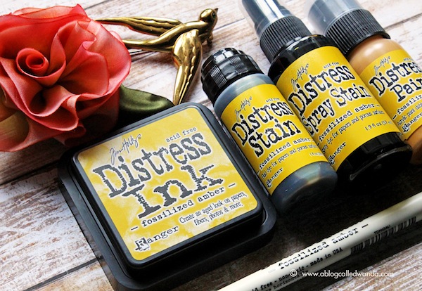
Tim Holtz Distress Ink Color Pop: Fossilized Amber!
Hi readers! I sure hope you’re loving this fun feature as much as I am! We’re back with the awesome Wanda Guess for our monthly color POP series, and this month she’s spotlighting Fossilized Amber! Next: Twisted Citron! If you missed our features on Cracked Pistachio/Abandoned Coral or Mermaid Lagoon, be sure to check them out!
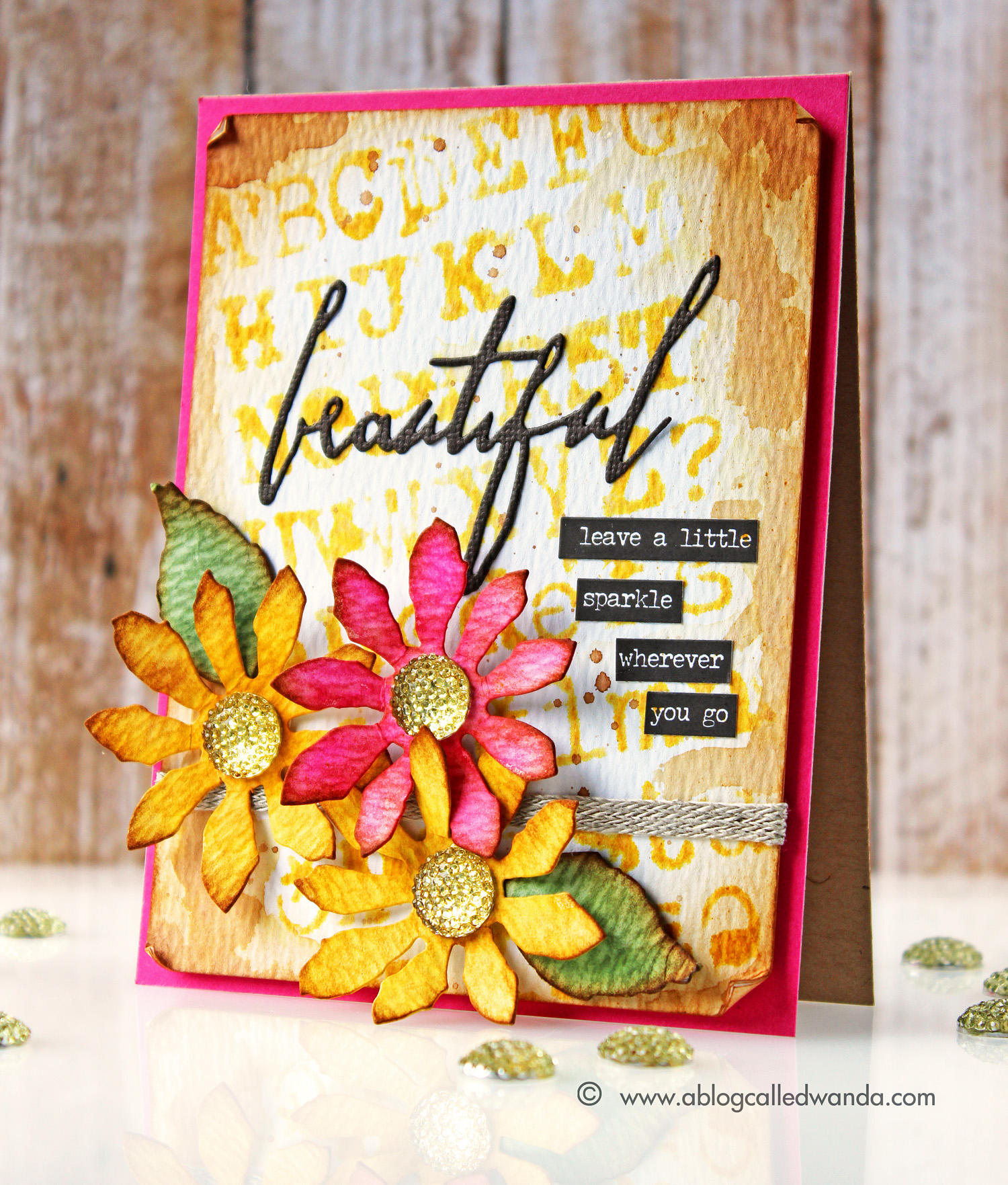
It’s Wanda, and I’m here today with the third installment in our Color Pop series – featuring the newest Distress Ink Color! I’m excited to share a project using the color for April – Fossilized Amber. This is a rich, deep, warm, golden yellow. Perhaps the color of sunflowers? That is what inspired me! So I made a card with some bright and cheerful flowers.
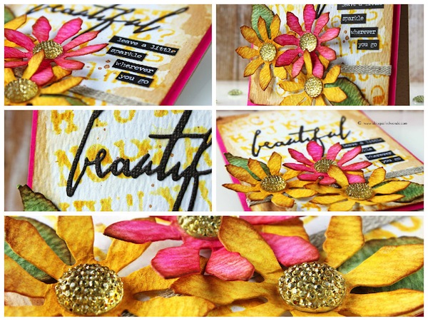
This ink color was an easy one to match with other colors – since yellow goes with almost any other color. But, I wanted something special, and something maybe not obvious. Well, it came to me – Picked Raspberry! And, yes, I love these colors together now! I used the Fossilized Amber Ink pad to stencil my background paper with the Typo Stencil. I also used the ink pad to color my Tattered Floral Dies. I used the Fossilized Amber Spray Stain to color in some Tim Holtz Gumdrops for the centers of my flowers. I like to show you different ways to use each medium. The spray stain is dark and pigmented and it drenches on the color.
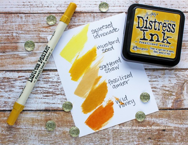
I’ve made another color swatch reference chart for you to see where the new color fits in with your existing Distress Ink colors. Here is the entire Distress Ink Yellow color story.
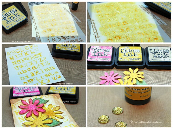
To make my background paper, I taped my stencil down to some watercolor paper and used a sponge dauber to ink it. Then, while the stencil was still on the paper, I misted the entire thing with water – to soften the edges of my stenciled images. Then I spattered some Vintage Photo ink and also edged my paper with the Vintage Photo ink. This gives me a nice base to work with. You can see I put my stencil on at an angle for some visual interest.
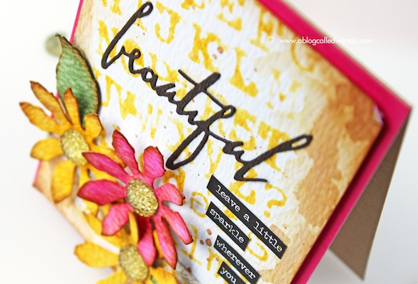
I die cut my Tattered Floral die pieces out of Ranger Watercolor paper and then applied ink from the ink pads. Here you can see my color choices. I die cut the word ‘beautiful’ from a TH word die and then added my stained gumdrops and my small word stickers. I decided to pop the card by using a layer of pretty raspberry cardstock behind my images.
Next up is the gorgeous Twisted Citron! (Editor’s note: Available to reserve now!!) Since the moment Tim announced he was doing a new color each month, I have been hoping for a bright citrus green! Yahoo – can’t wait to get my hands on the new color. See you next month! Have a great day and happy crafting!
SUPPLIES:
 |
 |
 |
 |
 |
 |
 |
 |
 |
 |
 |
 |
 |
 |
 |
 |
 |
 |
 |
 |
 |
 |
Thanks for reading today and thanks so much to the awesome Wanda for this inspiration today!
Blog Candy Alert! Is this color a must have for you? Comment your thoughts on this post for a chance to WIN a reusable Tim Holtz Idea-olgy tote bag! Good luck!


The Fossilized Amber is a great addition to the distress ink line of TimHoltz. Today’s card by Wanda is beautiful. She put wonderful elements together with a rocking color combo. Beautiful!!!
Lovely, thanks for sharing!
Love the color combo and your card came out gorgeous!
This new color is beautiful!
Sichuan a beautiful card, love the vivid colors and fabulous flowers!!!
Great new color; looking forward to playing with it.
What a beautiful card. Love the color combo and the way your mind worked while creating it (angling the stencil). Thank you.
Beautiful colors, fabulous flowers…..love your creation!
This is a beautiful color!
yes, it is! I think it will pair up nicely with my wild honey that I love.
stamping sue
http://stampingsueinconnecticut.blogspot.com/
Wow! Love how Wanda has showcased this beautiful new color. Can’t wait to use mine.
WOW WOW WOW, this is STUNNING!!!
WOWZERS! Gorgeous color combination, I love the new Fossilized Amber! Gorgeous card!
wow you made it look good, i couldn’t it came out all autmnal like with borwns and reds, but this is fab
Oooh–another fabulous color and beautiful card.
Wow, Wanda this is a beauty! TFS!
Great color! Thank you so much for the comparison color swatch too, I love being able to compare colors :)
I just received my Fossilized Amber bundle and will be using it on EVERYTHING! It’s my new ‘go to’ color…simply fabulous! A touch of yellow on top of many colors changes the intensity in a unique way. Love this mustardy rich yellow! And who wouldn’t love to Tim Holtz tote????? I know I could use one! Thank you for the inspiration and a chance to win one of these tote bags!
Oh my gosh!!! This is stunning!! Love the beautiful bold colours!! You shared some great tips too for using the ink pad directly on the watercolour paper :)
Beautiful card, fossilized Amber is on my wish list.
Love the new color! It is already ordered!! The card is just beautiful. When I get my goodies I will try my take on it! Thanks for sharing!
Like the way you did the background and the wonderful shabby chic look with the added inking & flowers.
Melissa
“Sunshine HoneyBee”
I love the rich tone. I will most certainly want to add it to my collection of distress inks. TFS
Yes, I need this colour! All I want to do right now is CASE Wanda’s gorgeous card down to the smallest detail, so that I can own one just like it!
Yum, yum, yum! Love this gorgeous card, Wanda! Such fun techniques and it turned out soooo beautifully!
Hello,
I saw this card in my readinglist, and I was curious about it how it is made. I saw the flowers and the mixing colours. Stunning card!!!! I can’t look all the time because our internetdownloads is limited. where I live there are no recources.
thank you for showing this.
kind regards, dora
Loved the colors of the card. The beautiful flowers are such highlights of the card
Love the Color mix. Great techniques. I love the stencil at an angle. Really adds life to the card.
Love your card and the amber is so gorgeous!!! Gotta try this!
This fossilized amber color is a great addition to the distressed inks line – it is dark enough to be used on its own and nicely complements wild honey and scattered straw colors. This card looks fabulous and provides great inspiration:)
Beautiful combination of colors!
The tattered flowers die is one of my favorites. The colors you used are beautiful.
What a beautiful summer card!! I love the summer colors.
Great project! colors are so beautiful!
This is gorgeous! I am so inspired to dig out a couple supplies and mangle my own version! Thanks for sharing!
Wanda is so creative–I love her bright, happy cards.
The timing of this post could not have been better! I have been ‘struggling’ to find the PERFECT yellow….without having to purchase, then not like! You just saved the day! Thanks for sharing your awesome project and for the ‘color swatch’ comparison! Happy crafting!
I was unsure, but I see that it fills a hole I did not know was there.
I love everything about this card!
A beautiful color & lovely card, thank you!
Wanda your card is amazing. Just absolutely gorgeous!
I am a Tim Holtz fan. I love the color that he came out with and the card is adorable. Just order me some of the paint yesterday. Thanks for sharing!
Love Wanda’s card, especially the gorgeous background. The Picked Raspberry with the Fossilized Amber is a truly great combo. Love this great new addition to the color family!!
When I first heard about the color-of-the-month I thought: We have every color we need, what other colors could there be?? How silly I was! The colors that are being added are absolutely perfect additions to the line of distress colors! And this card shows us just why!!! I am looking forward to seeing the Citron with the raspberry! Should be absolutely stunning!!
Beautiful card and this
color is pretty and I could
use it on my projects!
Carla from Utah
Simply stunning Wanda! I have a new favorite color combo :)
What a beautiful project! And thanks again for the color comparisons of the distress inks. I always find them so helpful.
Ooooo, aaahhhh….awesome!
This is so very pretty! I love these colors!
Gorgeous! I love the new distress colors…can’t wait to get the May one (so far my favorite). Hugs, Robin