Surf N Sand… Yes Please!
I can’t deny it, I’m missing warm weather really badly right now. So…to bring some sunshine into my world, I’ve created a card that reminds me of the beach!
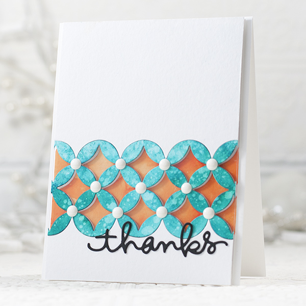
I played around with Peakcock Feathers Distress Ink and Dylusions Vibrant Turquoise Spray Ink on Watercolor paper…that’s my SURF! Peaking through from behind is my sunshine of Dylusions Squeezed Orange!!
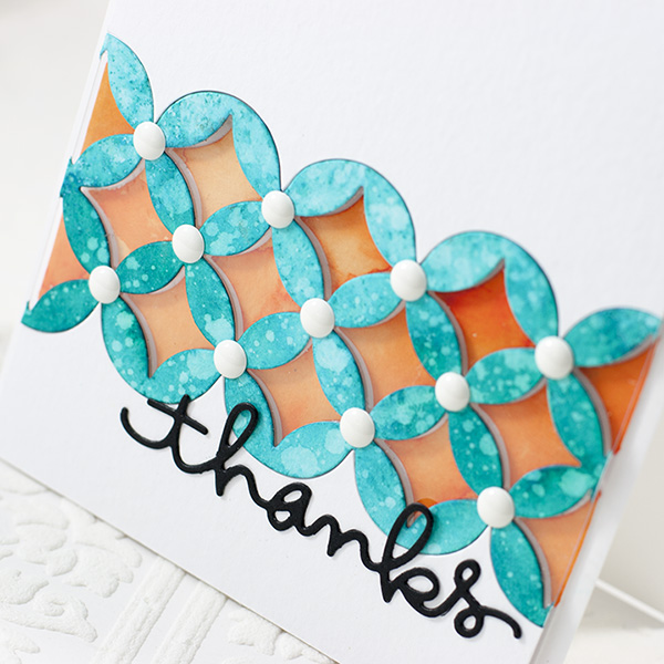
I used the new die from Tim Holtz… Courtyard Frameworks…it’s amazing!!! Love the continuous design! To finish off my design, I added Doodlebug White Sprinkles to the centers.
I’ve shot a video of my process, hope you enjoy!
Thanks for stopping by today, have a fantastic WARM week if you can!!

Blog Candy Alert!! Follow our blog via email and comment on this post for a chance to win a special blog candy!
                |


WOW….super LOVIN’ this.
Super cool card & video Shari! I have really got into inlaying my die-cuts, as I love to use both the positive & negative pieces. I also adore layering & acetate, so this technique is perfect for me. Theresa x
Can’t wait for spring. then to the pool. Great card.
Beautiful card! Love the beachy loo, fabulous color combo! The black thanks just pops and the white dots remind me of the center if a starfish! Love it! Oh and that TH die looks fabulous!
Great card and technique video! I *was* wondering how you put it together before I saw the video. ;-)
Love this card!
Great card. Enjoyed the video.
What a great effect to have the “surf” suspended above the “sunshine”! These colors are so very wonderful, especially in light of all the white that just doesn’t seem to want to go away around my house! Thanks so much for sharing your ideas and techniques and that bright ray of hope for warmer days!
Gorgeous card, Shari! Just love your work. Thanks for sharing.
wonderful colors indeed. love the WHITE dots.
What a beautiful card! I also am missing the sun and this great card made my day a little brighter, thanks :)
Fabulous card, great colors! Loved the video.
The result looks great as always! :) hopefully my computer will stop having a bad day and will play the video already :/
I am SO LOOKING FORWARD to the TH Frameworks Dies!! What fun and a lovely card!! Thank you!
Ok, I have got to try this! Fabulous!
Gorgeous card! TFS!
Fantastic card!!!
Awesome tutorial. Love that die.
Your card is gorgeous, love the colors you used. Thanks for sharing.
I could watch you play ALL DAY!! Just love these “beach-y” colors, Shari! And I’m with ya on missing warm weather – it sure has been a tough winter, hasn’t it? As always, thanks for the inspiration! ♥
I have always loved that pattern in the new Tim Holz die. I love your color combo too.
Love that turquoise color!
Bright card.
Carla from Utah
I was going to say “cool” card, but we have enough “cool” right now, so I’ll say “warm” card and “warm die” from TH. It’s so much fun to watch you create on the videos. Thanks. We have our beach vacation planned and It is nice to think about being at the beach during this bitter weather.
Great video! I couldn’t tell there was a piece of clear acetate behind the first layer so the video really helped explain all the steps involved in making your card.
Love the use of the acetate. Great color choices too.
Great card thanks for sharing!
I love the colors of this card–just beautiful!
I miss the warm weather too…love this card with the wonderful tropical colours.
Wow! Great card. I love the die cuts and misting on this project, great color combo
Beautiful card Shari!! It figures that the Tim Holtz die would be one that doesn’t work in Spellbinders!! I love die!!! Thanks for sharing!!
Fabulous card – peacock feathers is on my wish list
Oooh what a pretty card … LOVE that die :)
I wasn’t sure where you were going with the acetate and then . . . the great reveal at the end. Makes perfect sense now!! Thanks for the tutorial, Shari. I always enjoy your videos.
What a delightful card love the acetate technique thanks for the video have a great day!
I had no idea how that card was made. But the video explained it all.
Very creative!!!….
gorgeous card! love it!
Loving those colours and the dimension is really cool too. Feeling summery after looking at it!
I like the die you used, Sheri. The black “thanks” is so striking against the colors. Really pretty.
Awesome card!! I love the layers and colors!!
Wow this card is amazing love the colors and the design how great.
Aqua and orange is such a great color combo.
Super WOW, love the brightness of the card.
Oh I love this card! The diecut background with the wonderful colors make such a sriking design!
Really cool! Love the effect of the distress ink + spray on the courtyard frameworks die. Thanks, Shari!
Gorgeous Shari!!!
Cool card! I need that die!
Beautiful card … I love they way you used the die!!
Love these colours Shari! They remind me of sunshine and blue water! Ahhh…
This card is amazing. I don’t have the Tim Holtz die but I want to see if I have any other die that will do and play. And here in Australia we are waiting for some nice cold weather cause the heat is driving us nuts! Let’s swap. I’ll send you some heat and you send some colder weather over here.
love this card!!! and the colors are great together.. Thanks for the great video Shari!