Studio Monday with Nina-Marie: Stamp Layering with Pantone Green
Hello everyone and Happy Monday! In this week’s Studio Monday post, I wanted to feature some Simon exclusive products along with Pantone’s color of 2017: Greenery!

If you are not familiar with Pantone’s color of the year – or Pantone itself – let me give you a quick background: Pantone is the authority and worldwide resource for color. They provide color systems and technology to a wide range of industries and companies. Each year they choose a color that symbolizes what is trending and happening in our world. For 2017, that color is Greenery, which symbolizes nature and new beginnings. I thought I would combine both symbols in my card today and create a floral card with Spring colors, since Spring is commonly thought of as a new beginning.
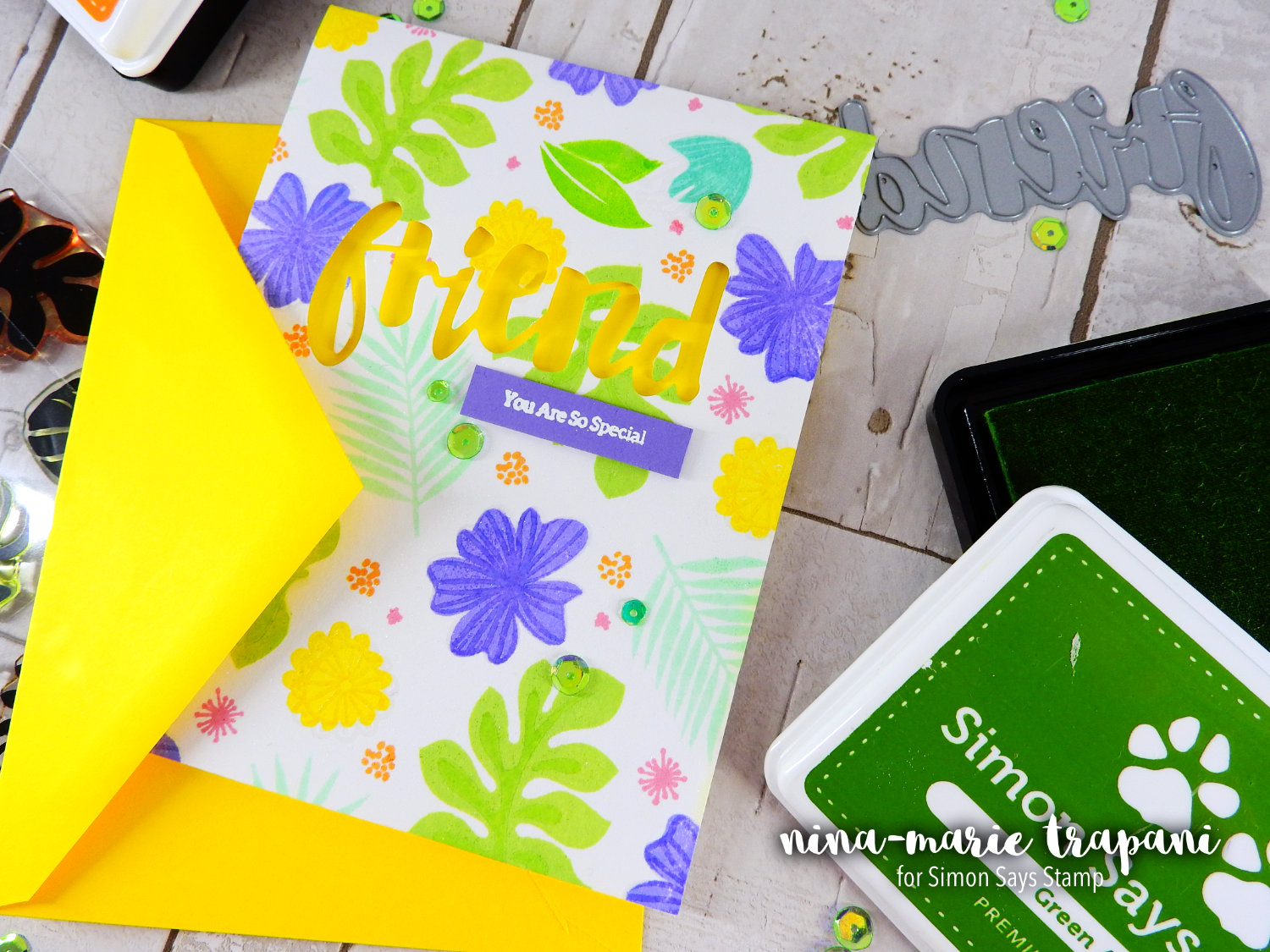
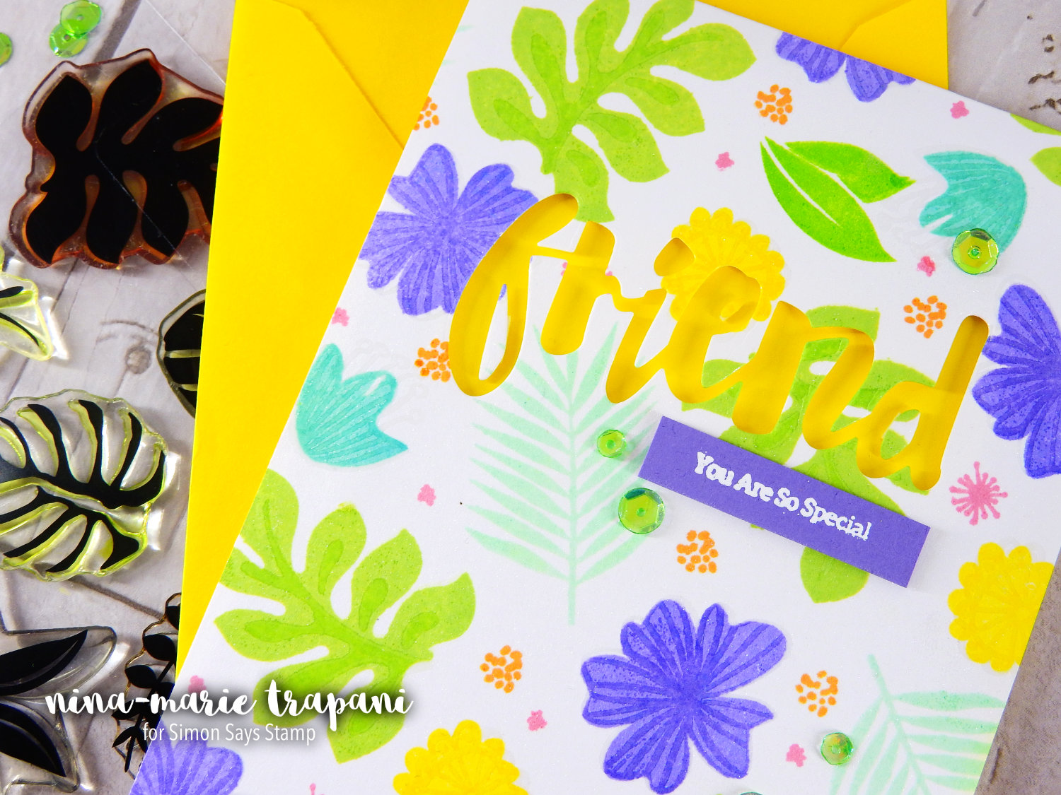
The floral images are taken from two Simon exclusive stamp sets; Tropical Leaves and Wild Beauty. There are coordinating dies available for both sets; however, I will not be using them today. Both stamp sets are simple, stamp layering sets. While many of you have multiple ink colors for doing stamp layering, I know not everyone does. So instead of doing stamp layering in the “normal” way, I want to show you how to do it with one ink color and heat embossing. This technique is perfect for stamp layering sets that have two layers. If you have a layering set with three layers, you could do some second generation stamping for the first and second layers and heat emboss the third.
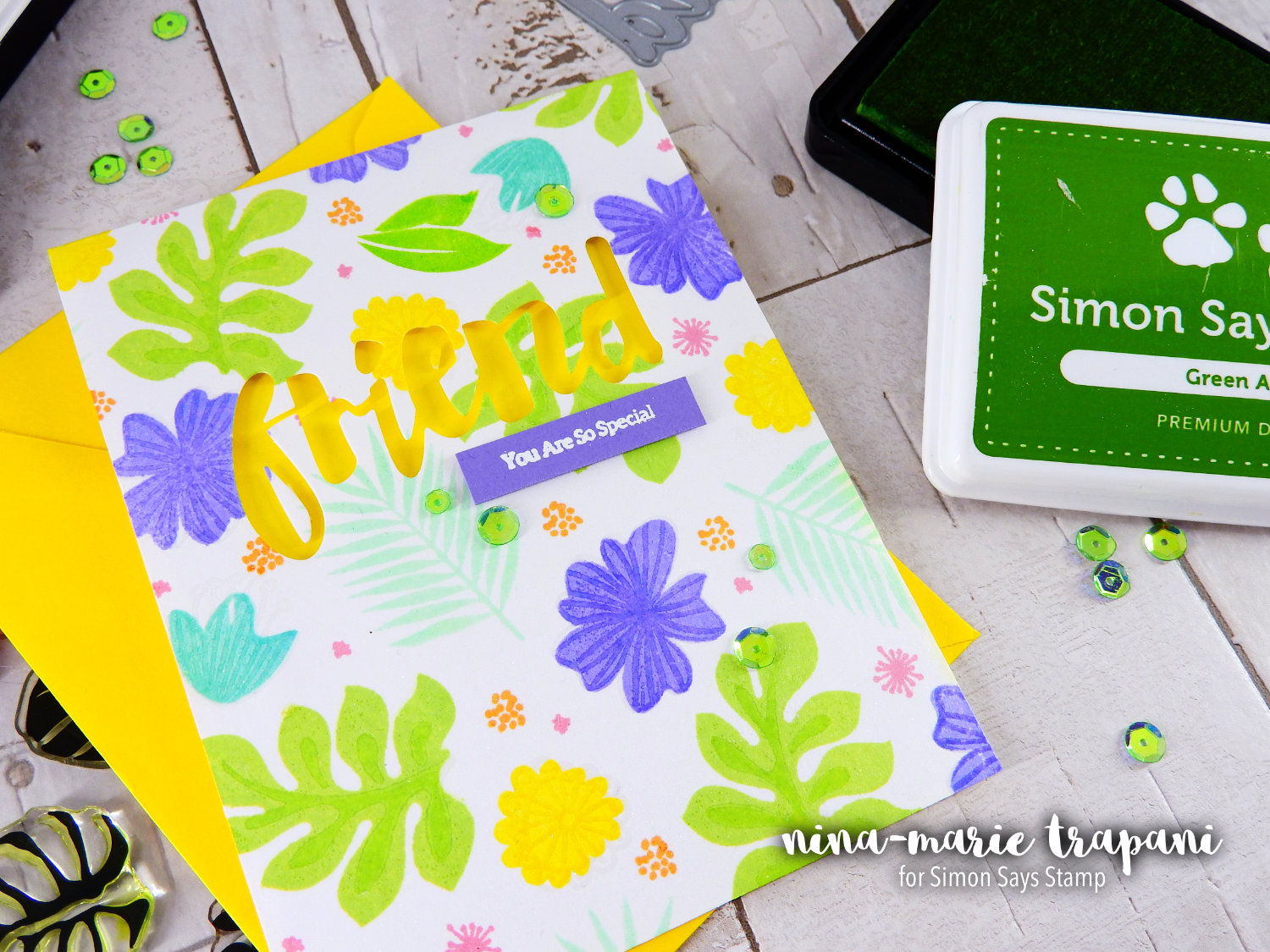
The sentiment features a fun negative/recessed appearance. I used the Simon Says Stamp Painted Friend die and a supporting sentiment from the Wild Beauty stamp set. I chose cardstock colors that matched my ink colors (as closely as possible). For the cardstock colors, I used Bright Yellow and a purple from Penny Black’s Periwinkle paper collection.
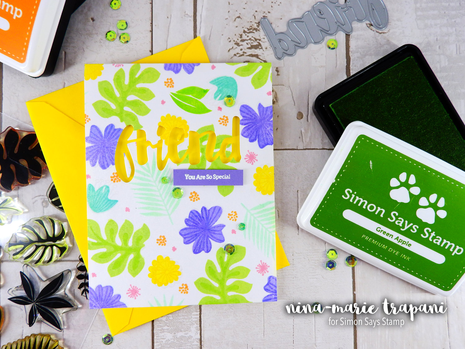
The colors I used today all pair really well with green. You’ll notice I used a lot of blue, green and purple and some pops of yellow. This is an analogous color scheme, which means all of these colors are next to each other on the color wheel. Analogous color schemes are easy to create because of this.
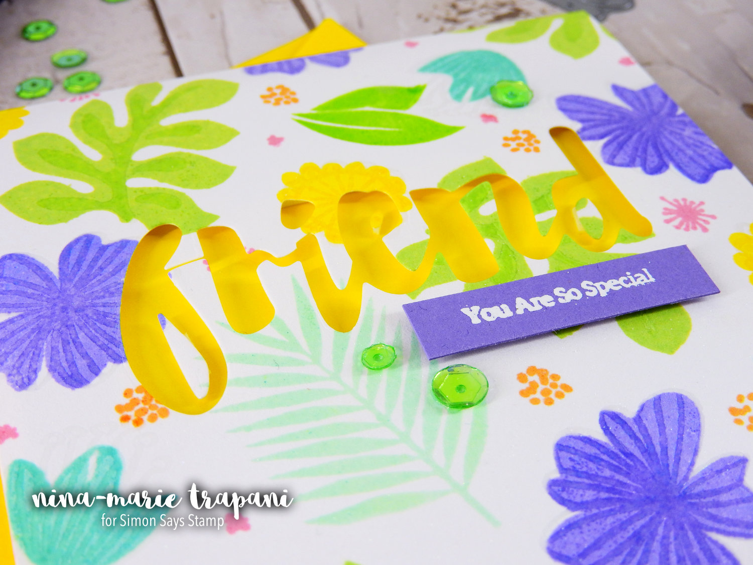
And because I wanted to throw in a bit more green, I used a few Peridot Mist iridescent sequins from Pretty Pink Posh to embellishment the card! The Peridot Mist sequins are a perfect match to the colors used in this card. I also love that how when the sequins catch the light, you can see hints of other colors!
I hope you will be checking out the video below to see how this card came together! Thanks so much for stopping by and visiting us today… I will be seeing you again this coming Sunday and Monday, so stay tuned!
WATCH THE VIDEO
SUPPLIES


Blog Candy Alert!! Follow our blog via email and comment on this post for a chance to win grab bags and blog candy! Remember to tag your awesome projects with #simonsaysstamp on social media so we can see what you are creating!


Love all these vibrant colors! Great card!
Love the card, it’s so pretty!! The colors just pop off the screen!! Thanks for sharing .
Awesome card! Love the bright colours!
Love these colors together! So bright and ready for spring. Great job!
A very happy card!
Love the colors!!
Such a bright and happy card Nina, I love all of the colours that u used and the yellow behind the word friend looked amazing! Thank you for a great video tutorial too, I think heat embossing the second layer of your flower stamps really looked fantastic.
Love, love, love all the yellows! Really hoping SSS will have that bright yellow cardstock and the yellow envelope for us soon!
This is a fun card! Love the colors and details, especially with the word friend die cut into the panel. Thanks so much for sharing your video!!
Great, bright & cheerful!
I really like the stamp layering effect you got from the embossing. Great colors and they have such neat names. I like the friend word popped up as well.
Gorgeous card! I keep forgetting to heat emboss the detail layer–thanks for the reminder!
These colors are beautiful together. A great way to welcome spring.
Beautiful! LOVE your gorgeous colour theme :)
Love all these fresh colours!
Pretty Spring card…love that green!
Pretty card and love the bright colors.
Wonderful card and great video too.
Beautiful colors on your card.
Beautiful card!
very pretty spring card!
Great card. Love the happy colors
Lovely card with lots of bright punches of color. Thanks for sharing.
Very cheery colors!
This is a happy card!!
What a fun and bright card! I love green but right now, all I’m seeing outside is gray and white. ?❄️
Bright, cheerful and delightful!!
Great card! :)
Beautiful card. Such vibrant colours. Greenery never looked so good.
Woah! Love those bright colors! Gobsmacked gorgeous!
The colors on this card are so beautiful. It reminds me of the tropical islands.
Super bright and fun card! Love it!
~God bless~
So bright and cheery!! Loving these colors!!
<3 J
jwoolbright at gmail dot com
HerPeacefulGarden.blogspot.com
LOVE this colorful card!!!
Such a beautiful card!! Love it:)
Always love when you do videos:)
Gorgeous colorful card!!!
This is a perfect card for Spring.
Fantastic colors!! This card would brighten anyones day.
Love the bright spring colors. TFS
Such bright happy Colors! Very cheerful!
Love the vibrant colours of your card!
What awesome colors.
So cheerful, colorful and spring-like, very nice!
Love the colors and the stamps. Great idea cutting the friends out and just leaving the negative. I have to remember this. Thanks for the inspiration.
Such a pretty and happy card! I love the die cut Hello sitting up from the yellow.
Love these bright colors!
Love that fabulous green! Chartreuse is my favourite colour for the past few years so I think it’s great as the colour of the year!
Gorgeous card, Nina-Marie. I am drooling for spring and your card just makes me smile.
Love that green! Pretty card for spring!