Studio Monday with Nina-Marie: Love Your Pet Day!
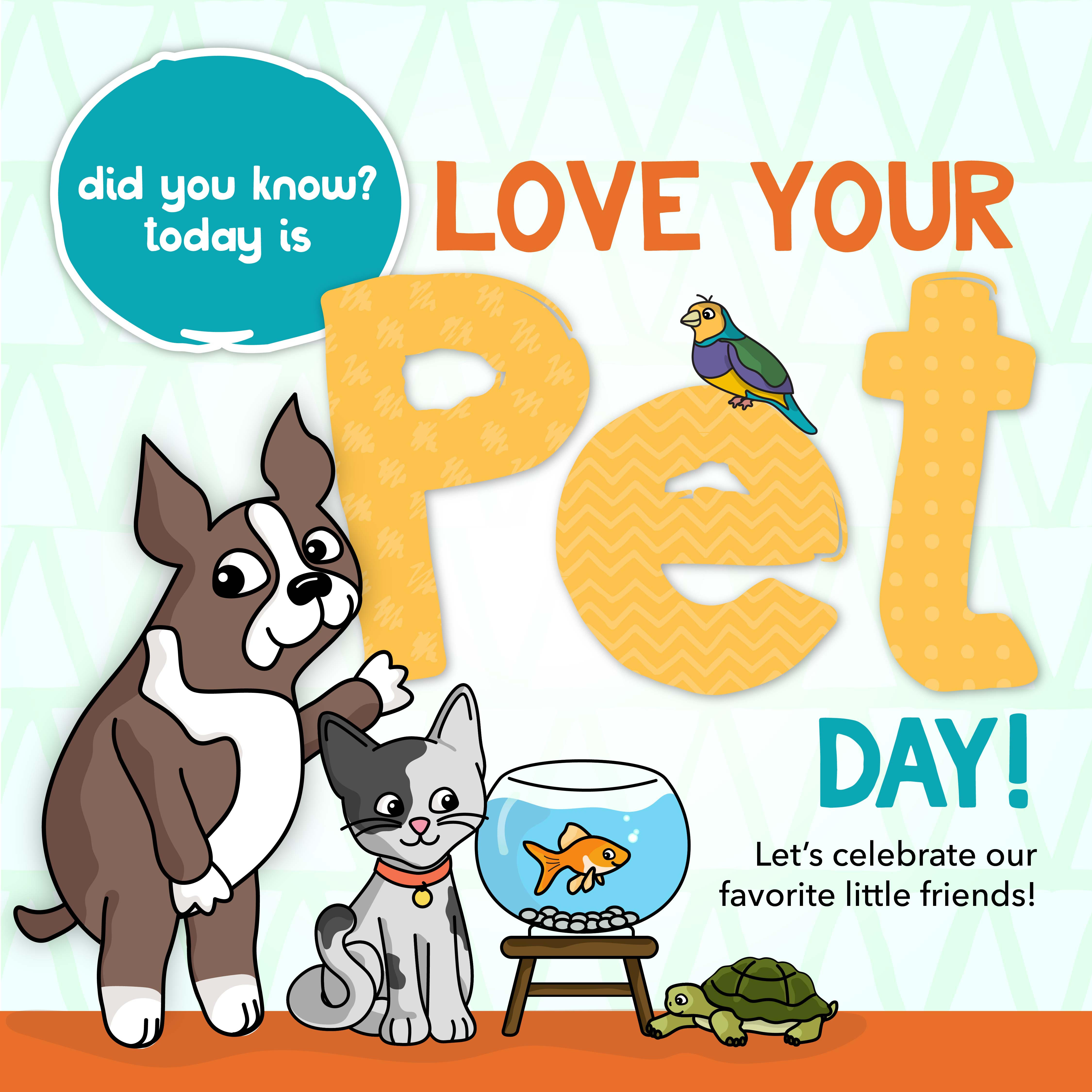
Hello everyone and Happy Monday! Its Nina-Marie here with you today. Have you heard that today is Love Your Pet Day? Its a special day to celebrate how much we love the pets we have in our lives!
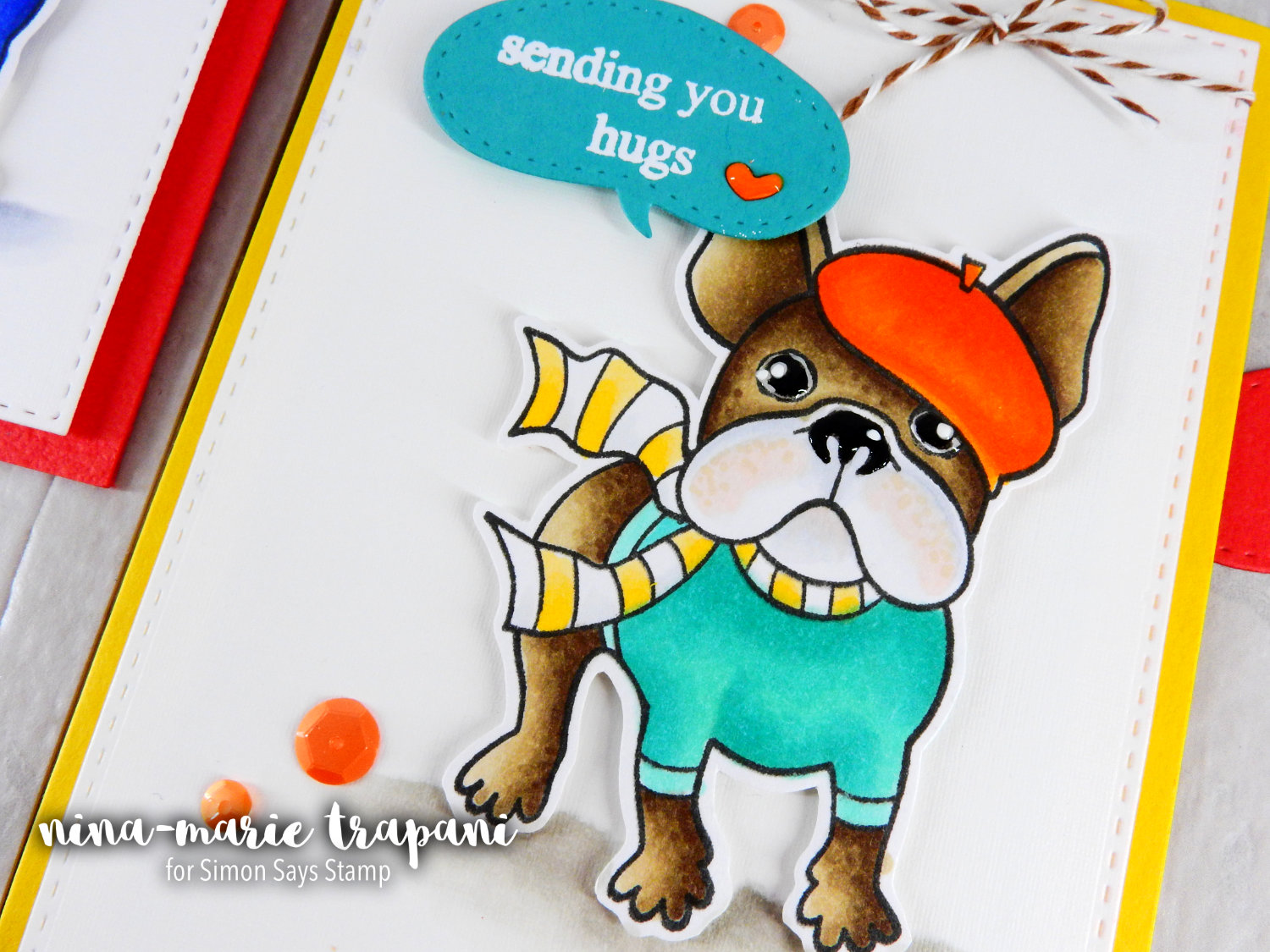
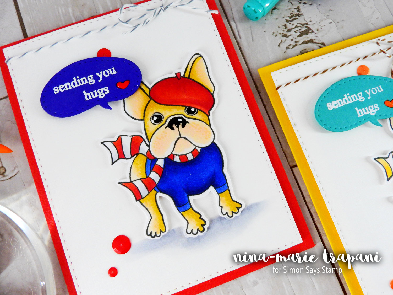
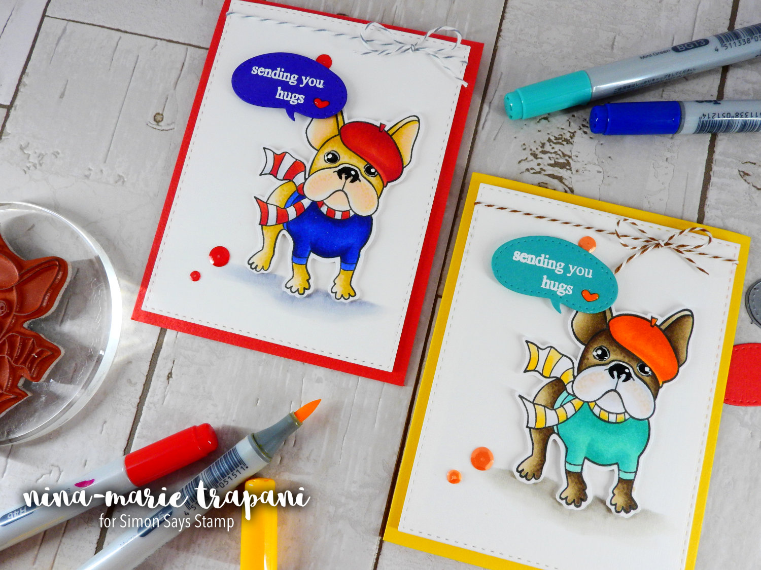
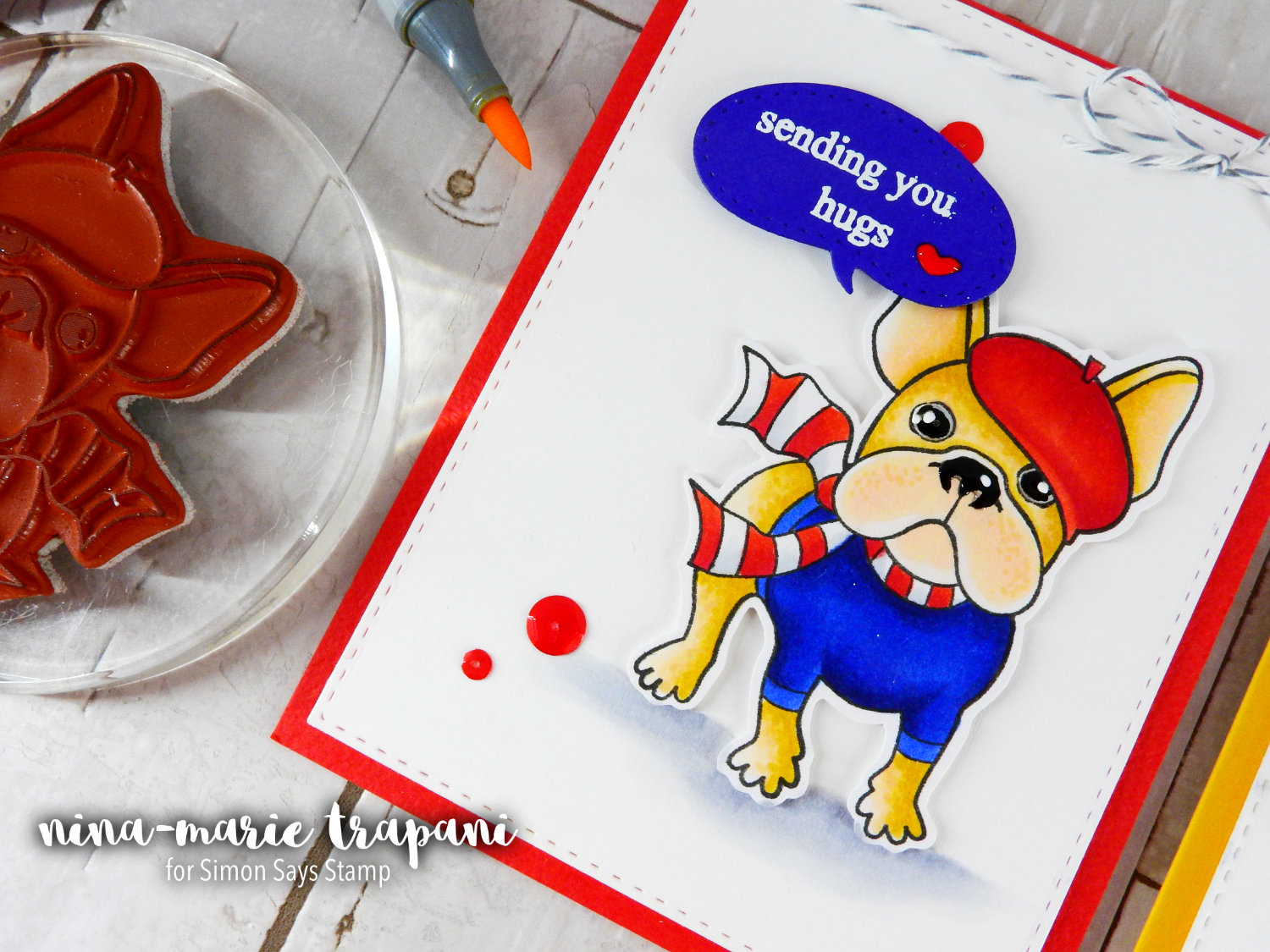
Since today is Love Your Pet day, I thought it would be a perfect time to use pet-themed products in this week’s Studio Monday post! I have chosen to work with the Frenchie Frenchie cling stamp from La La Land Crafts, along with their Heart Speech Bubble dies. La La Land products are new to me, but I’ve been very pleased with the quality of both their stamps and dies!
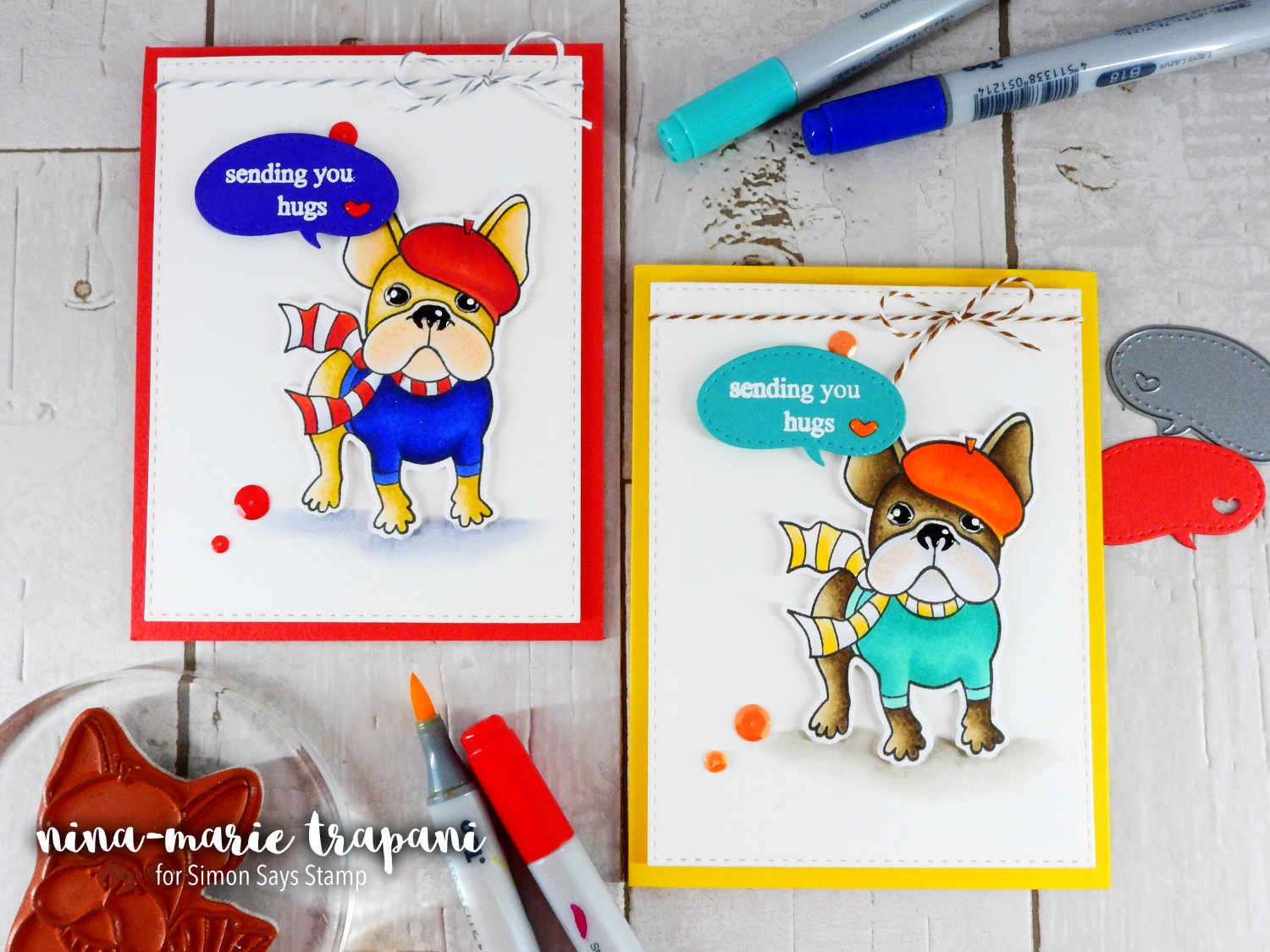
The cute pup in the Frenchie Frenchie stamp set TOTALLY reminded me of two of my friends’ pets. Because of that, I colored the dog to look like their pets! The golden brown dog reminds me of my friend Stephanie’s new pup named Lucas. The brown and white dog looks just like my friend Heidi’s dog named Simon (which happens to be who Simon Says Stamp is named after)! I think it is so much fun to color pet themed products to look like pets we (or our friends) have in our lives!
And while I am talking about the dogs that I colored in these cards: I have all the color combinations that I used today listed below. I colored the images with Copic markers.
Lucas (golden brown)
– dog: E50, E53, Y28, E00, R01
– beret: R24, R27, R46
– shirt: B26, B18, B39
– scarf: R24, R27, C0, C1
– ground: C00, C1, C2, C4
Simon (brown and white)
– dog: E42, E43, E44, E47
– beret: YR04, YR07, YR09
– shirt: BG32, BG13, BG15
– scarf: Y32, Y38, C00, C1
– ground: W0, W2, W4
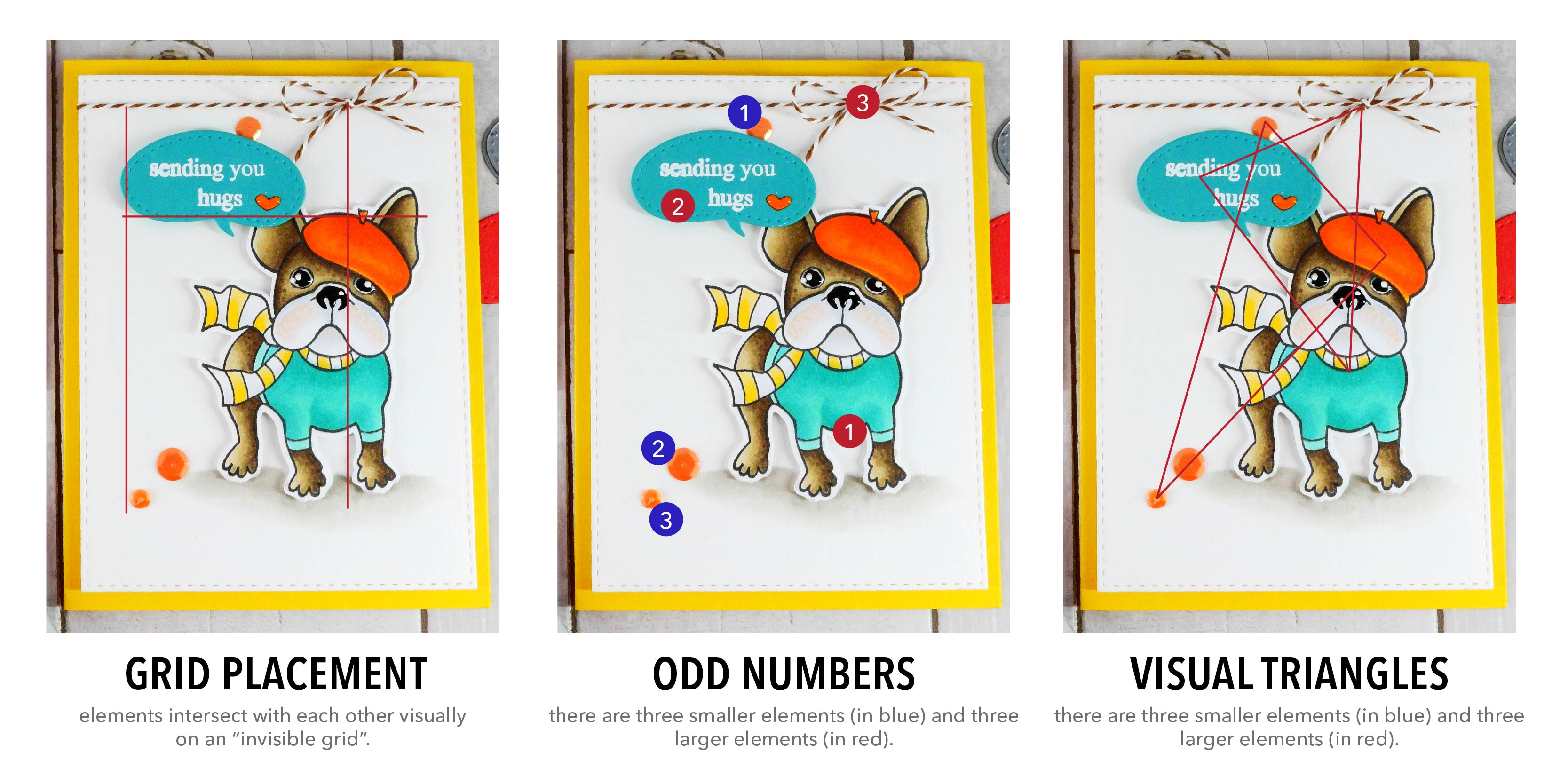
One of the main things I wanted to focus on in today’s video is creating a minimalistic design. These could also be classified as clean and simple. This type of card design, while it may look simple to create, actually requires a bit of thought.
For a card to carry minimalism correctly, you have to make sure that there is one element that carries the weight of the design to draw the viewer’s attention. All the other elements you add should not distract from, but rather frame the centerpiece.
All art is a form of communication. With minimalism, this means communicating that message clearly with as few elements as possible without leaving the artwork feeling like it is lacking something.
There are a few principles of minimalism that I think will help you in creating a clean and simple card. These should help make sure your card carries the message you want to send:
White space: I used a lot of literal white space on my cards today. White space helps keep the viewer from being distracted from the important, main focus of the card. But remember that white space does not necessarily mean it has to be white; I incorporated colored card bases underneath my white background panels. But because the colored card bases are simple and have no distracting pieces, they blend with the white area and subconsciously support the colors used in the dogs. So don’t feel like you have to use only white for the open spaces in your design.
Layout: This is a critical part of minimalism because an incorrectly laid out design will not clearly relate the message you are trying to send to the recipient. Strategic placement will make your clean and simple design look finished. Try arranging things on an “invisible grid”, where elements can intersect with each other visually. For instance: the bows of the bakers twine intersect with the head of the dog, and the bottom of the speech bubble line up with the top of the beret of each dog. Also try using odd numbers for embellishments (the sequins) and make sure that you can see visual triangles in your design.
Color: Our next principle I want to share is color palettes; and more specifically, choosing the correct colors. Attention will be drawn to what kind of colors were used in a design. While this applies to any card, it is even more apparent in a minimalist design because there are less distractions. I like working with a limited color palette when creating a clean and simple card. If you look at both cards I created, I used no more than three saturated colors; the browns, grays and blacks are all neutral in appearance and most of the time be used without any consequence to the design. You’ll also notice that I used colors that all compliement each other. The limited, coordinating palette allows all the elements to coexist on the card together and create a more visually appealing design.
The details: The final principle I want to mention today is incorporating tiny details. I am often adding tiny details to any card I create, but it is especially important to me when I create a clean and simple design. Some examples from these cards: I embellished the eyes and nose of the dog; added texture to the fur and face; used some strategically placed sequins; and even added a coordinating colored heart in the speech bubbles. These take your design up a notch and make the entire card feel finished.
Okay! So that was quite a bit of information to take in, but I believe it is important for you as artists to learn these techniques to help take your designs to the next level. And don’t let yourself feel overwhelmed by the idea of putting the extra thought into a clean and simple card. Believe me, I have been designing for a long time and I know that after doing it so long, its like a second nature. You don’t really think about it anymore; its instead all part of the process.
So I hope you will check out the video to see how I made these cards and hear a bit more about creating minimalistic cards! It really is fun and I hope you enjoy the video as much as I enjoyed creating it! Thanks for visiting with me today… I will see you again next week!
WATCH THE VIDEO
SUPPLIES
 |
 |
 |
 |
 |
 |
 |
 |
 |
 |
 |
 |
 |
 |
 |
 |
 |
 |
 |
|
 |
 |
 |
 |
 |
|
 |
 |
 |
 |
 |
 |
 |
 |
 |
 |
 |
 |
 |
 |
 |
 |
 |
 |
 |
 |
 |
 |
 |
 |
 |
 |
 |
Blog Candy Alert!! Follow our blog via email and comment on this post for a chance to win grab bags and blog candy! Remember to tag your awesome projects with #simonsaysstamp on social media so we can see what you are creating!


Beautiful. I love how bold the colours are and how much thought went into the layout. Now I have to go kiss my dog and wish him lots of love!
Thank you for all the design tips! They are very helpful, especially as I have no design background. Will try to incorporate them in future cards!
As always your cards are amazing dear Nina!!! Love the bright colors!!! I love so much pets and this is a very important day to celebrate!!!
Fantastic cards, love your coloring! Yes, I agree, super design tips for all! Thanks so much!
Great design tips and such cute cards. Cheers.
Great cards and lots of useful hints and tips
ooh, I did not know it was Love your pet day – what an awesome idea:)
Love your beautifully bold colored images, Nina:)
Adorable cards. I must go buy these products now. LOL
Super cute cards :) thanks for the tips
Super cute cards, thanks for the tips!
Really great tutorial, and it is amazing how just a change of color can create a whole new look to the same stamped image.
these are so cute
Two adorable cards, and thanks for all the design tips!
Every day is love your pet day as far as I’m concerned! Love your cards & thanks for all the tips!
Great cards and advice. Off to hug my pet.
Great cards. Love your coloring.
Great ards! Love the bright colours and that wonderful stamp!
Love the card and thanks for the tips on making it!
Adorable Cards Nina! and thank you so much for the tips! i will certainly use them in my projects!
Nina Marie is synonymous with awesome color explosions!!
What a dashing dog!
Such cute cards! Great explanation.
I LOVE to learn and you’ve given me some great tips. Fabulous bold colors and awesome coloring. Thanks so much for sharing with us!
Adorable. Love the beret.
THANK YOU NINA!!!! Rarely, do you find designers giving the Theory of Card Making the time that is needed to those of us wanting to learn! It’s just the basics to card making! ;) I LOOOOVED your video & took notes on the text here on SSS to keep in my files too! SUPER JOB on the video & your SWEET cards! THANK YOU AGAIN for the lesson!!! ;)
So, So cute and the colors are great. Thanks for sharing.
Linda D.
Nina, these cards are really adorable and I enjoyed the tips in the video. A very good tutorial on the process as always.
Thank you for the extra details! I like using 3 of something! I feel placement of the 3 has to be just right1
love all the details. Clean and simple with pizzazz is cool!
Thank you so much for sharing those design principles! So useful and so kind of you! Your cards are simply adorable! TFS
I just Love your cards! They are so cute!!
Great explanation on creating clean and simple cards! Enjoyed the video. Thanks for sharing!
So bright and bold!! I especially like the Simon card.
Such CUTE cards!!!!
Really cute cards – thanks for sharing!
These are so cute! Love the CAS design. Did a fabulous job with it and the explanation of minimalism. Great post Nina ♥
I just love these cards. The compositions are so nice as well as the bright beautiful colors. I try to use visual triangles when I remember. Great techniches. Thank you for sharing. I love learning new ways to layout my cards. I
Thank you for those great tips!
Just adorable!
Great cards, thanks for those tips!
I will have to make a card in honor of my pet parrot, Rocky!
Great cards.
Beautiful cards!! Love your coloring!
Very cute cards!
I have known about the concepts that make a card more visually appealing, but I’ve never seen someone break it down as clearly as you have. Very nicely done!
These cards are so adorable! Thank you for sharing your tips on creating clean and simple cards :)
Fun cards! Love the coloring!
Coco says every day is Love Your Pet Day!
Thanks for the great design tips!
Love that beret on Frenchie. Tres chic.
Super cute cards!!
Nina Marie–very cute cards! I also liked the explanation in the video and the diagrams in the blog that showed the how’s and why’s of putting the cards together. Happy Pet Day & thank you for once again sharing your techniques and inspiration. I learn so much from you.