Fruity Pointillism
Hi readers! Happy Saturday to you! I’m excited to share a very fun technique with you by Allison Cope! As a true blue fan of the impressionism eras of art, and a fan of Georges Seurat, I love seeing past art forms being introduced back into the modern era of art! This fun tutorial by Allison does just that!
Enjoy!
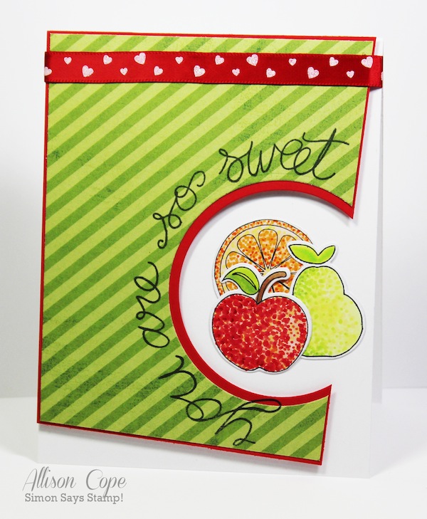
Hello everyone! I’m Allison Cope and I’ll be your host today! Today I’d like to show you a different way of coloring your stamped images. This technique is called POINTILLISM. The idea behind this process is to use a variety of colors and different sized dots to color in your image.
Let me show you how EASY this technique is!
Supplies:
- White Cardstock
- Fruity Sweet Stamps & Dies
- Copic Markers (on sale NOW! Use code: Markers to take 25% off!)
- Lots of Patience!
-
Begin by die cutting and stamping an image of your choosing using a dye ink like Memento onto smooth white cardstock. I am going to use Copic Markers to color in my stamped image today but any type of marker or pen will work for this technique. I used the Simon Says Stamp “Fruity Sweet” stamp and die set for my card today. This type of image is PERFECT for this technique!
-
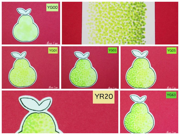
Begin with your lightest colored marker and color in a base color for your image. I used Copic YG00 for my base. You can skip this step but I always like the look of a flat base color on my images to begin with.
-
With your next lightest marker colour begin adding a variety of different sized dots of color to your shape.Make sure you do not dot your area in rows. You want random placement of your colored dots to make your object look more realistic. The smaller and farther away your dots are, the lighter your object will appear. The larger and closer your dots are, the darker or richer in color your object will appear.
-
Begin added another richer color to your object. As you can see, for my Copic YG03, I have only added it to the left side of my pear shape. I’m building a richer color on the left side and leaving the right side more light in color. This adds natural shading.
-
Again, I have added another darker shade of green to the left side. The more gaps you leave between your dots, the lighter it will appear.
-
This time, I added a light shade of peachy toned Copic to my pear, YR20. If you look at some varieties of pears closely, they have a peachy colored under tone to them so I thought this color would work perfectly!
-
I added one last dark green tone to only the very outer edges of the left side of my pear. As you can see, the left side of my pear appears darker and the right side is quite a bit lighter.In my little example square below, you can see how the lightest green dots begin on the left and graduate to a deep rich green on the right. Just by using small dots of color and overlapping your areas of dots, you can build a gradient of color!
Practice on scrap paper first so you can understand the pressure you need to use with your markers.
Let your dots dry in between applications! This will allow them to remain a crisp dot and not blend into the other colours below – your project may become more muddled with colors if you add your colors in quick succession (unless you wish them to blend that is!!).
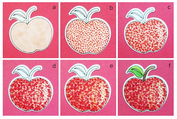
For my card, I also wanted to use a red apple too! For my apple, I wanted my colors to blend a little more so I added my layers quickly one after the other so they would blend. So here is how I colored it:
a) A base color of Copic R12 all over the apple.
b) Fully covered apple with Copic R14 dots.
c) An 80% covered apple with Copic R17 dots – leaving a lighter area on the right side of the apple.
d) A 30% covered apple with Copic R29 dots – mostly applied to the left side for shading.
e) An addition of a Copic YR20 for a slight orange tint all over the apple’s surface.
f) A final addition of Copic YG03 for a tint of green. Coloring of the stem and leaves using E23, E25, YG00, YG03 and YG63.
I hope you have enjoyed my coloring tutorial today! I had a blast coloring and creating with this adorable die and stamp set. I hope you give this coloring technique a whirl real soon!
Happy stamping!
~ Allison Cope ~
SUPPLIES:
 |
 |
 |
|
 |
 |
 |
 |
 |
 |
 |
 |
 |
 |
 |
 |
 |
 |
 |
 |
 |
Thanks for reading and thanks to Allison for being our fabulous guest!

Blog Candy Alert!! Follow our blog via email and comment on this post for a chance to win a special blog candy!


Special Simon Blog Candy ~ I’m in! Thank you for all the inspiration and this chance!
what a fun technique.
stamping sue
http://stampingsueinconnecticut.blogspot.com/
I am going to try this!
Fabulous tutorial, tfs! x
Super cute card and nice tutorial!!
Wow what a great idea! It looks great.
Nice idea… Love the card. Thank you for sharing
Thanks for showing this technique!
How much fun!
WOW!! What a very cool technique!! Thank you for sharing!
Great technique! Thanks for sharing it with us!
What a fun technique. Hugz
Fun!
Love pointillism! It’s amazing when you look really close and see the different colours the artist uses together to create the effect he wants. Great idea to try.
Love this technique and Allison’s approach to implementing. I have not used it since my high school days. It will be fun to play with it again. Cheers!
Love this technique …gotta try it…thanks for sharing how to do it!!
Great technique! TFS ;-)
wow cute!
Great tutorial, a sweet creation, thanks for sharing!!!
Such a fun idea using Copics! The fruit looks so cool! Awesome card!
It looks scrumptious! Love the fruity card!
Great to see older techniques coming back into vogue.
the fruit looks wonderful.
Great tutorial thanks!
I love this idea!!!
Fruit is a favourite of mine for summer cards. Nice and fresh designs here.
Beautiful card, great tutorial, gotta try it! Thanks!
WOOHOO! So great seeing Allison over here with this amazing tutorial! WOW!!! Impressive!!!
Cool technique :)
Hi Alison. Wonderful tutorial. I am going to try it.
Hi Ally! AMAZING finding you HERE! SUPER TUTORIAL & FABULOUS CARD! :D BLESSINGS!
Fun design, Allison! Love the cheerful colors as well. Thanks for a chance at the blog candy. (Already a follower)
What a creative idea! I love all the Impressionists but never would have thought to imitate this technique with copics. Must try this!
Cute fruit card! Love the pointillism effect, but you lost me at “lots of patience”! Ha. :)
<3 J
jwoolbright at gmail dot com
HerPeacefulGarden.blogspot.com
Thanks Ally for a fun technique. I’ve always enjoyed Seurat.
Shades of Seurat! Very cool! Love the circle cut away too.
This is a great idea!
Wow! Great fun technique and one that I will surely try. Thanks for the detailed info and for sharing your cute card.
This is just WOW !
What a cool technique! Thanks for showing us how. I love your card. Have an awesome weekend!
Nice card n what a good idea…
i love the colorful fruit!
Ooh, deliciously lovely! :D
Impressive! love pointillism effect!
Great to learn new techniques. Thanks!
Love this! Soooo fun! I have to try.
~kim
Thanks for this great tutorial.
What a fun technique. Thanks for sharing.
What a neat technique for coloring the fruit!
This is a very interesting technique and a great card resulted.
Love this bright card–and thanks for the tutorial on this interesting technique, I’ll have to give it a try!