Doodling with Debby: Watercolored Flower Border
Hi friends! Happy Wednesday! Welcome to the latest edition of Doodling with Debby with the always fabulous Debby Hughes! Be sure to watch the video and read on to learn more! Enjoy!

Hi it’s Debby here and for my Doodling With Debby video feature for Simon Says Stamp this month I’ve been inspired by the changing seasons to dig out all my flower stamps recently and today I’ll be combining the Center Cut Flower background stamp with a sentiment from the So Loved set, both by Simon Says Stamp.
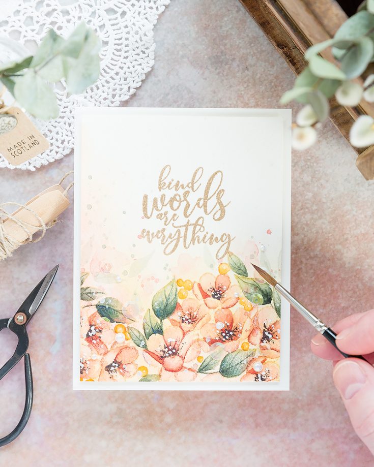
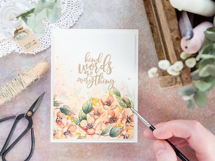
The Center Cut Flowers stamp has two elements, a frame, and a centerpiece and they can be stamped together or separately. I’ll be using just the centerpiece today to stamp and watercolor a border along the bottom of a piece of Arches Cold Pressed watercolor card, but before I stamped the border, I gave the watercolor card a wash of color first. I often paint my backgrounds after stamping and coloring the focal points, but this stamp has lots of detail going on, and the gaps between the flowers are quite small. To get a cohesive background, I thought it best to do the background first and then paint over the top. So, having given the

Having stamped the image once on the bottom right, I moved the card and lined up the stamp again but this time in the bottom left. I tried to nestle the image into the first impression so that there were minimal gaps between the two. I think one leaf overlaps, but that is OK as the ink reacts with water I can choose which part of the overlapping images to paint and you’ll not know they ever overlapped afterwards. I taped the watercolour card to a board, I did this when painting the background too, and the reason for it is to prevent the card warping when using a lot of water. I certainly needed it when I painted the background as I liberally applied water then but possibly less so when painting the flowers as much less water was involved.
OK, so for the background and painting the focal point flowers I used Daniel Smith watercolors. For the background wash I mainly Quinacridone Gold and Quinacridone Coral. For the leaves I used in the main Undersea Green, Jadeite Green and a little Lunar Black to deepen the mix for the shadows. For the flowers, I used Quinacridone Coral, Pyrrol Scarlet, and Alizarin Crimson. The benefit of having the warmth of the Quinacridone Gold as the background wash is that anything you paint over the top will pick up that warmth and glow. It is one of the reasons I chose to paint the flowers in similar colors to the background to get that warm tone on tone look.
Now I have to say that for a long time I wasn’t impressed with where this painting was going. It was a bit of a mess at times, to be honest, and that is why I think there is a lesson in perseverance to be learnt. Because quite often watercolour paintings look pretty rubbish before they start to improve and by sticking with them and working at it then the result is so worth it. This painting may not be my most favourite ever, but I certainly love how it came together in the end.
With the background wash lending, a warm glow to everything, I painted a base layer first moving around the image so that I wasn’t painting two areas next to each other until they were dry. This prevents the colors mixing and blending and can help to separate the two areas. So, for example, if I painted two petals next to each other at the same time, the paint would likely pool and gather as one puddle with the colors mixing together, and you’d lose the definition where one petal ended and the next started. However, if one petal is dry when painting the petal next to it, then the paint won’t spread over to the dry area, and each petal will be more defined. Having got a base layer down I simply went back in with more layers deeper in colour, keeping these deeper areas to where shadows would naturally occur – at the base of petals or where they overlap or butt up against one another – those would naturally be where you would find shadows and so that’s where I kept the deepest shades.
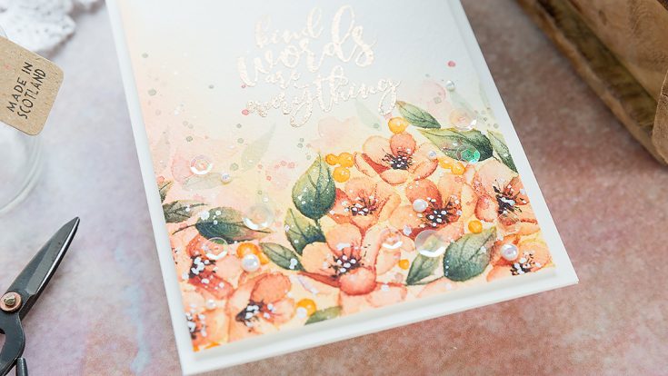
To finish the flower centres, I added black dots and a few flicks radiating out from the centre with more dots on the end to represent flower anthers. I speeded up the drying process for this part with a preheated heat tool and then added dots of white gouache on top. Gouache is an opaque watercolour, and you get lovely bright white highlights with it.
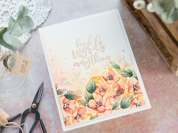
I like to add the impression of more flowers and leaves in the distance to fill out the area more. To do this, I used the same colours I had been for the flowers and leaves but diluted them down with more water. Things in the distance are paler and so painting these leaves and flowers with the diluted mixtures will automatically make them appear as if they are further away. For the leaves, I used the shape of the brush to pull a few leaf-like shapes. Starting with light pressure, then increasing the pressure slightly to get the width of the leaf and then lifting again to trail off to the leaf tip. I also added some vague flower shapes too. The great thing about painting like this is that the shapes don’t need to be precise, the impression of a flower is interpreted by the eye, and so a faint pink blob really does read as a flower in the distance in this context.
I finished off the painting with a liberal splatter of Perfect Pearls solution and some of the leftover paint. To give more definition to the petals and leaves, I used Faber Castell pencils to deepen the shadows and define the shapes more.
For the sentiment, I used the So Loved set which has some gorgeous sentiments. Now the safest thing to do with a finished painting would have been to stamp the sentiment on a separate piece and add it to the card in some way. However, I really wanted the sentiment stamped above the floral border, and so I took a gamble and went for it. To give me the best chance for clean, crisp embossing on this textured watercolour card, firstly I treated the card with an anti-static powder bag to help prevent embossing powder randomly sticking everywhere. Then I stamped the sentiment several times in clear embossing ink to ensure a good impression. I then sprinkled with Antique Gold embossing powder from Simon Says Stamp and heat set. And actually, considering I was stamping on a textured surface, I was pleased with how this came out.

I trimmed the watercoloured panel down to be just slightly smaller than an A2 card base, added foam adhesive to the back and then adhered it to a card base cut and scored from Simon Says Stamp Ivory card. This is my favourite card as I think it is the closest colour match to the slightly creamy colour of the watercolour card. To finish the card, I added a sprinkling of sequins and pearls from Little Things By Lucy’s cards snuggled in amongst the flowers and help in place with Gina K connect glue.
Thanks for joining me today, and I’ll see you next time for Doodling With Debby.
Watch below or in HD on YouTube.
SUPPLIES:
|


Thanks so much for stopping by and thanks to Debby for being our guest!

Blog Candy Alert!! Follow our blog via email and comment on this post for a chance to win special blog candy!


So so pretty. I’m going to watch your video when I get back from holiday and hope to put into practice.
Just absolutely breathtaking!!
Such a lovely card and terrific instructions. I am impressed with your technique for adding subtle background leaves and can relate to the courage required for stamp embossing the text. Shading with pencils is a great tip, too.
Beautiful card as always Debby, so wish I could watercolour like that!
I love the way you show us how to just keep going back to deepen the colors until we are happy! Beautiful card!
Debby, I know you said this wasn’t one of your favourite cards, but it is one of mine! It is stunning, and thank you for this tips! Especially about painting each item so they aren’t touching. I am going to try this technique on my next watercolour card. The results are stunning!
Beautiful card!! I love the soft colors. I don’t usually like oranges but this is spectacular!!
I love the softness of the colors on this card. It’s beautiful.
Beautiful! LOVE watercolor!
Serene and beautiful. What an absolutely gorgeous card. Debby colors so magnificently!
Such a gorgeous card! I love those colours!
The flowers are gorgeous.
I envy anyone with this talent
for beautiful coloring.
thanks for sharing
txmlhl(at)yahoo(dot)com
Oh my! Such talent! I wish I could paint like that – the card is gorgeous.
What a gorgeous card! I love the warm colors- beautifully watercolored!
Very pretty design. Thank you for the clear instructions as they are much needed when I go near watercolours x
Your card is lovely! I enjoyed the video of how you colored it.
Gorgeous card, Debby. Love the soft colors.
I want to get my cards to look like this!
This is a really pretty card! :)
Your card is gorgeous! I love how you colored the background and floral image. Thanks for sharing your tips. Adding the look of extra flowers in the distance is a great idea. :)
It’s hard to imagine that any card of yours would look “pretty rubbish” at any time. I’ve had many watercolor cards look that way and couldn’t save them. This is beautiful and I love the background painting!
JUST incredible coloring! WOW WOW WOW
Realy pretty, I love it!
Simply breathtaking! Wow!
Stunningly beautiful and elegant card. The watercolouring is outstanding! Love it!
Such gorgeous card. I would frame the card and hang it in my bedroom. :)
What a beautiful creation! The flowers are so beautifully colored and the sentiment is wonderful, too!
A work of art Debby. Absolutely gorgeous!
Oh Debby I’m speechless again. It is probably my all time favourite thus far. You just keep perfecting your skills. Thank you for helping us so much with hints and tips on technique. I’ve learned a lot from you but sadly my results are amateurish but I do have fun!
That is just amazing!!!! you are so talented–I hope that you know that. Not just anyone can make something like that (although talented people always think that others can, they just need practice. NOT true). Anyway, it looks amazing.
I think I could listen and watch you paint all day, such a beautiful piece of art.
Debby, this is so amazingly stunning that I am in awe of your talent. The soft colours are so gorgeous together. You are a wonderful artist.
As, always beautiful watercolor from Debbie. Thanks so much for the inspiration and video.
So pretty in these peachy colors.
Oh my!! Your coloring is stunning!! Amazing work!!
Stunning Floral card. Love watching Debby paint and create!
Such a beautiful card!!!!
Debby, this card is utterly gorgeous! I love how you added flowers in the distance and I love to watch your process.
Oh how beautiful!
I like your colors, and how the background gets soft, sort of like how it looks in a photo. This is a really great looking card.
This is absolutely gorgeous, Debby!!! I love the colors!
Amazing card Debby, love your water coloring!
Wow!!! Stunning card!!!! The colors are Amazing!!
Wow this is so beautifully done, I enjoyed watching the video very much!! Thanks for sharing.
Your card is gorgeous Debby! The way you kept the colors in the pale tones just is fabulous. Thanks for sharing.
This is a beautiful card. I love the colors you chose here and although this may not be a favourite for you, it is my favourite.
Hi Even though this isn’t one of your favorite cards, I think it is beautiful. The colors are so soft and delicate.
Such a beautiful card.
Beautiful card Debby! Thanks for all the tips and tricks! I’ll have to try your water-coloring technique! TFS
LOVE! LOVE! LOVE, this technique! You have inspired me to inquire about classes in my area. Thank you for sharing your mad skills.