Distress Ink Color Pop: Lucky Clover!
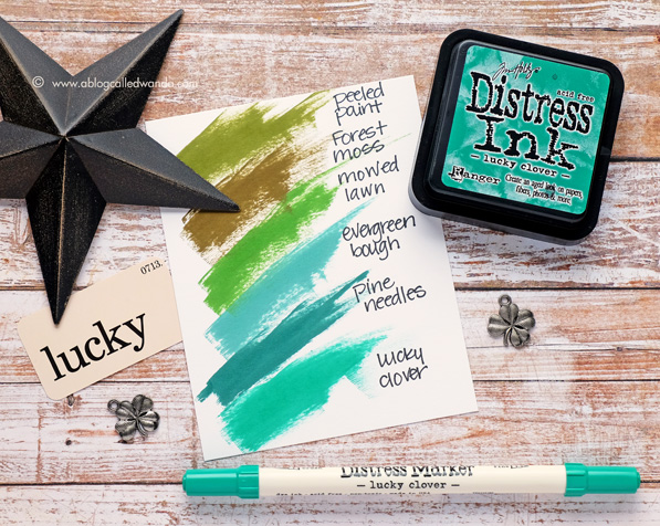
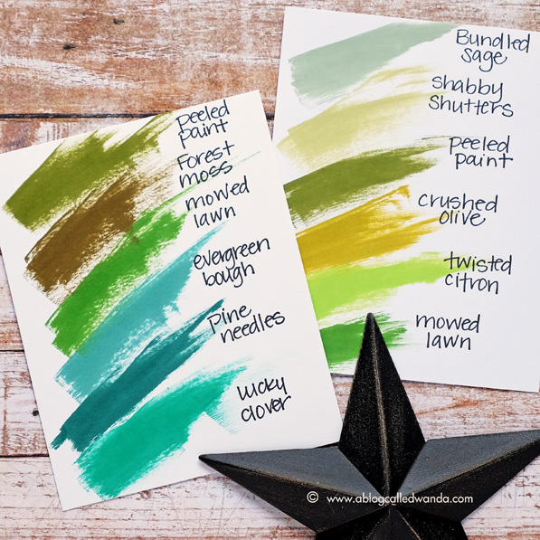
Hello! It’s Color Pop Day! I really look forward to this every month! I’m kind of sad that this is the next to last one! The last color has been announced and it’s Candied Apple. That makes 12 new beautiful colors in 2015. It’s been great fun to anticipate the new colors. Today I am featuring the gorgeous Lucky Clover! The color for November. Oh my. It’s awesome! It’s a beautiful emerald, bright, clean green. I like this one a LOT! The swatch above shows you where this new green fits into the Distress Ink color family. I put another swatch at the end of the post to show the rest of the greens for you. I find this really helpful when I’m trying to decide on colors. This color said “Starbucks” green to me! Ha…I can find a coffee reference in just about anything! I paired Lucky Clover with some rich brown hues to make a coffee themed card.
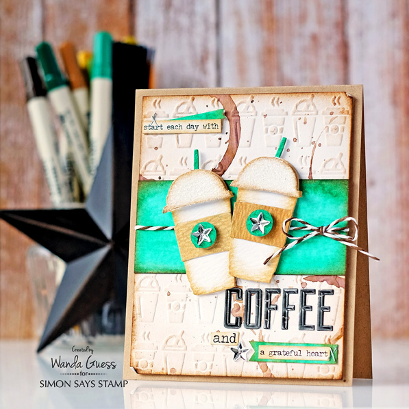
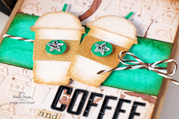
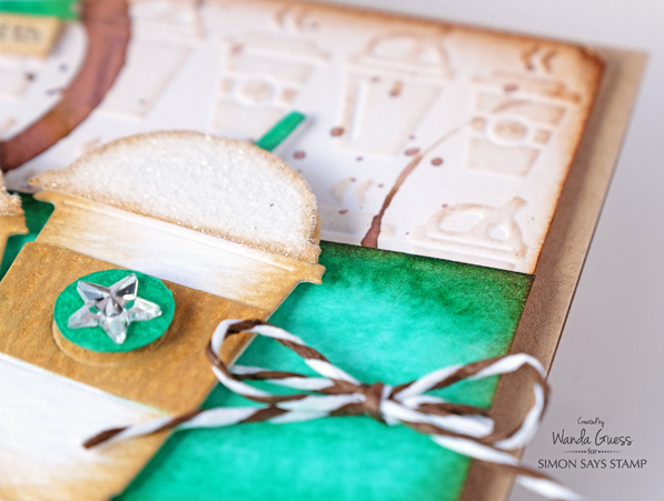
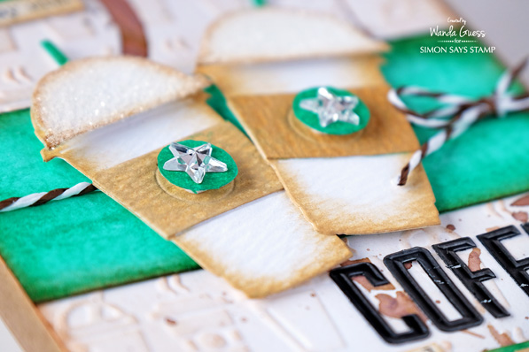
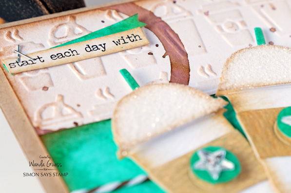
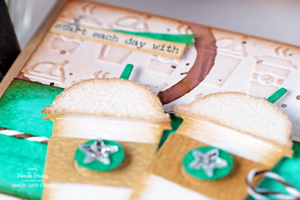
How totally adorable are these Mini Coffee Dies?? They are called Fresh Brewed. There is a hot cup and a cold cup in the set. I used the cold cup to make a pair of drinks for the focal point of my card.
I used the Lucky Clover Ink to make a watercolor panel as an accent piece on the front of the card. This really pops the color! I added tiny green banners for just a little bit of Clover throughout. The sentiment strip is from the Occasions Small Talk stickers. I cut the sentiment in half and put half of it in the top corner, and the other half in the bottom corner. This is one of my favorite sayings and I love that it was part of the stickers pack!
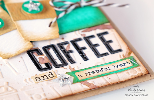
My background layer is super fun! I made it using the Sizzix Texture Fades “On the Go” embossing folder! Coffee cups! I embossed it onto a piece of watercolor paper and then edged it with Vintage Photo and Ground Espresso Ink. Ground Espresso was the natural choice right?!
One tip for getting your embossed images to stand out is to gently ink over them. After embossing, I took a sponge dauber and barely went over the coffee cups. This creates a depth and shadow for the embossed parts. I wanted it to look like coffee cup rings on my paper. To create this I put some Ground Espresso Ink onto my craft sheet and added water. Then I took a small juice glass, rolled it around in the ink, and put it on my paper. So fun! I used the new Tim Holtz Splatter Brush to add drops of ink also. 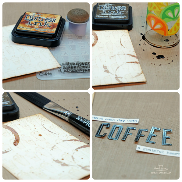
To make my cups, I die cut the shapes three times out of watercolor paper. Then I cut the different pieces apart with scissors. Then I added color to the pieces. The fun part was adding lots of Rock Candy Distress Glitter to the lid piece! When I assembled them, I used foam tape to pop up the center piece, and added a mirrored star.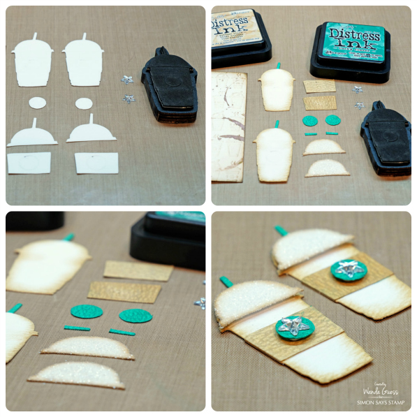
I used some brown and white paper string to add a bow. I used the Deco Type Letters to spell out the word COFFEE on my card….and started putting the whole thing together.
Here is the other color swatch. This shows most of the greens in the Distress Ink product line. They are all beautiful! Tip of the day: CLICK HERE to get your downloadable color chart for all of your Distress Inks! All the new colors have been updated. Print it out on nice thick cardstock and stamp all your colors! I keep my chart on my desk at all times.
Okay, that’s it for today! Thank you for joining me for another episode of Tim Holtz Distress Ink Color Pop! Have a great day!
SUPPLIES:
 |
 |
 |
 |
 |
 |
 |
|
|
 |
 |
 |
 |
 |
 |
 |
 |
 |
 |
 |
 |
 |
 |
 |
 |


Great card–love all the details. This is a great color–I’m waiting for my order with it to arrive!
Love this idea and since I have all the distress inks ever made I can do this . I love this green as it really does pop! Good Job!!
Pretty color. Love the card.
what a fun card – definitely Star Bucks green and Ground Expresso – perfect!
This is a great card and loved all of the techniques. Great color. Thanks for sharing.
Linda D,
Coffee and stamping are two favorite things so you know that I love this card! This embossing folder and the coffee cup dies combine for a gorgeous card
Love this colour
Cute card! I want to re create it! My favorite distress ink color is Blueprint Sketch, but all of them are beautiful!
Lovely color and I love the little coffee cups!!
<3 J
jwoolbright at gmail dot com
HerPeacefulGarde.blogspot.com
Another fabulous colour….cute card too!!!
Lovely card. Gosh, this colour reminds me of my great grandmother’s kitchen! The walls and cupboards were this colour. She lived to be 103 btw.
Love how you used the Lucky Clover. Can’t wait til you use the CandyApple Red!
Love that lucky clover colour…and the card turned out fabulous
Awesome card! Love the whole design.
My favorite of the 2015 colors has to be Cracked Pistachio ♥
Wow, what a great card with an awesome sentiment! And love that Lucky Clover! :)
such a pretty colour
Oooh I LOVE this shade! I just bought a new t-shirt today that colour!
Fabulous card – love the coffee rings, the sentiment and the colors. Thanks for the inspiration !!
Twisted Citron was may favorite. I don’t have candied apple yet but it looks like it could bump citron out of first place.
Luck clover is my fav. I seem to do a lot of cards in blues and greens.
Fabulous card!!! I love the color and I have to agree with you that the color does say Starbucks Green!!
Love this card! The juice glass rings is a clever touch. Will be using that one. Thanks for showing all the colors green together. So easy to see which one is best for the project at hand!
I love the Lucky Clover but I really really really liked the Wilted Violet and think it was the best addition. Thanks SSS!!! =)
Love this card… especially since I love coffee so much! Great use of the color!
Great card and colour!
Great card! Lots of detail work involved, but it sure payed off! Love the coffee cup background, and how you highlighted it with the inks. TFS.
Cute cards and thanks for the color comparison. My fav color is abandoned coral. Love it.
Love that card – I hadn’t realised how bright the Clover colour was! It’s great. My fav though has been Cracked Pistacio – loved it on some of my Christmas cards!
Great coffee card design.–I like this shade of green.
Lovely card, loving the shades of turquoise and browns here. My favorite color has to the Lucky Clover, I am bit biased with this color, I simply love it.
I love the Lucky Clover color!!
Great card thanks for sharing how you made the card.
I need to pick up all of the new colors. thanks for the inspiration
I love Wanda’s Color Pop posts–so creative. This card is fantastic! I love that background embossing folder and the way she used the quotes on her card.
Amazing card! Love everything about it! You thought of every detail! My fav color is Wilted Violet.
Very cute card! I love all the texture!
I love the abandoned coral color.
Cool project. Choosing a favorite ink color is really tough, since all twelve colors are so gorgeous! Though I seem to reach for my Twisted Citron most often.
I’m all about reds, so candied apple is my favourite of the colours!
My favorite color is candied Apple. It will be great for Valentine projects.
OMG!!! I LOVE this card. Obviously I love coffee too :)
Just how awesome is the colour. Who would have thought of using a green on a coffee card. I have to try out making something with these colours soon. Thank you so much for such an amazing looking card and the idea <3
Such a beautifuuly made card. My fav release so far has been the Crushed Olive. Just love that color.
Such a pretty color and cute projects!
Fun card, Wanda. Cracked Pistachio is my favorite & I also really like this Lucky Clover.
Lovely card and use of the colour.
I love the brightness of Lucky Clover, it makes this card pop! My favorites are Craved Pumpkin, Mermaid Lagoon and Lucky Clover. I couldn’t pick just one.
I love Twisted Citron, with Wilted Violet a very close second. Thanks for sharing your card and the colour comparisons.
Wilted violet is my favorite distress ink color for 2015. I just love that shade of purple
Another great colour, thanks for the demo. My favourite so far I think is the Blueprint sketch colour. Love the tinge of mauve in there.
Oooh! I think Wilted Violet and Abandoned Coral are my faves. Not sure I can pick just one! ;)