Distress Ink Color Pop: Candied Apple!
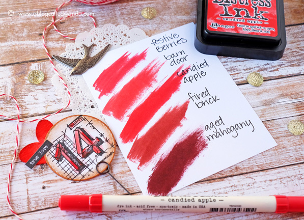
Hello creative friends! It’s Color Pop Day! This Color Pop is sort of bittersweet…because it’s the last one! Twelve beautiful new colors for 2015! Can you believe it? What a fun ride it has been. I have really truly enjoyed sharing with you and bringing you a project with each new color. I’m sad it’s over. The good news is that I think that maybe this is my favorite project of all of them – and I have been so anxious to show it to you! The final color in the Distress 2015 ink series is Candied Apple. It is a beautiful, bright, apple, fire engine RED! Man, this color is vivid and bright and I love it! The swatch above shows where it fits into the Distress Ink color family. It’s very close to Barn Door in my opinion – with a little more warmth to it. I think it’s the perfect color for Valentine’s Day. This color just had to be made into hearts! Since this color is so vivid, I paired it with neutrals for today’s project – Vintage Photo and Antique Linen.
Before we get too far into the photos – I want to tell you some other good news! Since we got lots of good feedback on the Color Pop Series, we have decided that I will keep doing a monthly Ranger Color Series. YAY! I’m still figuring out the best ideas for it. Maybe I will show color combinations….or maybe feature some of my favorite colors….or keep it seasonal? I would really love your input on this. Tell me what you want to see more of!
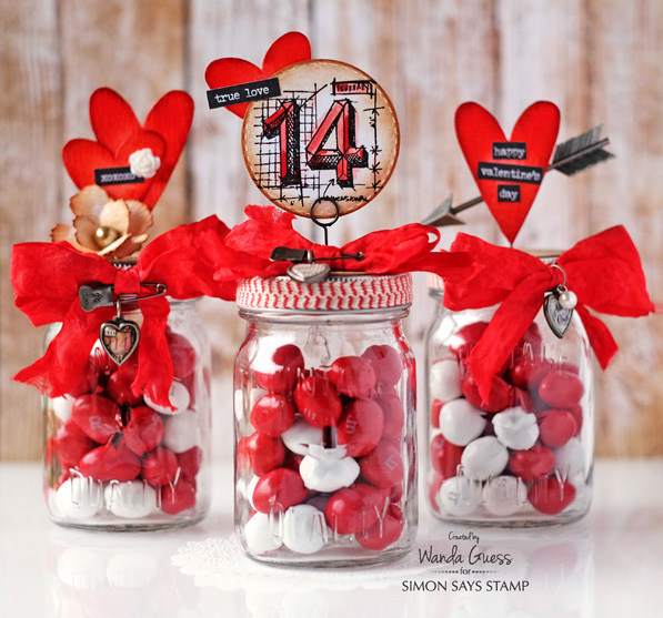
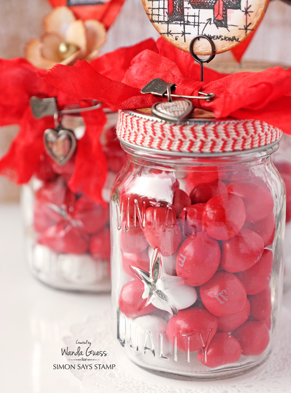
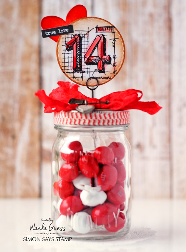
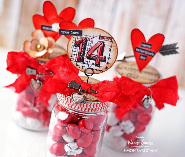
For my Candied Apple project, I used the Tim Holtz Mini Mason Jars and lots of cool Ideaology embellishments to make Valentine treat jars. I had the best time making these! One of the fun things about this project is that you can go as crazy or as simple as you want. (I went crazy!) My jars are filled with Peanut M&M’s.
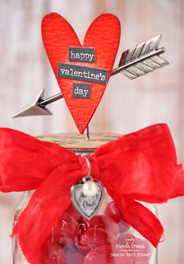
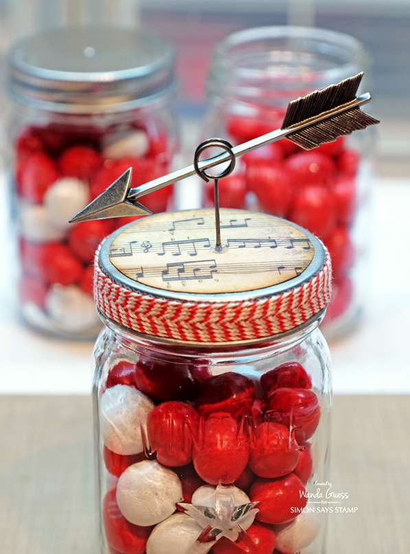
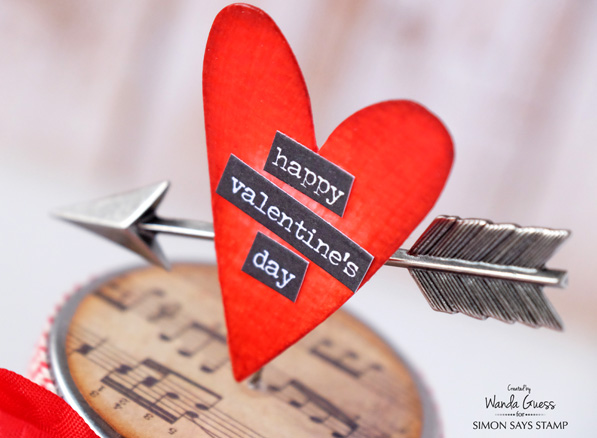
For this jar I used the Silver Arrows along with a Movers & Shapers Heart Die and the Occasions Stickers.
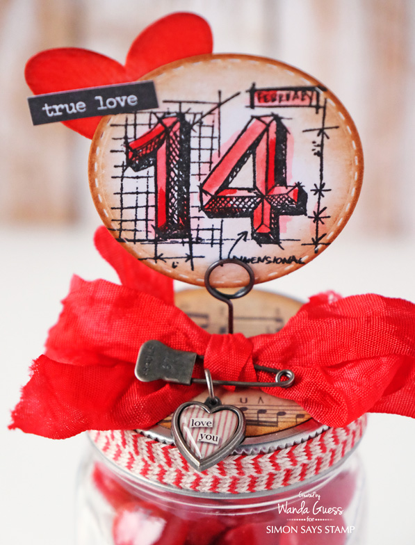
For this jar I used the Tim Holtz Mini Blueprints stamp set along with more hearts and stickers! My stamped image was colored using a Candied Apple Distress Marker and a Water Brush for a soft watercolor effect. The Stitched Circle was edged in Vintage Photo Ink.
You know that I love to dye my own ribbon! I used the Tim Holtz Crinkle Ribbon and the Candied Apple Spray Stain for a rich, deep red. OOH LA LA. After the ribbon was dry, I sprayed it with Perfect Pearls, so it also has a little shimmer. I die cut my hearts out of watercolor paper and then inked them with Candied Apple Distress Ink. Then I added a few coats of the new Crazing Distress Medium. It makes a really cool finish on paper. For the tops of the jars I cut Tim Holtz music paper into two inch circles and edged them with ink. 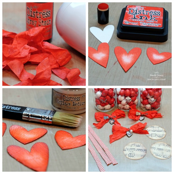
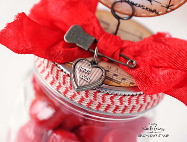
I wanted to show you how the arrow was mounted onto the jar. The lids are not super thick, so it was easy to poke a hole in the top using just the memo pin. Then I put the arrow into the ring at the top. The heart covers the middle. I added a drop of Glossy Accents to keep the pin from sliding down into the jar. Tip: I kept all the decorations affixed directly to the lid, so the recipient can open the jar and get the candy without too much trouble and without ruining the look.
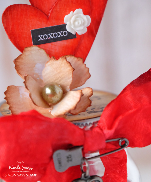
I made this rose using the Mini Tattered Floral Movers and Shapers Die. I cut two of them and formed them into a rose – then I added a pearl to the center. I used different word stickers on each jar. I love that there are now Occasions stickers for Valentine’s Day (and every other holiday too)!
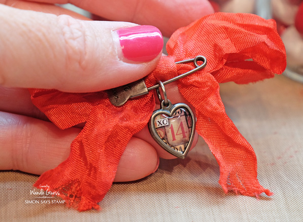
I have always been crazy about these heart charms! That reminds me – I need to buy some more!!
Thanks for joining in on the Color Pop adventures with me! It has been my pleasure to do this collection of projects. I wish there were MORE new colors for this year too! Don’t you? CLICK HERE to see all the Color Pop Blog Posts! Happy Crafting everyone!
SUPPLIES:
Leave a comment on this blog post – for a chance to win a blog candy grab bag! Winner will be announced next week! Good luck! Have a great day!









I was blown away with these beautiful little jars!! What a cute idea for Valentine’s day. Thanks for sharing with us.
Love these! They are terrific and use a lot of great products!
Stunning. I love these ideas for Valentine’s gifts!
These little jars are
too fun and love the
finishing on them.
Carla from Utah
Super cute project, and this is a great color!
I’d love to see you continue with a series featuring various colour combinations of Distress Inks, and you are so correct……the new Candied Apple is absolutely eye-popping, vibrant and stunning.
Gorgeous projects! I love all the fine and fancy details especially the hand dyed ribbon! Very exciting news that you will be hosting a monthly Ranger Color Series. Looking forward to that!
Love this colour and the projects today are amazing. Thanks for sharing.
LOVE LOVE LOVE everything you created here!! So fun and festive!!
Ok that is a must get red so sweet is this colour and love all those creations :)
In a word… YUMMY!
I love these jars! Especially the new Distepress Ink color, Candied Apples.
When your post came up, my jaw dropped to my saggy boobs. OMGoodness, these are stunning and so vividly RED. Red is my favorite color, I wear it a lot, I accessorize with it, I decorate my home with this accent color too. Wanda….your jars are just amazing, and look like you had a lot of fun creating these. I betcha you make Tim H proud to represent him and his company. Yes, I’m glad you’ll continue with this Color Pop series for Simon and Tim. You did an awesome job.
love that arrow
What beautiful reds! Perfect for Valentine’s Day projects! Thanks for the tutorials!
Love, Love, Love these project and the color. Thanks for sharing.
Linda D.
Just love this colour, so bright and cheery, and love these little bottles and these are beautifully decorated, thanks for the instructions of how to make them ourselves!!!!
Completely smitten with your jars, Wanda! The new red is a big YES! And must have!!!
What a great idea! I love using mason jars for gifts and crafts! Thanks for the inspiration!
The have the color, but I haven’t tried it yet. Wow! It really is a beautiful pop of red! Love the project!
LOVE LOVE LOVE these Wanda!! ;) THANKS SO MUCH for sharing and have a Fabulous Weekend!! ;)
Wow what a great Valentine treat container.
What a bright, delightful treat jar. This color is gorgeous. It was needed in the distress line.
I love the candy apple!!Gorgeous color!!
What a tasty project, I’m afraid I’d eat more m&m’s than I would put into the jar!
Wow! What a cool way to use red distress ink with a fun valentine’s treat! Yum!
Such a fun and festive project…love this color!!! Super excited to hear that “color pop” will continue, thanks so much for sharing! :)
I love the Candied Apple colour – such a wonderful red! And I love your jars – they’ve used the colour perfectly!
Fantastic projects Wanda. I can almost taste those candies… they are perfect with that RED colour. More projects along the same line would be terrific. Cheers.
Cute little jars…great gift idea!
Awesome gift ideas!!! Love the accents you added and the candied apple red is just a fantastic red!
OOH LA LA indeed !!! Love this color and your jars are awesome !!!
Love this project! Valentine’s Day is my favorite crafting holiday. These are adorable.
These Valentine projects are so sweet!
Thanks so much for the informational video on black ink comparisons! I printed out the chart at the end to have for reference. That is VERY good information to have. Oh! and the Valentine project is really nice, too!
These are just as cute as can be! Love the new color and your fabulous inspiration.
This is a great red color. I think you should do seasonal color combinations.
That’s a whole lot of colour!!
great crafts, the candied apple is one of my favorites from the latest release and you’ve done a great job, love the jars
This has to be my favorite red♥ I love the candy jars♥
Great little gift jars Wanda – love this colour too. For future DI projects I would really love to see bright DI colour combinations that really catch the eye. I always love to see how different colours look blended together too. Cheers!
It’s such a bright beautiful red! Love your candy jars, Wanda! They are Perfect! ThanksSSS!
Gorgeous pop of color
Love this color, awesome jars!
I’m just learning about Distress Inks and how they can be used – thanks for the inspiration. Love the Valentine projects!
I’m picking up my candied apple ink pad tomorrow… can’t wait! Like barn door but a bit warmer? Sounds like perfection.
yummy candy jars. . . think I would like to see color combinations – so fun!
These Valentine jars are so lovely and yummy looking. Anyone would love to receive one of these jars.
Have really enjoyed this series, Wanda. I’d love to see some color combos as I struggle with this.
I live this candy apple red too. Your jars are so cool. In fact that is the thing about Tim holtz stuff. It us cool, not pretty, or lovely. Sometimes beautiful and very cool and that is how I would describe your jars! Hard to pick a fav… Something about the way you colored the number red and water painted it too, I really liked that effect.