Color Coordinates: Thanksgiving!

Happy Friday everyone! Welcome back to the blog. I have another Color Coordinates for you completely inspired by Thanksgiving and Fall! I’m finally embracing Autumn… I’ve been avoiding it knowing that cold winter weather will soon follow. But with colors like this, I feel a delicious Thanksgiving meal in my future.
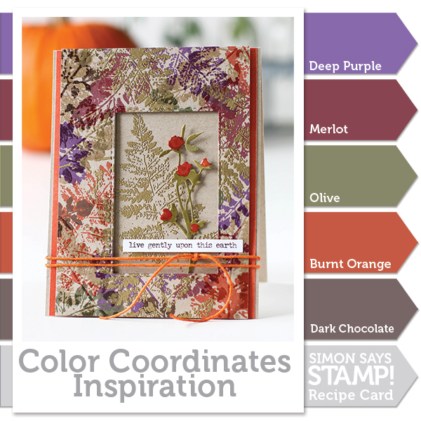
I used the Simon Says Stamp ink colors in Deep Purple, Merlot, Burnt Orange, Dark Chocolate, and Olive (which has been discontinued but Hero Arts Moss is a great substitution). I used my inks and the Tim Holtz Leaf Prints stamps on a panel of Desert Storm cardstock. Once I had my leaves stamped in color, I added a second layer of gold embossed leaves, followed up by a clear embossed layer. This gave me a great amount of texture and additional color.
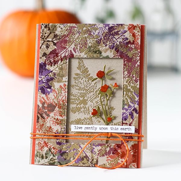
Once I was done stamping my panel, I used a Stitched Rectangle die to create a window. I added a piece of desert storm cardstock with a single gold embossed leaf and added a die cut Wildflower colored with Copic markers.
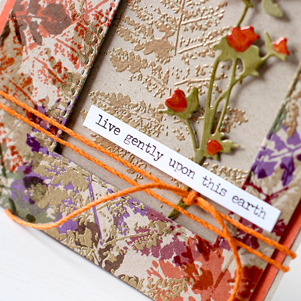
I finished my card off by adding a message strip, orange cord and Glossy Accents on the flowers. I’ve shot a video of the process which you can watch below or on our YouTube channel.

Blog Candy Alert!! Follow our blog via email and comment on this post for a chance to win a special blog candy!
Thanks for stopping by today, I hope I’ve given you some inspiration to try something new with your stamping inks! Enjoy!
 |
 |
 |
 |
 |
 |
 |
 |
 |
 |
 |
 |
 |
 |
 |
 |
 |
 |
 |
 |
 |
 |
 |
 |
 |


Wow this card is so beautiful I can’t take my eyes off it. The fall colors are exquisite. It would be so special if I got this card in the mail. I would frame and display it immediately. Wishful thinking I know. An absolute beauty!!! LOVE it!!
Absolutely stunning card creation, Shari !! And I do so appreciate the video and how to!!!
Wow, this card is simply gorgeous, love this autumn color combo and the touches of gold make it so elegant! Thanks for another awesome video.
I love the pretty color palette!!Gorgeous!!
Most beautiful card I have ever seen. Searching my brain and my stamps for some kind of holiday themed card using that layout and those techniques. What gorgeous stamps to work with. Absolutely love it.
WOW!!! It is sooo beautiful!
Cristina
thehouseoftheblackbirds.blogspot.it
Lovely card – love all the splashes of color and the gold embossing:)
B
E
A
U
T
I
F
U
L
Like the wonderful Autumn artsy leaf colors.
Melissa
“Sunshine HoneyBee”
Totally unique and different! Awesome gold embossing with colorful splash!
STUNNING creation! I love the beautiful fall colors and the gorgeous embossed leaves :)
Wow! Beautiful card and colors!!!
Lovely card! :)
One of the prettiest cards I have seen in a long time.
What a gorgeous fall card. I love the color combination and the detail!
So beautiful, detailed and luxe. Love this!
That card is one attractive looking card!! I just love what you have done here in the pop of color and the pop up of frame! The super orange twine is lovely!! So beautiful! TFS
Logging off of the computer to head to work when this popped up! Absolutely gorgeous!!!
WOW – spectacular color palette and super gorgeous card !!!!
GORGEOUS!!!!!!! STUNNING!!!!!! Love the texture and colours!
The colors of this card are so beautiful! It’s like a cozy card hug.
Beautiful fall color! I love the layers of ink!
So pretty!
Merlot is one of my favorite colors and I love it with these other colors.
Lovely colors and design!
Wow! What a beautiful color combo, Shari! So perfect for fall! Your card is gorgeous! ♥
Sooooo very beautiful, gorgeous, stunning and all of the other “gorgeous” descriptive adjectives. I really love this card. The colors are perfect to evoke the Autumn mood. Wonderful. Thank you for the color coordinates and the truly beautiful design ideas.
Ditto on the WOW factor!!! The colors are stunning! Fabulous layout! These colors are just perfect for Fall.
Beautiful card–I love the color combo.
WOW! A gorgeous card and I love the extra dimension added with the clear and gold embossing powders!
I thought it was beautiful and then you added the little sprig of flowers – gorgeous. I always know I’m going to see something develop and hear your thoughts along the way. Thanks so much.
Gorgeous colors for a Fall card! I can’t get enough of leaf images–love your card!
Never thought about using desert storm cardstock before, have now changed my mind. Such a beautiful card.
Stunning card! Love the colors!
Gorgeous fall card! Love the colours and the overstamping/embossing technique for the background panel.
Wow Shari how absolutely gorgeous! What a stunner! Love your mix of colours.
This color palette is exactly what i love about fall…. so pretty…love the card!
Love those colors….I feel the same about fall as you do, winter is around the corner….brrr!
I always like your color combos, but this one is exceptionally spectacular! I immediately watched the video as I was intrigued by you using the clear embossing to add even more texture and shine. Thank you for sharing a great idea. And those colors….. yum!
Beautiful!
Your fall card is beautiful!
Such a BEAUTIFUL & Lovely card :)
Gorgeous color combination and card. I think the inks “Dark Chocolate” and “Merlot” would make a great gift for a crafty friend even for their names. :)
Love the colors and added textures
Really Stunning card!! Love all the texture!!
I am definitely going to try this technique because this card is stunning! Thank you for the video.
Wow! This is so elegant and fresh! What a beauty!
Love the inclusion of the purple here, such a gorgeous, rich fall card!
WHAT A TOTALLY GORGEOUSLY STUNNING CARD! I noticed the colors RIGHT AWAY as being stunning, but Shari, you BROUGHT THEM TO LIFE!!! I LOOOOVE what you did with embossing with clear embossing powder too, with everything else you did! I don’t think I EVER thought to emboss with a second embossing powder! THANK YOU for that little lesson! ;)
stunning!