Color Coordinates Recipe!

Hello everyone!!! Happy Friday and welcome back to the blog. I have a Color Coordinates Recipe for you today featuring some of our newer ink colors from our Splash of Color and Color of Fun releases.
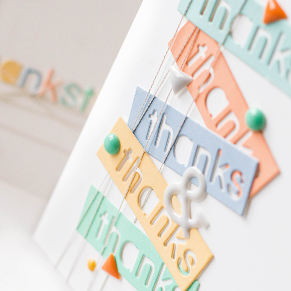
I’ve combined Apricot, Mint Candy, Duckling, Lake Shores, and Steel blue all together to create a soft palette great for any occasion.
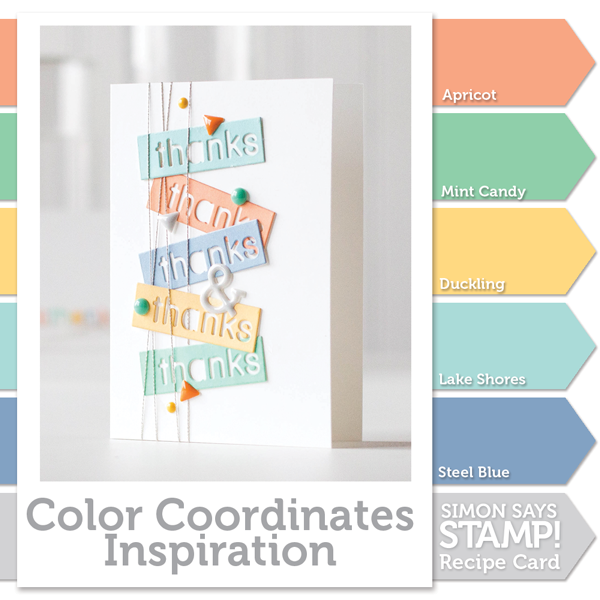
For my card, I colored strips of card stock with my inks then die cut them using “Thanks” from the Summer Greetings word dies. I can’t say thanks enough!
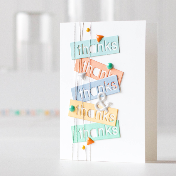
To finish things up, I added some enamel shaped arrowheads and dots.
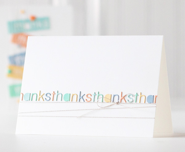
I couldn’t leave out all the left over letters, so I created a simple card using them in a row.
I’ve shot a video of the complete process, you can view it below or on our YouTube channel.
Blog Candy Alert!! Follow our blog via email and comment on this post for a chance to win a special blog candy!
I hope you all have a fantastic weekend!
 |
 |
 |
 |
 |
 |
 |
 |
 |
 |
 |
 |
 |
 |
 |
 |
 |
 |
 |


Great cards, I love the color combo and the design of these cards. Awesome.
In keeping with the theme of this card “thanks” for giving us this video!
Totally awesome Shari!! I love you combine all of these colors. Thats the hardest part for me, figuring out what colors match.
These little dies look like fun!
Your cards are so soft, crisp and clean. I love SSS 120# white cardstock. It is quality paper for cards and it is very smooth. The colors you put together here are gorgeous. I want, I want, I want! I really like that “thanks” die too. I haven’t seen that before.
So very pretty, these colors go great together!
Two fantastic cards!
Nice colors!
Love the colors. they are so soft and pastel. Makes me feel warm.
thanks.
simple, fresh looking cards!
simple and amazingly cool
The most difficult time I have in creating cards/projects is figuring out color combination. This video is so helpful! Love your cards and really like the color combination.
Like the colors and the block letter die sentiments.
Melissa
“Sunshine HoneyBee”
Amazing cards with awesome colors !
love these colors!
Great way to use scraps too. Nice, clean and simple card. Love all the soft soft colors. TFS
Wonderful cards! What a beautiful color combo! So soft and just YUM ♥
That was so smart to use the left over letters and that card is equally as awesome as the other one!
I never get enough of Shari’s awesome cards and this color combination just screams summer fun! Great job! She inspires me so much!
LOVE!!!
This was great.
Beautiful cards!! Love the colors..
Such soft, pretty colours.
Such beautiful colors, love it!!!
Love these soft, yummy colors together!! Reminds me of bowl of ice cream sherbet.
Lovin these colors!
Thank you for doing again the color coordinates Shari! This feature is always a favorite of mine and I also love your cleverly designed cards. TFS
Love the simplicity of the cards and the color combination is perfect!!
So soft and pretty! I love it!
Such beautiful colors!
This is so pretty! I love the card! Hugs, Robin
Awesome cards!!! I love the idea of using the cut out letters to make an additional card:)
Beautiful color palette. Super fun cards, too. Love that you also used the left over letters. Michelle t
What a pretty design and a great way to use the negative space of the die as well as the letters. Lovely.
What a beatiful color combo! Love the use of the cutout letters in a second card…
Very nice color combo.
Amazing soft color combo and so simple!
Great card design Shari!
So fresh and inspiring.
Such a pretty color palette. Thanks for sharing.
That is such a pretty color combo. Loved both of the cards.
Beautiful colors. Love your two cards and the idea of using the cut out letters is wonderful. Thanks for sharing.
Linda D.
These cards are so fresh and beautiful!!! This color palette is quite stunning!!! TFS!
Wonderful color combo and fantastic card examples! You and the SSS blog are such an inspiration! Love it!
Beautiful, soft colors! LOVE the new word dies. Thanks for your sharing your crafty ideas with us :)
Many thanks to you for this inspiring video and beautiful cards, what an awesome card kit!
That is one gorgeous colour collection – love it! I especially love the first card – clever layout and awesome use of colours! TFS Karen x
Awesome card! I love that you went really soft on the color. I think sometimes we want to pick really bold colors… but soft colors are good too, right? TFS!
Thanks so much for the great video and project ideas. Fabulous!
Very cool- I need to use the negative space more often. :)