Art Journaling with Shari Carroll
Welcome to the blog everyone and happy Tuesday!
I have an art journal feature today that represents my comfort zone. Of all colors, I love neutrals!! Soft muted tones are easiest for me to design with. What colors are you most comfortable with?
I started out with my Dina Wakley media journal (watercolor pages) and some amazing paper from 49 and Market Captured Adventure collection. These papers are 6×6 double sided and are about a 60lb weight, very sturdy! There are 2 sheets of each of 9 designs, and they have 2 sheets of laser cut elements that you can use on your creations.
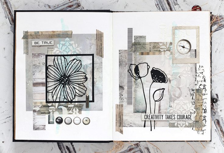
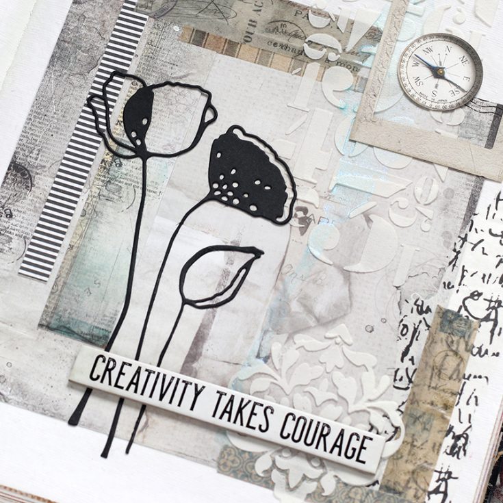
I used a sheet of 6×6 paper on each of the two pages of my journal layout, then added strips of cut paper to balance the page. I added a bit of embossing past with the Simon Says Stamp Damask and Tim Holtz Numeric stencils. Once the paste was dry, I added a hint of color with Prima Metallique Light Patina acrylic paint.
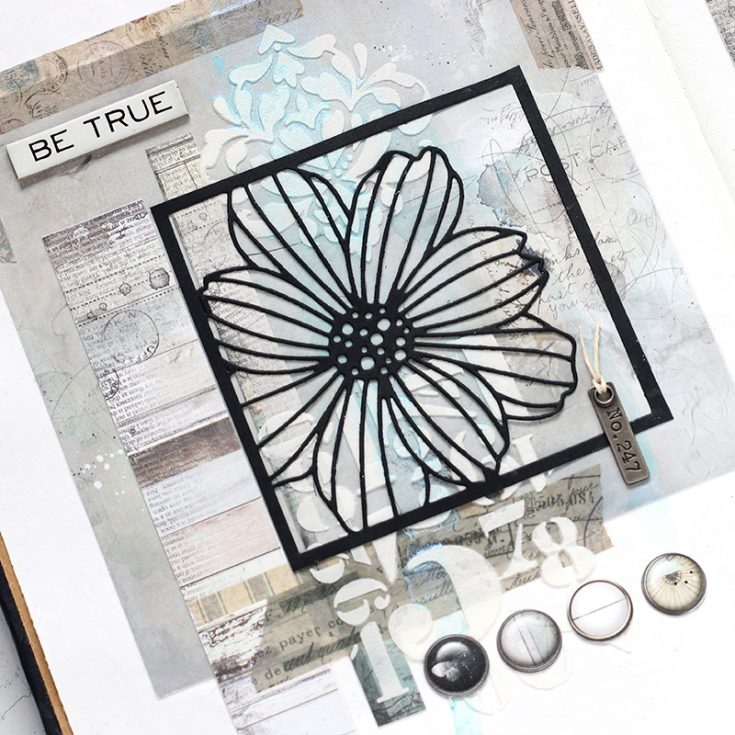
I glued down a Simon Says Stamp Cosmo Flower Frame and Alexandra Renke Poppy flower die cut from black cardstock. Once I had my flowers in place, I added elements from the 49 and Market laser cuts and Tim Holtz Quote Chips for my journal title.
I’ve shot a video of the complete process, you can view it below or on our YouTube channel HERE.

Blog Candy Alert!! Follow our blog via email and comment on this post for a chance to win special blog candy!
Thanks for stopping by today, I hope you’ve enjoyed my art journal inspiration!
|


I like the monochromatic look. It’s very relaxing.
I love your neutral layout… so classy looking.
Great journal. Don’t need a lot
of color to make an interesting
design. thanks for sharing
txmlhl(at)yahoo(dot)com
Great to see a spread in nutural colours; looks so good!
I love the black and white monochromatic look! Thanks for the inspiration.
that is just gorgeous Shari – so peaceful and calming
The black die cuts are so artsy. They look very cool with the various mixed media objects.
Love this journal spread! Shari always does an amazing job with her journal pages.
Beautiful!!
Love the look of this card–so beautiful.
This is truly one of my all time favorites, because I am also most comfortable with neutrals – and I just purchased the Dina journal, I think this will be my first project! Thank you Shari!
What a great look. And I agree, creativity does take courage. It’s so easy to get into a comfortable rut. The projects can be beautiful, but we need to branch out a bit–I do, anyway. The mixture of metals, tapes, papers, etc. is inspiring. I have some supplies that I need to break into in my craft room. Thank you.
Gorgeous project, love the neutral color. You have been an inspiration to try some art journaling. Thanks for sharing your creative talents.
So very pretty!
Very pretty in neutral colours! I like the dies you used too!
That is really beautiful. I love the final look of that spread. Love the use of the paste and then dribbling paint down that section. The end product is just beautiful I really want to try and do something like this. You make it look so easy.
Wow! I have mostly seen bright colors or dark and grunge looks on art journal. Love this soft amd muted palette! Something new for me to try! Thanks for sharing.
I enjoy all your videos and am so happy to see you have a new one for us. I love the idea with the neutral backgrounds and the 6 x 6 paper pad….I have plenty of those and need to start to put those on my journal pages. Thanks for the inspiration.
Beautiful journal pages!
absolutely gorgeous!! i love the colors and the die cuts.
This is just beautiful Shari. I have to be honest, until about 2 yrs ago, I was not into collaging or art journaling at all. However, after watching you, Vicky P., Anna-Karin and a few others I have learned that it can be quite fun and relaxing. I have always loved the monochromatic look so this combo today has really got me thinking. Well done!
Such pretty pages. Thanks for sharing…
Great pages! Good use of a neutral palette. Stunning!
Wow! This is gorgeous!
Wow!!! It’s really beautiful!!!
Love the look of these pages. So easily transferable to a card or scrapbook page design.
Beautiful pages—love the design and soft colors.
I love color—-from neutrals on up! This is gorgeous and the black die cuts used as silhouettes are genius! My next card is going to be in neutrals with black die cuts! Thanks for the inspiration. I also love the 49 & Market papers, especially for their sturdy weight!
Beautiful pages! I always love when you share your latest art journal spreads. So inspiring!
Beautiful pages, absolutely love the neutral tone, colours and the design.
Cool look of black against the lighter background.
What cool pages! I love when you do the art journaling pages because then I can just sit back and watch you do the pages with the just music playing and watch your process and I always learn something! Thanks for sharing your pages, they’re so pretty!
This is such a cool layout! I love the color scheme, and the flower die cuts in black :)
Love the pages! So creative.
Thanks for sharing.
Lovely! Fabulous creations. Love the neutral colors.
These are gorgeous pages. Love the elegant feel with the beautiful neutral colors. ♥
Love it–so much texture, love the papers you’ve used.
LOVE the neutral color palette for your pretty journal pages.
What lovely papers, and what a great art journal layout you’ve made! You are so good at adding color so subtly that it just creates an impression in the background; I didn’t even realize there was blue on there until I watched the video. Thanks for sharing such a subtle look with us.
Love the sophisticated tonal look
Great use of the dies, washi tape and embellishments. Fun journaling pages!
Beautiful pages.
Really pretty. Love the color palette and the layout!
Wow!!! This is Absolutely STUNNING!!!!!
Gorgeous art journal pages, I love all of the details and the added embossing paste!
Normaly I am a bright colour person, I love my reds but this soft muted tones pages I love them! I think there is such a serenity in the pages and that is so beautiful, I have to try this kind of tones also. Thank you for showing your comfort zone that inspires me to come out of my comfort zone.
What a relaxing video. I, too, love neutrals and the pop of black with it is just stunning! These journal pages would also make beautiful cards!
Love the subtle colors. Love the pop of black for the flowers. Very inspiring Shari!
I like the brighter colors usually, but this is very nice!
I had a rude awakening. I kept thinking, “I like this, but I don’t get it, and I can’t do it.” Then the sentiment! Creativity takes courage! I don’t have the courage to tackle something like this! Really! Strange, but true!