Art Journaling with Shari Carroll
Welcome to the blog everyone and happy Tuesday!
I have an art journal feature today that represents my comfort zone. Of all colors, I love neutrals!! Soft muted tones are easiest for me to design with. What colors are you most comfortable with?
I started out with my Dina Wakley media journal (watercolor pages) and some amazing paper from 49 and Market Captured Adventure collection. These papers are 6×6 double sided and are about a 60lb weight, very sturdy! There are 2 sheets of each of 9 designs, and they have 2 sheets of laser cut elements that you can use on your creations.
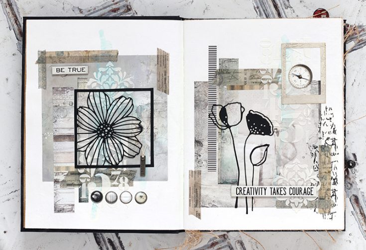
I used a sheet of 6×6 paper on each of the two pages of my journal layout, then added strips of cut paper to balance the page. I added a bit of embossing past with the Simon Says Stamp Damask and Tim Holtz Numeric stencils. Once the paste was dry, I added a hint of color with Prima Metallique Light Patina acrylic paint.
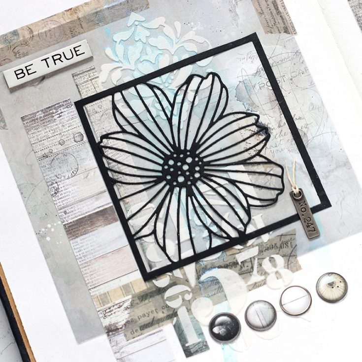
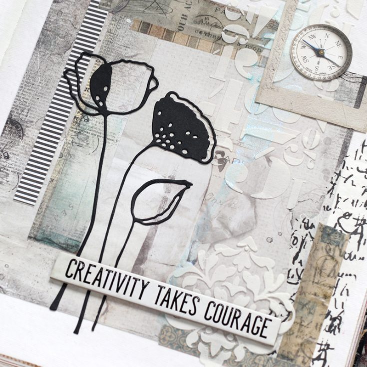
I glued down a Simon Says Stamp Cosmo Flower Frame and Alexandra Renke Poppy flower die cut from black cardstock. Once I had my flowers in place, I added elements from the 49 and Market laser cuts and Tim Holtz Quote Chips for my journal title.
I’ve shot a video of the complete process, you can view it below or on our YouTube channel HERE.

Blog Candy Alert!! Follow our blog via email and comment on this post for a chance to win special blog candy!
Thanks for stopping by today, I hope you’ve enjoyed my art journal inspiration!
|


lovely project. Your details and video really make the project seem doable for the novice! I might have to be inspired :)
Always amazes me how you put so many elements together perfectly!
I love this project! You soft palette make it so elegant! TFS
In awe of this project – TFS
Lovely project. The black and white color combo is great.
Stunning journal spread. I absolutely love the color palette.
Simply beautiful! Love the designs on each
page and the hint of the light patina.
Very pretty. I like the neutral palette.
Wonderful pages – love your style and watching your videos – thank you!!
Such pretty pages in your art journal. Love the soft muted colours.
Oh my Shari !! This is so beautiful !!!
Awesome project. Thanks for sharing.
Linda D.
Thank you for the wonderful video Shari. There is such a soft “quiet” look about this that really appeals to me. What really stuck with me is the phrase “Creativity takes courage”, & for me, that is so true. I’ve tended to stay within my safe comfort zone all my life & have enjoyed, since my late 50’s branching out. It’s a process, isn’t it?
How beautiful this
card is, love the
texture designs.
Carla from Utah
Awesome, I really need to start a journal, they look so fun. I already follow by email.
I always love your work, the design and the choice of words, too. How i’d love to be at a workshop with you!
Beautiful entry y’all!
This is absolutely lovely. Did you have a design in mind before you started or did it just come to you? I agree with you that “creativity takes courage”, but I see you have a lot of it…Praise God. Thank you for your inspiration and your desire to share with all of us. Stay blessed!
gorgeous layout!!
Oh wow, that looks amazing! Love it!
OMG … I so LOVE your journal pages! That 49 Market Collection is amazing!! I just got Dina Wakley Journal a month ago … it is fabulous… haven’t started in it yet! Looking at your video makes me more excited about art journaling. I love Dina’s stamps I have quite a collection; and Tim Holtz stencils … gosh I’m giddy !!!
I love the neutral colors for these pages!
This is very pretty!
All your layers are so beautiful – I need to get more courageous with combining more elements when I’m creating something.
Great project!
Shari, you always inspire me with your art journaling.
So very cool.
Like how striking the art journaling is.
Melissa
“Sunshine HoneyBee”
Awesome textures and designs! Love the stencils and dies!
Wow! Gorgeous art journal project! I love these Soft muted tones so much.
This is ABSOLUTELY FABULOUS!!!!!!!!!
Thanks for the art journaling inspiration! It makes me want to give it a try!
I love to watch your videos, they are great. Your pages are beautiful.
This is such a lovely project! Wonderful work!
Awesome project!!
Loving the texture and the soft blend of colours x
How unique!! I love how all those textures come together.
Great combination of elements. The neutral tones are just right for highlighting the silhouettes. tfs
Fabulous details on
this creation. Love
all the stamping and
texture.
Carla from Utah
These are stunning! I rarely use neutrals- you have mastered them!
I could never do this, not in a million years.
LOVE the bold black elements with the muted colors/papers underneath.
Beautiful, I love the soft tones used on these projects. I will definitely have to try them. Thanks for the inspiration. :)
Beautiful layout! Thanks for the video.
Great journal pages!
This is just gorgeous, I love the super soft colors.
While I love the bright, vibrant colors usually used in Mixed Media, these are quiet, serene and peaceful. Thought provoking, rather than noisy. Just beautiful. Would love to do something like this on canvas for my home.
Very beautiful. Love the neutral palette and the black accents.
love the colors you used on your projects:)
Beautiful project. Love the colors!