A Special Art Journal from Paper Crafter’s Library!
Hi everyone! My name is AndreaWalford and I’m so excited to be guest posting here on the Simon Says Stamp Blog! Today I wanted to share with you an art journal page I created using my Tim Holtz Distress Stains and Perfect Pearls Mists.

I’ve been a scrapbooker and stamper for well over 10 years now, but only started to dive into the world of mixed media and art journaling about 2 years ago. I find that it’s really stretched me creatively, and taught me to think about my supplies in a whole new light. For me, art journaling is first and foremost about personal exploration & development. My art journals are typically a reflection of whatever I’ve been thinking about or pondering on. I use them as visual reminders and for encouragement. I’ll pick a scripture verse or quote that serves as a reminder for me, and create my page based around that.
The second reason I love to art journal is that it is a source of creative exploration and development for me as well. I’m irresistibly drawn to colors, images and textures, and over the years I’ve accumulated (hoarded?) quite a stash of supplies – in particular, color mediums and stamps. I love being able to take many of the same products I use in my card making and scrapbooking, and incorporate them onto my canvases and into my journals.
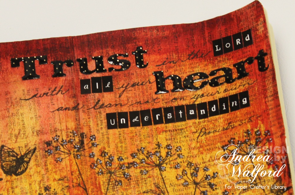
As I was playing with Distress Stains and experimenting with different techniques and applications as we prepared for Ranger Week on the Paper Crafter’s Library blog, I was thrilled to discover how fantastic they are for art journal pages. Because they are so fluid, I was able to quickly and easily create a gorgeous, vibrant background for my art journal page. The addition of a few different colors of Perfect Pearls mists added just that little bit of shimmer that I’m always looking for, and the stamps gave me the ability to quickly and easily add visual imagery to my page without worrying about my drawing skills (I’m still working on those). I finished up my page by using a combination of letter stickers and handwriting for my quote, loving the texture and visual interest created by mixing and matching fonts and font sizes.
I’ve created a video for you (see above) all showing you how I made my art journal page. The video was filmed as I actually made the page, with the introduction filmed at the end. When I started to create I had no preconceived ideas of what it would end up looking like. I started with my scripture and two colors of Distress Stain (Wild Honey and Barn Door) – I only added in the third color – Aged Mahogany – afterwards, when I felt like I wanted a deeper red mixed in there. I tried to keep the video as short as I could, while still sharing with you some of my art journaling processes.
Supplies list:
I hope you enjoy today’s video and that it inspires you to do a little art journaling yourself!
Andrea
*Follow Simon Says Stamp on Twitter!
*Like Simon Says Stamp on Facebook
*Enter the Vintage Simon Says Stamp & Show Challenge!
*Enter the Simon Says Stamp Challenge!
*Subscribe to our Blog!
*Subscribe to our Blog!
*Sign up to Receive Our Newsletter!
*Subscribe to us on Youtube
*Follow us on Pinterest!
*Follow us on Pinterest!
Congrats to weekend blog candy winners!
- From Embellish Your Art with Wendy Vecchi : Maureen Chandler!
- From Getting Fancy : conil!
Please email [email protected] with the name of the blog you won so we can get your candy to you!


Pages are beautiful….that is my favorite bible verse….thank you for showing your techniques.
Development is a multifaceted concept that encompasses social, economic, and technological progress. It involves improving the quality of life, fostering innovation, and enhancing infrastructure. Organizations like Promogen.org play a crucial role in facilitating sustainable development by providing resources, training, and support to communities in need. Through collaborative efforts, Promogen.org helps empower individuals and organizations to create lasting change. This approach not only addresses immediate challenges but also lays the groundwork for future growth. Ultimately, development is about building resilience, promoting equality, and ensuring that everyone has the opportunity to thrive in a rapidly evolving world.