5 Ways to Add Texture With Embossing Paste
Hi everyone and Happy Sunday! It’s Shari here with a look at some embossing pastes that are more of the specialty variety. These are shiny, matte, shimmery and some are clear!
I’ve decided to work with the same card stock (Slate) and stencil so you can clearly see the comparisons.
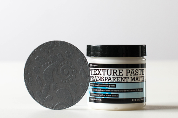
I’m starting off with Ranger’s transparent matte Texture Paste. This was the first time I’ve used it. Once it dried, I was really impressed with the look. I’ve always liked flat or matte paints but didn’t expect this to look like I had used an embossing folder. One of my new favorite pastes for sure!
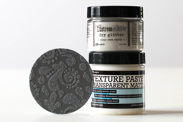
Next up is the same paste but I’ve used Rock Candy Glitter on top while it was still wet. You can use any clear paste with the glitter, but used this one out of convenience. This has a beautiful sparkle to it and would be a fantastic texture to use for snowflakes on Winter cards.
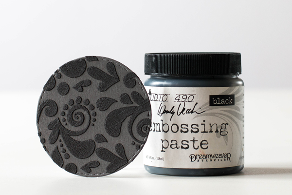
My next selection is the Wendy Vecchi Black Embossing paste. The effect looks like stamped velvet to me. One of the things I noticed about this paste is how concentrated and true the black is which is perfect for an elegant, formal look. It’s also a nice compliment to the slate card stock.
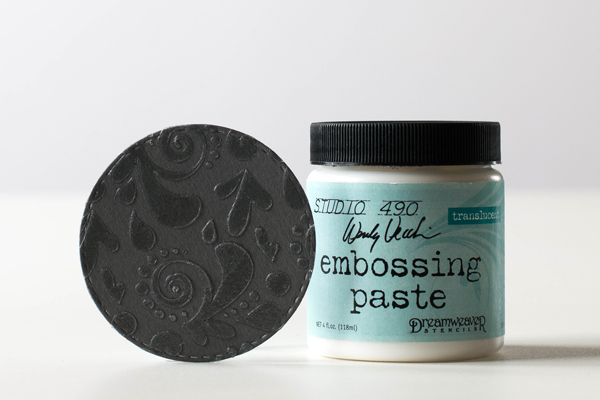
Now for the shiny pastes. This is the Wendy Vecchi Translucent paste. It starts out white and dries to a super shiny clear. This is a great paste to use on any color card stock! You could also use this paste with glitter and embossing powders (let paste dry before heat setting embossing powders). Also note that Ranger’s Transparent Gloss is very similar.
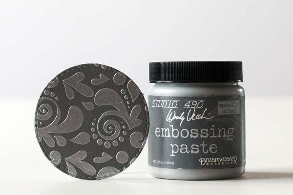
To finish off my comparisons, I’ve used the Wendy Vecchi Metallic Silver Enbossing paste. This has a gorgeous metallic finish and can be used just as is!
I have shot a video of the process, and how to use these pastes with a stencil. You can view the video below or on our YouTube Channel.
Blog Candy Alert!! Follow our blog via email and comment on this post for a chance to win a special blog candy!
Thanks for stopping by today. I hope I’ve given you some insight on some of the specialty texture pastes available in our store.
 |
 |
 |
 |
 |
 |
 |
 |
 |
 |


LOVE!!! That metallic embossing paste. Thanks for sharing these ideas with us.
What a GREAT comparison; love that you used a slate card stock for the comparison; definitely nice to see a different base color used. THANK YOU!
I use a lot of embossing pastes, but these comparisons are a great idea. I may make up a swatch book!
Super samples of differing looks using embossing pastes! Thanks!
Thanks for this! I’ve recently been using WV translucent paste and coloring it and using glitter on it! I’m loving the black and silver you show!
Thank you for the tutorial – very enlightening.
Great comparison, they are all pretty awesome tho. I think you should either star il right on the tops of the jars or glue that sample to the lid, just sayin’
This is a great video! I appreciate that you have show how each works and looks differently, it has shown me ways to use these products much more effectively. Thank you so much.
Thank you Shari for a great tutorial on pastes. I have only recently bought my first jar and don’t know a lot about them yet so this was very helpful!
I really like all these suggestions. Thank for sharing such a fantastic post. Great post, thanks for sharing .if you want to get Silver Paste http://motoronsemiconductors.com/