Doodling with Debby: Simple Heat Embossing For An Easy Masculine Mixed Media Card

Hi friends! Happy Thursday! Please join me in welcoming back the amazingly talented and inspiring Debby Hughes! Keep reading, and be sure to watch the video for all the details! Enjoy!
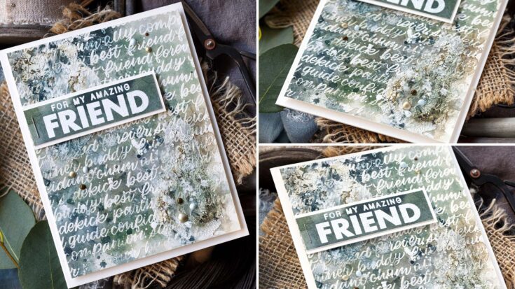
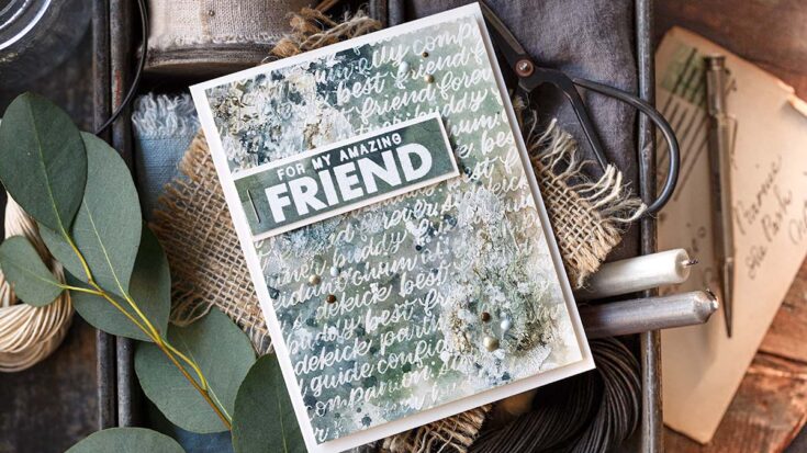
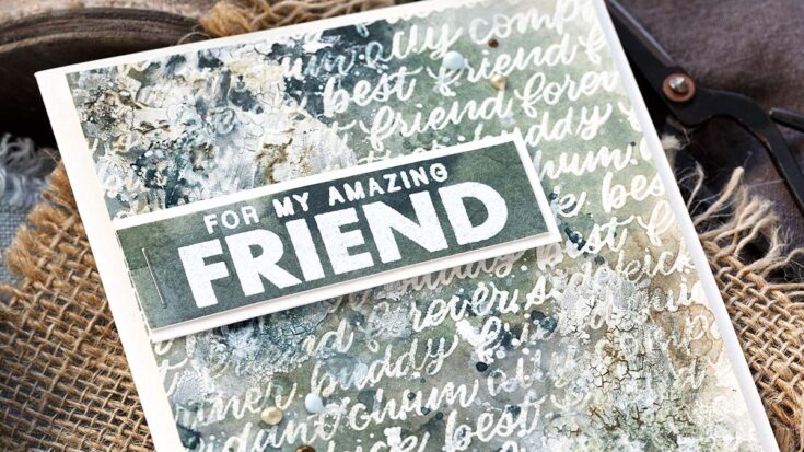
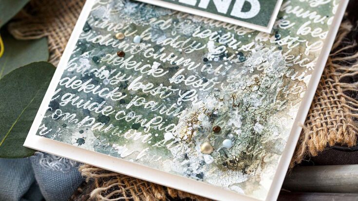
Hello, it’s Debby here with my Doodling With Debby series. I seem to be in a mixed media phase at the moment and the simple heat embossing on this card made for an easy masculine mixed media card full of interest and texture.
Heat embossing is one of my go-to techniques when working with watercolours. It is magic the first time you see the slick surface repel the water sending it pooling around the base of the image. In addition, heat embossing provides an excellent background as a starting point for a mixed media card.
Step by Step How-to:
- On a piece of Arches Hot Pressed watercolour card, pre-treated with anti-static powder, stamp the Handlettered Friends set in Versamark ink.
- Sprinkle with white embossing powder and heat set.
- Tape the card to a board with Painter’s Tape.
- Use your favourite water media, be it watercolours or Distress Ink and lightly wash over the heat embossing. The slick surface resists the paint mixture. However, it helps to keep the lettering clear if, once dry, you wipe the letters with a bit of water and a cloth.
- Keep layering the paint over the heat embossed background.
- Add in white gouache for a hazy, opaque look in places.
- Splatter with white gouache, left-over paint and plain clear water. Let the puddles mix and blend until dry.
- Splatter some more – you can never have too much splatter!
- Trim the piece to fit on an A2 card base.
- Apply Distress Crackle Paste with a spatula and scrape around over the heat embossing.
- Leave to dry, or if time is short, dry with a heat tool.
- Scrape off some of the crackle paste for a more distressed look.
- Rub Crooked Broomstick and Walnut Stain Distress Crayons into the cracks of the paste. Rub with a finger to spread the crayon around, blend in with water and dab off any excess.
- Add more layers of paint to help the crackle blend into the design.
- On a piece of watercoloured card treated with anti-static powder, stamp a sentiment from the Friend Greetings set in Versamark ink and heat emboss with white embossing powder.
- Trim the greeting out with a craft knife, clear metal-edged ruler and a craft mat. Adhere the greeting to Ivory card and trim to leave a skinny border on three sides.
- Staple the sentiment to the background and add foam adhesive under the far end to slightly raise the greeting off the panel.
- Adhere the panel with more foam adhesive to a card base cut and scored from Ivory card.
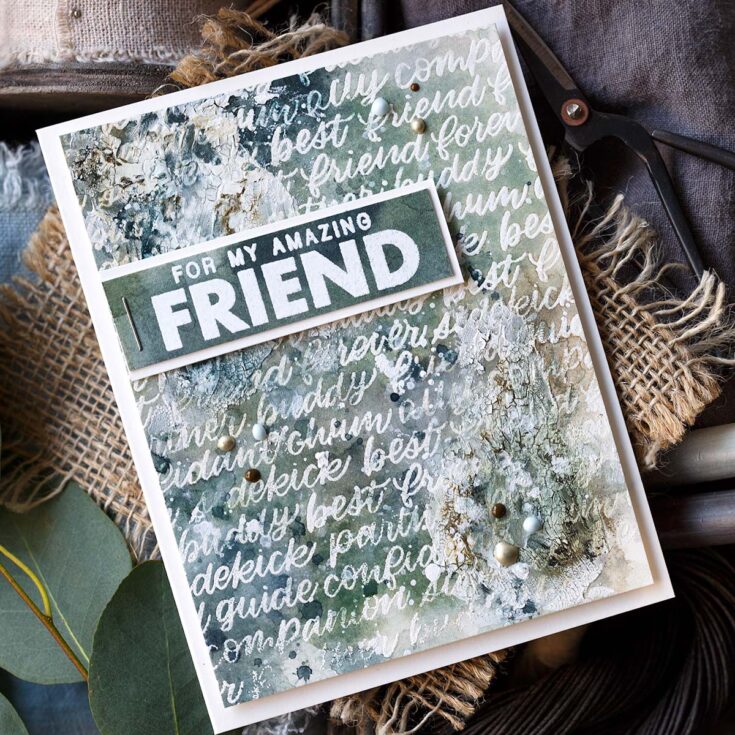
- Add a triangle of Nuvo Crystal Drops around the greeting using Duck Egg Blue, Dark Walnut and Pale Gold droplets.
Well, that’s me for this month. I hope you enjoyed this tutorial; you’ll find the video below. Thanks for joining me, and I hope to see you next time for Doodling With Debby.
WATCH THE VIDEO:
SUPPLIES:
|


Thanks so much for stopping by, and thanks to Debby for being our guest!
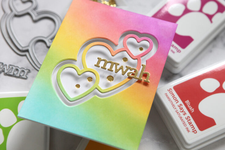
EZ with CZ: See-thru card with Floating Greeting

Hi friends! I’m delighted to welcome back the always entertaining and inspiring Cathy Zielske with her monthly installment of EZ with CZ! While this project may not be as “EZ” as others shared in the past, we encourage you to push yourself to try something new and find that you can manage this stunning result as well! Read on, be sure to watch the video, and enjoy!
Hi crafty friends! Cathy Z. here with another installment of EZ with CZ, and today, the card I’m sharing is a tiny bit more involved than my typical designs but the execution is simple and I really love this simple idea!
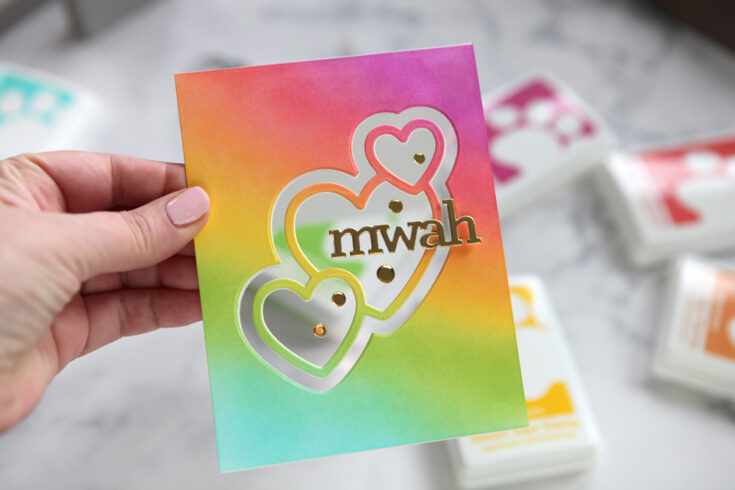
Adding a see-thru window is a fun way to create a cool effect on your card. I chose to create a colorful, ink-blended panel, but you could do this much more simply, as well.
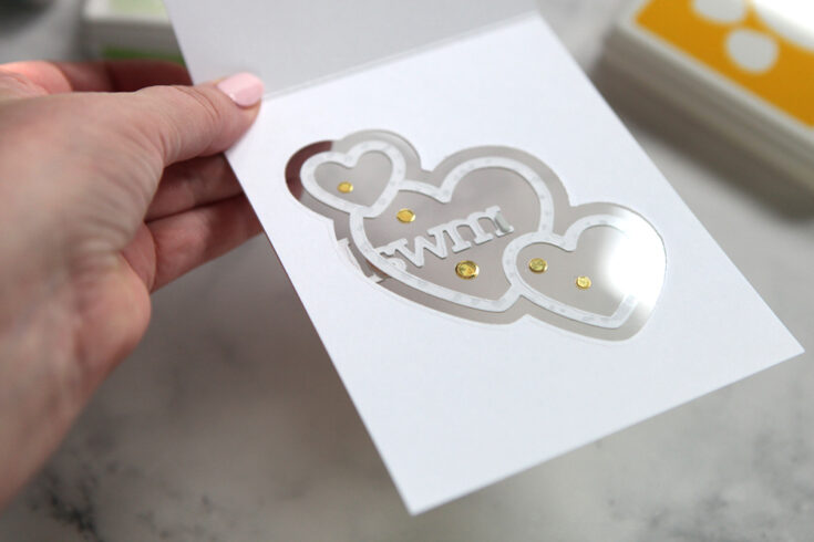
When you sandwich your acetate between a panel and a card base, you create a very finished look to the inside of the card, as well.
Here is my video showing you how I created this card:
WATCH THE VIDEO:
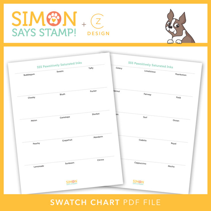
Did you see my swatch chart in the video? I created that for all of the Simon Says Stamp Pawsitively Saturated Inks that have been released to date! I used my SSS Swatch Stamps to create the samples. Download my chart by clicking on the image below!
See you next month!
SUPPLIES:
|


Thanks so much for stopping by, and thanks to Cathy for being our guest!
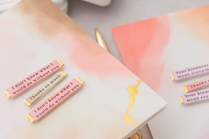
Yippee for Yana: Abstract Backgrounds with Ink Pads
Hi friends! Happy Tuesday! Please join me in welcoming back special bi-monthly guest Yana Smakula to our blog! Read on, and be sure to watch the video for all the details! Enjoy!
Hello, crafters, this is Yana Smakula for Simon Says Stamp! Welcome back for another Yippee For Yana video! In this video, I’m sharing my secret for creating abstract painted-like backgrounds using nothing more but ink pads.
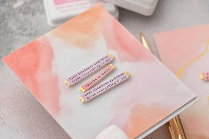
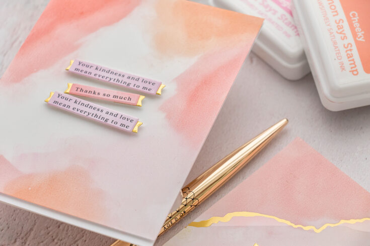
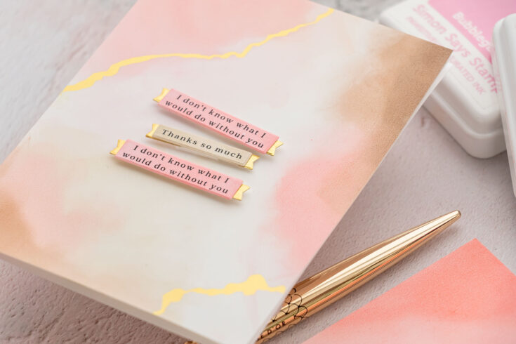
My trick to creating these painted-like abstract backgrounds is using the right type of paper. I’ve found that glossy synthetic papers work best for this technique as they don’t absorb the ink as fast as the regular papers do, giving you lighter color and allowing you time to manipulate the ink on the paper.
I am using Spellbinders Specialty Glimmer paper, it is designed for hot foil stamping, but I’ve found it works amazingly well for this technique. You can try other synthetic or glossy papers you have in your stash to achieve similar results.

I prefer to use Simon’s Pawsitively Saturated inks for this technique. I find this type of ink and this type of ink pad foam to work much better for this technique.
And all I do is direct to paper. I apply the ink onto the paper and next, if I need to, I use my finger to blend it out. I’ve found that the dryer the ink pad, the less ink the ink pad has, the better results I get as I don’t transfer as much ink onto the paper and I don’t have to blend it out as much.
Here are my top tips for building these backgrounds:
- Apply ink from the edges in. I don’t add ink in the center of the panel, I just add it to the sides of the panel. I can add the ink onto all 4 sides, or just in sections, but never to the center of the panel.
- Leave a bit of the panel free from ink, keep it white. You want some of that white to show. Although, you can create a completely colored background using this technique if you want. I want mine to have a bit of white.
- Start with the lightest color and layering on the darker colors you build your background. I do prefer to use lighter colors, and I stay away from the dark ones, as I feel these backgrounds look so much nicer when lighter colors are used.
- My rule for adding color is to add 90% of the lightest color, 60% of the medium color, and no more than 30% of the darkest color. This will give you a beautiful layered background.
It’s okay to mess your background up. You can wipe the ink away using a cloth if you don’t like the result. You can use a baby wipe to get a lot of the ink off of the background. That’s what’s great about using synthetic paper and this type of ink. The synthetic paper doesn’t allow the ink to go inside, the ink sits on top and because of the ink formula – if needed, the ink can be wiped off.
You can of course try this with other types of ink you have in your stash. I have tried it with dye ink, Simon’s dye inks, and it works, but I still prefer the softness of the Pawsitively Saturated ink.
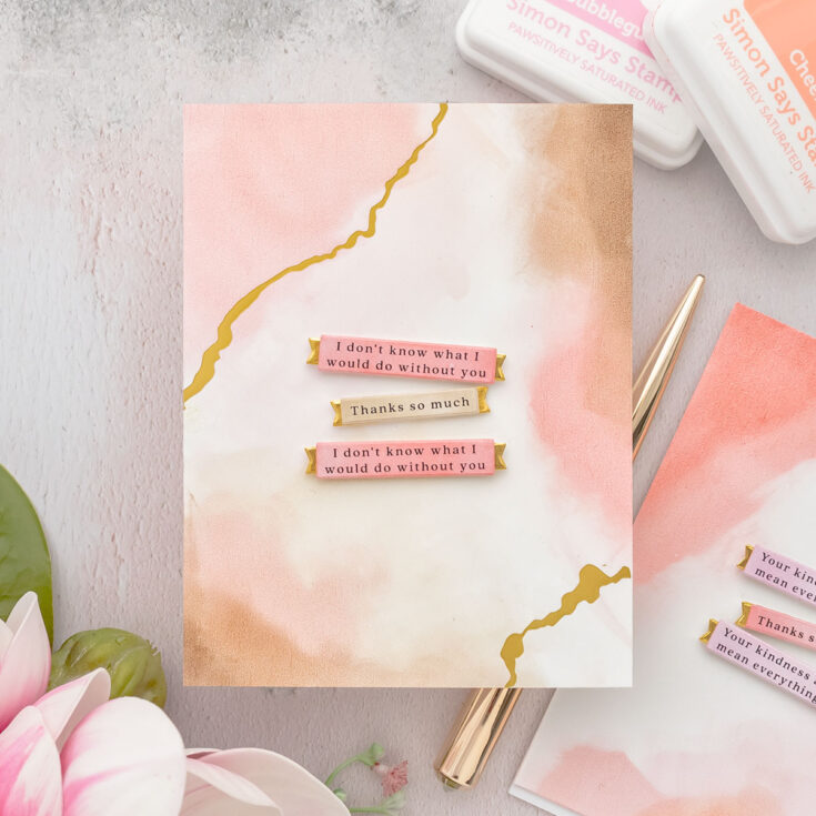
These backgrounds create beautiful backgrounds for cards, you can also use them to die cut something, perhaps a large focal element for your project. I used mine to create Clean and Simple cards and all I did was add a simple sentiment on top.
Thanks so much for joining me today, have fun crafting!
WATCH THE VIDEO:
SUPPLIES:
|


Thanks so much for stopping by, and thanks to Yana for being our guest!