Crafty with Caly: Lemon Zest
Hi friends! Happy Wednesday! Please join me in welcoming back special guest Caly Person to our blog today with this gorgeous and happy card design! Be sure to watch the video for all the details! Enjoy!
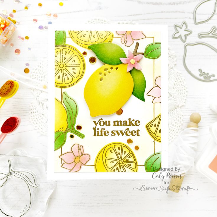
Hello there! It’s Caly with you today and I’m excited to share an easy, but pretty card! The new Lemon Zest die set pairs well with the You Shine set, so I’ve combined them for my project.
I began by stamping and embossing the You Shine images around a white panel to create a frame. I stamped the images with embossing ink and embossed the panel with gold embossing powder. To add color to these embossed images, I used the emboss-resist method. I isolated the images by creating stencils using the coordinating dies for each of the images I stamped. I have a video and hope you’ll watch to see this done!
WATCH THE VIDEO:
Using one stencil at a time, I applied ink using small and round detail blending brushes. When I was done, I used residual yellow ink from my brush and filled in the white space around the edges. Once my background was done, I trimmed ¼” off all the sides to get crisp clean edges and to get a nice mat for my card base.
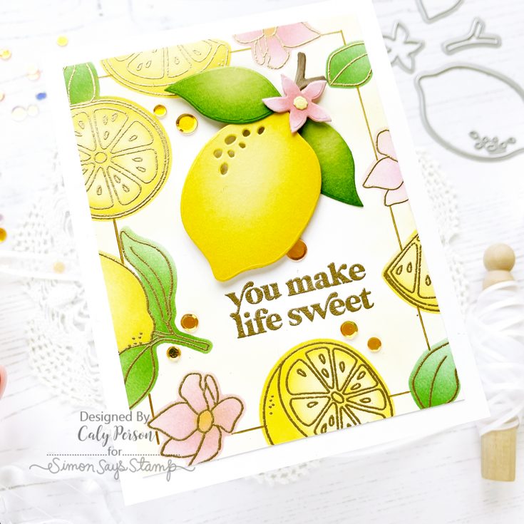
Next, I die-cut the pieces from the Lemon Zest dies and ink-blended them using the same inks I used for my background.
Ink colors used: Fairway, Cheeky, Sunbeam, Cappuccino
Cardstock used: Banana, Cotton Candy, Green Apple, Neenah Desert Storm
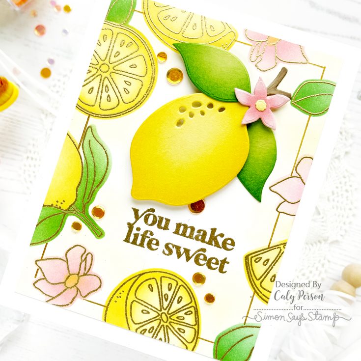
I attached my die-cut lemon over my lemon frame/background using 3D Foam Square from Simon Says Stamp. These are new and come in two different heights and colors and are so handy! To finish, I attached a few sequins from the Sunflower Fields Mix.
I hope you enjoyed this card! Thanks so much for spending some time with me today! ~Caly
SUPPLIES:
|


Thanks so much for stopping by, and thanks to Caly for being our guest!
Art Journaling with Shari Carroll: Nature’s Beauty
Welcome, everyone! It’s Shari here with an art journal page where I’ve done a little color study. I have a photo inspiration of my son Brooks’s grapes from his garden, and I LOVE the color combination! I did a centered layout leaving lots of white space for contrast.
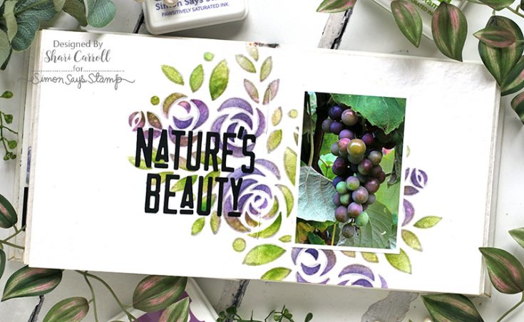
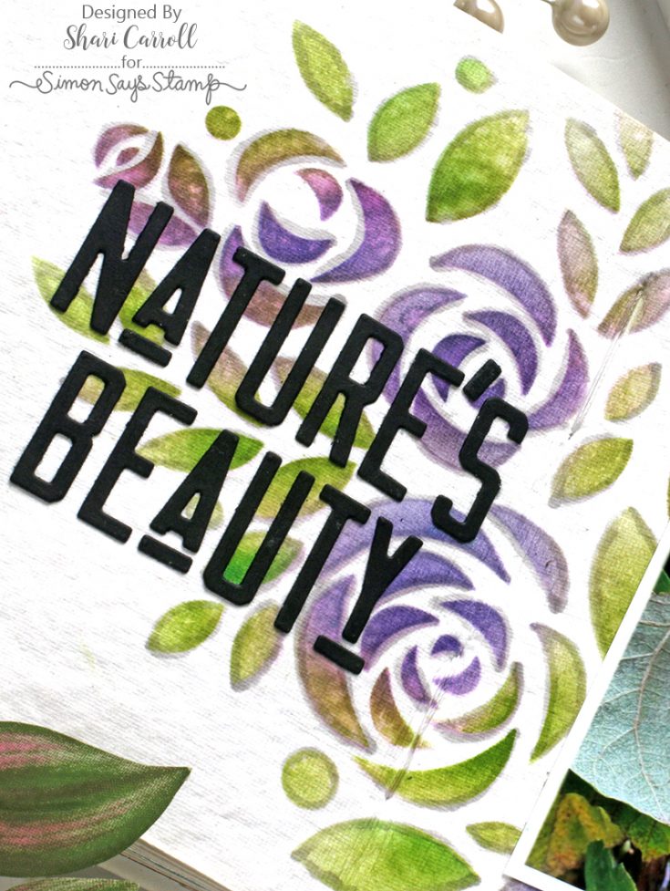
There is this color that sits between purple and green that I think of as the “sweet spot”. I tried to create this color by blending inks overtop of each other through a stencil.
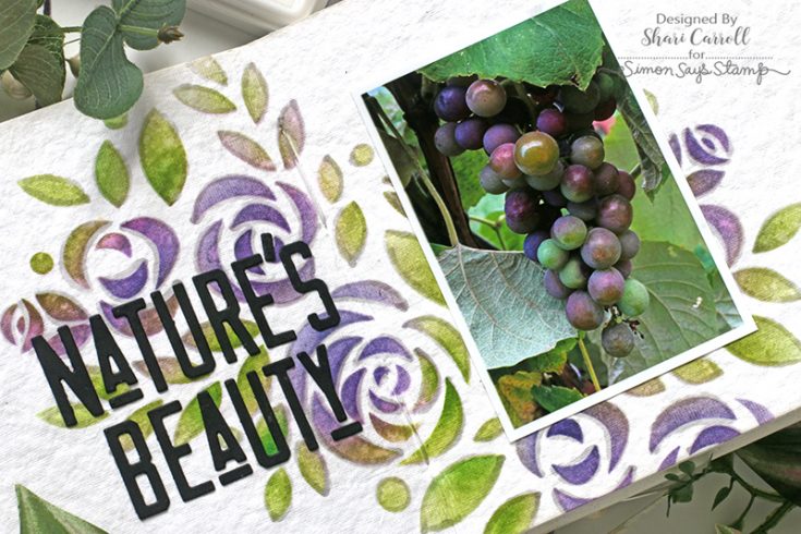
Once I had done the stenciling, I outlined the images with a grey Copic maker for a finished look.
SUPPLIES:
|


Studio Monday with Nina-Marie: Reverse Confetti Circle Gift Card Holder

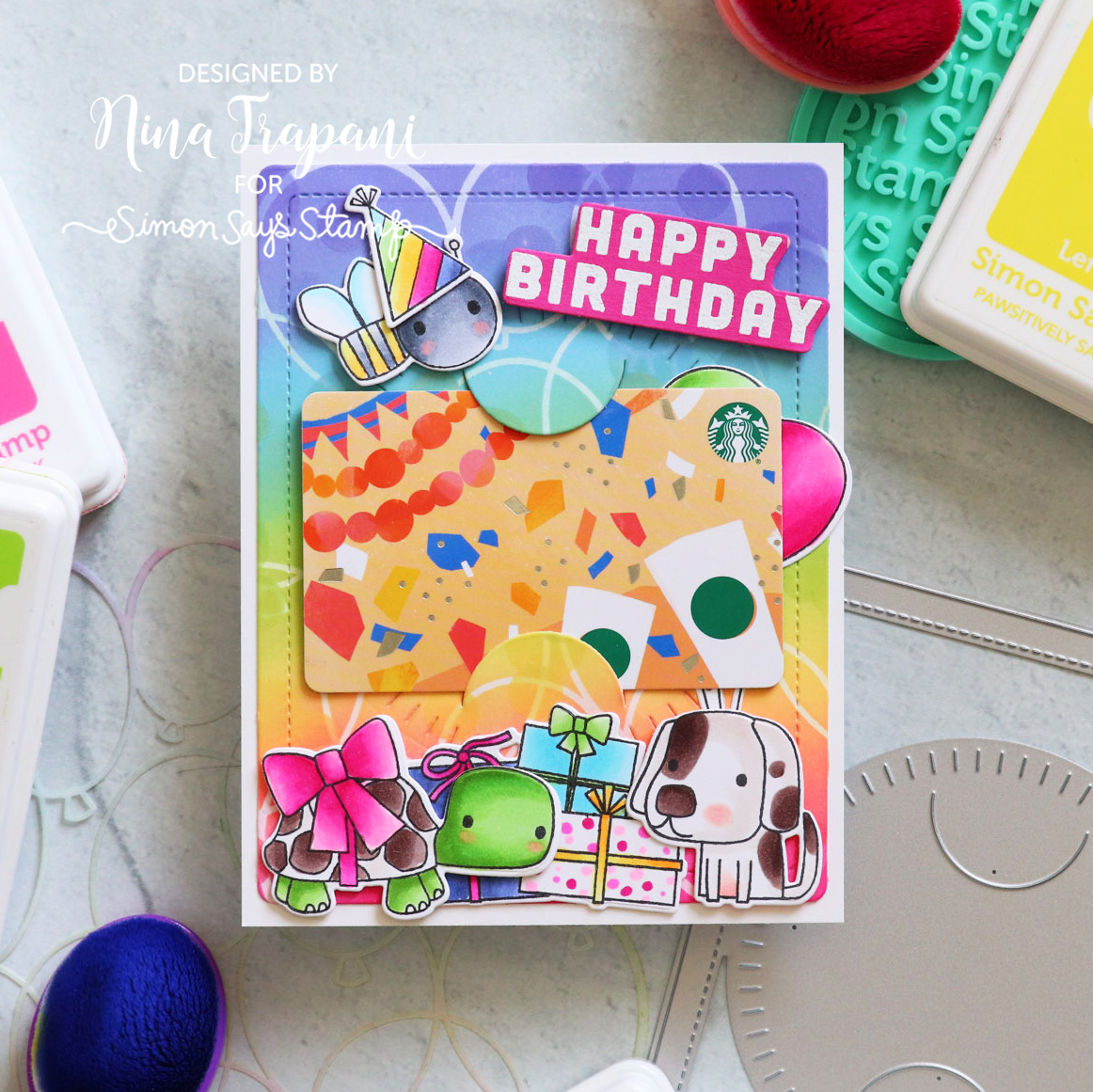
Hello everyone, it’s Nina-Marie Trapani here with you sharing a project using Reverse Confetti products! Birthdays are a perfect time to make gift card holders! For today’s card, I am pairing the adorable Birthday Buddies set with the Circle Gift Card Holder from Reverse Confetti.
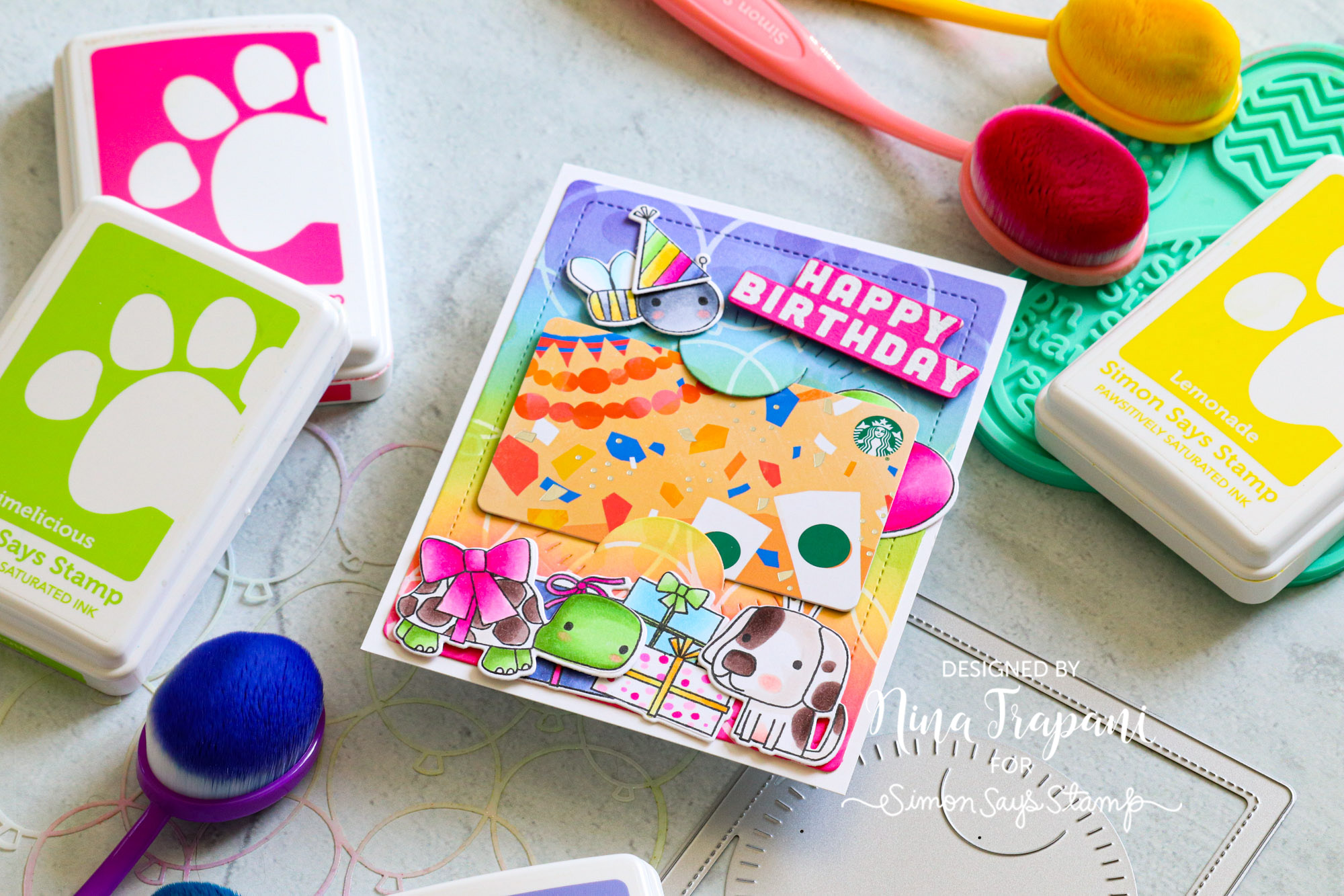
This darling birthday card also features some of our Simon exclusive stencils to create a colorful background, including the Balloon Bunch and Layered Confetti stencils.
Be sure to watch the video below to learn more about how I made this card!
WATCH THE VIDEO
SUPPLIES
|


