Time to Stock Up! 25% Off Ranger (Including Tim Holtz!)

Hi friends! Happy Friday!
We’ve got an extra-special treat for you this weekend! It’s the perfect time to stock up on your favorite Ranger crafty staples—or finally try something NEW you’ve had your eye on.
Shop early for the best selection, and don’t miss out on these amazing deals—happy crafting!
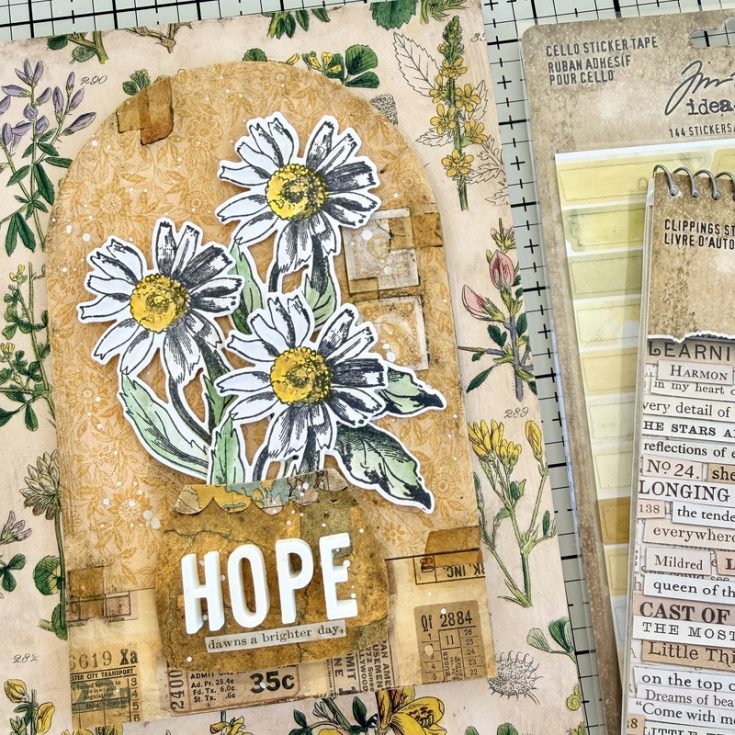
HOPE Panel Tutorial by Paula Cheney

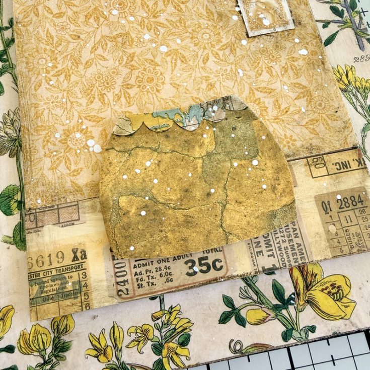
I was listening to a podcast recently where the speaker shared a small, beautiful observation: she loved seeing tiny flowers growing in the cracks of a sidewalk. To her, those stubborn little blooms were a visual definition of hope.
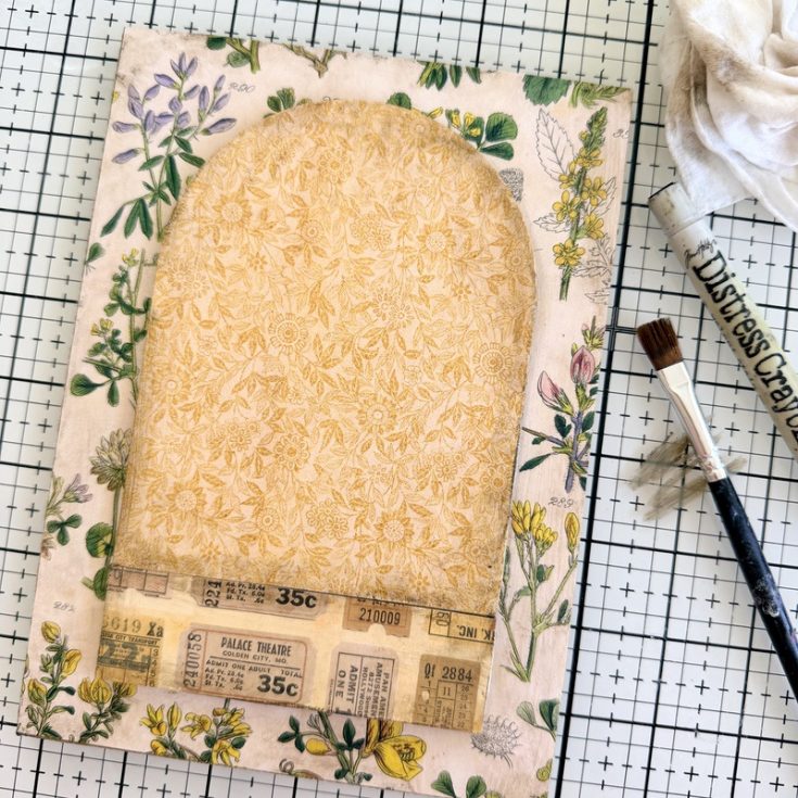
When I sat down to create this project, I found myself staring at a sheet of cracked-pattern paper from the Palette Yellow collection. Immediately, her words flashed back to me. I wanted to create a piece that mirrored that exact feeling—the idea that even in the fractured, “broken” places, there is space for something bright to grow. This project is my version of that sidewalk flower: a reminder that hope always finds a way through.
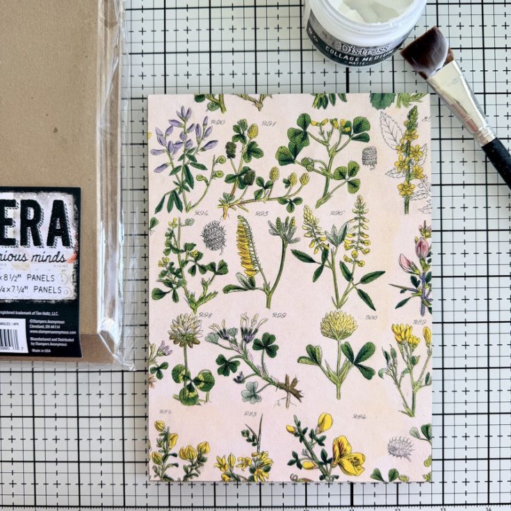
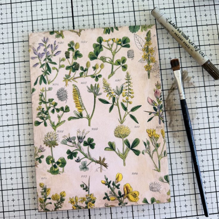
- Begin with an Etcetera Panel (6 x 8.5”) as the substrate. Use Collage Medium to adhere paper from the 12 x 12” Palette Yellow paper pack. I chose a bold botanical to counterbalance the ditsy print I will be using next. Be sure to add a layer of Collage Medium over the top of the paper to seal.
- Once the Collage Medium is dry to the touch, scribble Walnut Stain Distress Crayon on the edge of the Etcetera Panel. Use a damp brush to move the crayon around to age the edges.
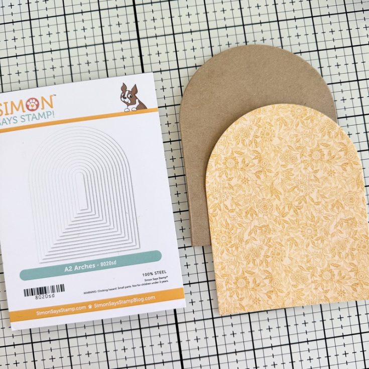
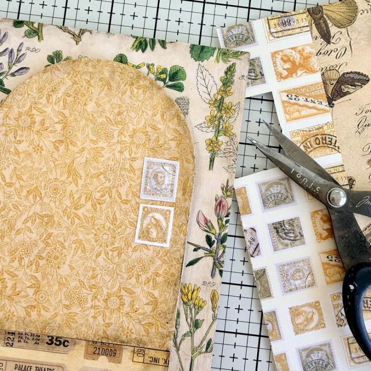
- Using the largest arch of the Simon Says Stamp A2 Arches Wafer Die, cut a piece of Palette Yellow paper and two pieces of thin chipboard. Glue all the pieces together with Collage Medium.
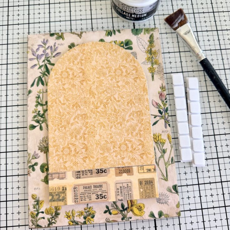
- Use 3D Foam Squares to add the arch shape to the Etcetera Panel. I added a second piece of chipboard to extend the length of the arch (1 1/4 x 4 1/4”). I covered the small chipboard rectangle with another Palette Yellow pattern for added interest. Add 3D Foam Squares to adhere it to the panel below the arch. Once the two pieces were in place, I added a layer of Collage Medium over the top and let it dry.
- Once the Collage Medium was dry, I repeated the crayon technique to give definition to the edges of the added chipboard pieces.
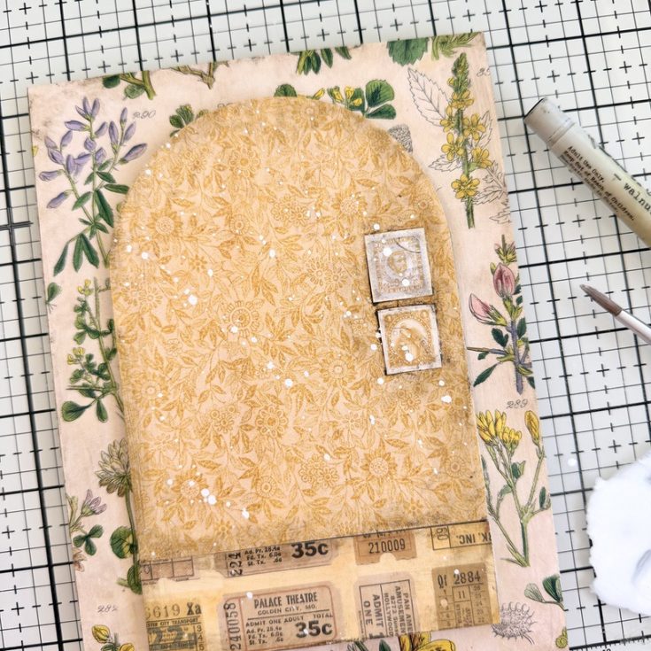
- Cut a couple stamp from the Stamps Palette Yellow paper and adhere them to the right side of the arch. Cover with Collage Medium to seal and let dry.
- Once dry, use the Walnut Stain Crayon to build up a dark edge around the stamps. Make a puddle of Picket Fence Distress Paint and a small amount of water. Use a paint brush to flick the white paint over the arch (I covered the background panel with a paper towel to protect the surface from the splatter).
STAMPING
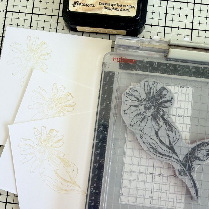
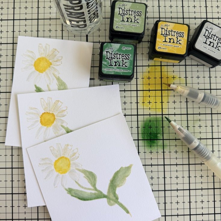
- Use a stamp positioner and Antique Linen Distress Ink to stamp three pieces of Distress Watercolor Cardstock with the daisy image from the Stampers Anonymous French Garden stamp set. DO NOT remove the stamp from the positioner after stamping – you will use again after coloring the images.
- Use a variety of Distress Inks and a Detailer Water Brush to watercolor the images. I used a combination of colors – for the leaves, Rustic Wilderness and Bundled Sage. Lost Shadow for the petals and Mustard Seed for the center.
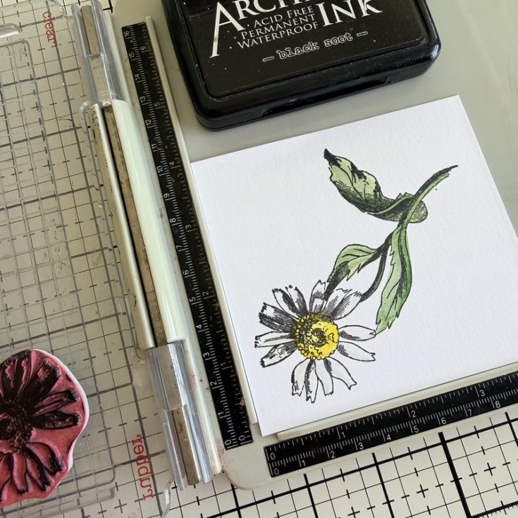
- Once the stamped images are colored and dry, place each image back into position on the stamp positioner. This time, stamp the image with a dark Archival Ink, like Black Soot or Ground Espresso. The dark color brings back the lost details of the image.
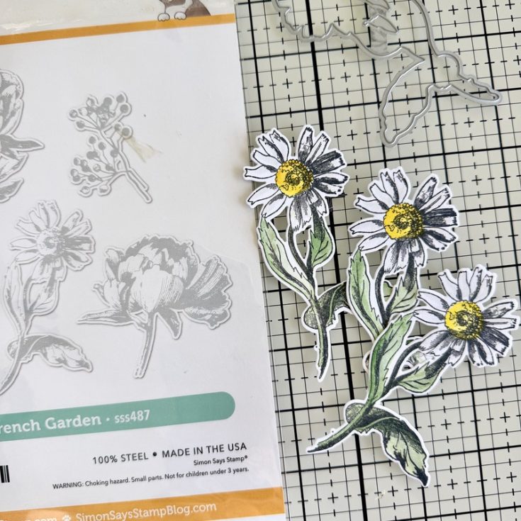
- Once stamped, use the Simon Says Stamp French Garden Wafer Die to cut out the three images. Now that was EASY!
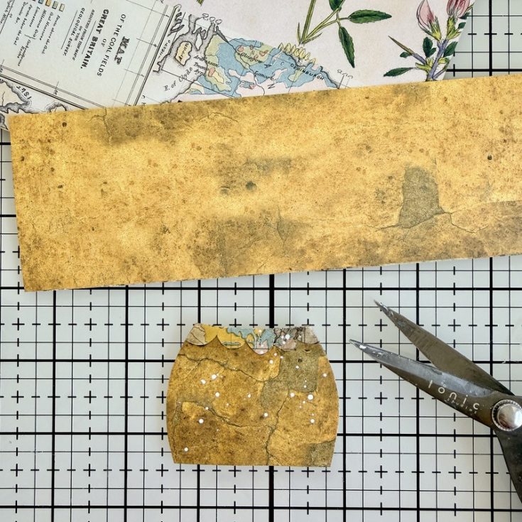
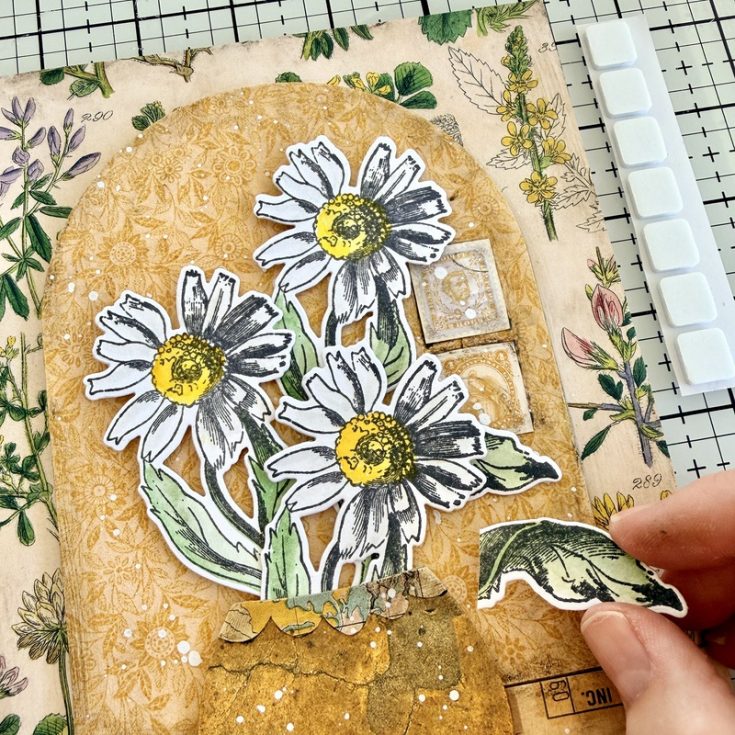
- Next we need a vase of sorts. I cut drew a shape on chipboard then cut it out. I chose the cover the chipboard with the Palette Yellow paper with all the cracks in it to go with my theme. I freehand cut a small piece of the Palette Yellow Map paper into a small scallop to run along the top edge – but you can decorate the vase anyway you choose.
- I added the vase to the panel with 3D Foam Squares. I cut each Foam Square in half and lined the edge of the vase so I can slip the flower stems inside, just like a real vase.
- Add one 3D Foam Squares to the back of each flower and add to the vase. I cut the leaf from the daisy on the left and repurposed it behind the daisy in the front.
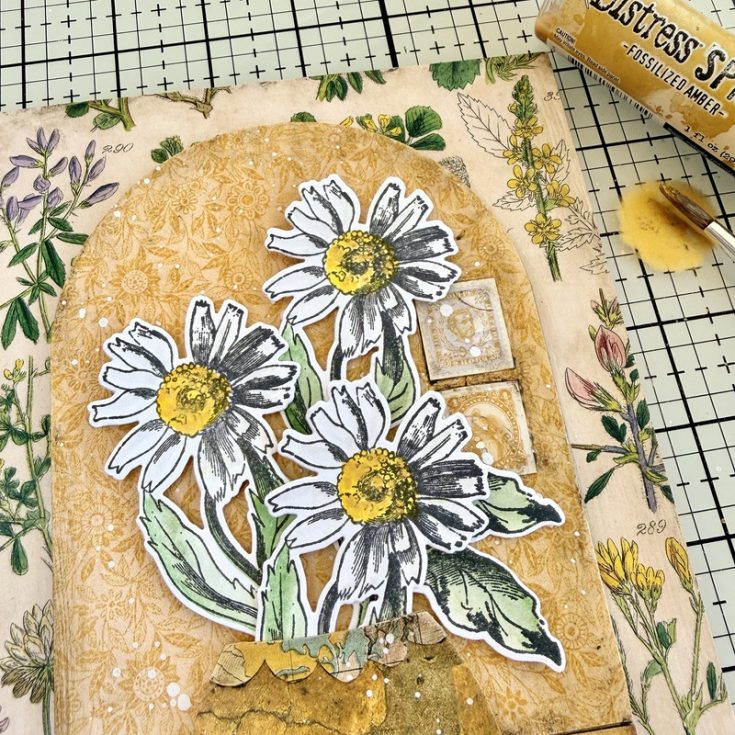
- This step is not easy to see in a photo, but I used a paint brush to add dots of Fossilized Amber Distress Spritz to the center of each flower for a bit of shine. Again, hard to see in a still photo but in person it is beautiful when the light catches it.
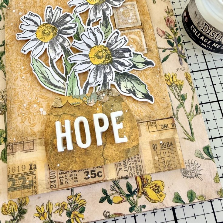
- Just a few more steps, the first being the addition of the word HOPE to the vase. Typography is one of my favorite idea-ology products. The 3D letters always give a pop of something unexpected when added to a piece and they are so easy to use – just glue them down with Collage Medium. I do like to have a tiny brush on hand to wipe away any glue that might squish out from underneath.
- And in one final move, I added Cello Sticker Tape to various areas of the arch and a Clipping Sticker below the word HOPE. I used the Walnut Stain Distress Crayon to create the added buildup around the Cello Tape Stickers. Love the dimension it creates so the tape stands out from the golden background.
SUPPLIES:
|


Thanks so much to Paula for this gorgeous inspiration and to YOU our reader, for stopping by today!
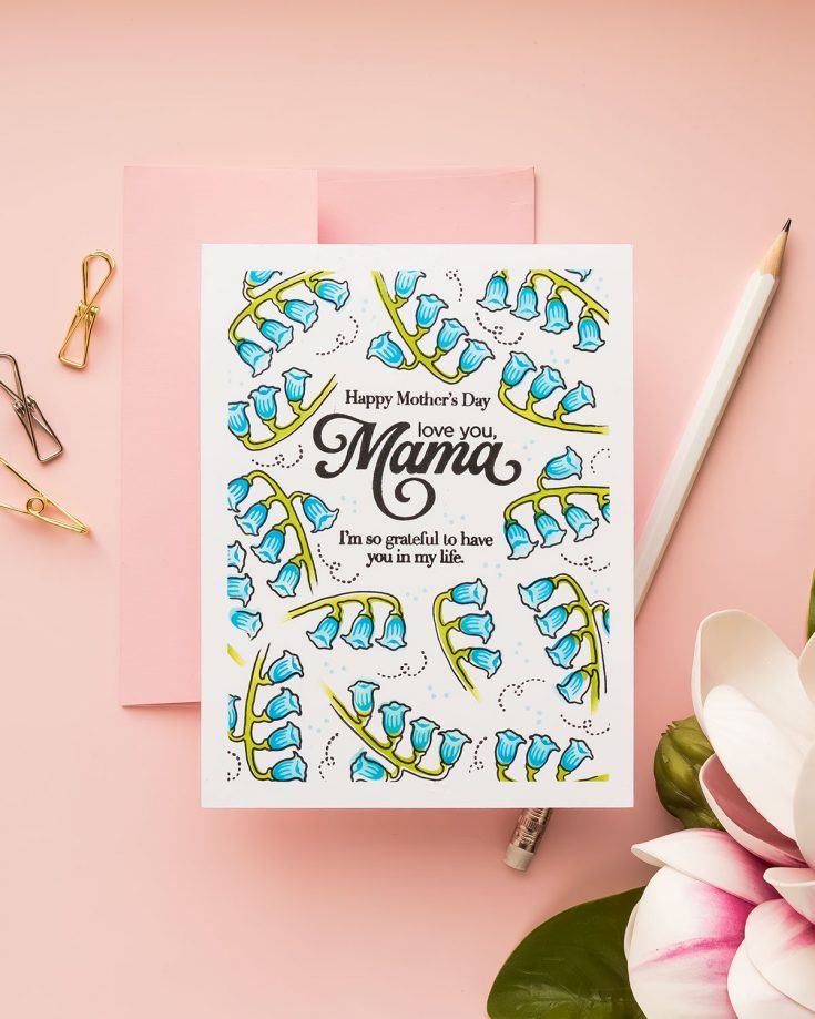
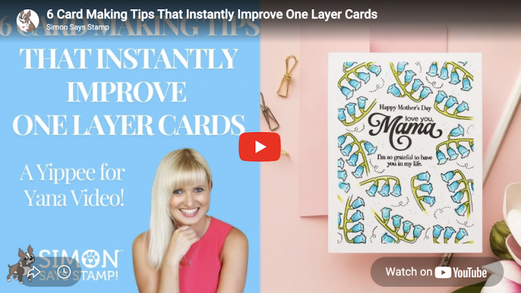
6 Card Making Tips That Instantly Improve One Layer Cards: Yippee for Yana

Hi friend! Please join me in welcoming back the oh-so-talented and amazing Yana Smakula! (Please note: our dear friend Yana is Ukrainian. To show support to our brothers and sisters in Ukraine, please see Yana’s post HERE.)
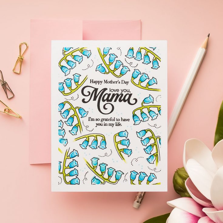
Hi everyone! Welcome back for another Yippee for Yana episode. One-layer cards are often described as simple. And they are. But they can also be surprisingly tricky to get right.
Without die cuts, foam adhesive, or layers to rely on, every decision you make matters more. Placement, balance, spacing, and detail all play a role in whether your card looks polished or unfinished.
Today I’m sharing a simple formula I use when creating one-layer cards. I call it the anatomy of a one-layer card. Once you understand these steps, you can apply them to any stamps you already have in your stash and create clean, professional-looking designs every time.
You can watch the full process in the video below.
Step 1: Start with the Sentiment
The most important decision on a one-layer card is where your sentiment goes.
Because you are not adding layers later, you need to plan your layout from the very beginning. I like to place my sentiment slightly above center to create a natural visual balance and leave room for the design to build around it.
If your card ever feels “off,” chances are it’s not your stamping, but your placement.
Step 2: Create the Illusion of Layers
Even though this is a one-layer design, you can still create the look of dimension.
One of my favorite tricks is to mask the panel edges with tape to create a clean border. This frames the design and instantly makes the card feel more finished and intentional.
You can use tape, draw light pencil lines, or simply visualize the border if you prefer.
Step 3: Plan Before You Commit
Before stamping anything onto your panel, take a moment to plan your layout.
I like to stamp my images onto scrap paper, cut them out roughly, and move them around on my panel. This allows me to test different arrangements, balance the composition, and avoid awkward gaps.
Once I find a layout I like, I take a quick photo with my phone so I can easily recreate it.
This extra step can save you from making mistakes and gives you much more confidence as you build your design.
Step 4: Build Your Background
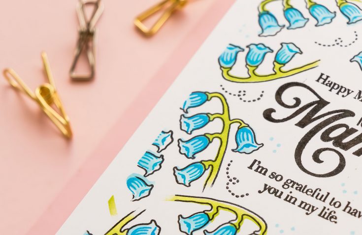
Now it’s time to bring your design to life. Work around your sentiment and build your background using your images. Start with larger elements first, then fill in with smaller ones.
Rotate and angle your stamps to create movement. If an image feels too long or too large, you don’t have to use all of it. Fading or partially stamping images can create a more natural, organic look.
Whether you’re stamping or ink blending as I did here, the goal is to create a balanced composition that flows around your focal point.
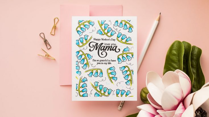
Step 5: Add Detail and Depth
Once your base layer is complete, go back and add detail stamping.
This step brings everything together and gives your images more definition. Don’t worry about lining everything up perfectly. A slightly offset look can actually add interest and dimension to your design.
This is where your card starts to feel finished.
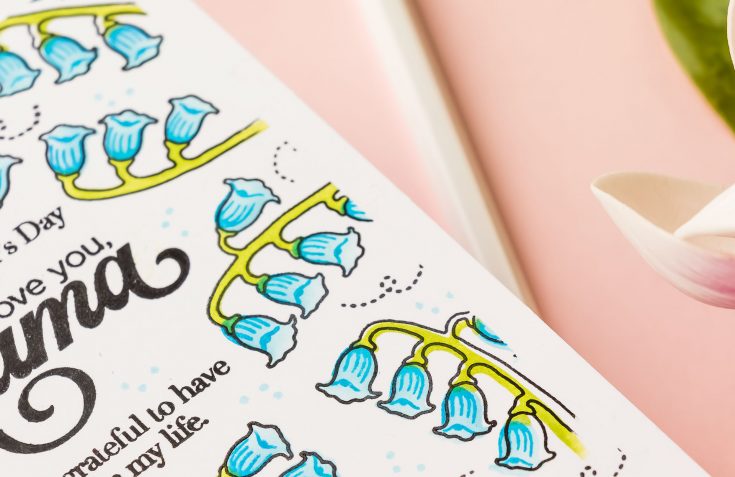
Step 6: Fill the Gaps
Take a step back and look at your background.
If you notice any empty areas, fill them in with small details. This can be tiny stamps, dots, or simple textures that complement your main images.
These small additions help unify the design and eliminate any areas that feel incomplete.
Once your background is finished, remove any masking tape to reveal a clean border and mount your panel onto a card base.
That’s it. No die cutting, no layering, and no bulk.
Here’s a quick recap of the anatomy of a one layer card:
- Start with your sentiment
- Create a faux border or frame
- Plan your layout
- Build your background
- Add detail
- Fill the gaps
This approach takes the guesswork out of designing and gives you a repeatable process you can use again and again.
If you give this technique a try, I’d love to see what you create.
WATCH THE VIDEO:
SUPPLIES:
|


Ways to support Ukraine:
If you are looking for ways to support Ukraine, we encourage you to visit this page on Yana’s blog:

A big thank you to YOU, our reader — and to Yana for being our guest!


