Studio Monday with Nina-Marie: Tall Scene Card Featuring Neat & Tangled
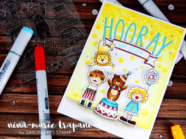
Hi friends, it’s Nina-Marie here with you today, sharing a brand new Studio Monday tutorial! Today I will be featuring Neat & Tangled products as I show you how to go outside the box of a standard A2 sized card and create larger scenes!
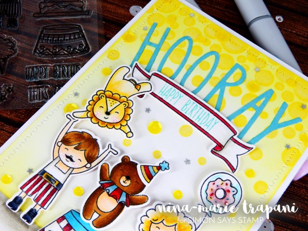
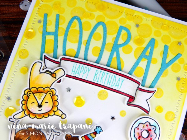
In today’s video we’ll be using the Big Top birthday stamp and die sets, the Journaling Alpha dies, and the Falling Circles stamp set; a combination of the newest stamp and dies sets from Neat & Tangled’s two most-recent releases! The Big Top Birthday sets are going to be the “stars of the show” (no pun intended!), but the additions of the Journaling Alpha and Falling Circle sets are an important “supporting cast”, what helps bring this scene to life!
I colored the images on this card with Copic markers and used fairly easy shading on most of the pieces simply because the images are on the smaller side. It also illustrates the point of not needing to have lots of markers in your stash to create stunning, colored images!
For those of you interested in the color combinations I used, I have them listed down below and in the video during the coloring process.
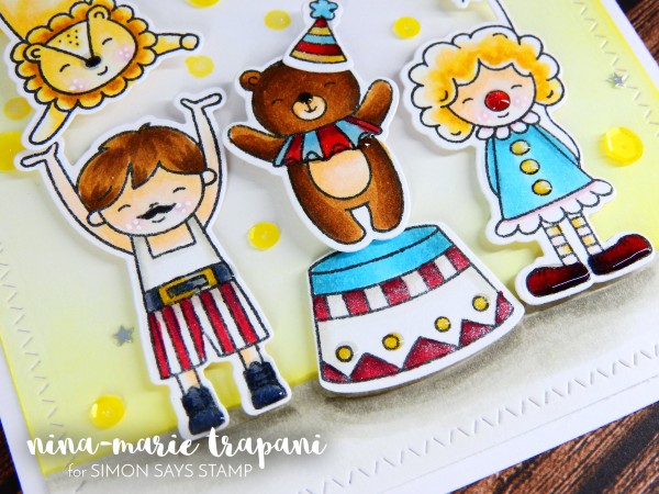
- girl: BG01, BG53, BG57, RV00, RV93, YR30, YR23 (dress); C5, C7, R37, R59 (shoes); YR20, YR30, YR31, YR23 (hair); E0000, E00, E21 RV00, RV93 (skin); BG0000, BG01, RV00, RV23, RV93 (balloon)
- boy: W1, W3, W00 (shirt); R37, R59, W1, W00, C5, C7, YR30, YR23 (pants and belt); C5, C7 (shoes); E0000, E00, E21, RV00, RV93 (skin); E35, E57, E47 (hair)
- lion: YR20, YR30, YR31, YR23, E35, RV00, RV93
- bear: E35, E57, E47, E0000, E00, BG01, BG53, R37, R59
- pedestal: BG01, BG53, BG57, R37, R59, W00, W1, W3
- banner: R37, W1, W00, W3
- party hat: YR30, YR23, R37, R59, BG01, BG53
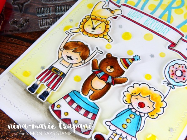
The card, as you can see, is much taller than the standard A2 size (4 1/4″ x 5 1/2″); this is because I not only wanted to do something different, but I also felt that the larger size fit the design of the card that I had in mind. Never feel that you have to create cards a certain size; cards can as small or large as you prefer! I think it’s fun to create cards of all shapes and sizes; something a bit unexpected! :)
So to see how I put this card together, be sure to watch the video below or on our Youtube channel! If you enjoy, please give the video a big thumbs up and subscribe to our YouTube channel if you haven’t already, so that you don’t miss any of our weekly inspiration videos!
WATCH THE VIDEO:
SUPPLIES:
 |
 |
 |
 |
 |
 |
 |
 |
 |
 |
 |
 |
 |
 |
 |
 |
 |
 |
 |
 |
 |
 |
 |
 |
 |
 |
 |
 |
 |
 |
 |
 |
 |
 |
 |
 |
 |
 |
 |
 |
 |
 |
 |
 |
 |
 |
 |
 |
Blog Candy Alert!! Follow our blog via email and comment on this post for a chance to win a special blog candy!
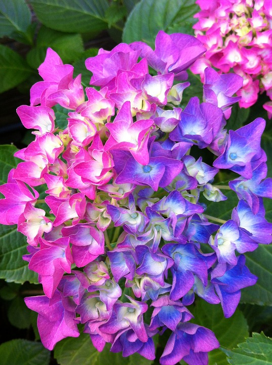
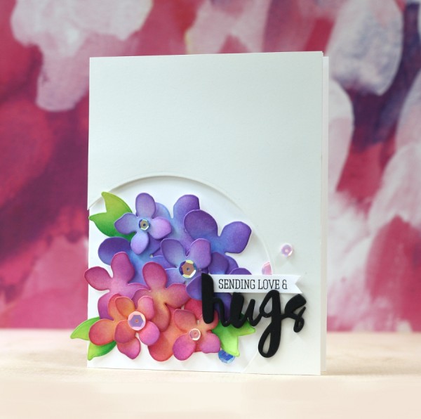
Hydrangea Ink Blending
Hi friends! Thanks for stopping by today! Please join me in welcoming the fantastic Laura Bassen back to our blog as a guest today! Today she’s pulled out our Hydrangea die set from our Among the Stars collection, and used the photo inspiration included below to make this beauty POP, with the help of some special ink color choices! Some other key ingredients in Laura’s card are the Painted Hugs die, Cream Off cardstock, & Crystal Reflections sequins. Don’t forget to watch the video, and enjoy!
Watch the video:
Supplies:
 |
 |
 |
 |
 |
|
 |
 |
 |
 |
 |
 |
 |
 |
 |
 |
 |
|
 |
 |
|
Blog Candy Alert!! Follow our blog via email and comment on this post for a chance to win a special blog candy!
Weekender with Wanda – Summer Tiki with new Tim Holtz Dies!
Aloha! Happy Saturday! It’s time for the latest edition of Weekender with Wanda here on the Simon Says Stamp Blog! I hope you are enjoying a beautiful Summer weekend! I missed seeing you here last weekend, but oh man, wasn’t that an awesome blog hop last Saturday?! Wow! I am very happy to be with you here today because I have been so anxious to share this card with you! I went bananas when I first saw the new Summer 2016 collection of dies by Tim Holtz for Sizzix! I practically stalked the SSS store until they were available! I love anything Hawaii, tropical, tiki related, and these new dies are perfect for our Summer crafting! So, today, I am featuring three of the new Sizzix die collections by Tim Holtz along with loads of vivid Distress Inks and Stains. Aloha!
I started this card design by die cutting a bunch of the pieces from the Tropical Dies and playing with them on my craft mat… Arranging and re-arranging until I got a layout I liked. Then I chose my color palette. The embossed background came into the picture because I wasn’t really liking patterned paper with all this color. And, I really love the Airmail Embossing Folder. I use that one a lot!
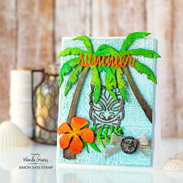
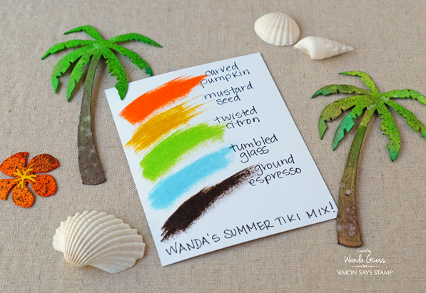
This color palette makes me think of Summer and the beach. Bright orange (Carved Pumpkin) with lime green (Twisted Citron) and ocean blue. I grounded all of the bright colors with beautiful brown ink in the form of Ground Espresso. In this photo you can see that the pieces are adhered to the card using foam squares for dimension and interest.
Here is my Summer Tiki Distress Ink Color Mix for this project! Don’t these colors look nice together?
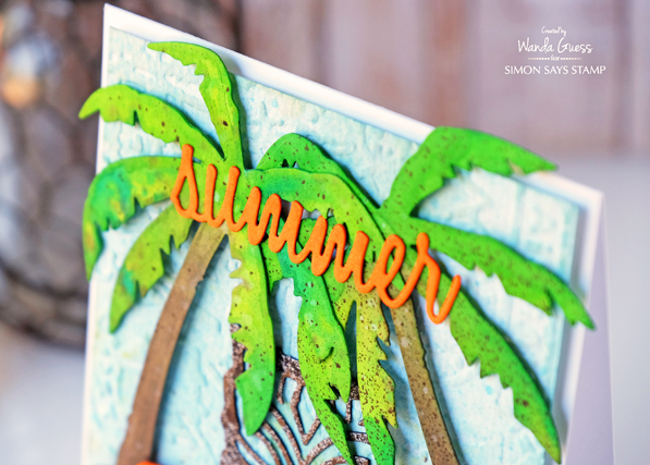
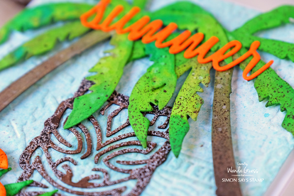
Here is a close up of the palm trees and the Summer Die cut. The Summer die cut comes in a package with 18 other Vacation Words in this retro cool font. I know I will use it all the time – and it’s perfect for Summer scrapbook layouts too.
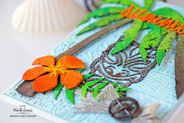
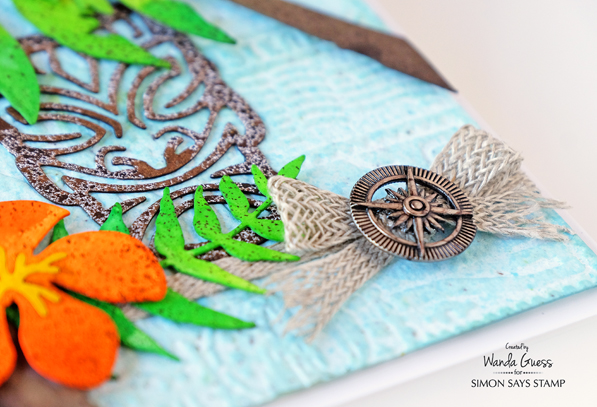
I used the Compass Charm from the Ideaology Souvenir Charms package. I snipped off the attachment part on the top and then colored the metal with a brown Copic Marker! Did you know you can color on glass, metal, plastic with your Copic Markers? Yes! I wrapped some Linen Ribbon around the card and glued the compass on top. On every card I like to use something soft (ribbon, linen, twine, cord, vellum) and something hard (enamel dots, gems, metal charms) to give balance of textures. This card has no shortage of texture!
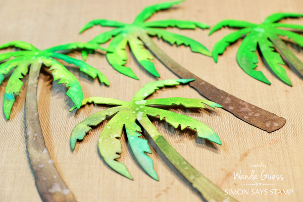
I typically will use Distress Ink Pads for most of my Tim Holtz projects. For this card I wanted to try something new and different – a different medium. Almost all of the color used today is from Distress Spray Stains. Distress Stains are fluid, water based ink very much like the ink used in the Distress ink pads. The liquid form makes for very interesting and unique effects. I started by die cutting my pieces out of Tim Holtz Watercolor paper. I started with the trees. I sprayed the trees with clear water using the Distress Sprayer. Then, while it was wet, I sprayed Antique Linen and Ground Espresso Stains onto the paper. You can see how the colors really sort of ‘melted’ together to make a neat effect. Then I did the same thing on the top of the trees with Twisted Citron and Lucky Clover Spray Stains. Then I dried the pieces with my heat tool.
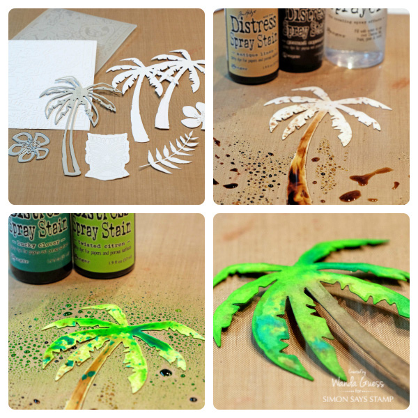
This is what they looked like after they all dried. I added drops of water as you can see here. This might be my new favorite technique!
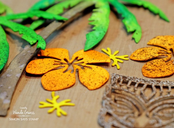
I colored the orange flowers the same way as the palm trees. For the Tiki statue I tried something different. I simply sprayed the Ground Espresso Stain directly onto the dry watercolor paper. I love the mottled effect that came out!
As my final step, once all the pieces were dry, I spritzed Ground Espresso Spray Stain on everything to give an aged look.
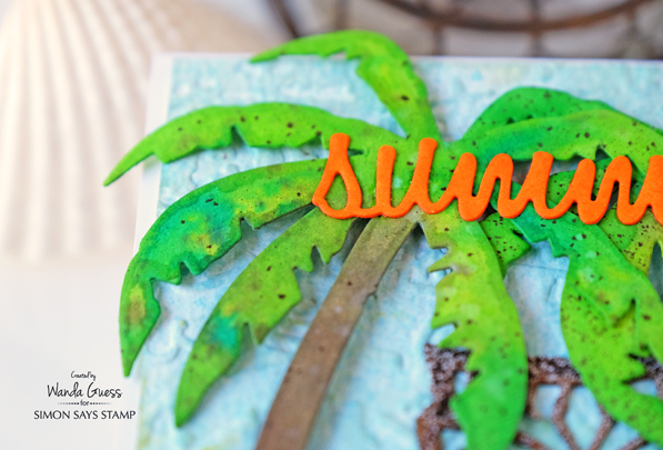
The embossed background panel was attached to a white card base using foam squares. The Tiki was glued directly onto the background and then everything else was layered on top. I cut one of the palm trees to look as if it was coming in from the side of the card.
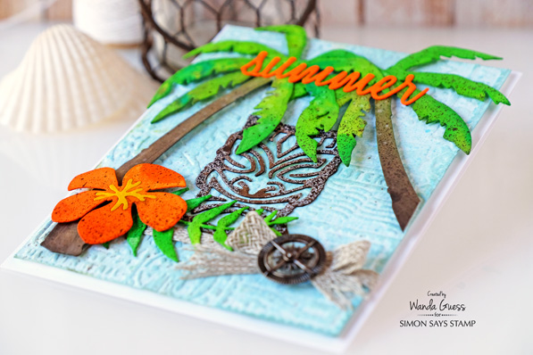
Thanks for coming along with me on this tropical journey! Does this card remind anyone else of the Brady Bunch episode where they went to Hawaii and Bobby finds the ancient Tiki!? I’m totally dating myself! Have a great week and I’ll see you here next weekend!
SUPPLIES:
 |
 |
 |
 |
 |
 |
 |
 |
 |
 |
 |
 |
 |
 |
 |
 |
 |
 |
 |
 |
|
 |
 |
 |
 |


