She Lives the Poetry She Cannot Write – Mixed Media Masterpiece by Emma Williams

Hi friend! Happy Sunday! The quote on this gorgeous mixed media project by special guest Emma Williams was just TOO gorgeous and perfect for a Mother’s Day reprise and share inspiration showcasing a great array of Tim Holtz branded products!! Be sure to read on to learn all of the details and enjoy!

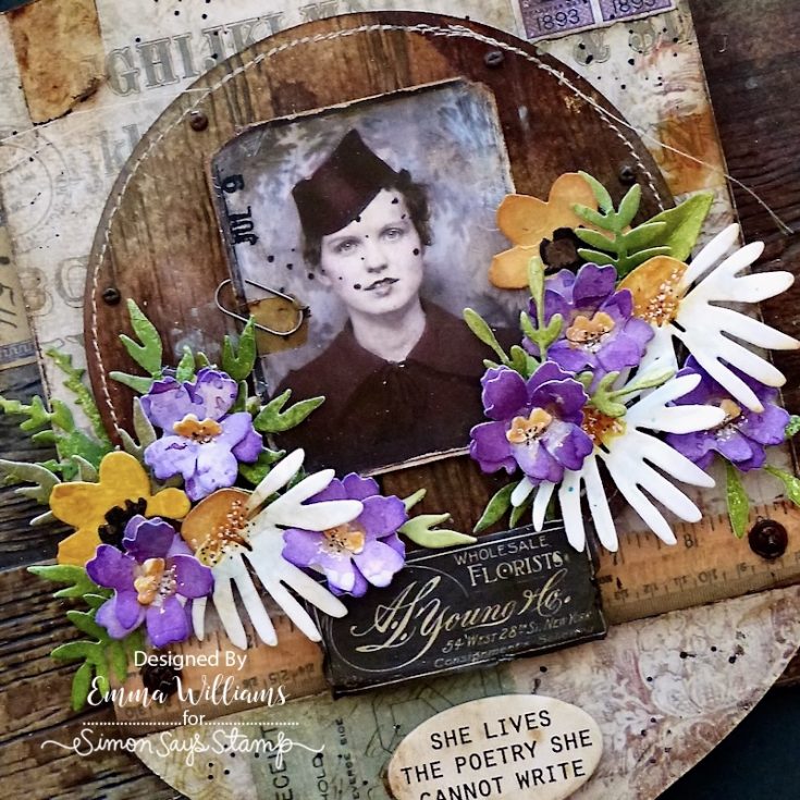
To begin with I created the wood effect background for the Rectangular Etcetera Panel. For this, I used the Sizzix Lumber 3D Large A5 Embossing Folder by Tim Holtz. This larger sized folder is so perfect for this size of panel and creates the most spectacular, realistic results. I cut a panel of Distress Watercolor Card to fit the folder, together with a 10cm circle of the same cardstock cut using the SSS Basic Shapes Circles Wafer Die Set. After lightly misting water over the surface of the card, I added the color. For this I used Distress Spray Stains and Oxide Sprays in the following colors; Bundled Sage, Scorched Timber, Weathered Wood and Gathered Twigs Spray Stains and Speckled Egg Oxide Spray. If you need to, you can add more water to blend the inks before drying the card stock with a heat tool.


I placed the inked cardstock inside the embossing folder and ran this through my Sizzix machine. Repeat this process to create an embossed effect using the circular piece of card.

Using the smaller Etcetera Panel in the pack of 4, I adhered Design Tape around the edge of the Etcetera panel. I then machine stitched the embossed wood effect cardstock, and attached this to the centre of my Etcetera Panel using Matte Collage Medium.

Moving onto the Etcetera Facade, I chose my favorite shape from the pack, the shield. I kept the circular section that is in the centre of the facade in place, I didn’t remove it and adhered a piece of the Wallflower Paper Stash over the top, attaching it with Matte Collage Medium. Apply a coat of the Medium over the surface to seal the paper and set this to one side to dry.

Machine stitch a border around the edge of the embossed lumber circle and using foam pads, attach the circle to the centre of the facade to add dimension and height. Apply Walnut Stain Distress Crayon around the outside edge of the facade, using your fingertip to blend out any harsh lines of crayon. At this stage, I also added a couple of Cello Stickers.

Take four of the stacking strips that are included in the Etcetera Facade pack, and attach these vertically to the back of the facade.

Adhere the facade into position onto the front of the Etcetera Panel by adding Collage Medium along each of the strips. The top and the bottom of the facade will overhang the edges of the panel.
The background is now complete, and we can move onto creating the floral arrangement that sits on either side of the vintage photo in the finished piece.

For these flowers, I used the Tim Holtz Sizzix Vault Side Order Floristry 2D Die Set. For the tiny purple violets, I inked a piece of the Mixed Media Heavystock card by applying Dusty Concord and Milled Lavender Distress Ink to my glass media mat, misting the inks with water and then picking up the color by swiping the card through the inks. I then used a heat tool to dry the cardstock before die cutting my flowers using this purple card. For the remaining flowers and greenery, I used Distress Watercolor cardstock. After cutting a variety of shapes, I added colour to these pieces, using Distress Inks (colors shown in photo) and blending brushes.

Layer and shape each of the die cut floral pieces. I used two die cut layers for each of the purple violets, before adding the yellow centers. I then added details to all the floral pieces using a black, and a white gel pen.

Place the florals to one side whilst applying colour to the photo from Tim Holtz’s Photomatic set. After cutting the photo to size and trimming off the outside border, I color tinted the image with Distress Crayons and a water brush.

Using a sanding disk attached to a blending tool, I sanded the edges of the photo, and made small tears on the corners, before inking with Walnut Stain Distress Ink. I added another piece of the Cello Sticker Tape to the photo and then added a Remnant Rub in the top left hand corner. Attach the photo to the centre of the embossed circle, adding a mini paper clip to the image.

To build up the layers for the central focal point, I added a ruler ephemera piece from the Memoirs Ephemera pack, and attached this underneath the photo, applying a coat of Collage Medium over the top, and adding Walnut Stain Distress Crayon along the edges, again blending out any harsh lines of color with my fingertip. I then took the die cut flowers and arranged these on either side of the photo.

I attached these flowers to the panel, using a combination of hot glue and foam pads, and adding them at varying heights to create depth and dimension.

The “Floristry” Ephemera piece is again taken from the Memoirs Ephemera Pack and after backing this onto a piece of mount board that I had in my stash, I inked the edges, adding a few rips and tears and attached it to the centre of my floral arrangement with foam pads.

I attached another piece from the same pack, the number ‘365 label’, to the left of the facade, adhering it directly onto the embossed lumber background panel and aging it with Walnut Stain Distress Crayon around the edges. I also added a Hardware Head to either side of the lumber base panel, placing them centrally on the left and right hand sides.

We’re nearly there and all that’s left is to add the small details. I attached some postal stamps ephemera from the Palette Ephemera Pack, and adhered these to the top right corner of the facade. After applying a coat of collage medium to seal the paper, I once again, ran Walnut Stain Distress Crayon around the edge of the postal stamps to give them more of a vintage feel.

To complete the make, I added some small Mini Fasteners around the outside edge of the embossed lumber circle.

I attached a Quote Chip Label, placing it centrally at the bottom of the facade.

Finally, I added some hardware as a finishing detail. Each piece of metal is altered with Distress paint to create more of a rusty vintage look to the metal. To begin with, I applied a layer of Crackling Campfire Paint, allowed this to dry, before then adding a layer of Black Soot Distress paint. Allow the paint to become tacky before wiping away any excess paint. To complete this, I applied a layer of Tarnished Brass Distress Paint to the metal surface, again wiping away the excess. Once the metal is dry, I attached these pieces to my panel, adhering them into position on either side of the ruler ephemera piece and at the top of the facade, using Matte Collage Medium to secure them in place. Photo 20
So that’s my project complete, and I hope you’ve enjoyed this tutorial and as always, the tips and techniques have inspired you to get inky and create…I’d love to see what you make!
See you all again very soon and Happy Crafting everyone…Emma x

SUPPLIES:
|


Thanks so much for stopping by, and to Emma for being our guest!
Psst! This great deal ENDS TONIGHT!

Watch This Pattern Come to Life! Layered Color Illusion Technique: Yippee for Yana

Hi friend! Please join me in welcoming back the oh-so-talented and amazing Yana Smakula! (Please note: our dear friend Yana is Ukrainian. To show support to our brothers and sisters in Ukraine, please see Yana’s post HERE.)
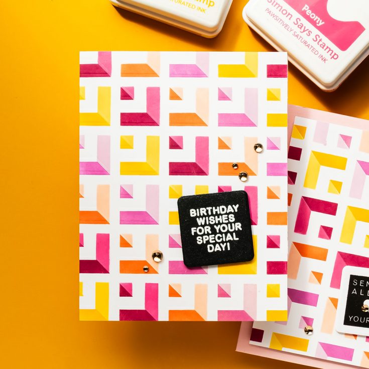
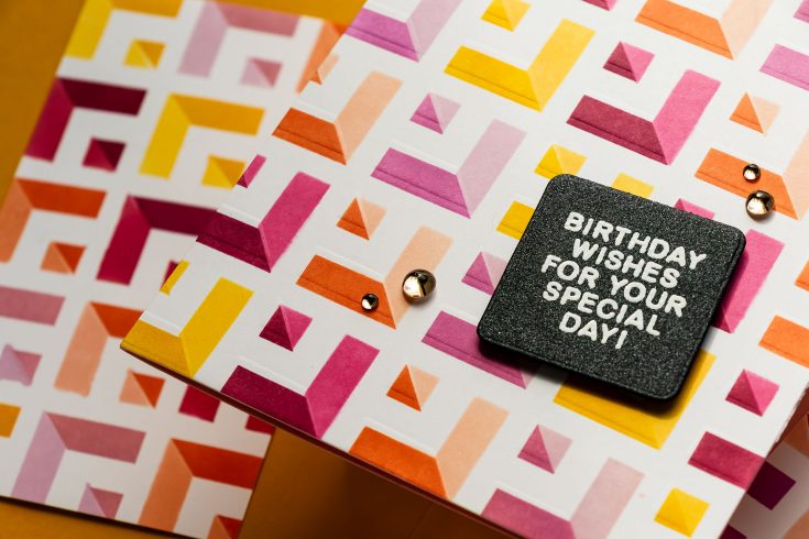
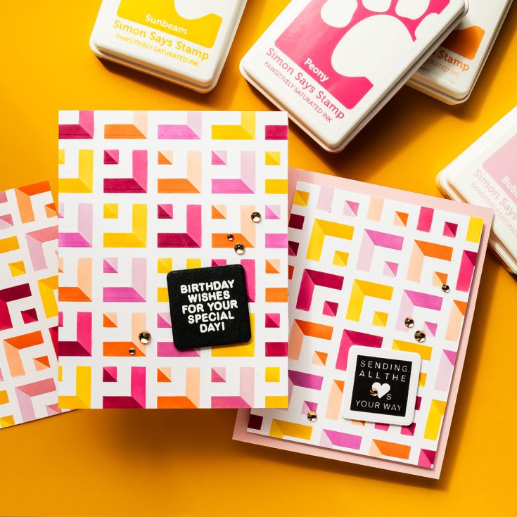
Hi everyone! Welcome back for another Yippee for Yana episode. There’s something incredibly satisfying about taking a single stencil and turning it into a bold, layered background full of movement and dimension. Today’s project does exactly that using the Simon Says Stamp Receding Squares stencil, and the result is a vibrant design with a subtle optical illusion effect that really draws the eye.

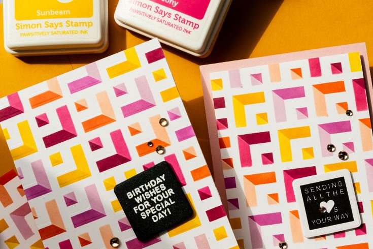
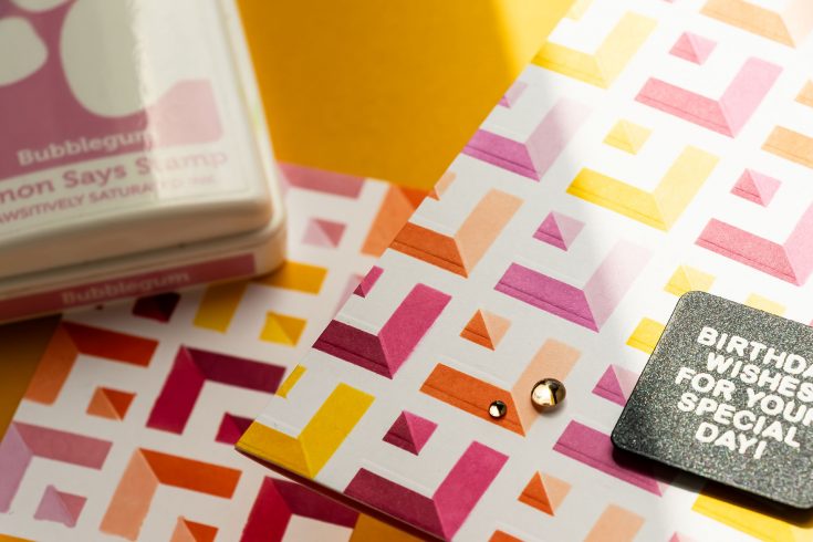
If you enjoy ink blending and want to stretch your supplies, this is a technique worth trying. I started by securing a panel of Neenah Solar White 80 lb cardstock onto a 7 x 7” Pawsitively Perfect Craft Tacky Mat. This holds both the paper and stencil firmly in place, making blending much easier and more controlled. The stencil is positioned once and stays in place for the entire first layer.
To make blending quicker and more precise, I created a custom mask using acetate sheets. These were simply cut from old clear card bases and taped together with low-tack tape. This mask allows you to isolate sections of the stencil so you can blend one area at a time without worrying about overlapping ink.
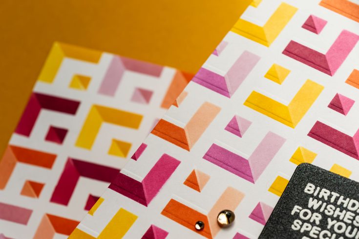
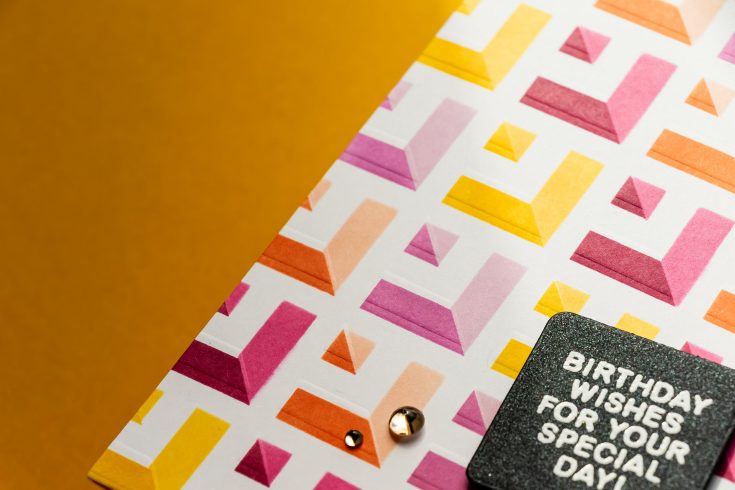
For the first layer, I chose a warm color palette: Citrine, Sweets, Sherbet, and Rose inks. Instead of switching colors constantly, I worked one color across all corresponding shapes before moving on to the next. This approach keeps the process smooth and surprisingly relaxing.
Once the first layer was complete, I cleaned the stencil and masks, then flipped the stencil over and rotated it 90 degrees. Carefully aligning it over the original design creates the foundation for that optical illusion look.
For the second layer, I used lighter shades of the same colors: Sunbeam, Bubblegum, Peachy, and Peony. Blending lightly and building color gradually is key here to avoid ink seeping under the stencil.
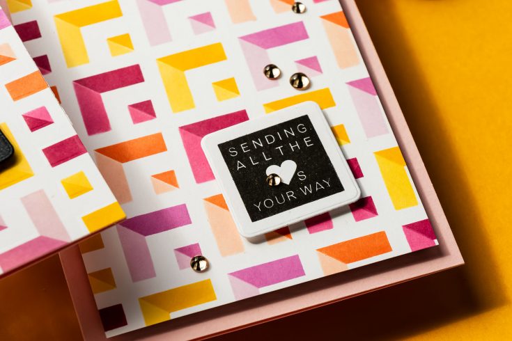
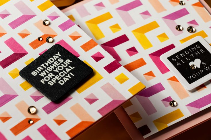
When the stencil comes off, the reveal is the best part. The overlapping layers create depth and dimension that almost looks like the pattern is shifting.
To add even more interest, I used the stencil again for dry embossing. While it doesn’t create as deep an impression as an embossing folder, it adds a subtle texture that enhances the design. Offsetting the stencil slightly before embossing gives an unexpected layered effect that works beautifully with the geometric pattern.
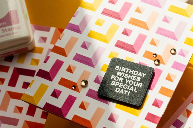
With a background this bold, finishing the card is simple. I stamped a sentiment from the A2 Grid Basics set and heat embossed it in white onto black cardstock. After die-cutting it into a rounded square, I adhered it slightly at an angle to break up the strong linear design. The panel was mounted onto a colored A2 card base to carry that vibrant feel to the inside of the card. A few champagne embellishments finish everything off with just the right amount of sparkle.
This design is a great reminder that you don’t need complicated supplies to create something eye-catching. A single stencil, thoughtful color choices, and a bit of layering can go a long way. If you give this technique a try, I’d love to see what you create.
WATCH THE VIDEO:

SUPPLIES:
|


Ways to support Ukraine:
If you are looking for ways to support Ukraine, we encourage you to visit this page on Yana’s blog:

A big thank you to YOU, our reader — and to Yana for being our guest!
WEEKEND SALE — GOING ON NOW!
Treat Yourself to Something Special This Weekend ✨
You make magic every single day—pouring your creativity, care, and heart into everything you do. Now it’s time to turn that magic inward and create something just for you.
Whether it’s a fresh stack of cardstock, that stamp set you’ve been eyeing, or a few new tools to spark your next idea, this is your moment to indulge in what inspires you most.
Enjoy $15 off your $100+ purchase with code MOM and treat yourself to supplies that fuel your creativity and bring your ideas to life. Because you deserve a little crafty joy, too.


