Watch This Pattern Come to Life! Layered Color Illusion Technique: Yippee for Yana
Hi friend! Please join me in welcoming back the oh-so-talented and amazing Yana Smakula! (Please note: our dear friend Yana is Ukrainian. To show support to our brothers and sisters in Ukraine, please see Yana’s post HERE.)
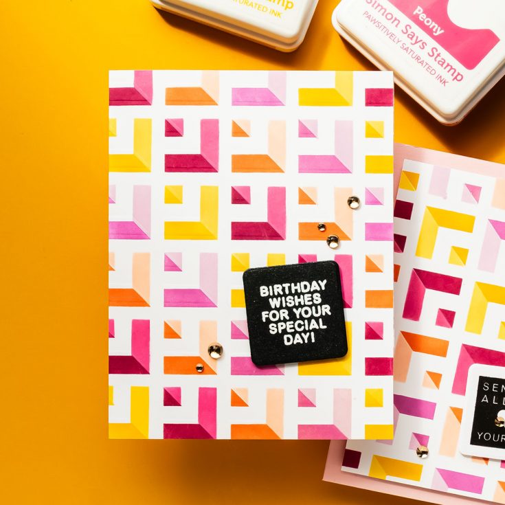
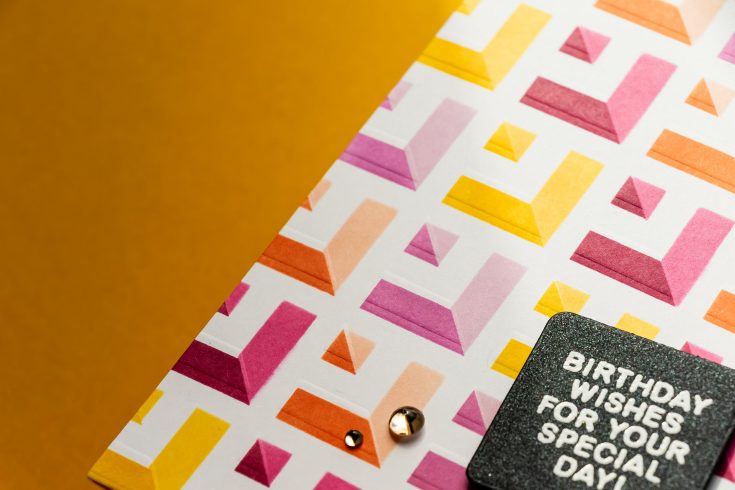
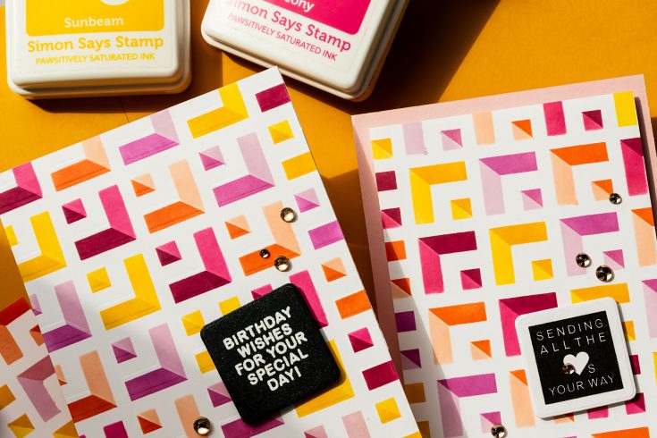
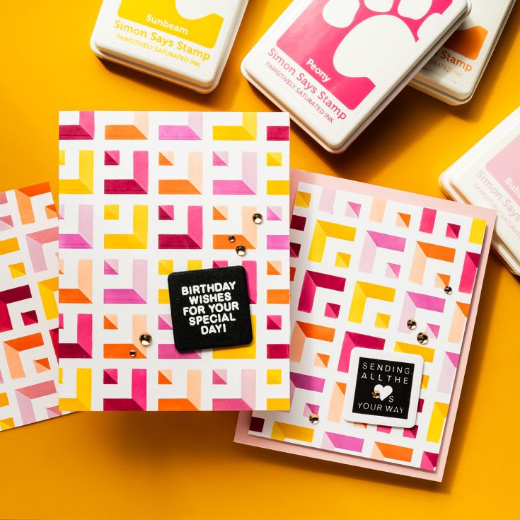
Hi everyone! Welcome back for another Yippee for Yana episode. There’s something incredibly satisfying about taking a single stencil and turning it into a bold, layered background full of movement and dimension. Today’s project does exactly that using the Simon Says Stamp Receding Squares stencil, and the result is a vibrant design with a subtle optical illusion effect that really draws the eye.
If you enjoy ink blending and want to stretch your supplies, this is a technique worth trying. I started by securing a panel of Neenah Solar White 80 lb cardstock onto a 7 x 7” Pawsitively Perfect Craft Tacky Mat. This holds both the paper and stencil firmly in place, making blending much easier and more controlled. The stencil is positioned once and stays in place for the entire first layer.
To make blending quicker and more precise, I created a custom mask using acetate sheets. These were simply cut from old clear card bases and taped together with low-tack tape. This mask allows you to isolate sections of the stencil so you can blend one area at a time without worrying about overlapping ink.
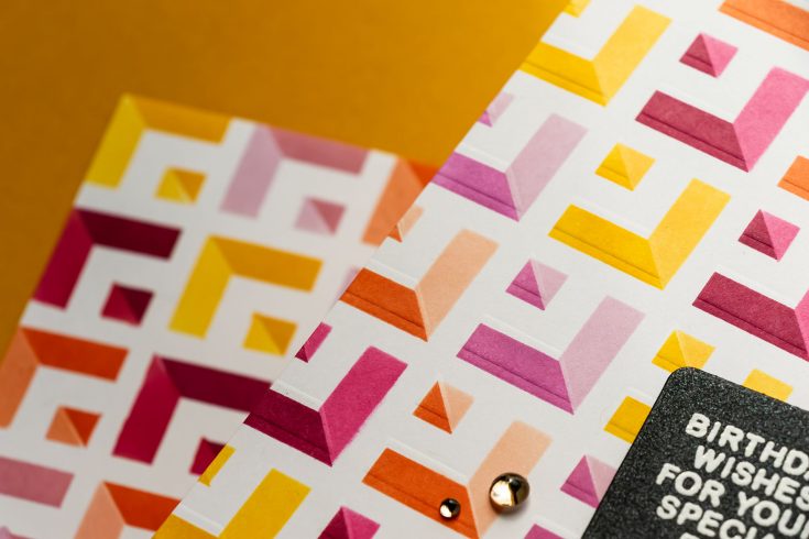
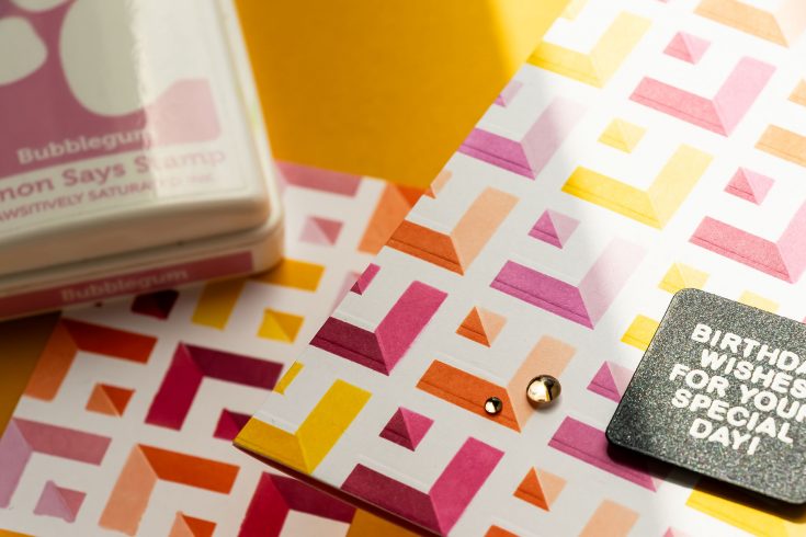
For the first layer, I chose a warm color palette: Citrine, Sweets, Sherbet, and Rose inks. Instead of switching colors constantly, I worked one color across all corresponding shapes before moving on to the next. This approach keeps the process smooth and surprisingly relaxing.
Once the first layer was complete, I cleaned the stencil and masks, then flipped the stencil over and rotated it 90 degrees. Carefully aligning it over the original design creates the foundation for that optical illusion look.
For the second layer, I used lighter shades of the same colors: Sunbeam, Bubblegum, Peachy, and Peony. Blending lightly and building color gradually is key here to avoid ink seeping under the stencil.
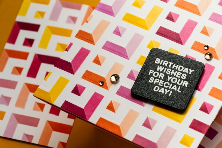
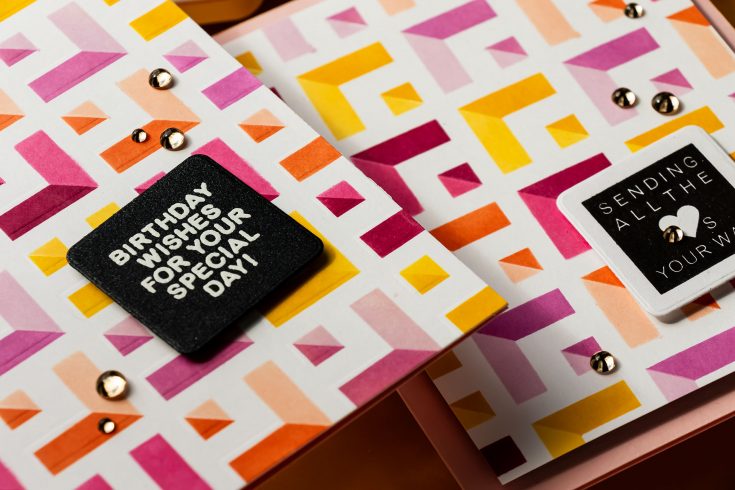
When the stencil comes off, the reveal is the best part. The overlapping layers create depth and dimension that almost looks like the pattern is shifting.
To add even more interest, I used the stencil again for dry embossing. While it doesn’t create as deep an impression as an embossing folder, it adds a subtle texture that enhances the design. Offsetting the stencil slightly before embossing gives an unexpected layered effect that works beautifully with the geometric pattern.
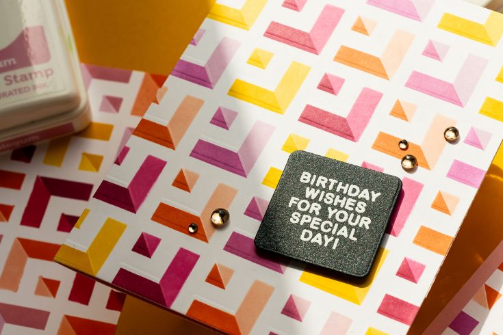
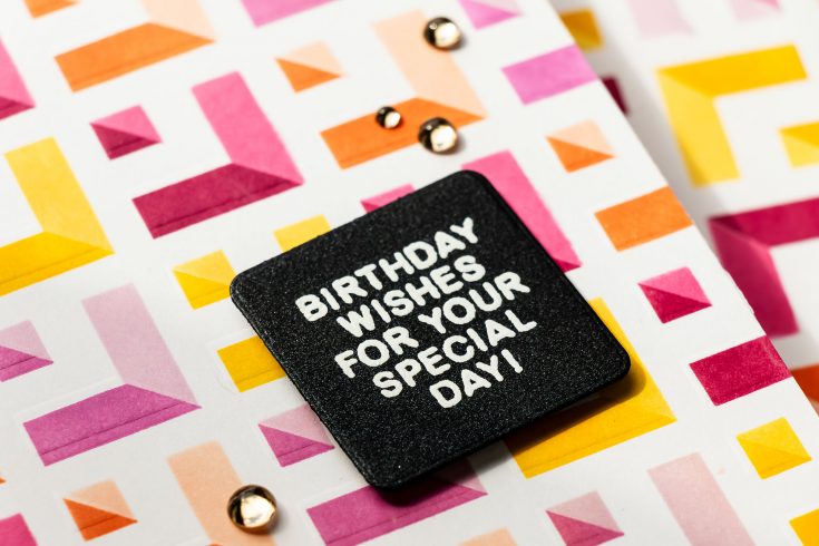
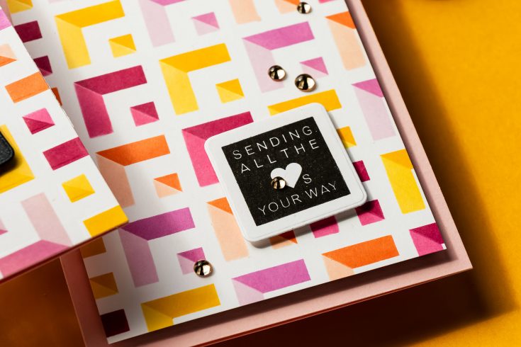
With a background this bold, finishing the card is simple. I stamped a sentiment from the A2 Grid Basics set and heat embossed it in white onto black cardstock. After die-cutting it into a rounded square, I adhered it slightly at an angle to break up the strong linear design. The panel was mounted onto a colored A2 card base to carry that vibrant feel to the inside of the card. A few champagne embellishments finish everything off with just the right amount of sparkle.
This design is a great reminder that you don’t need complicated supplies to create something eye-catching. A single stencil, thoughtful color choices, and a bit of layering can go a long way. If you give this technique a try, I’d love to see what you create.
WATCH THE VIDEO:

SUPPLIES:
|


Ways to support Ukraine:
If you are looking for ways to support Ukraine, we encourage you to visit this page on Yana’s blog:

A big thank you to YOU, our reader — and to Yana for being our guest!
WEEKEND SALE — GOING ON NOW!


This is so cool
I am very impressed with your content.
I totally agree, sales like these are the best time to find new hobbies. While waiting for downloads or browsing the store, I have been playing スイカゲーム on my browser. It is such a relaxing puzzle experience that really helps pass the time between big gaming sessions.
this is so fun
The depth Yana gets from one stencil is incredible. Seeing this graphic pattern pop like a Ragdoll Hit of pure contrast!