Yippee for Yana: Messy Watercolor Mother’s Day Card
Hi friends! Happy Wednesday! Please join me in welcoming the always awesome Yana Smakula in our Yippee for Yana series where she is making a special Mother’s Day card in honor of this weekend’s upcoming holiday, but really you could take this design and make a card for any occasion! Be sure to read on and watch the video for more information! Enjoy!
Hi everyone, this is Yana Smakula, welcome back for another Yippee For Yana video!
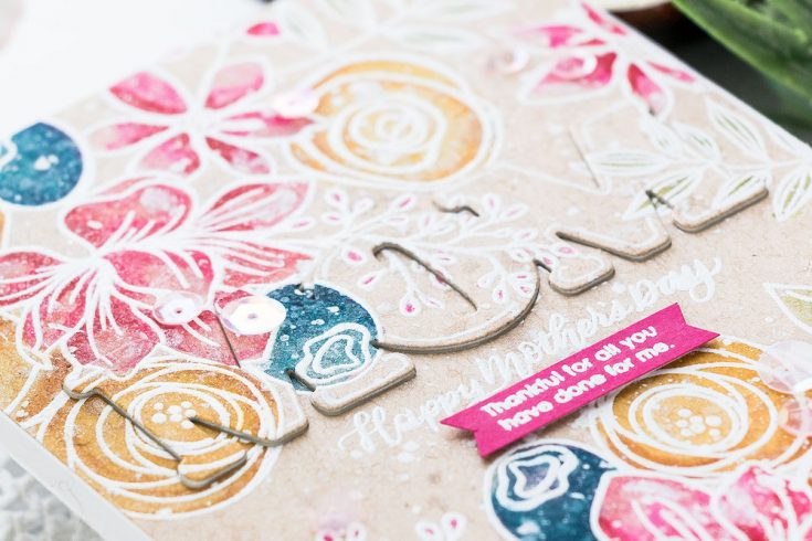
In this episode, I’m sharing easy and messy watercolor floral card Mother’s Day card using some older goodies from Simon Says Stamp. I know how much you enjoy watching tutorials using not only new but also older products so I’m hoping you’ll find this video useful.
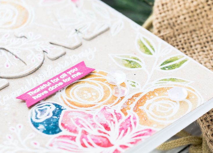
The main stamp set I’m using today is the Sketched Flowers 6×8 clear stamp set by Simon.
I also have a “Happy Mother’s Day” sentiment stamp from another stamp set, called Mom Flowers. I also used a sub sentiment from here, another sentiment for the inside of the card and also a coordinating die.
I wanted to do simple and messy watercoloring. I started working on this card by prepping cardstock for heat embossing. I wanted to heat emboss image outlines to simplify the watercoloring. When I have raised outlines to my images I find that I can watercolor faster, as I am not afraid to go outside the lines, the embossed outlines help me stay inside the image boundaries.
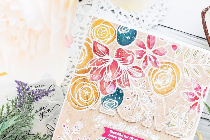
The paper I am using today is actually not a watercolor paper, it is regular cardstock. This Neenah Desert Storm 80lb cardstock. I picked this paper for my card today because I wanted my watercoloring to have a nonwhite background to it, but I didn’t really want to spend the time coloring the background itself.
I’ve done it in the past – I would color the images themselves and would later come in and also color the background to whatever color I wanted. Results are usually phenomenal, but this is also a very time-consuming process. A way around is to use colored paper right away.
I stamped images and sentiment on the front panel, covered them with Hero Arts White Detail embossing powder and heat set.
Now comes the fun part! Coloring! Similar to my previous Simon Says Stamp video I used my Daniel Smith Watercolors and a water brush.
You would think that watercolor would not show or would not work on kraft paper, but if in fact does work beautifully. Yes, the colors are not as vibrant and saturated as they would have been on white, the kraft color of the paper does dull some of the colors, but water coloring on kraft still works.
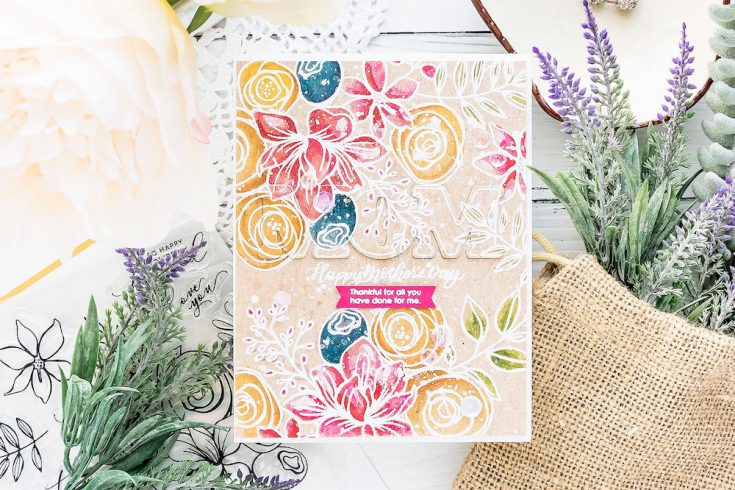
I started by coloring leaves using Serpentine Genuine and also Sap Green colors for some shading. Next, I used Quinacridone Rose, Opera Pink, Imperial Purple (although this is one of the colors that turned muddy, I later colored over it with PhtalhoTurquoise), Cadmium Yellow Medium, Quinacridone Gold, and Quinacridone DeepGold.
The trick to coloring on non-watercolor paper is using very little water. This kind of paper is not designed to take and hold water so you need to go easy on the amount of water you add with your watercolors. Using a water brush here helps me as I know exactly how much water is coming out and I can control the amount of water to make sure I’m not letting too much out and not over saturating my paper.
After the coloring was done, I added a generous spritz of Hero Arts Iridescent Shimmer. This is step number one to make the watercolor piece messy. Next, I used some white acrylic paint, diluted it with water and splattered onto the card rather heavily.
At this point, I felt like the sentiment was lost on this card, so I decided to use a coordinating die from the Mom’s Flowers stamp set and die cut word MOM into this panel. My plan was to inlay it back in but with the help of thin foam adhesive to pop it up just a tad on the card.
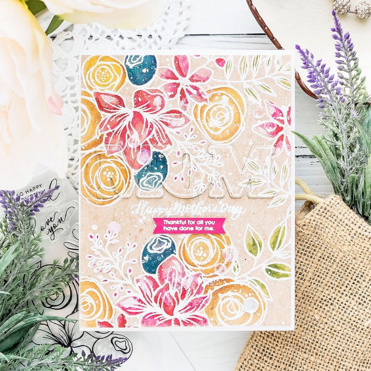
I inlaid it back into the background and added the negative piece from the letter O back into the background to make it look solid.
Finally, I outlined the die cut letters to help them stand out a little bit on the card. The coordinating stamp is a solid one and while I could have used it, I didn’t want to have solid stamping on these letters, I only wanted an outline, so I drew one myself using a white pen. This ended up looking like the MOM outline was positioned under all of the florals on the background as if it was masked.
The messiness of this card disguised any of the imperfect hand-drawn lines on the word MOM and helped them blend and become a part of the design.
I also used a few sequins from my stash to add some sparkle to the card front and finally stamped another message on the inside of the card.
I hope you will give this idea a try!
SUPPLIES:
|
Thanks so much for stopping by and thanks to Yana for being our guest!

Blog Candy Alert!! Follow our blog via email and comment on this post for a chance to win special blog candy!










Such pretty colors! :)
I love this card! Your video was awesome, Yana.
Beautiful card! :)
Amazing mix of artsy and “messy”.
This card is amazing! I love your watercolour look, it is just a unique style. I love how it has a messy but oh so pretty look to it. Thanks for the video. I love watercolouring but I have so much to learn.
So pretty!! The messy watercoloring looks fabulous. Thank you for the tips you shared. I like the ideas of covering it with the shimmer spray and the white splatters.
<3 J
jwoolbright at gmail dot com
HerPeacefulGarden.blogspot.com
Beautiful card, I love the ‘artsy’ look!
Such a beautiful card as always by Yana! Lovely inspiration for upcoming Mother’s Day crafting!
Beautiful card! Love the colors.
Thanks for sharing…
Very beautiful card! Thanks for sharing
Such beautiful watercoloring!! Love the card!!
What a great technique. I am going to do that. I have wondered how others have popped up stamped letters….
Gorgeous card! Love the technique.
Thanks for sharing.
Gorgeous as always! Love the floral stamps!
I love Yana’s style and design. It is always fresh and pretty. I subscribe to her channel and love all her videos!
Beautiful card, Yana! I wouldn’t have thought to try watercolor on kraft cardstock – thanks for the idea.
Absolutely stunning!
Wow! This technique seems super fun
Beautiful card, love the water coloring.
I have that stamp set and have yet to use it but your card was outstanding. What are you talking about with your “messy outline” of the word Mom? It was great.
So pretty!
So very beautiful!!
Gorgeous card. I love the watercolor on craft. Ive been eyeing this stamp for several months now. I think Im going to have to add it to my next order.
Very pretty card. I really like how the watercolors are on kraft stock.
Sketched Flowers is one of my favorite stamp sets, I use it a lot. You card it beautiful!
Beautiful watercolour! Stil no fan of cutting letters like this…
Thanks for the technique inspiration, Yana! Wonderful card!
Beautiful card, love the colours!
I surely like the look Yana – TFS your art work – beautiful!
I like the technique you used on the beautiful card!
Thanks Yana, enjoyed the video and thanks for admitting that you too make “mistakes” and have to cover them and experiment, so nice to see that we all do that. It turned out lovely and your Mom will love it!
What a beautiful messy creation!!!
I really like how you popped the word Mom on the card front. I like to call that a “ghostly pop”. It’s there and not there at the same time! LOL
Such a Beautiful card!!!
Such a beautiful look. I need to get my kraft cardstock out more :)
Very pretty. I like the watercoloring on the Neenah desert storm cardstock.
What a beautiful card! I like the muted color the Kraft card stock makes. It doesn’t look messy to me tho, I think it’s stunning. I definitely want to try this since the embossing will help keep the color from straying. I’m usually it safe with a paint brush. Thank you for the video, I love watching how you get to the finished card. Happy Mother’s Day to you whether you are a mother or celebrating yours!
Love this card and the look of watercolor on kraft card stock. I have some 100# Neenah Desert Storm and will try this technique on that. Thanks Yana!
Love this card. The background looks like a beautiful tapestry.
beautiful work – very arty!!
Very feminine and lovely. I like this technique and I am going to give it a try.
This is such a beautiful card!! I love the softer look of watercolor on the Desert Storm cardstock.
Bright colors, yet a muted overall effect. Stunning.
Beautiful card and great video.
Yippee is right! Yana creates such beauty, no matter what the challenge. So pretty!
Love your card. Love the stamp set. I use this stamp set a lot. Your watercolouring is beautiful.
Gorgeous card! I love the colors you used and popping up the MOM sentiment really gives the card some added interest!
I love this stamp set and your card and tutorial were terrific. I always appreciate knowing I’m not the only one who gets to a point and wants to crumble my card up and start over. Seeing how you changed the color and saved it was encouraging!
I love the look of these patterned die cut on pattern cards – your’s is great inspiration on something to try for my own mother’s day cards!
Beautiful card, Yana. I love the watercolors on colored paper. I usually don’t get good results with anything but watercolor paper — think I use too much water. I’m going to practice a bit and give this a try!