Yippee for Yana: Copic Markers on Kraft
Hi friends! Happy Monday! Allow us to start your week off with some gorgeous inspiration from none other than the fabulous Yana Smakula! Read on to learn more about how she created this gorgeous card and enjoy!
Hello and welcome back for another Yippee For Yana video! In this episode, I will show you how to use kraft cardstock to your advantage when coloring with Copic markers and creating a Fall card in muted colors.
video! In this episode, I will show you how to use kraft cardstock to your advantage when coloring with Copic markers and creating a Fall card in muted colors.
When I was finishing this card my husband stopped by my desk and expressed his astonishment regarding the fact that Copic markers color so well on kraft cardstock. He said, and I quote – I thought they only worked on white.
And I think a lot of people have this perception, we believe that Copics are a good coloring medium to use on white paper only. I am the kind of person who likes to break the rules and even rebel if you will, so when it comes to this coloring medium I’m all about trying something else besides the ordinary.
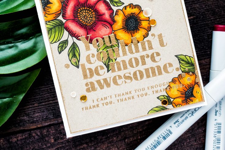
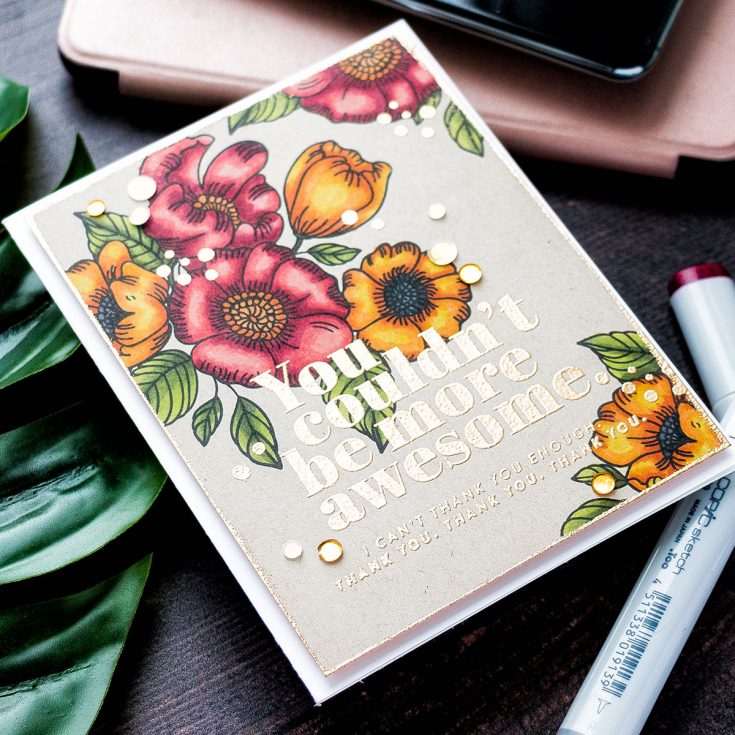
I started to work on my card by stamping a beautiful floral cluster from the Thankful Flowers stamp set from the October 2019 Card Kit from Simon in Intense Black ink onto kraft paper that was included in my kit. I cut the panel down to 4 1/4 x 5 1/2” and I’ll later trim it down some more.
I wanted to have more than just that one cluster on the card, so I used other, single floral and leaf images from my stamp set to add additional imagery to this panel. I did a little bit of simple masking – I stamped the two single flowers onto masking paper, cut them out making partial masks, and added single stamped leaves next to them creating two mini clusters in the bottom right and top right corners on the panel forming a floral cluster triangle of sorts. The middle bottom area of the panel is where I planned to have the sentiment, so I kept it relatively free from imagery.
With the stamping done I moved to the coloring part. I am not a pro when it comes to Copic markers, I don’t have a whole collection, in fact I only have a handful of markers, but over the years I have collected the colors that work really well together and whenever I color with Copics I tend to stick to the same colors over and over again and you’d be surprised, the only thing that changes is the color of the paper that I color on. Truth be told I find myself rarely coloring on white these days.
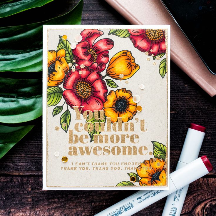
The colors I picked for my coloring are G99, G94 and YG03 to color the leaves. This green combo looks great on kraft and becomes more muted and a lot more suitable for Fall coloring all thanks to that background paper color. It does look more vibrant on white, but the kraft here mutes the vibrancy of the color and makes it ideal for Fall.
To color the flowers I used a set of red and orange markers. My red go-to color combination is R89, R39, R27, R24, and R22. I did go very dark deep red here to have nice bold shadows for my flower petals. Again, as with the green markers due to the background color of the paper, I was using the reds ended up a lot more muted here. As for the orange colors, I am not really a fan of orange color per se, but I do enjoy seeing it in nature, I love the orange leaves and the orange flowers you’d see during Fall. But I just somehow struggle to re-create that same gorgeous orange color on paper. Here, on this kraft background, it was much easier to have pretty orange flowers. I used YR18, YR04, YR15 and Y15 colors to color the flowers orange.
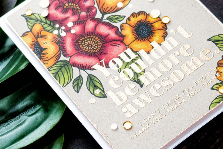
With the coloring done I heat embossed a sentiment. It reads: “You couldn’t be more awesome. I can’t thank you enough. Thank You, Thank You, Thank you”. It was embossed in Antique Gold embossing powder.
To spice this background up I decided to trim the panel down to 4 x 5 1/4” and treat the edges with embossing powder to make them look as if they are dipped in gold paint. I used one of Simon’s pre-made card bases for this card, the A2 side folding card and foam mounted the panel over it using fun foam. The panel warped a bit from the heat embossing and the fun foam helped to flatten it.
Lastly, I picked a few of the gold and cream sequins from the Sunken Treasure sequins mix to decorate this card. I used my Crystal Katana tool and Simon’s Craft Tacky glue to adhere them in place. I loved using this glue bottle, the applicator is very fine and precise and allowed me to add just the right amount of glue to adhere even the smallest sequins in place.
SUPPLIES:
|


Thanks so much for stopping by, and thanks to Yana for being our guest!

Blog Candy Alert!! Follow our blog via email and comment on this post for a chance to win special blog candy!


Beautiful. Love the coloring on kraft.
Beautiful! I love the colors on craft paper. You did a beautiful job with the layout and your use of Copic Markers is lovely!
Your coloring is always amazing!
Beautiful card! Love the copic colouring on Kraft!
I love your idea of using Copics on kraft paper. I love using pencils on kraft. I will definitely go try it with my Copics now!! Beautiful coloring, great card!
peace,
Kristina
Beautifully colored!! Love Copics on Kraft!
Such great shading. I am trying to learn…..Nice on kraft.
Yana is an expert even if she only has a few Copics. I need to put Kraft paper on my list and I already follow by email.
Wow, wow, wow. What a stunning and beautiful card.
The flowers look great on a kraft background. They look so natural.
Wow!! Oh my. Gorgeous. I love these bright flowers on the kraft. Yana’s husband said what I was thinking about coloring Copics onto Kraft!
Kraft is so lush with bold colours on top – love this!
What a beautiful card! Love the coloring…
Thanks for sharing.
Hiw oretty…i love working with kraft.
How pretty
I have never colored on kraft card stock, but admire them.
Gorgeous coloring, love it.
This is such a gorgeous stamp, love the beautifully colored flowers and gold embossing on edges make it look elegant.
I saw a video on YouTube where someone stated that copics don’t work well on colored cardstock due to the transparent nature of the ink, and I thought to myself – Yana could do it! And you did! It’s beautiful!
This card is so beautiful! The colours are so much more vibrant than I would have expected.
Yana, you make it look
so easy and always so
beautiful!
Carla from Utah
Wow this is beautiful! Thanks for sharing all the techniques!
It looks so great!
Really lovely card … and your hubby is very observant!!
Such a beautiful card.
beautiful Card
Beautiful card as always Yana!
Such a beautiful card!!
So beautiful!
Beautiful card. Love the effect of copics on kraft. I didn’t know they would look so gorgeous!
Beautiful coloring on this terrific card Yana. Thanks for the tips!
As always, Yana makes nothing but BEAUTY!
That gold embossing on that font is gorgeous!! I wish there was an alphabet stamp set that looked like that!
Your coloring is always wonderful! Thanks for the encouragement to use it on Kraft paper.
I wish I could color my images so beautifully. Stunning card
This is a beautiful card.!
Love the coloring on non-white surfaces. That is a really lovely card.
Yana, you are such an amazing artist. This is very lovely card!
I love Yana’s work so much – great card – the gold embossing is particularly effective
I never cease to be amazed at the coloring skills of your designers. This is gorgeous. If I got a card like this, I’d frame it to hang on the wall. Also the end of my quest for the perfect gold embossing powder. I love the soft, clean look of your embossing powder.
Beautiful card, I love working on kraft or other darker card stocks. Thanks for sharing this with us.
Gorgeous card! I really enjoyed the video and watching the card come together.
WOW – WONDERFUL card!
THANK YOU for sharing your video and INSPIRATION … I am so surprised that the Copic markers didn’t bleed => NOW I NEED to try this AND to add an embossed edge too :)
FABULOUS card!
Beautiful card!
This is beautiful!
This is just gorgeous!!! I’ve tried coloring on something other than white just one time. I was not really impressed. I might have to give it another try sometime. I LOVE the embossed sentiment and the embossed edges of the panel; so elegant!!
Yana’s card is so lovely. Great stamps, beautiful coloring and so we’ll embellished!
Gorgeous – I love the vibrant colour on the kraft background and the embossing over the design is wonderful!
Love the embossed sentiment.
I just started using markers to color my stamped images. I just love it, so much fun. Love the card, simply beautiful!!