Studio Monday with Nina-Marie: Working with Mood/Color Boards + Hero Arts
Hello everyone and Happy Monday! Its Nina-Marie with you today, sharing the latest installment of my Studio Monday series. This week I wanted to share tips for creating with mood/color boards. I’ll also be featuring some newer products from Hero Arts.
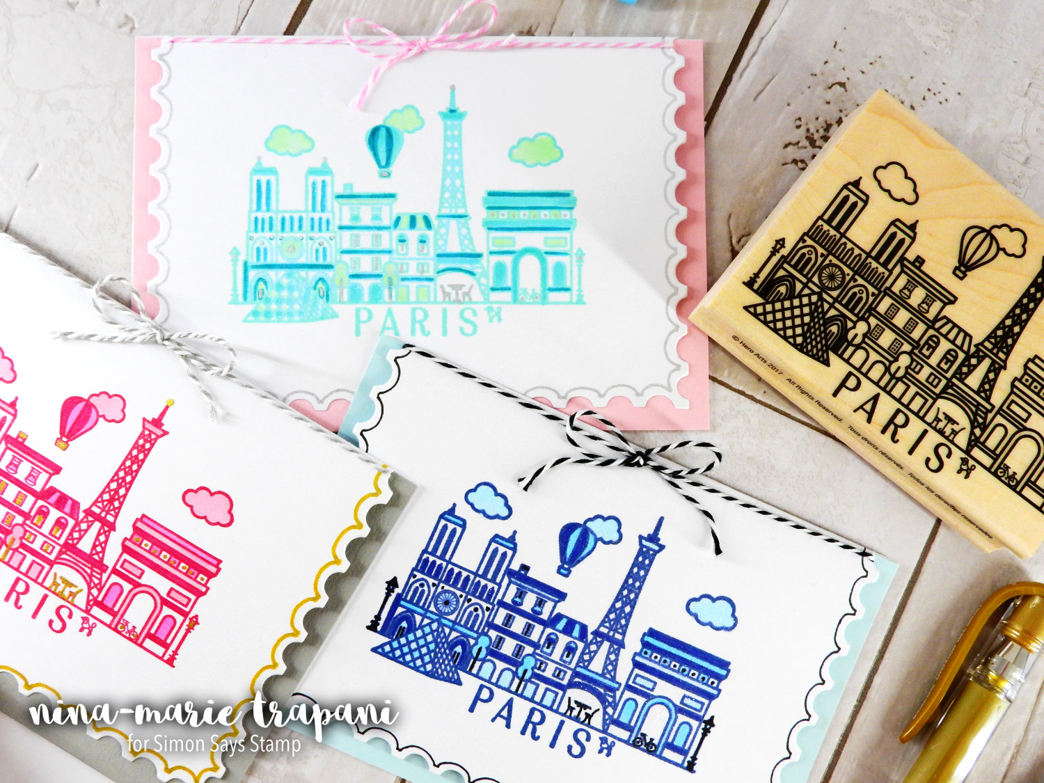
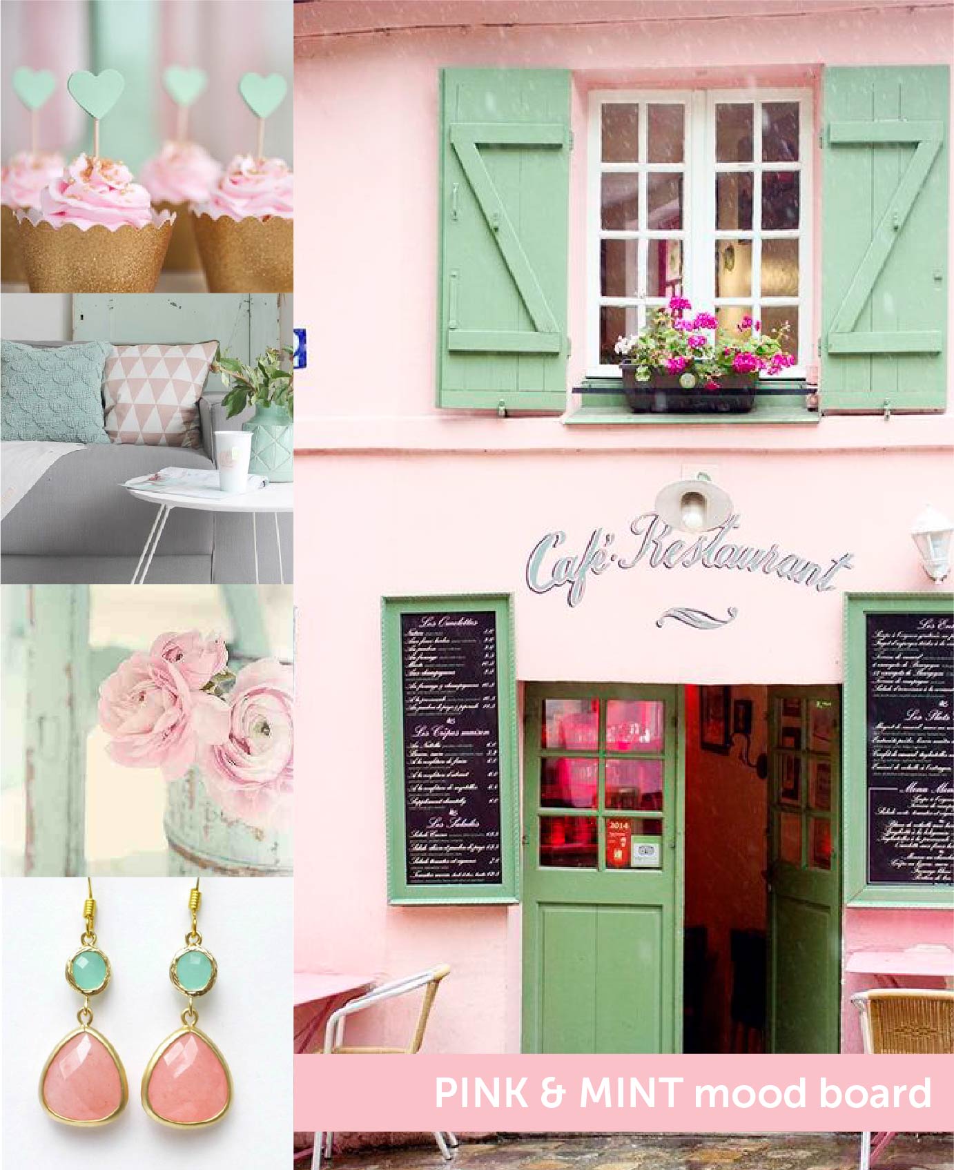
Mood boards, or also known as color boards, are a collection of images that share a common color scheme. You could also use a mood board for a collection of images that share a similar style, theme or subject. I personally love them for color combos. When I decided to use the Destination Paris wood block stamp with the Postage Stamp dies on these cards, I headed over to Pinterest to see what kind of color schemes I wanted to use.
I started my search by looking up “Paris, France”. Because the stamp I was used in these cards is depicting this particular location, I felt it was a natural place to begin. Looking through the vast array of options in my search results, I focused on finding three images that REALLY caught my eye. Here’s a look at the three color boards I created for these cards:
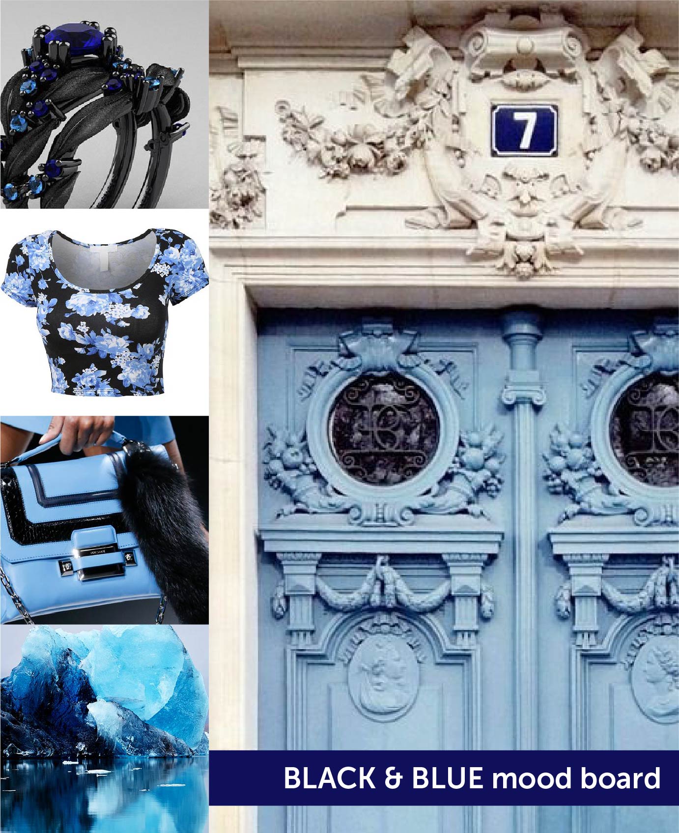
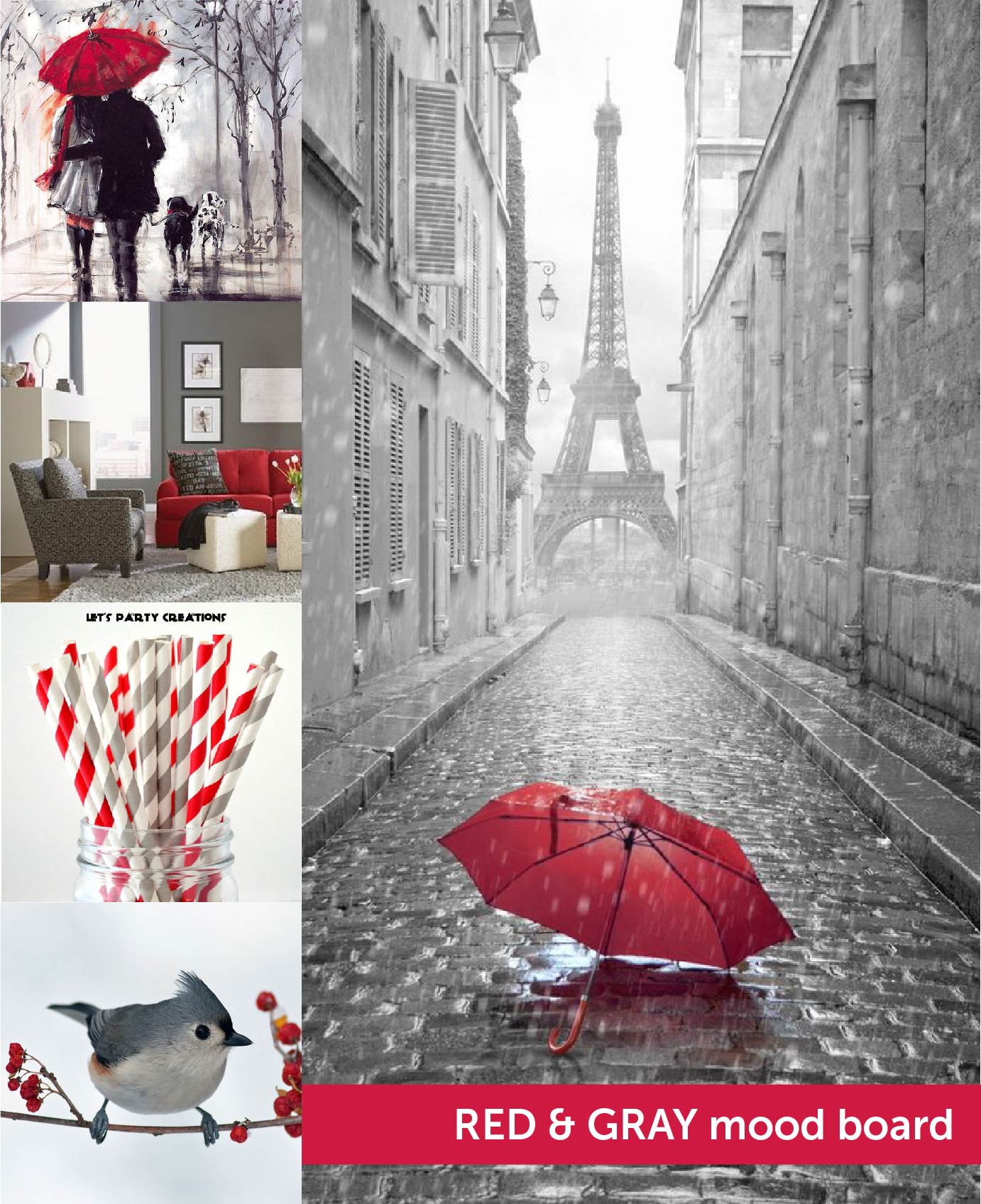
Once I had decided upon the three main images, I then searched for other images that shared the same predominant colors. For example, let’s look at the photo of the Eiffel Tower in the rain. The primary colors in the image are red and gray. By searching Pinterest for “red and gray”, I was able to discover other images with the same shared color palettes.
Now, the idea of searching for additional images may seem pointless. I already had my color combos picked out by the initial image search I had done, so why choose more? Because selecting a few additional photos for my boards is SO handy! They might help me draw inspiration for a certain texture, accent, theme or feel. I also save these boards for future use, so having the additional photos included in the board provides further inspiration.
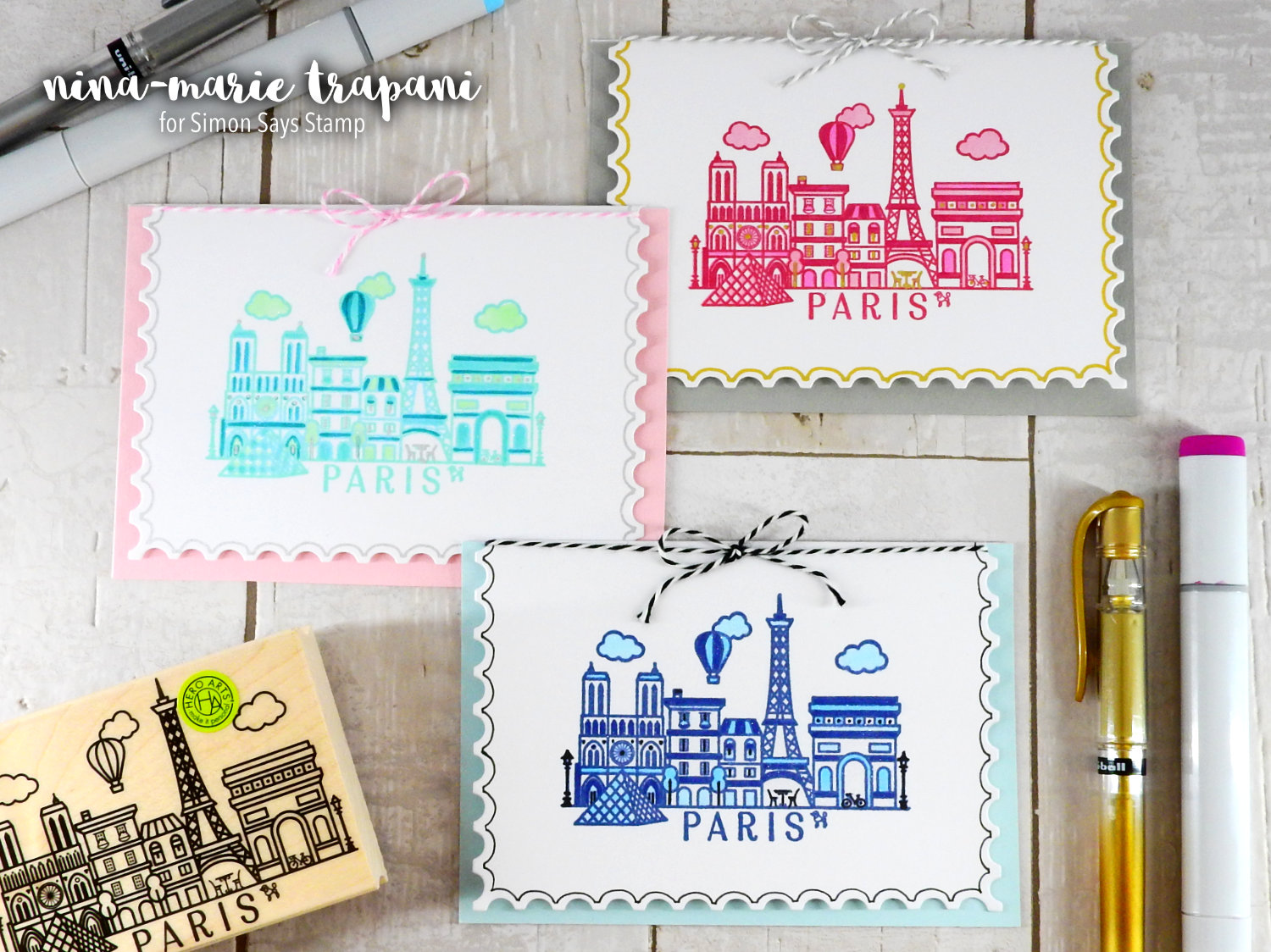
In the video, I will be sharing how I created the partial die cut card-front using the Postage Stamp dies from Hero Arts. These dies are SO versatile. If you follow me often, you’ll have noticed how much I have been using them lately. I love that I am getting so much use out of these particular dies.
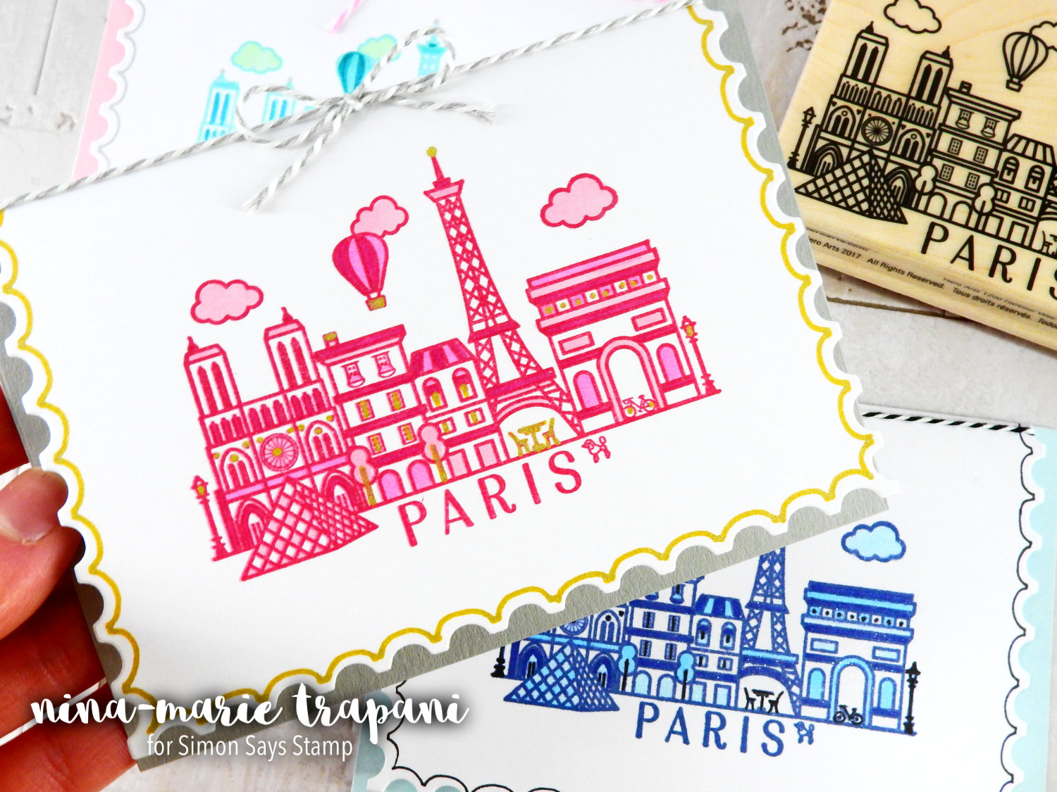
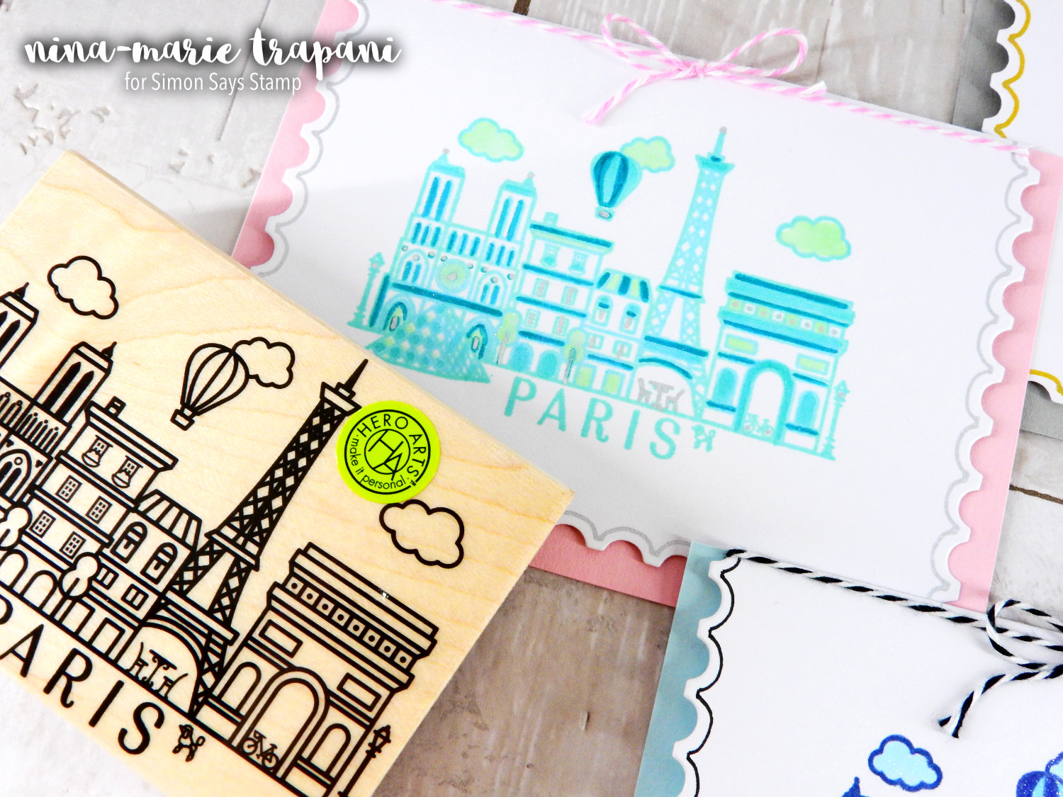
One of the things that I love about the Destination Paris stamp is the clean, graphic style of it. I wanted to make sure I carried that same feel into my finished cards, so you’ll notice the “minimalist” appearance. This is actually quite trendy these days! By utilizing clean lines, flat color and some hand drawn elements, I was able to let the modern feel of the stamp shine beautifully.
I am particularly fond of the pink and gray color scheme. The pop of gold also accents those two colors nicely!
Another thing I wanted to point out: This card design is perfect for those of you that are not into coloring as much as other crafters. I personally would -and will!- color almost anything I lay my hands on. But its fun to break out of the norm every so often and do something a bit outside of your usual style.
If I had skipped adding some color with my Copics and simply used the stamped image as-is, it still would have looked amazing. Had I done so, I would have still added the additional hand drawn details with the gold, silver and black gel pens. You can see those details in the finished cards.
 Be sure to check out the video below to see how I put these cards together! You’ll also learn a bit more about working with mood/color boards. I will be talking about that in the beginning of the video and I hope it is of help to you! I love referencing things such as color boards when I am in a creative rut. I never know what kind of spark it will ignite by seeing something totally unrelated to papercrafting!
Thanks for stopping by and spending a bit of your Monday with me… I will be back again next week with another Studio Monday video for you!
WATCH THE VIDEO
SUPPLIES


Blog Candy Alert!! Follow our blog via email and comment on this post for a chance to win grab bags and blog candy! Remember to tag your awesome projects with #simonsaysstamp on social media so we can see what you are creating!


Great cards! :)
lovely cards
stamping sue
http://stampingsueinconnecticut.blogspot.com/
I love that idea of mood/color boards. It helps to get you inspired to use certain colors. Thanks for sharing!
Love what you came up with using the mood boards as reference, they are a great starting point! Thanks for sharing!
Wow! Awesome cards!!! You’re great dear Nina!!!
Beautiful work Nina-Marie! I love the monochromatic look and the mood board is a great idea to use for inspiration!
I love the mood board idea!Very cute cards!
Thank you for sharing :)
I’ve never made design boards but I think I shall start! As much as I dislike pink in general, that pink and mint are fabulous together! Love the cards! Paris is on my “list.” :)
Love the way you used the gel pens to add the edging to the postage stamp die. I just got these and now you have gave me some great ideals to use them.
Awesome cards. Love the Hero Arts Paris Stamp. The color combinations are perfect!
Pretty! TFS
Beautiful moodboards!
Great cards
I love the idea of mood boards! Could incorporate a color scheme like that into a vision board and it would make it look so beautiful!
Nina I loved all the color combos used. Thanks a lot for sharing this inspiration!
the result was well-worth the effort put
into selecting pictures for inspiration.
The cards are beautiful.
thanks for sharing.
Love the mood boards idea.
Love the great use of colors..
Great cards!
Beautiful Cards!
beautiful coloring, Nina and wonderful looking cards
Interesting how the colors used can change the mood of these fun cards. Thanks for the common sense design ideas.
Some really great ideas/techniques … thank you!!
Love that Paris scene. Great cards!!!
Love that you can have a jumping point to your creations like these mood boards.
What a gorgeous set of cards, especially love the darker blue one!
I love the way that the different colors work together to make great cards.
Aww.. Loved the cards.. And the mood board idea is so so cool.. Thank you so much for the inspiration!
These cards are so beautiful!
Mood boards work for me. Adorable cards!
Lovely cards and I appreciate them more being not much of a colorer. I especially love the red & gray mood board, so pretty.
Fantastic inspirations! Love the mood boards!
I love the mood boards. The cards are awesome!
I was glad to see that you also peel wood block stamps, I have to do that with my larger stamps because my hands are bad from years of delivering mail, and I was worried I might be damaging them. I love my Postage Stamp infinity dies ( again, mail carrier here) and I really liked your tutorial of leaving the top part of the card uncut. I really like your color combinations
Colour / mood boards are so inspirational!
Awesome inspiration, Thanks!
Great idea for when one needs a color inspiration. I have a list of colors that work well together, as a reference, but a visual one is best.
very pretty cards and so inspiring:)
These are Awesome! Great reflection of the mood boards ♥
What a cool idea. I’ve never created a mood board before, so thanks for the inspiration.
Oh, so beautiful! I love the reverse scalloped edges on the cards. Such pretty travel cards.
Thank you for brightening my Monday morning.
The touch of color incorporated into the stamped image that matches the color on the edge of the card creates a big impact. Very nice.
Mood boards are always so inspirational to me. Thanks for sharing this idea.
Just simply lovely xx
great mood boards. . . .lovely cards
Love the cards, they open up a new spectrum of the color world. I am going to use orange and teal. I need to decide on the stamp first. I think it will be mountains for me.I love the out doors so will try this in the afternoon. Thanks for the video.
Such a great idea Nina, your talent goes way beyond the obvious! Awesome cards!
Great colors! Awesome cards!!!
Great cards. I have never heard of mood boards. Thanks for sharing this new to me idea!
Very lovely cards!!! I really love the die that you used. It makes the cards look elegant!!