Weekender with Wanda – Taylored Expressions Wildflowers!

Welcome back to another edition of Weekender with Wanda here on the Simon Says Stamp Blog! Happy to see you here today – and happy weekend! It’s the last weekend before September and my studio is quickly transitioning over to Autumn crafting. It’s still warm, and there are still lots of flowers in our yard, but I can feel the light changing and I can feel the cool morning breezes too. My card for today is sort of a seasonal transitioning card. Pretty wildflowers, in muted tones of gold, purple and olive green for Fall. Today I’m featuring stamps from one of our favorite companies – Taylored Expressions! One of the stamp set lines they make are beautiful bouquets. And each bouquet stamp has a perfectly matching die! Gotta love that too! CLICK HERE to see them all!
One quick note about Weekender with Wanda! Stamptember starts next weekend so there will be a break in my column for the next month as we celebrate with all kinds of festivities! But, don’t worry, I’ll be back soon!
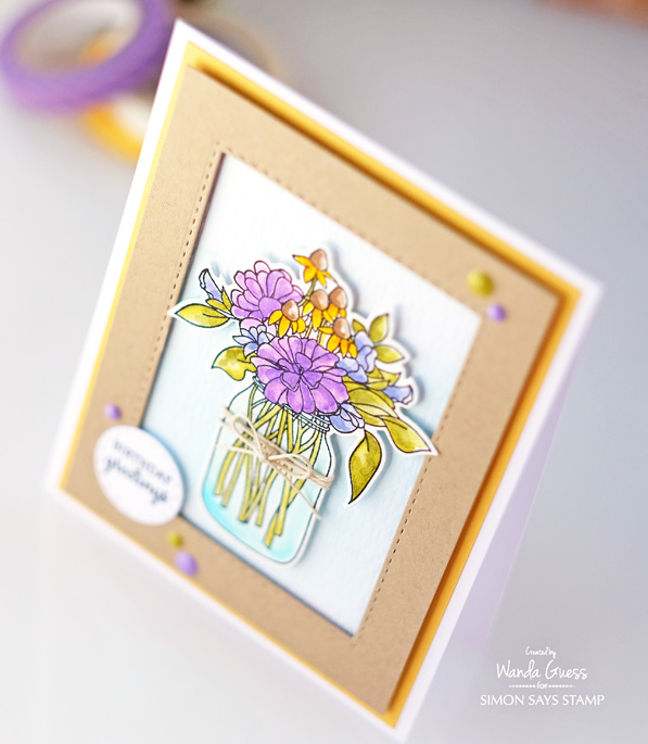
I chose the pretty Wildflower Bouquet stamp set and die and created a sweet birthday greeting. I colored the image with Kuretake Zig Clean Color Brush Markers on watercolor paper. Here is the finished card.
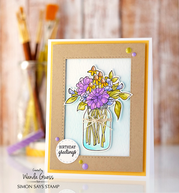
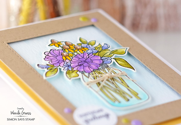
I started with a nice white card base. Then I layered yellow cardstock. I cut a piece of kraft cardstock and then made it into a frame using the Simon Says Stamp Stitched Rectangles Dies. When I put the card together I used foam tape to raise the frame up from the background layer. This creates a good focal point for the bouquet.

I stamped my image and die cut it out using the matching die. I used Kuretake Clean Color Brush Markers to color the flowers and the pretty jar vase. The brush markers have such a nice small tip on them – makes it very easy to get into the small spaces of this image. I used water to soften the color and create a watercolor effect. This is quickly becoming one of my favorite ways to watercolor!
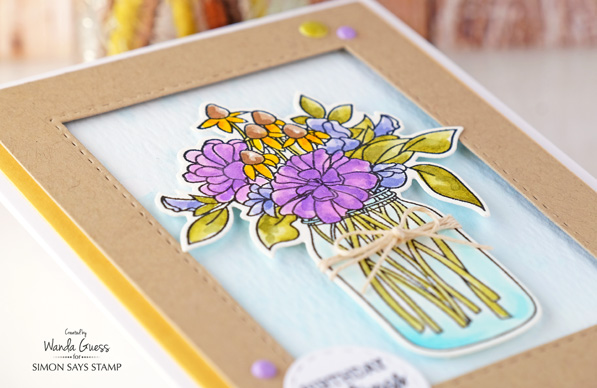
I tied a pretty little twine bow around the jar and then attached the jar to my card using more foam tape. I stamped the sentiment and die cut it with a small Stitched Circle Die. The background was created by lightly water coloring with Broken China Distress Ink and clean water. I thought it needed just a tiny bit of color behind the main image.
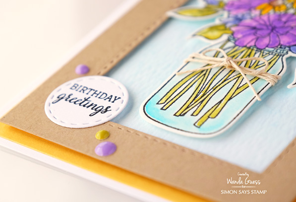
This image would be really pretty in pinks and reds too…hmmm. Maybe I should have made another one! And, this is a good card sketch layout to remember for when you have one focal stamp. As I’ve been known to do…I added a few enamel dots to complete my card. Do you think I should buy stock in enamel dots? LOL!
Thanks for visiting with me today! Get ready, because STAMPTEMBER is coming soon! Hooray! Lots of celebrations are on the way!
SUPPLIES FOR TODAY:
 |
 |
 |
 |
 |
 |
 |
 |
 |
 |
 |
 |
 |
 |
 |
 |
 |
 |
 |
 |
 |
 |
|


So beautiful! I love the clean simpicity of this.
Gorgeous jar of flowers, what could be better then this!!!
Lovely card, great layout and colors.
This is so neatly done and looks fabulous. I love the colors.
So pretty. Thank you for sharing this.
I, too, like enamel dots. Always look forward to your posts. thanks for sharing your talents.
This is just gorgeous!
A very cheerful and pretty card!
Beautiful colors and the kraft frame is a pretty touch!
Beautiful card! I love your coloring and the colors you used!
So lovely!
Beautiful. Love the raising of the frame. Very true this brings attention to the stamp. Great Zig coloring. I love using them also. TY for sharing your tips and art.
Just lovely, Wanda! Thanks for sharing so many great design tips today. A bouquet of garden flowers in a vintage Ball jar is just my style! ♡
Love this simple design! And gorgeous coloring!
Such a pretty card. Very nice color combo. Thanks for the lovely design idea.
Gorgeous card…love the frame around the image.
Like the coloring & framing of the wildflowers.
Melissa
“Sunshine HoneyBee”
Such pretty colors!!
Great card! :)
I like how the frame is popped up on this card as well as the lovely flowers in the vase – nice job Wanda thanks for sharing
This is really cute! Thanks for the tip on the markers. I’m trying to decide which ones to purchase.
Wanda, love the colors that you used. They are so bright and fresh against the white. Thank you for sharing.
Pretty card!
Love this card design and how it showcases the focal image. I’m also crazy about the Taylored Expressions bouquet stamps. Your coloring on these flowers is amazing! I’m going to give that a try.
Absolutely this is a beautiful and lovely card, Wanda. Always love flowers in mason jar :)
Pretty card, beautifully created. Flowers in a mason jar…just perfect…on a card or real!
Love the color combo. That yellow card stock really made your colors pop. silly me – I thought you stamped each flower individually.
Love the design elements, layout, stamp, colouring, and effective layered look!
Very lovely. I always look forward to your posts.
A jar of gorgeous flowers; oh, to have those in real life, sitting on my kitchen table! Thank you for the smile today!
~carol
Very pretty.
Love how it’s popped off the background.
the framing is nice.
thanks for sharing.
Your card is beautiful. I really love this stamp and die set!
Very nice! I always enjoy Wanda’s cards! Have a great weekend!
What a gorgeous card Wanda! Love our bouquet.
So pretty! Love the colors you used & the great placement of those enamel dots!
Love your sentiment treatment–something I often have trouble with! Gorgeous card, Wanda–I love my Zigs, too, but still need to try this kind of coloring instead of just the “messy watercoloring.” Thanks for the inspiration!
Really pretty card and nice stamp also!
Love the gorgeous layering on this card
Super gorgeous card..LOVE the layout!!
Here it feels like the Summer has just started..nice warm weather!
Very pretty card! Makes me want to get out me Zigs!
WOW such a pretty card!!! Love it and all you create:)
What a pretty card! The colors, the design, all of it….beautiful ♥
Beautiful card, Wanda!
Superb card!!!
Gorgeous card! Love the dimension and coloring!
So cute, and I love the colors that you used. Thank you for the inspiration!
Take care, Kim :)
This is so pretty! The kraft frame over the yellow panel is such a lovely touch with the jar of coloured flowers. Gorgeous!!
Love these colors paired with kraft paper! Nice depth too and FABULOUS coloring! I think that pinks and reds would look great with too! See you after ‘Stamptember’ :)
Pretty card Wanda!
Lovely card. Perfect color combination. I like the raised frame panel and jar/flowers. The enamel dots add that extra special touch.