Weekender with Wanda – Peace Card!

Hello everyone! Happy Saturday! Today I’m so very excited to share my new feature with you – it’s called “Weekender with Wanda!” I’ll be here on the Simon Says Stamp Blog every week on one designated day of the weekend! We are going to have lots of fun! I will be showcasing products from different companies and sharing new techniques. I hope you will join in with me every week as we stamp and hang out together. What do you think of my fun cartoon?
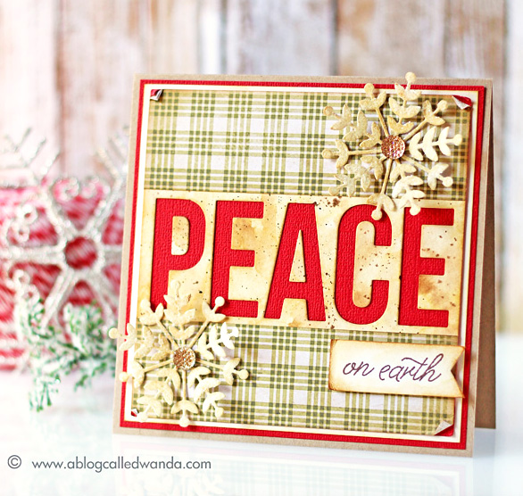
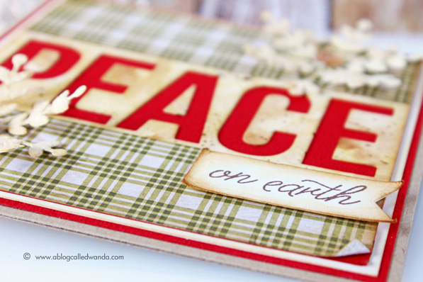
Today I am featuring more awesome new products from the latest Simon Says Stamp release – Create Joy. I posted a few cards already using the new holiday stamps and dies, but I really wanted to feature the “Big Peace” die and share that with you. I made a Christmas card in traditional shades of red and green. I gave it a vintage feeling with distress inks and some nice plaid paper from the Tim Holtz Christmas line for 2015. This would be a great masculine card I think. Let’s get started!
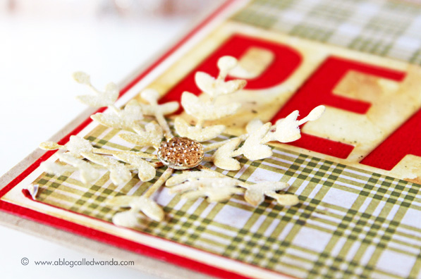
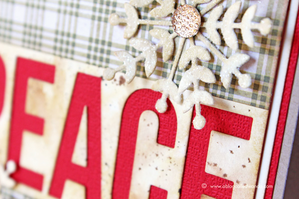
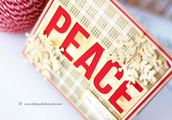
Here is a close up of the beautiful Rylynn Snowflake Die! I die cut it out of watercolor paper and then inked it with Antique Linen and Brushed Corduroy Distress Inks. Then I covered the entire piece in Rock Candy Glitter to make it sparkle.
I die cut the “PEACE” die out of watercolor paper. I wanted it to look old and vintage, so I sponged Antique Linen and Brushed Corduroy Distress Inks onto the paper. Then I took a water brush and gently swirled some water around to blend the colors together. Once that was dry, I used the Tim Holtz Spritzer Tool and a Distress Marker to add brown splatters. Once that part was finished, I mounted it onto some bright red card stock. I think this is so striking – love the red!
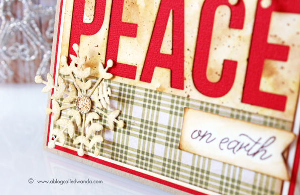
I used the Big Add-Ons stamp set to stamp my sentiment onto a piece of cream cardstock, then I mounted it onto the card with foam squares. This stamp set works perfectly with the Big Peace and the Big Joy dies and stamps. I really like how traditional this feels with the bright red and the darker green. One tip for making your vintage projects – stamp in brown ink instead of black!
I’m really looking forward to sharing and visiting with you every week! Leave me some comments and let me know if there is something specific you would like to see featured, and I’ll start a list. I will pull one winner from the comments for a Simon Says Stamp Grab Bag! I’ll announce the winner on next Saturday’s post, so you have all week to leave your comment. Have a great weekend!
 |
 |
 |
 |
 |
 |
 |
 |
 |
 |
 |
 |
 |
 |
 |
 |
 |
 |
 |
 |
 |
 |
 |
 |
 |


What a beautiful card!
Beautiful card!! Congrats on this new adventure…looking forward to more ” Weekender with Wanda”!
I would love to see more of your Vintage/Brenda Walton design projects. On a card or off the Card..project would be nice. Between you two…you make vintage beautiful.
I like your fun cartoon, and I love your card! Sounds like we’re going to have fun!
wow I love that Big PEACE
I hope you can show how to make plaid paper and the way to make it good looks like a real DP plaid paper
many thanks Wanda for asking
That die is beautiful and I like the casual air the plaid adds.
Fab card! Looking forward to more Weekender posts :)
Lovely card!
This is a beautiful card! I like the classic, rustic look.
Today’s Christmas card is just stunning. I have all of the layering and the touch of aging on this card.
That’s cute and it does look masculine.
Love this card!
Love the design of this card. Beautiful!
So fun, loving this! Would love to see some watercolor and wet embossing techniques! Can’t wait to see more of this feature weekly!
Very creative and thanks for the hint about using brown for stamping♥
Great card love the big PEACE!
Congratulations. . . .look forward to the weekender series. . .love how you ‘vintaged’ this card. . . great inspiration for both negative/positive of the die cut word. . . .
Very pretty card.
Cute peace card! I would like to resist stamping techniques.
Love the card, Wanda. There is such perfect balance between the plaid paper and the boldness of the die cut letters and snowflakes.
Love the design on this card. Looking forward to future posts. Thanks for the great project ideas.
Beautiful card I love how the letters really pop
Beautiful card! Can’t wait to see what you have for us next weekend. ♥
Love this bold but rustic card!
Beautiful. Love the negative cut.
I love that die and your card is fabulous! I’m so glad you’ll be here every weekend!
I’m looking forward to your weekend inspirations! I really like the card you have here, so more of the same would be great. Simple and classic designs like this never go out of fashion and can be enjoyed by people of all ages. :)
Lovely Christmas card. I really like everything that gets put up on the SSS blog so I don’t have a preference.
Love the card layout and colors for this gorgeous vintage like Christmas card! Looking forward to your new Saturday feature too.
Lovely card! I really like the big red PEACE and the glittery snowflake.
Love the card! Looking forward to more Weekenders with Wanda.
Welcome Wanda….look forward to our weekends with you…..THANKS… Love the distressed aged feel on this card.
Beautiful card, Wanda! The “peace” die is so pretty over the red! Why don’t my distressed pieces look this good?
Love the card!!! That pop of bright red is amazing!!!
I love the vintage feel of this card, beautiful.
Nice card, thanks for sharing.
CONGRATS on your New Feature!! BEAUTIFUL CARD!! THANKS for sharing and have a FABULOUS WEEK!! =)
Great card, thanks for sharing!
I look forward to learning some inking techniques.
I agree, this is a nice masculine card and we know such are not common nature to us female stampers. I like your new post and look forward to seeing your weekender post in the future. Your new portrait cartoon is cute. I would like to see a post on comparing 12″ paper cutters. I have a Creative Memories cutter and a Fiskars cutter. While both have been adequate, it bugs me that they both are a minute fraction off. When I fold my cardbase, there is usually less than 1/ 16″ sticking out beyond the cardbase on one end. Yi! Drives me bananas!
Fantastic design, homey and warm.
Lovely card, I like the big Peace and the plaid paper used.
So happy to learn more! And especially nice to see you on the weekend when I have a bit more time! Thank you.
Love this. Traditional colours but a modern look. Hugz
DELIGHTFUL card Wanda!!!
LOVE how you used the negative to feature the sentiment and think the watercolour panel is GORGEOUS!!!
THANK YOU for sharing your CREATIVE INSPIRATION!!!
PS – I have no special requests because I have lots to learn and know that whatever technique or product you use, I will continue to learn :)
Love the vintage feel to the card.
What a beautiful card! The word peace really stands out. I really would like to see some more vintage looking cards with distress inks or watercolor techniques
How exciting to be able to see you every weekend on the SSS Blog. I love seeing all the gorgeous cards you create! I’m not particular about what I would like to see. I enjoy it all!
Beautiful card!!
This is such a great card. I would love to see more inspiration mixing techniques like this – using patterned paper, dies, distress ink, embossing, etc all together. Too often I get stuck in a rut using the same techniques over and over, and I’m never sure how to combine them all.