Weekender with Wanda – Go where your heart takes you!

Hello crafty friends! Welcome back to the latest edition of Weekender with Wanda here on the Simon Says Stamp Blog! I’m so lucky that I get to see you every weekend. I really look forward to thinking up a new project to share with you, and I love hearing from you! I read every single comment you leave on my posts, and your kind words uplift me and inspire me! Thank you! Today is my post of the month in which I feature Tim Holtz and Ranger supplies. I try to challenge myself to do something new, or bold, or different. Well, for today’s card I went way out of my color comfort zone! I went big and super bright with lovely primary colors! I used some of my favorite dies from Tim Holtz and lots of ink pads. Let’s get started!
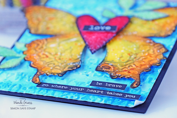
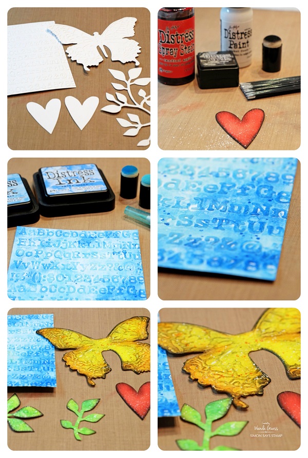
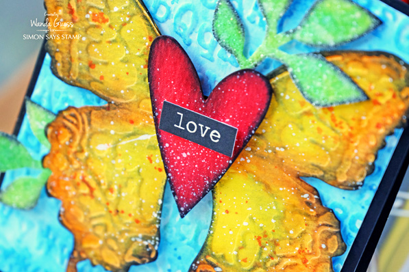
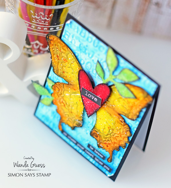
The focal point of my card is the beautiful Layered Butterfly Die from Sizzix by Tim Holtz. In the package with the die, you get a matching embossing folder that perfectly embosses the butterfly. To do this, you first cut out the butterfly. Then you put the cut out piece of paper into the embossing folder and run it back through your die cutting machine. Lovely! There is also a Bee and a Dragonfly version. My card base for today is deep black cardstock – a nice contrast to all that color.
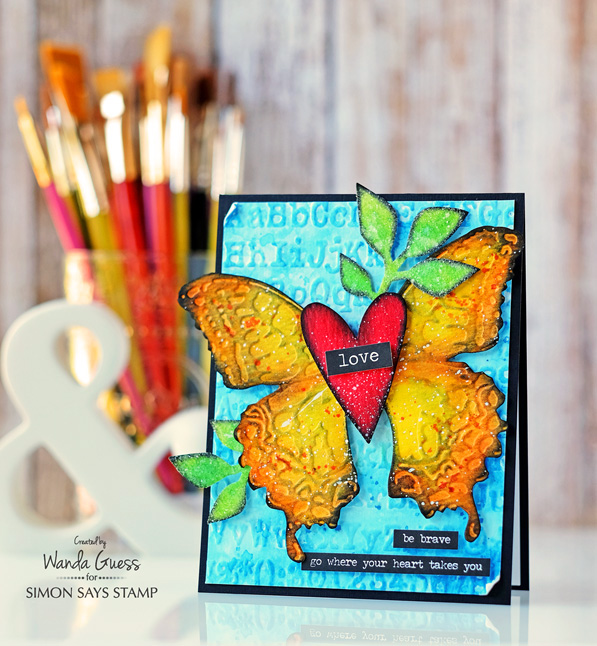
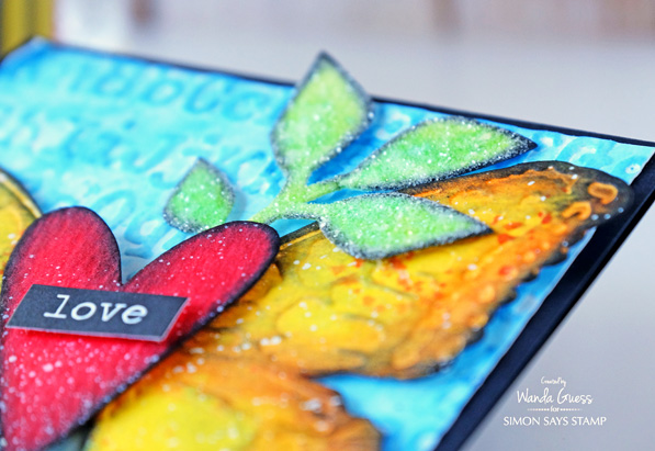
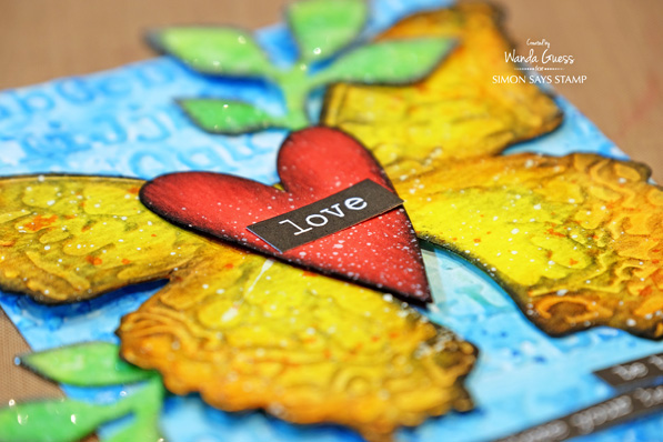
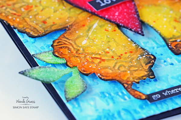
Even though the butterfly is my focal point, I really LOVE how this heart came out. It just pops off the page. There is a lot of texture going on in this card. I decided to add more by covering my leaves with Rock Candy Distress Glitter too! (more is more)! In this close up you can see all the different mediums I used. I started by die cutting all of the pieces out of Tim Holtz Watercolor Paper. For the heart, I sprayed it with three layers of Candied Apple Distress Stain and let it dry. For the butterfly I used Squeezed Lemonade, Carved Pumpkin and Ripe Persimmon Ink pads and a sponge dauber to put the color down. The leaves were inked with Twisted Citron and Cracked Pistachio. YUM! (Ink color links at the bottom of the page!)
Once all the pieces were dry I used a small sponge dauber and Black Soot Distress Ink and edged all of the parts. Then I used Picket Fence Distress Paint and the Tim Holtz Splatter Brush to add white flecks. This was a really fun project!
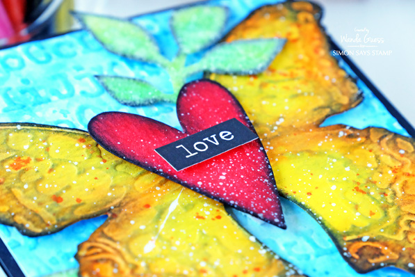
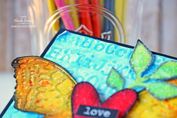
In this photo, you can better see the glitter. The embossing on the blue layer was made using the Tim Holtz Typewriter Embossing Folder. Then I layered two colors of blue ink over it. Since these are all primary colors they just pop all together!! This is not my normal color palette but it’s so rich and happy. I might have to do more of this!
At first the background was created with embossed watercolor paper. Then, I added Tumbled Glass and Salty Ocean Distress Inks to the paper and wet it all with my water brush. When it was dry, I splattered clean water over it to remove some of the ink. This is a great technique! Then I splattered Salty Ocean ink on it a second time – to build up the layers of color. This sounds harder than it is, truly! The trick is to let your paper dry in between the different ink layers.
My accents are from the Tim Holtz Stickers lines – Big Chat and Small Talk. I love those stickers! They are perfect for any project – and they come in white or black.
Here are some in-process photos. In the first photo you can see all my pieces ready to ink. I used the Tim Holtz Movers and Shapers Hearts, and the Garden Greens Dies. These are a couple of my go to items in my Tim Holtz stash. In the middle two photos you will see some close up shots of the background layer. The bottom two photos show the finished pieces ready to assemble. I trimmed the center of the butterfly since I was going to layer the heart over that part.
One of my tips is to assemble your card on your craft sheet or table first until you get it the way you want it. In this next photo all the pieces are loose. So, when I get it the way I want it I snap a quick picture with my iPhone before I take it apart again. That makes it easy to reference when I am gluing everything together! This works especially well when I am doing cards with flower clusters or leaves.
I like how some of the paint made a big splotch across the butterfly wing. This part always makes me nervous!! It’s the very last step after I’ve worked really hard on something… One bad speckle or splatter can mess up the whole thing!
Thank you for spending part of your weekend with me! Hope you have found something to inspire you to get crafty! Have a great weekend, and I’ll see you soon!
SUPPLIES:
 |
 |
 |
 |
 |
 |
 |
 |
 |
 |
 |
 |
 |
 |
 |
 |
 |
 |
 |
 |
 |
 |
 |
 |
 |
 |
 |
 |
 |
 |


Love the rich vibrant colors!
Beautiful card! Love the white splatter!
“Weekend With Wanda” is my Saturday morning highlight! A fresh brewed latte and delightful eye candy…PERFECT!!!
Thank you Geri! That is such a nice thing to say!
This is gorgeous!
Wanda your color choices are so gorgeous! I think I should add that embossing folder to my list. Love the typewriter version. Once again you have inspired us all to create. Thanks
Love the multi-layered effects. Beautiful.
Love the shading on the butterfly.
Wonderful project.
thanks for sharing.
GORGEOUS card! Your colors are so vibrant! How cool is that butterfly die and matching embossing folder, WOW! So clever! LOVE how you added that pretty heart to the center!
SUPER gorgeous card!!LOVE it!!
Great card and colors. Thanks for sharing.
Linda D.
Gorgeous and bright! Love all the texture too!
Big and bold it is, Wanda, but I love the layers and textures!
What a beautiful project
Beautiful colors and texture. Just beautiful.
Love it! I gotta get that butterfly of Tim’s!! Hey . . .you coulda’ sent yourself this card, last year!! LOL!!! Miss you . . . . J
That’s great!! Haha. Miss you too Janice! XO
Beautiful card–love it!
Wow–fabulous bright color combo.
Love all the bright, bold colors!
So bright and beautiful!
Beautiful card.
Awesome textures and colors!
Beautiful texture Wanda. TFS
Absolutely love the brightness of this. All those details and finishing edges are brilliant!
beautiful – love all the gorgeous texture you managed to create:)
Love the background
Beautiful vibrant colours.
I love these colors! Gorgeous! I think I will try my hand at this but with a birthday theme. I love this big butterfly! Thanks for the inspiration!
Love the bright colors
OH wow. Great project and such good explanations of how you put the card together. Love it.
I love how vibrant the colours are.
Lots of lovely texture on your card – thanks for sharing.
This is so beautiful!!
I love all the texture! Great card!
Beautiful die and card. Had no idea it could look like this.
what a happy, bright card!
Such a beautiful and vibrant card
Beautiful card… Love all those vibrant colors. Tim Holtz products really are exceptional .
After being a sewer for years and years, I have just recently become a card maker. I signed up for the Tim Holtz class and am learning all kinds of new techniques! I really love this card as it includes some of the techniques I have learned and gives me lots of inspiration. Thank you for sharing!
Beautiful card with so many great techniques!
Love the splash of glitter! The embossing adds the perfect accent to the butterfly & background……Fantastic Card!!!!!
Beautiful card!! Love the butterfly! Very beautiful!!
-Berina
Moxie Craftie
Lovely!
Absolutely Beautiful!
This is such a gorgeous card!! The vibrant primary colour combination really is lovely!!
This is beautiful Wanda, love the glitter.
How gorgeous your
butterfly is with the
shiny heart! So pretty.
Carla from Utah
Gorgeous colour and dimension on this card!
Your card is bright and happy!
This card is simply stunning. The bright contrasting colors and dimension makes this card stand out.
Beautiful card by Wanda! Love the gorgeous colours!