Tim Holtz Distress Ink Color POP: Hickory Smoke!
Hi readers! Happy Tuesday! If you’re like me, you may have been curious how the fabulous Wanda Guess would POP a grey ink color, but as you may have guessed (as I did), she did it in am AMAZING way! Read on and enjoy!
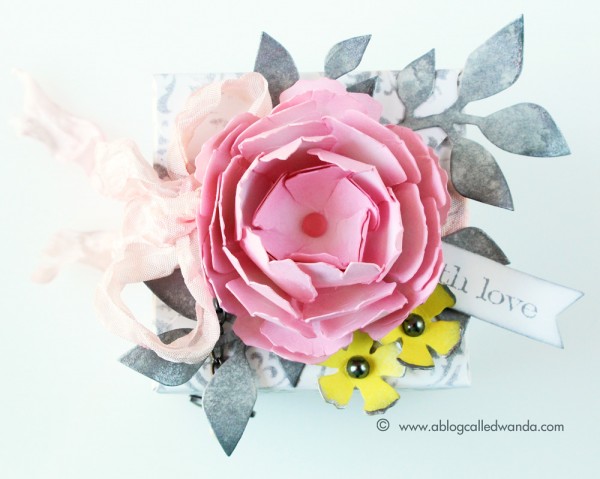
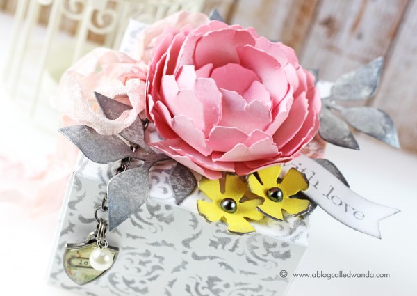
It’s Wanda, and I’m here today with the latest installment in our Color Pop series – featuring the newest Distress Ink Color! I’m excited to share a project using the color for June – Hickory Smoke. This is a soft, medium, shade of cool grey. Like the color of steel or the grey part of the ocean. I had a lot of ideas start to flow with this color and ended up going with one of my favorite classic color combinations – grey, pink and yellow. It’s a retro 50’s vibe when you use these colors together. Think – a pretty 50’s roses table cloth. Are you feeling it? And, instead of making a card this month, I made a gift box – perfect for a wedding gift card!
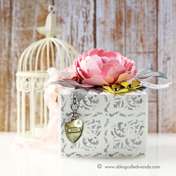
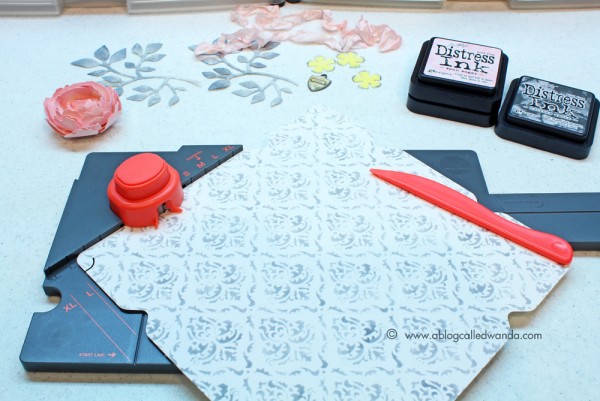
One of the nice things about this grey is that it’s not too dark. And, it isn’t too warm. Yeah, the perfect grey! I started by using the Gothic Stencil on repeat (8 times) to make a sheet of my own patterned paper! I used a nice thick, smooth white paper. The stencil matches up on a repeat and this was easy to do. I used a small sponge dauber and the Hickory Smoke ink pad and went to town. I made my paper into a 9×9 inch square and then used the We R Memory Keepers Gift Box Punch Board to make the pretty box. Then the fun part — decorating it!
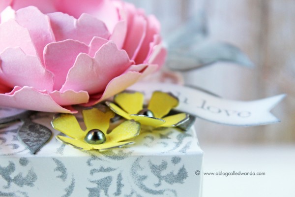
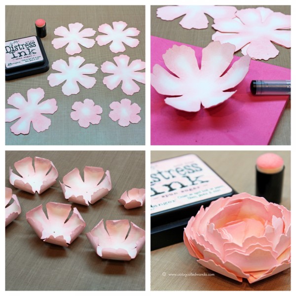
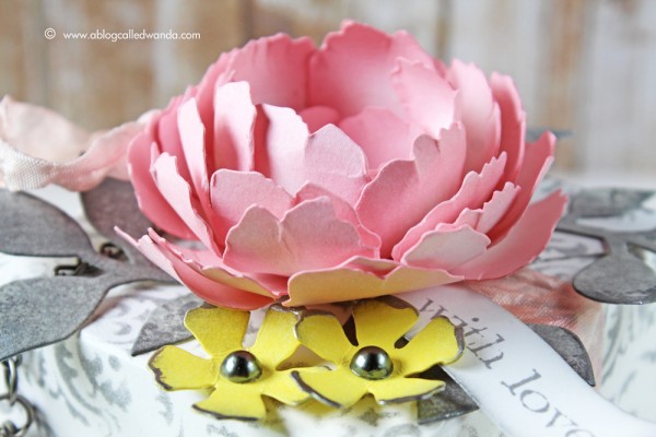
I cut out several Tattered Florals die pieces and colored them using Spun Sugar Distress Ink and Squeezed Lemonade Distress Ink. I curled all the edges of my pink flower inward and nested them together with a pink brad in the center. It sort of looks like a cross between a cabbage rose and a peony! For the Lemonade colored flowers I added a bit of Hickory Smoke ink to the edges. You can see that I also added touches of Ranger Silver Paint to both my leaves and my yellow flowers. I wanted a bit of shine for this…but not glitter. For the leaves, I cut out the Garden Greens and colored them with Hickory Smoke. Something a bit unexpected and different… I dyed my own ribbon with Spun Sugar Inks and crinkled it up nice and pretty.
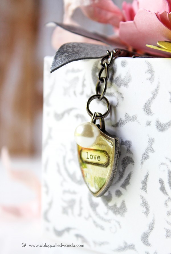
I made a charm dangle off the edge of the box with a Shield charm and a pearl bauble. More is more, right? Yes!
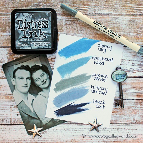
I’ve made another color swatch reference chart for you to see where the new color fits in with your existing Distress Ink colors. I’m showing you some different shades that will help you see the true color of Hickory Smoke.
Next up is the gorgeous Blueprint Sketch. YEAH! I love the TH Blueprints stamps so I am already thinking along those lines for next month’s project. What a pretty blue!! Yowza! See you next month! Have a great day and happy crafting!
SUPPLIES:
Blog Candy Alert!! Follow our blog via email and comment on this post for a chance to win a special blog candy!
Congrats! Blog Candy Winners!
From: Splash of Color Border Waves: Miriam Prantner!
From: DIY Decoration Idea for Jars!: Sandy Ross!
From: Summer Fun with Simon Says Stamp Exclusives: Dee Earnshaw!
From: Guest Designer Lia Griffith: Pauline Adamson!
From: Pigment Powders and Embossing Paste!: Janice Carl!
From: 4 Seasons of Crafting; ONE stamp set!: Maureen Reiss!
Please email Samantha ([email protected]) with your mailing address (if applicable) and the name of the blog you won from to claim your prize!









Gorgeous flowers!
I love the custom patterned paper you made. It looks great!
Great use of grey, love it.
Gorgeous color palette for this beautiful gift wrapped box! The flower colors are perfect with this grey tone! And I love seeing the color swatch! :)
Oh my word, this is simply GORGEOUS!
That is one gorgeous box! Love the stamping, and I wasn’t too sure about wanting this colour, I now know I need it! Thanks for sharing, already subscribe Karen
I love the gray and gorgeous flower. Fabulous stencil choice too!
I have always loved pink and grey together. Always have, always will.
Your project box came out beautifully!!!!
Very pretty Wanda. Anyone would be happy to receive such a pretty gift. Love your overall pattern and the colors you used. Thanks for sharing.
Lovely. Colors are amazing together.
Wow- this is so pretty!
OMWord!! Prettiest gift box EVAH!!
stunning creation…love the new colour.
What a gorgeous project!! The flowers are so beautiful and so is the patterned paper!!
Wanda, stunning, beautiful, gorgeous, fabulous, magnificent, did I leave anything out, lol. No really it’s pretty, I’m going to have to try and make this for sure. Thanks for the inspiration.
I love how you show us the coordinating colors and where the new one fits. Thanks.
Love the color combination.
Just love the step by step photographs!! Thank you so much for showing this! Totally inspired now! #YouRock
very pretty color combo!
Oooh I love this shade … I’ve been looking for a nice grey for ages!
Beautiful creation. Thanks for the tutorial Love those flowers!
Those flowers are Gorgeous! And the custom paper is awesome. You’re right,, the grey is a perfect color for this project!
This is gorgeous! I was wondering how to use the hickory smoke ink. I love it with the pink and yellow. Thanks!
Gorgeous projects! Thanks for sharing this inspiration.
Carol B
ciaoitalia2007 (at) gmail(dot) com
Very cool project! and thanks for the color comparisons! They are very helpful! :)
Such a beautiful creation. love it!
Love gray and pink together, lovely project. TFS
Love the new color. And love that little gift box. So cute.
I absolutely adore your gorgeous box! Now I do want that gray!
Gorgeous gift box!
Love the flowers.
The flowers are beautiful. Great job
Very pretty projects. Grey is an underrated colour. Hugz
So pretty!!
Beautiful package! I love the color combo and the charm adds a nice touch.
This is beautiful, jaw-droppingly gorgeous and just FLAT OUT amazing!! Wanda so totally rocks!! Wow, she is just so versatile in her talents!!!
Oh this is GORGEOUS! I LOVE it simply beautiful!!!!!!!
So Pretty Wanda! Thanks SSS!
love pink and grey
Wow! This is amazing – Hickory Smoke really does POP against the pink. I love the color swatches provided since it really helps give an idea of how HS compares to the other TH colors.
What a beautiful combo of colors.
Tim Holtz Distress Inks are a collection of 48 acid-free, non-toxic, fade resistant, water-based dye inks. Tim selected the colors and helped develop these inks to produce a realistic, weathered look on paper, photos and decorative fibers.
pink is an decent color most people like lite colors such as pink, yellow and green