Studio Monday with Nina-Marie: Zig Gem Watercolors on Dark Cardstock
Hello crafters! I am so thrilled to be back with a new video for you! I’ve got some super-fun Studio Monday videos planned for the next couple months and cannot wait to share them all with you!!
Today’s tutorial is going to touch on watercoloring with the oh-so-beautiful Zig Gems palette. Have you gotten to see or play with these new watercolors? The metallic jewel-tone colors are simply stunning, especially when you use them on dark colored cardstocks.
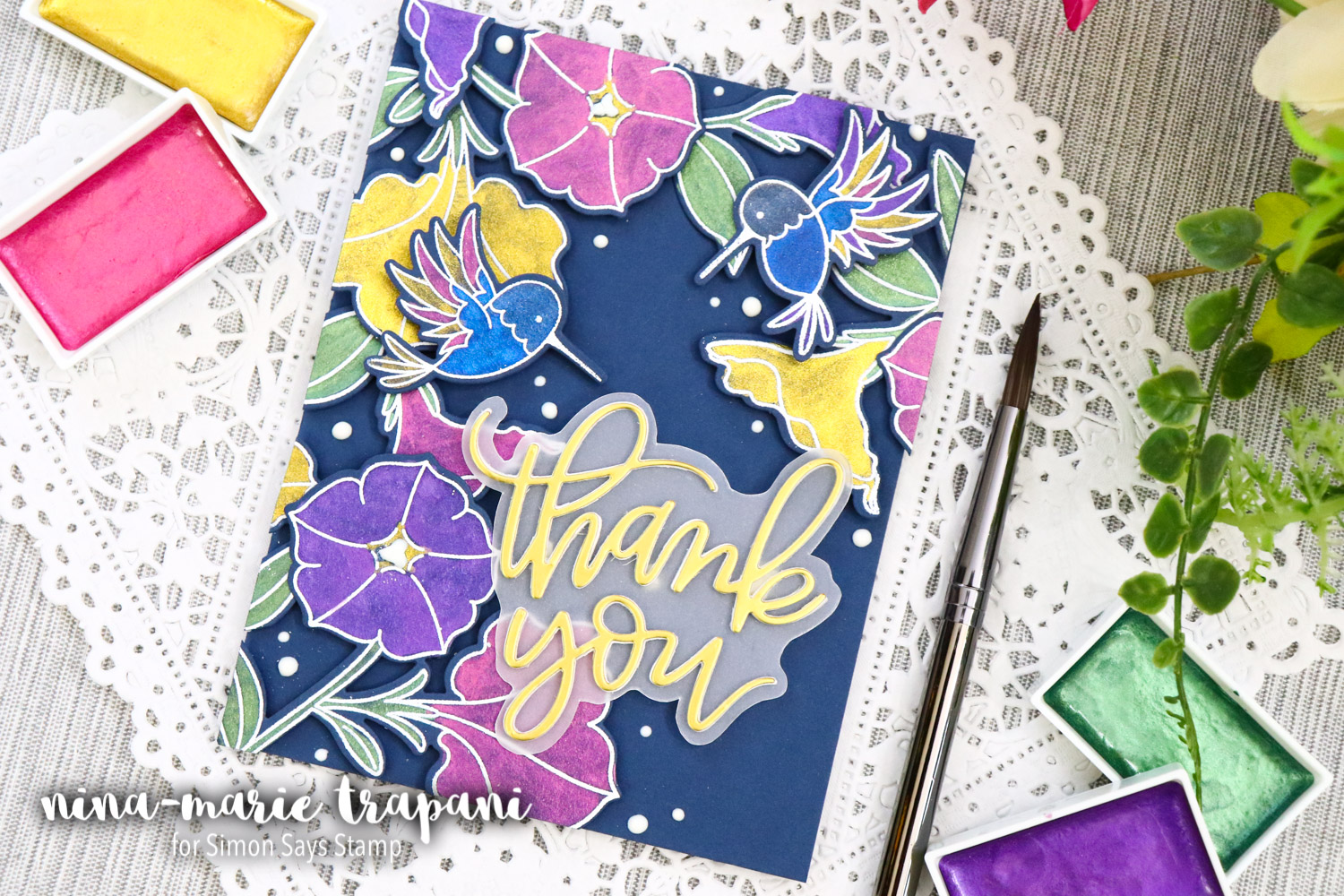
You could easily do this technique on black cardstock, but I fully admit that I am a color-girl! So in my case, I opted for Simon’s Soft Navy as my base cardstock.
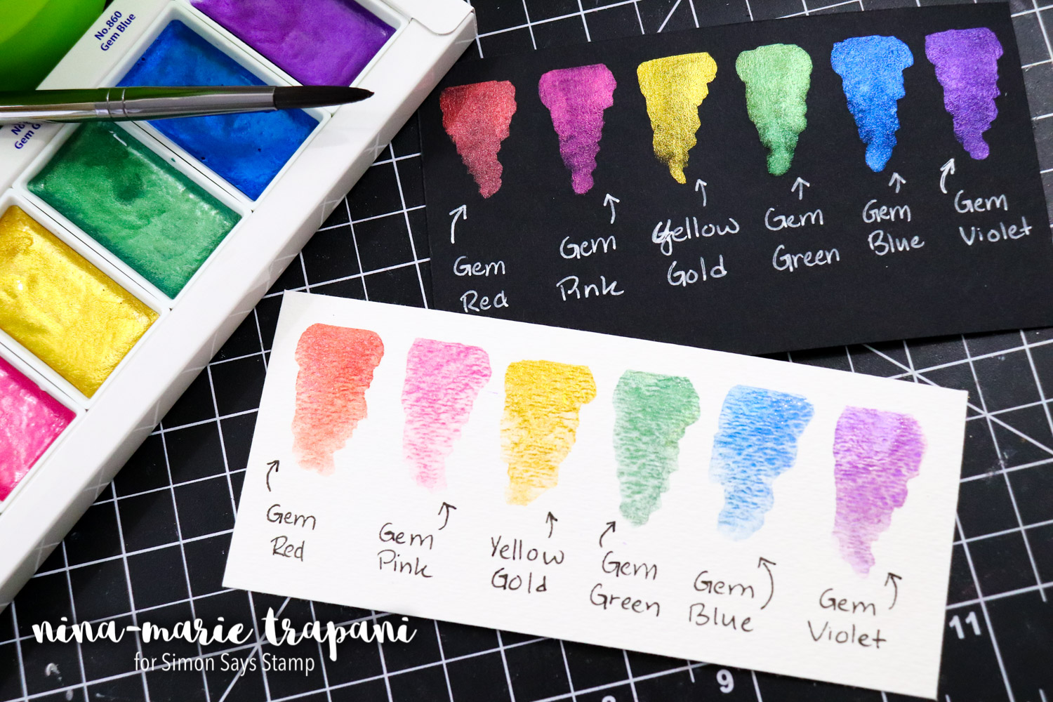
These watercolors perform beautifully on darker surfaces; the vibrancy literally jumps off the paper! When you use these Zig Gem colors on lighter paper, you get a much softer and almost pastel effect. The photo below demonstrates the difference between dark and light surfaces. I personally really like the intensity you get with dark paper!
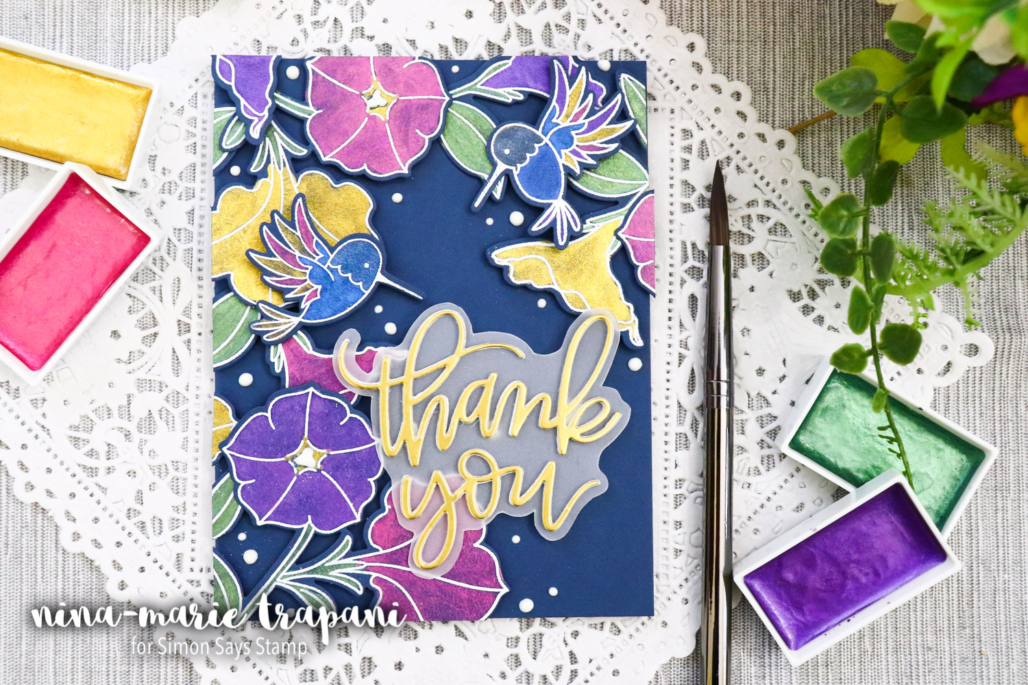
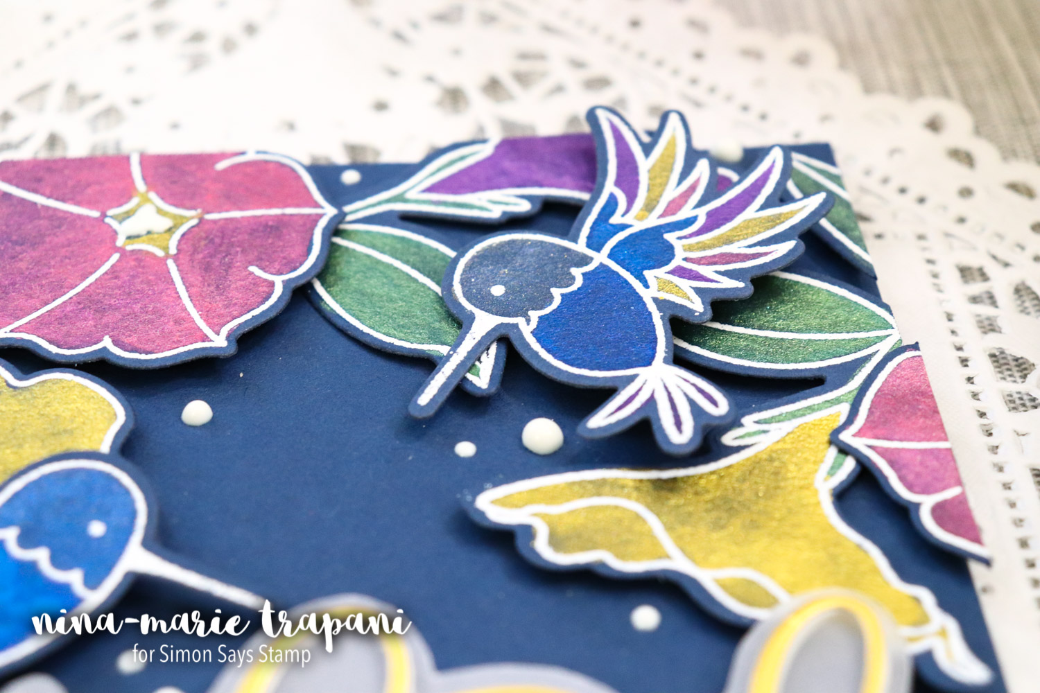
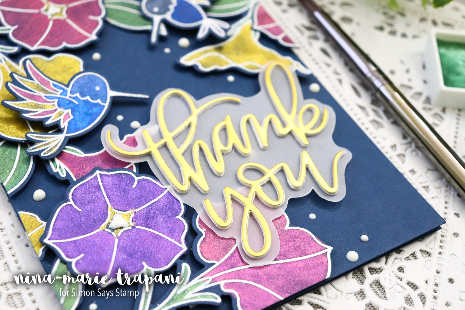
My card features images from a couple of new Pretty Pink Posh stamp sets; Pretty Petunias and Hummingbird Thanks. Each image is white heat embossed onto Soft Navy cardstock and then colored with the Zig Gem watercolors.
When I watercolor onto cardstock like this, I make sure to use as little water as possible so that I do not over saturate the paper. I also purposely did the white embossed outlines for two reasons:
- The colors will stay within the areas in which I place them because of the raised, embossed outlines. This makes the watercolor process easier since you don’t have to worry about adding color next to a wet area.
- White embossing shows up so much better on the dark paper, rather than a plain stamped image. It also gives each image an extra bit of “pop”!
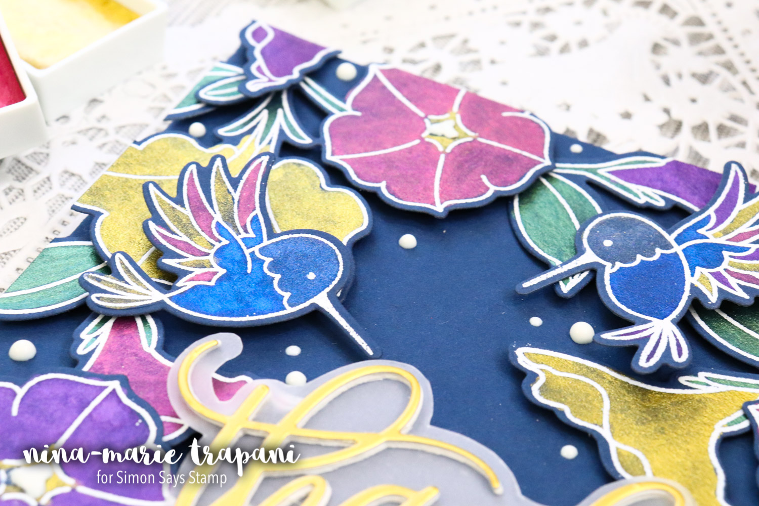
Once the images were colored and dry, I cut each one out with the coordinating dies for each stamp set. I then began to layer them onto the navy card base with foam tape.
There is also a die cut sentiment featured on the card, which is also from Pretty Pink Posh! This stunning script Thank You was cut from one of my a gold satin-foil cardstock from Tonic Studios. You’ll also notice that there is an outline around the sentiment; if you watch the video I created for this card, you’ll see how I did that.
Finally, I added Nuvo Drops in the Gloss White color around my images to tie in a bit more of the white and create some depth for my scene.
I hope you will watch the video to see this card come together, as well as get a close up look at the beautiful Zig Gem watercolors! If you don’t have this palette of pretty jewel toned colors, you can find it here. I think you’ll have fun incorporating these watercolors into your upcoming projects!
Thanks so much for visiting with me today; I’ll be back next week with a brand new Studio Monday tutorial!
WATCH THE VIDEO
SUPPLIES
|
Blog Candy Alert!! Follow our blog via email and comment on this post for a chance to win grab bags and blog candy! Remember to tag your awesome projects with #simonsaysstamp on social media so we can see what you are creating! 










Beautifully done! I love those shiny colors on the dark background, TFS
What a beautiful, colourful card! Love those watercolours.
Really pretty card and I love the shimmer shine! Thanks for your wonderful video!!
wow! those colors really do pop … the shimmer with the metalic is gorgeous
Beautiful paints and great tip on using the die to outline the word die cut!
How beautiful!! Thank you for great inspiration and the outline effect tip :)
I love how vibrant the watercolors are on the dark cardstock. Thanks for the inspiration and great job on the beautiful card!
Its a really good idea to use shimmer watercolors ! Loved it. Will surely try. Thank you for sharing.
I enjoy just looking at the new and beautiful ideas
Such great colours! Super!
Beautiful card!
Your card is just beautiful
Just beautiful! Love the colors and that thank you die!
WOW! Stunning card!!!
Cristina
thehouseoftheblackbirds.blogspot.it
Beautiful! Can’t wait to try this!
I love how stunning the colors are on dark paper.
Wow, these colors are wonderful and they show up well on the dark cardstock.
So beautiful!!
Bright, vivid colors.
Very pretty design.
thanks for sharing
txmlhl(at)yahoo(dot)com
OMG!! Those watercolors are amazing! I love how they look on dark paper. Beautiful card I love the colors ❤
WOW such a GORGEOUS card!!!
What vibrant and gorgeous card! I love this technique and I can see I just might have to purchase these beautiful metallic paints. So pretty on dark Cardstock. Thanks for the inspiration.
Love the idea of tracing the die to create an outline, love that idea!!! I love the card and the beautiful colors!! I love Finetec and the colors that they have, great company and watercolors! Thanks for sharing .
Thank you for demonstrating those gem colour watercolours. They pack a punch! Love your card :). Pretty Pink Posh hit it out of the park with those 2 stamp sets.
Wow! Love how vibrant the colors are on the dark paper. Beautifully stunning card!
Beautiful card! Those new colours are amazing!
This is gorgeous – those gem watercolors really look amazing on the black cardstock!
These are beautiful! I love the fact that shading isn’t needed! Shading is hard!! Thanks for the inspiration and the trick with the die outline on vellum.
Love your card–the colors are wonderful, so intense. Thank you so much for sharing!
Oh my gosh, I LOVE those watercolors! They look amazing on black! Great demonstration–thanks. =)
Such a cool results
Wow, I had no idea you could get a result like this on dark paper…gorgeous!
Gorgeous card! love the colors so much.
These Vibrant Colors must be amazing to work with.
Gorgeous card. I love the new watercolors.. have ordered a set to give them a try!
I like the valuaƅle info you provide to your articles.
I wioll bookmark your eblog annd check again hedre rеgularly.
I’m quite certain I’lⅼ be informed a lot of new stuff right right here!
Goodd luck for tһe next! http://www.ylywsm.com/comment/html/?151192.html
So beautiful! Love the colours on the navy cardstock. And thanks for the tip about creating a “shadow” for my die cut sentiments! I’d never thought about doing that.