Simon Says Stamp Color Coordinates: Spring Flowers

Welcome everyone!! I hope you’re having a good day. I have a Color Coordinates recipe that is perfect for Spring flowers! I’ve used some of our new ink colors; Rose Apple, Clementine, Velvet Orchid and Dusty Sage. For the neutral, I’ve used Fog cardstock.
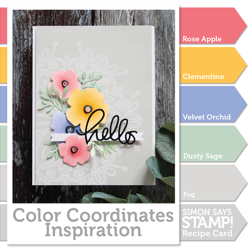
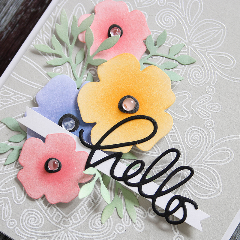
I started by die cutting the Forget Me Not Flowers from Neenah white cardstock and colored them in using Tsukineko sponge daubers with the inks.
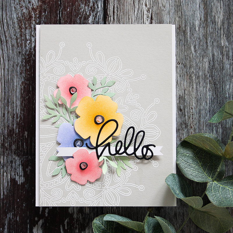
I concentrated the ink in the center of the flowers and blended it out to the edges. Blending is a great way to extend your ink colors by creating lighter shades. Once I had my flowers and leaves colored, I arranged them onto a white embossed Flower Medallion stamped on a Fog cardstock panel. I die cut Hello from black cardstock and set it onto a strip of white. To finish up, I added Studio Katia round drops to the flower centers.
I’ve filmed the process of making this card which you can view below or on our YouTube channel HERE.

Blog Candy Alert!! Follow our blog via email and comment on this post for a chance to win grab bags and blog candy! Remember to tag your projects with #simonsaysstamp on social media so we can see what you are creating!
Thanks for stopping by!
 |
 |
 |
 |
 |
 |
 |
 |
 |
 |
 |
 |
 |
 |
 |
 |
 |
 |
 |
 |
 |


Beautiful card and beautiful color palette! Thanks for sharing!
P
R
E
T
T
Y
It are great colours to combine! Great cards!
I love this dreamy color combo! It’s so very beautiful.
So sad that I can’t be at the Create event. It’s my wish to go some year and meet all the great people at Simon and all those that write for this blog.
Beautiful – I love the embossed soft gray background – the pastel flowers look gorgeous against that.
Absolutely pretty!!!
Beautiful
Gorgeous card!!! Always love watching your videos, Shari – there is always something new that I learn:)
Beautiful card, Shari! Love the colors and your fabulous design!
Beautiful colors….I love those flowers!!!
Lovely card! Thanks for the tips.
Such a beautiful color scheme. Your card is lovely, Shari.
This is so incredibly pretty! The flowers are simply lovely on the embossed white stamped background!
Lovely colors Shari. I just can’t take it anymore, I have to have that medallion stamp! Thanks for inspiring.
Just Gorgeous! Love the Forget-Me-Not stamps and those SSS inks!!!
Great color palette!
Very pretty
I love the color coordinates blog posts. They really help me with my color choices. Awesome video…thanks for sharing with us.
Beautiful colours and a beautiful card.
Beautiful card and wonderful color selection. The softness of the flowers is stunning.
Love the embossed background, it really makes the flowers “pop”!
Very very pretty…love the colors!
Love how you did this!
I love the color coordinates series! Beautiful card. Thanks for sharing.
Such a beautiful card and I love the colors you chose! The background stamp and the embellishments you chose were the perfect touch.
so pretty! love those colors together :)
Thanks for the reminder to use gray. Beautiful card.
Gorgeous! Love the colour combo. Great way to get more use of your inks.
Nice.
Very pretty card, Shari! Love these flower dies and the colors are so soft and dreamy. thanks for the video!
Very pretty card. :)
So pretty! Love these colours!
Shari – I LOVE THIS CARD; the fog background rather than white is just the BOMB; so springy and beautiful!!
Thanks for the video and ink blending tip. Very pretty card.
Lovely card, great flowers.
Love the background emboss with your flower colors!
Great card! :)
Lovely card. I need to get that fog cardstock. It is a nice alternative color that makes everything look pretty on top of it. Beautiful job.
Beautiful! I always enjoy the new color coordinates!
Your card and color combination are gorgeous. Thanks for all the great inspiration.
Nice! The fog cardstock with the white embossing is a great background for this card!
Pretty card! Love the color combination.
Lovely colours together, it’s a great card and design!
Love the card and I love how you used the inks on the flowers. I don’t have any of the new inks yet, but those colors are gorgeous. I’m a soft color person when I do my cards, not a bold color person, so those colors are right up my alley!! Love when you do the color coordinates, I always love to see what colors you put together! Thanks for sharing .
Very pretty. I like the white embossed background.
Love
These soft and pretty colors on your elegant card,
So beautiful
What great colours to work with! I might give that a try for my next card. It’s a bit softer than I usually aim for. Lovely card Shari!
One of my favorite cards! I have those daubers & you’ve inspired me to use them like this!
Love the way the flowers are coloured and adore those glass flower centres. x
This is a color combo to just love. The soft colors card is a great one.