October’s Color of the Month Is…
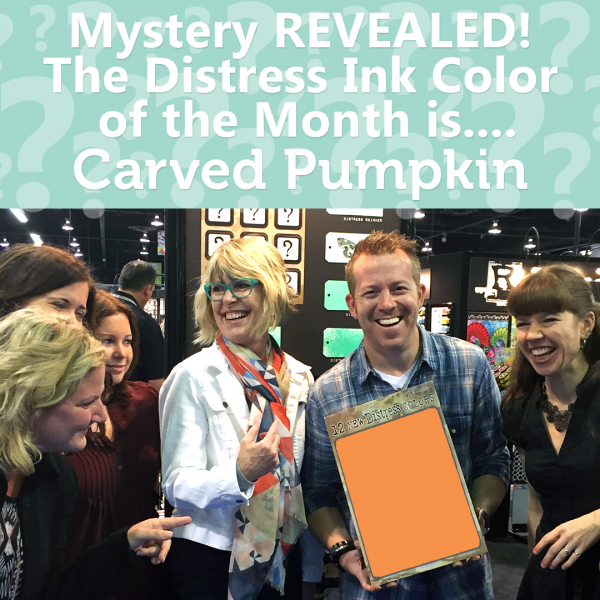
Hi readers! We’re happy to kick your October off RIGHT with a fresh new color from Tim Holtz & Ranger!
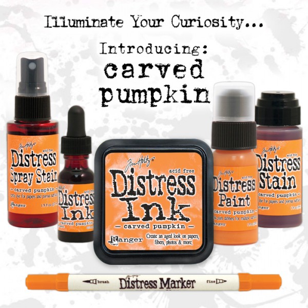
We hope you’re as excited as we are about this lovely color: CARVED PUMPKIN!! You can reserve this color now, and it will ship at the end of the month!!
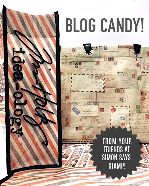
Blog Candy Alert! Is this color a must have for you? Comment your thoughts on this post for a chance to WIN a reusable Tim Holtz Idea-olgy tote bag! Good luck!


Love this shade of orange!
I’m sure I’ll get this color, too! My goal is to own all the new colors. I love the vibrancy of these new Distress colors and they blend so well into the Distress color palette. Orange is perfect for October! :)
We should go guessed that the October floor world be in the orange family.
I’m not usually much of an orange girl, but add the word pumpkin? :D I think this will be joining my collection.
perfect color for October – pumpkin!
What a yummy color!! Perfect for Fall.
This is a gorgeous orange but I would not use much since Orange is not a favorite color of mine. I will probably wait till the mini is released.
Looks like a gorgeous color
and just right for Fall projects.
Carla from Utah
Love this color! So inspired to make fall season Papercrafts!
What a COOL color….right in time for FALL!!! Thanks Tim…I love all my – oops – your Distress colors! Thanks too for the chance to win!!!
Paper Hugs,
Jan
Great color! Wish I had it now. lol
LOVE this new color. I use a lot of the Distress colors that are orange based but this one is a perfect orange!! Can’t wait to get mine and use it for my Thanksgiving cards. Just love all the new Distress colors introduced this year. Thanks for the chance to win even though my chances are slim.
Love it!
I just love all of the new colors introduced this year, but probably would say Twisted Citron has been my most favorite. Sure love the looks of October’s pumpkin color, can’t wait to have it in my collection! Thanks for the chance to win the sold out stamp set, cool (coffee) beans! = )
mmm, DELICIOUS colour – LOVE IT!!!
I tend to use lots of orange and green in my crafting, so Carved Pumpkin will fit in quite nicely :)
I’m one of the few that loves orange all year round. I can wear it easily with my blonde hair, freckles and brown eyes. What a great shade. A little will go a long way this vibrant shade!
It was the shade of orange missing from the line. It fits in perfect but we need this color this month for Halloween. I guess it does fit in for Thanksgiving. Love the vibrant orange color!
Pumpkin picking pretty
One of my favorite shades of orange! Waiting for the minis to come!
Absolutely a must have! Perfect for Halloween and other fall card making. Such a lucious color.
I love orange as a colour, yes it is perfect for autumn and Halloween, but its exciting with other colours too. So I love this new Distress colour, and I am loving the way each new colour just fits in so perfectly with the range – you gotta have them all!!
Great color addition to the line.
I would love to add this orange distress ink to my collection! What a perfect color for all our fall projects, cards, and scrapbook layouts! Thanks for the opportunity to win one!
Oh good a nice orange shade :)
This orange color looks great!
LOVE it!
WOW!! This one is gorgeous! Love how vivid it is. This is a must have color! :-D
Perfect color for October.
This is my most favorite shade of orange. Love it!
What a gorgeous colour! It reminds me of pics of pumpkin pie in my cookbooks! MMMmmmmm now I’m craving a large piece of pumpkin pie!!
Love, love, love it. Orange is one of my favourite colours! Fabulous!!!
I love orange and all things fall so this color is great. Of the new colors. I like blue print and this one best
Hmmmm this is a yuuuuummmyyyy color!!!
Perfect!!! Love it!
Such a gorgeous and perfect color for the month of October!!!!
Perfect orange! Pure pumpkin :)
I’m not really a fan of Orange, but I have been trying to expand my color choices lately, and this would certainly be a huge leap!
That would be a yes! Orange is my favorite color.
Perfect color for fall/halloween, One of my favorites.
Fabulous color
Love the name for the new color. Great addition.
What a beautiful card! Very creative. I love the Ground Expresso color used to look like spilled coffee. Pumpkin is perfect for the fall. Not too neon bright.
beautiful color perfec for halloween!
So glad to see another orange hue in the lineup!!
Not sure if I would get the large pad but maybe the marker or mini.
This color is perfect to use with the new Hickory Smoke ink and I would love to see it covered with perfect pearls in gold for a glorious pumpkin.
I LOVE LOVE LOVE the New Color and I CAN’T WAIT to get my HANDS on it!! WHOOP WHOOP!! THANKS for sharing and for the chance to WIN!! Have a FABULOUS WEEK!! =)
Love the new colour! Will be great to use spring, summer and autumn and the orange is so up my street as I love to use orange especially on hot summery projects and cooler fall projects: this colour is a must have for me, thanks for the chance, already subscribe Karen
I was just talking to a friend about having a more orangey orange for a distress color would be awesome!!! There have been many awesome colors, but I’ve love twisted citron!!!
Just love the newest color….so glad the distress inks are getting brighter colors!